
This year, I was asked to present a workshop at the Data Science Go Virtual Conference. The DSGO attendees included 2500+ new data scientists, and my presentation was geared toward the 200+ who were interested in learning to use Tableau for data visualization. I was super excited for the opportunity to share something that I am passionate about, and I had a blast.
Showing off the Power of Tableau
I’ve taught Tableau beginner courses for a while now, but I wanted to approach this workshop a bit differently than I had others. In my experience, people tend to think of Tableau as a dashboarding tool, which it is, but it is also a wonderfully robust tool when you want to quickly dig into new data to see what you have. I often use Tableau to help me explore data and find the message I want to share. Since this audience included people who were new to—or were changing careers and going into—data science, I thought this was the perfect opportunity to show off Tableau as a fast, iterative data exploration tool. So with that goal in mind, I set out to demonstrate my favorite data visualization tool to an eager group of data scientists.
This presentation included several new experiences for me, which was exciting. Not only was this my first virtual conference, but it was also the first time I was presenting a beginner’s workshop using Tableau Public instead of Tableau Desktop. Plus, Tableau Public had just been upgraded to version 2020.2, which included several fairly substantial changes. So not only did I get to show off Tableau as an excellent data exploration tool, but I was also able to demonstrate that the free Tableau Public app is a robust and flexible tool.
If you are interested in a quick overview of the workshop, read on! I’ll explain some of the concepts we covered and give a brief description of the exploratory analysis we did. You can also catch the replay of the entire workshop on the DSGO YouTube channel.
If you’d like to download the blank workbook we used in the DSGO workshop, you can download it here and follow along with my demonstration. You can also download the finished workbook here. In this complete version, I’ve added a resources section and an extra chart or two.
Get to Know the Basics
If you are new to Tableau or data visualization and analysis, there are a few key concepts you should understand. Let’s start with dimensions and measures.
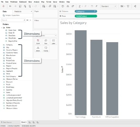
Dimensions are typically descriptives we use to provide context for the data we are exploring. Dimensions usually give us information such as who, what, when, where and how. When we include dimensions in our data visualizations, they give us by statements that allow us to make comparisons between groups or over time. For example, I can look at Sales by Category and compare the sales values of the Furniture category to that of the Technology or Office Supplies categories, as in this example bar chart below. Notice that in Tableau v2020.2, the dimensions are listed above the thin grey line for each individual folder/table and in the main data pane list of fields that are not organized into specific folders:
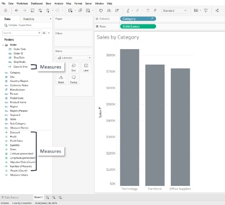
Measures are typically the numeric values that we associate with analytics, although not all measures result in numbers. In Tableau, the default aggregation (or mathematical operation performed on a measure) is SUM, but we can change that at any time. When we put a measure on a view, we tend to get the summed value of that measure broken down by the dimension we have on the view. In the bar chart example below, we have the measure – sum of sales – broken down by the dimension: Category. Just like with the dimensions in Tableau v2020.2, measures are listed under the thin grey line for each folder/table and in the main data pane:
Discrete vs. Continuous Fields
Another important, often confused concept has to do with the blue and green coloring that designates discrete and continuous fields. Don’t let these colors confuse you. They aren’t related to dimensions and measures.
Blue fields are discrete; for example, the categories Furniture, Technology and Office Supplies shown in the bar charts above. Boolean values—True/ False—are also discrete. I like to think of discrete values as either/or values. For example, a product might be in the Technology category or it could be in Furniture, but it isn’t going to be somewhere between. Boolean is either true or false. There is no range between True and False. Discrete fields provide buckets for our data and give us headers and labels when we put them on the view.
Green fields are continuous; for example, the Sales values in the bar chart above. Continuous fields can be represented as a range of values. Looking at the example bar chart above, the Technology, Furniture and Office Supplies sales values are within the range of $0 to approximately $850K. Continuous fields add a number line, or an axis, to a view and allow us to evaluate the magnitude of the value against a scale.
It’s important to understand these distinctions because you will run across discrete dimensions, discrete measures, continuous dimensions, and continuous measures in your data analysis. Understanding how Tableau reacts when you put a discrete or continuous field on your view is the first step in your successful data visualization journey.
Let the Data Exploration Begin!
Once we have a firm foundation of dimensions, measures, and discrete and continuous fields, we can start exploring some data. In our workshop, we explored a popular dataset of FIFA Football player ratings. This dataset is available in numerous places online, including Tableau, Kaggle and Data.World. This dataset includes player and club information for more than 600 football clubs and nearly 17K players. The data includes player demographics like age, nationality, team affiliation and rating scores.
In our workshop, we created bar charts, histograms and tables to dig into the data. We examined the top clubs ranked by the players’ rating scores and compared the differences in the top club when we used the sum of the scores vs. the average of the scores. We then normalized the roster sizes by filtering to include only the top 20 players on each team’s roster. We ended the workshop by adding a few advanced skills such as creating a calculated field to identify the top 20 players on each team, and then creating a parameter to give our end users control over how many teams they want to see in a list of top clubs by overall player ratings.
After the workshop, we had a wonderful Q&A session where I was able to answer questions about next steps for learning Tableau, books to read, Tableau community projects in which to get involved and best practices for data visualization. I had a blast, and I really hope the participants did, too!
The Tableau Transformation
I consider myself lucky. I have been in education for nearly 20 years, most of that teaching at university. Several years ago, I was asked to help with an accreditation project where I found Tableau Software. That was a turning point in my life. Not only did Tableau make it possible for me to successfully complete that project, but it also opened the doors for a new career as a Data Visualization Consultant and Trainer.
I have the best job in the world working with a fantastic team at an amazing company, and we would love to help you progress in your analytics journey! Reach out, and let’s begin the conversation. Ultimately, my hope is that anyone reading this recognizes the benefit that Tableau can bring to your practice and that you find as much fulfillment in your career as I have in mine.