
Tableau dashboards are a beautiful blend of technical proficiency and clever visual design. They can be used to show highly complex data in simple yet pleasing ways that can’t be found anywhere else. In this webinar, we walk through several example dashboards in Tableau, identify the effective features of those dashboards and then share some of our own tips and tricks for maximizing both the aesthetics and the efficiency of new dashboards.
What Makes a Dashboard Great?
We have three criteria to determine if a dashboard is great. Each dashboard should be:
- Intuitive – easy to understand and doesn’t require much explanation
- Flexible – versatile and often multifaceted, it allows the user to approach data from multiple angles
- Contextualized – places specific values in context and helps users maintain the big picture, even as they dig into the details
Let’s look at an example dashboard that wasn’t built in Tableau. This visualization of Covid data from Gov.UK exhibits the criteria we mentioned above:
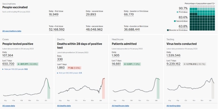
Lots of layering, the variety of tooltips and the different graph types provided throughout display a large amount of data easily.
These pages aren’t overwhelming or complicated but still manage to provide easily digestible information:
Example Vizzes from the Tableau Community
Below are other mentions of fantastic dashboards put together from the Tableau community. If you’d like to download the workbooks for these dashboards, they can be found on the Favorites tab of Keith’s Tableau Public profile.
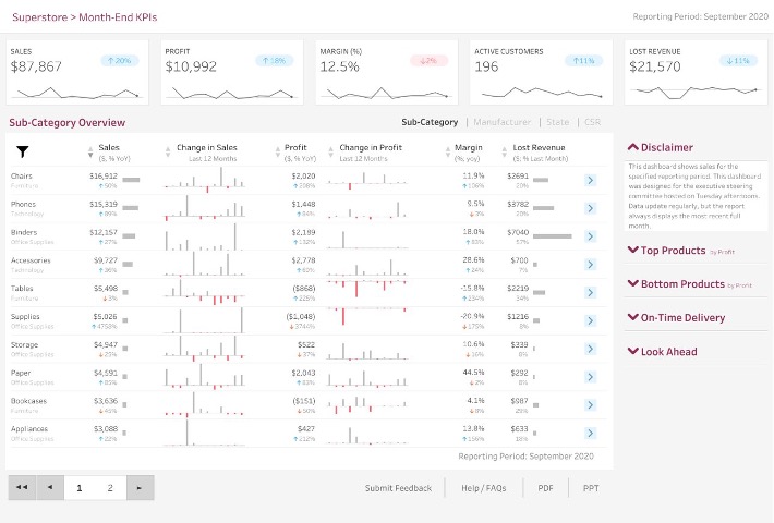
Above: Luke Stanke provides a sales dashboard for executives that’s flexible and contextualized.
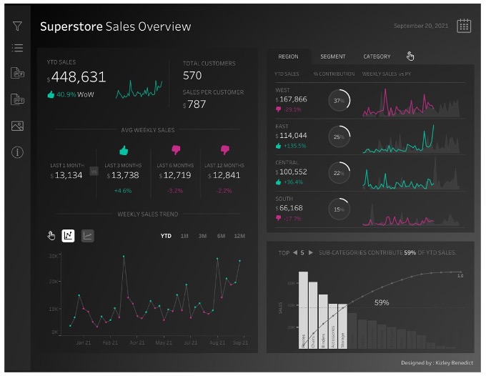
Above: Kizley Benedict did a dark Superstore dashboard with a striking look that was clean and beautiful.
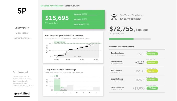
Above: Ludovic Tavernier’s salesperson dashboard was built on Superstore but with a different look that featured clear headers and explanations around the charts.
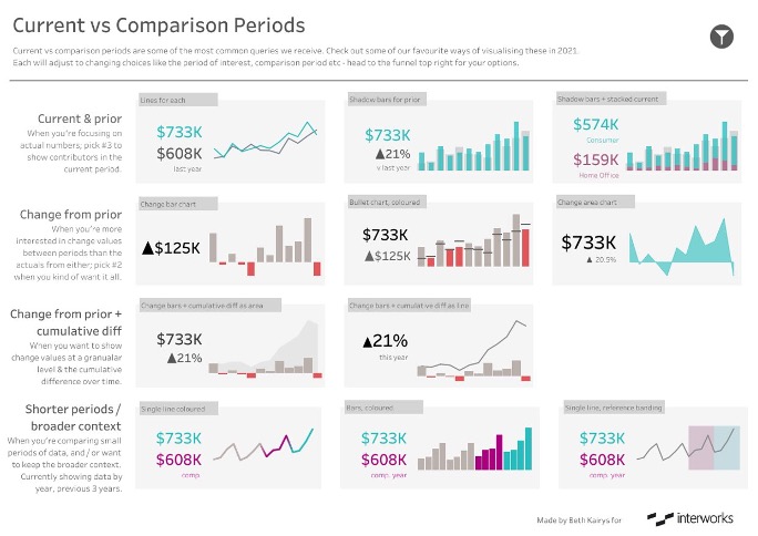
Above: InterWorks’ own Beth Kairys put together a great visualization for current vs. comparison periods.
This dashboard is clean and beautiful with clear comparisons applicable to different use cases.
Better KPIs and BANs
Here’s a Tableau dashboard that was put together years ago as an example of what a dashboard could look like:
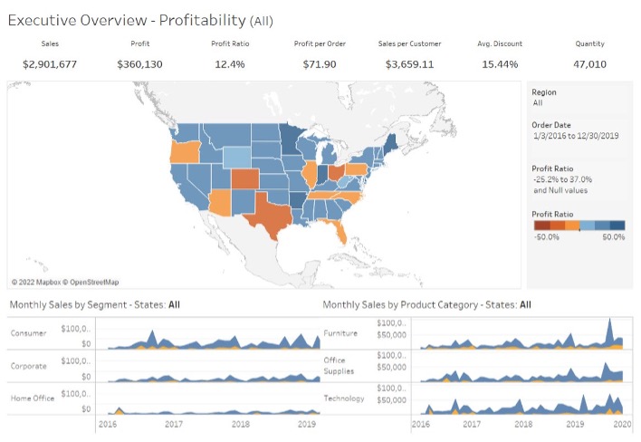
The KPIs and BANs up above are prominently displayed, but there’s no context. We don’t know if the $2.9 million in sales is good, bad or neutral. There’s no indication if sales are up, down or stable in any way.
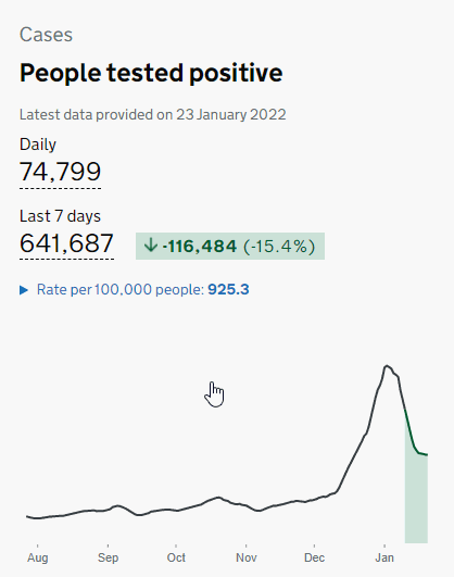
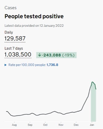
Here is the Gov.UK graph again with a trend line that directly correlates with not only historical change over months but also closer change over weeks, highlighted in green. The dashboard creators also use color to correlate a drop in measured weekly cases with where the dip appeared on the line:
Below is an example of a Tableau graph we at InterWorks generated for a client that incorporates some of these ideas. At the outset, the client just wanted to see a number, but we showed them much more:
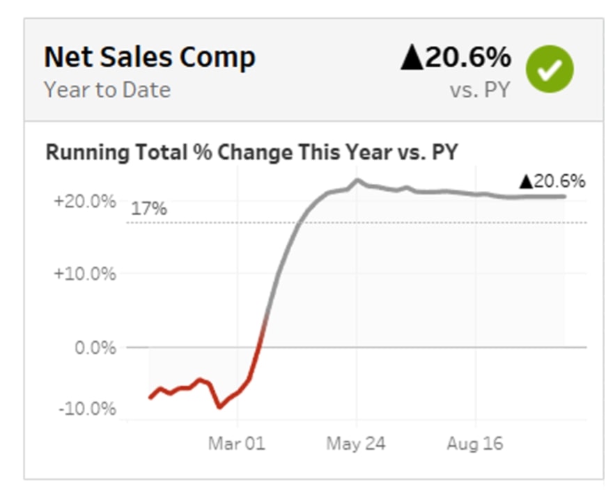
We provided the number requested, but we contextualized it by looking at time and how it compared to their goal of 17% growth. We looked specifically at the reference line in the graph itself and the green check mark in the top right to convey at a glance if growth looked okay or needed more attention.
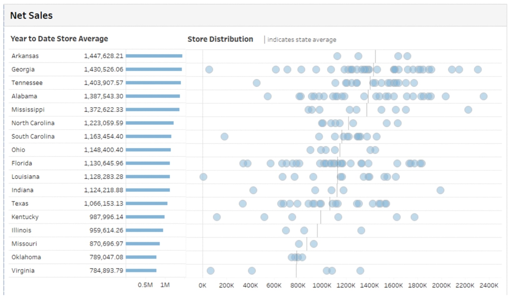
Further, this distribution plot showed the underlying stores that made up the client’s average. This provides a fuller picture of what these numbers actually mean in context:
Landing Pages
Just like being given numbers without context, being launched straight into the deep end of a dashboard is confusing. It’s like being dropped in a random location without a map. At InterWorks, we found ourselves building more home screens last year to work a little bit of magic into these dashboards. These landing pages can provide a soft landing for users entering the dashboard to select how they want to interact with it. This can help with clarity in, say, a workbook where a client may not know about the other screens included. A landing page can help them find what they’re looking for immediately. It can also help when there is a dashboard serving multiple use cases, or if there are similar dashboards with minor distinctions.
Landing pages can be like a doormat to enter your dashboard or a signpost showing which way to go. To browse some examples and see how landing pages can enrich the data experience, explore Curator by InterWorks.
As shown below, landing pages can sometimes just be a place to document your dashboards and provide context:
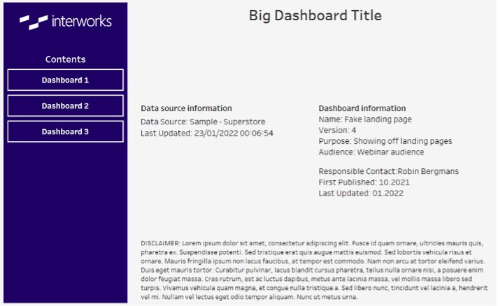
This example shows data sources, when the dashboard was last updated and other relevant information. There’s also a disclaimer at the bottom for compliance reasons, which is sometimes requested for sharing purposes. It’s good to have that information upfront instead of contained within every dashboard.
The next example below was the result of a client being very specific about where their dashboard fit in with their processes:
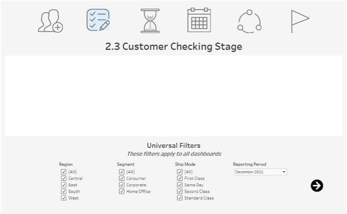
Users were already aware of the dashboard, knew when to access it and what to use it for. With this landing page, they could choose their scope up front. They could filter by region, segment and ship mode, all within a set reporting period. Users could set their own context before launching the dashboard. Not only that, but filtering down the information in the dashboard before loading improves performance and ease of use.
Explaining Visualizations with Natural Language
Even with Better KPI and BAN placement and landing pages, how can we help users interpret what it is they’re actually seeing? This can be challenging when the data is constantly changing. Good chart selection helps with that understanding, but pairing effective charts with explanations of these insights can push it to the next level.
In the example below, we wanted to help a client monitor the usage of dashboards. The top chart is the running total of new users over time based on their first viewing, and the bottom is a week-by-week count of new users gained:
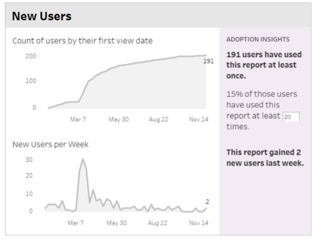
When shown to the client, they wanted further explanation on how these two charts interacted. That’s when the sidebar was added to plainly explain exactly what was going on with both graphs. Because we used logic to construct them, they were dynamic and changed with any updated information.
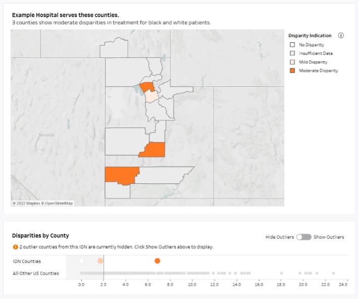
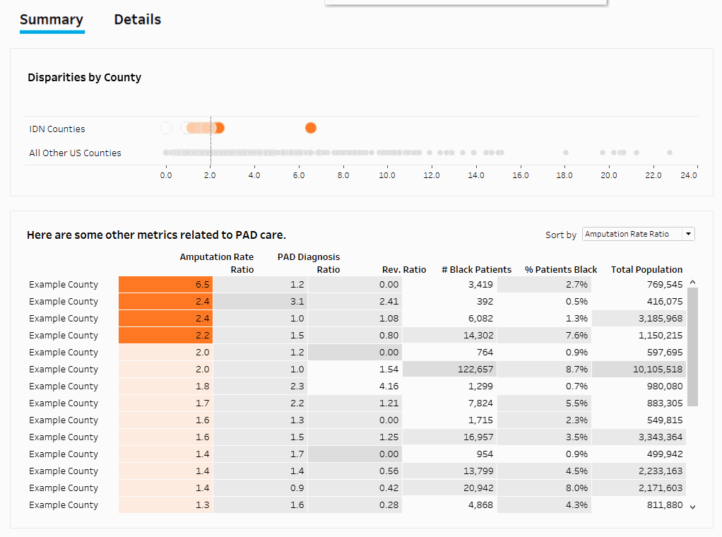
In this healthcare dashboard, we wanted to show counties with disparities between treatment for black and white patients:
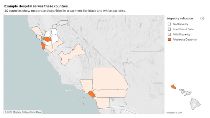
Though the map and colors paint a clear picture, we also added a description at the top to note here that 10 counties showed those disparities. We placed that at the top to drive user attention right to it.
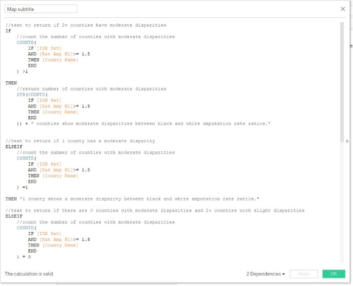
The logic can get a bit difficult with multiple permutations to plan for. This image captures half of the calculations done on that last chart alone:
Even with the extra work, these descriptions can be invaluable to ensure that users can save time and gain increased clarity on the data’s meaning. Adding in natural language like this is not only useful for explaining key results but also disparities and outliers:
On the dot plot at the bottom, we saw some extreme outliers that skewed the axis of the scale, so we excluded them by default. Sometimes, though, the outliers were being serviced by the hospital or provider in focus, so we needed an option to turn them back on:
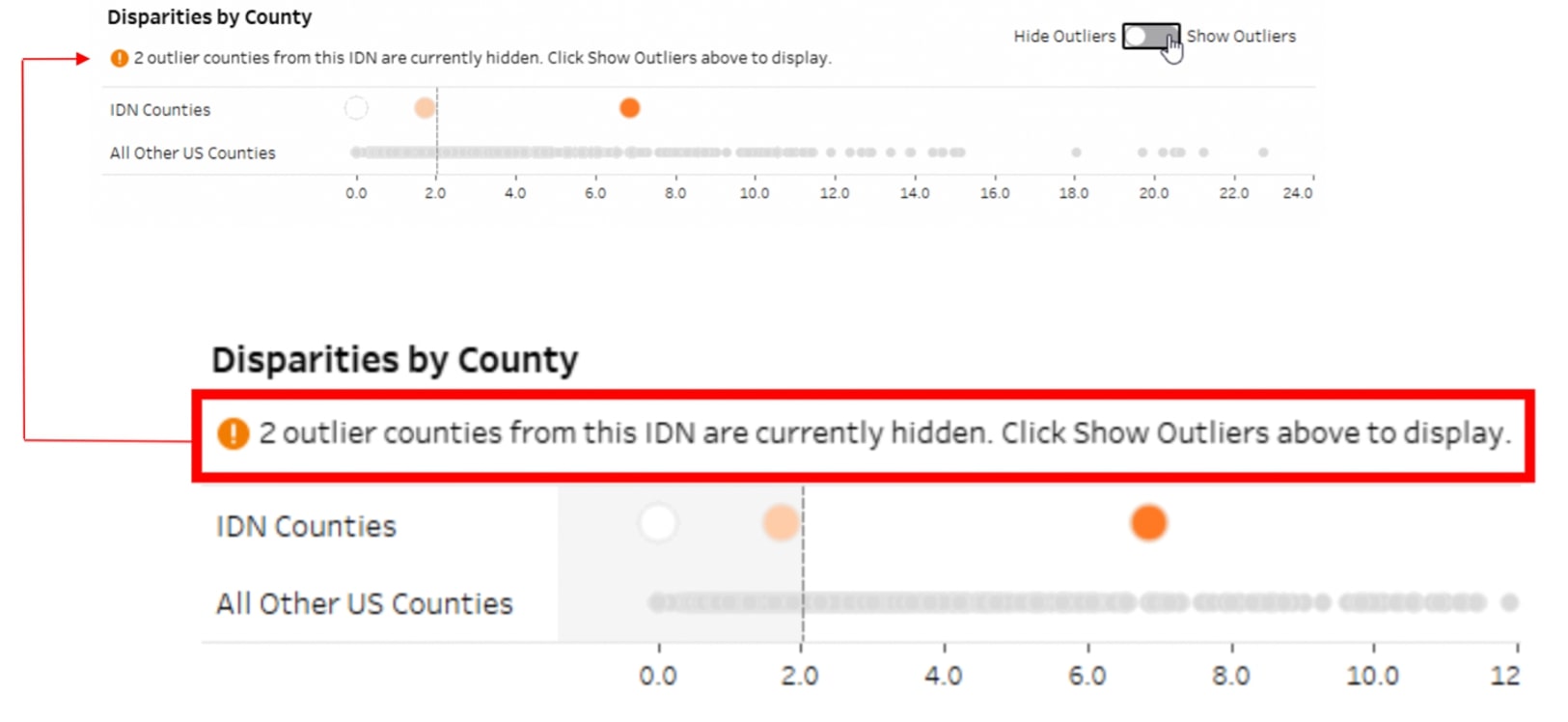
For this, we included a description to make sure that the hidden counties weren’t overlooked and that users would be encouraged to use the toggle feature to see the whole picture.
More details about natural language can be found in this blog post.
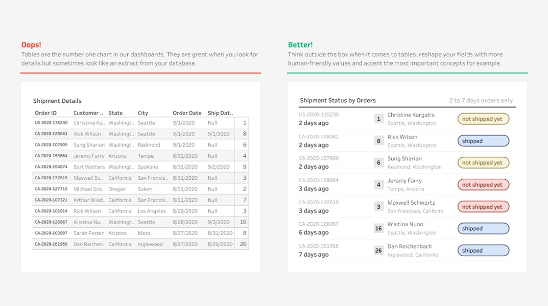
Improved Tables
What happens when a client wants to see all the data all the time? Maybe there are a slew of questions about exports, or maybe you don’t even get to build a visualization in the first place? Tables aren’t all bad. They have use cases where they can be quite helpful. There are some techniques we can use to elevate them to being a solid asset in these situations.
Here’s a look at the trusty, classic highlight table:
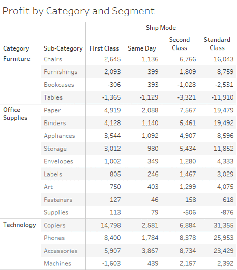
The use of color draws the eye to the good and bad in any table. Bold coloring isn’t necessary, but it can be a subtle option to guide users to important information. Visual analytics is intended to save time and brain capacity when it comes to finding relevant data. When done effectively, visual analytics ensure clients have those resources left to find patterns and ask better questions.
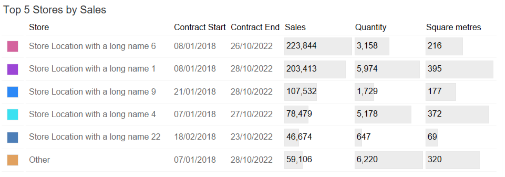
Recently, this table was well received. The whole setup was busy and colorful, and during creation, we insisted the table could be more than just a table. We added bars behind the categories down below to measure the values. That light gray color was used so as not to be overwhelming but still provide necessary context immediately:
Here is another fantastic of how to elevate tables example from Tableau Community member Ludovic Tavernier:
Every organization goes at its own pace in the visual analytics journey, but these tips can be a subtle way to help bridge the gap to more effective analytics.
New Show/Hide Applications
Another way to improve tables is to use Tableau’s show/hide feature. Pradeep Kumar was one of the first to use this in his dashboards, as seen here:
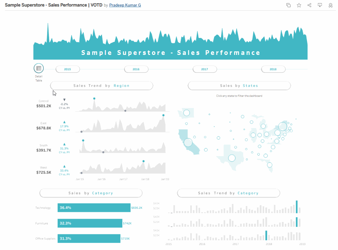
He illustrated the ability to toggle on a different set of records and see underlying data. With the show/hide feature, he cut out the need for another screen for this new information. This same feature shows up in this dashboard by Kizley Benedict:
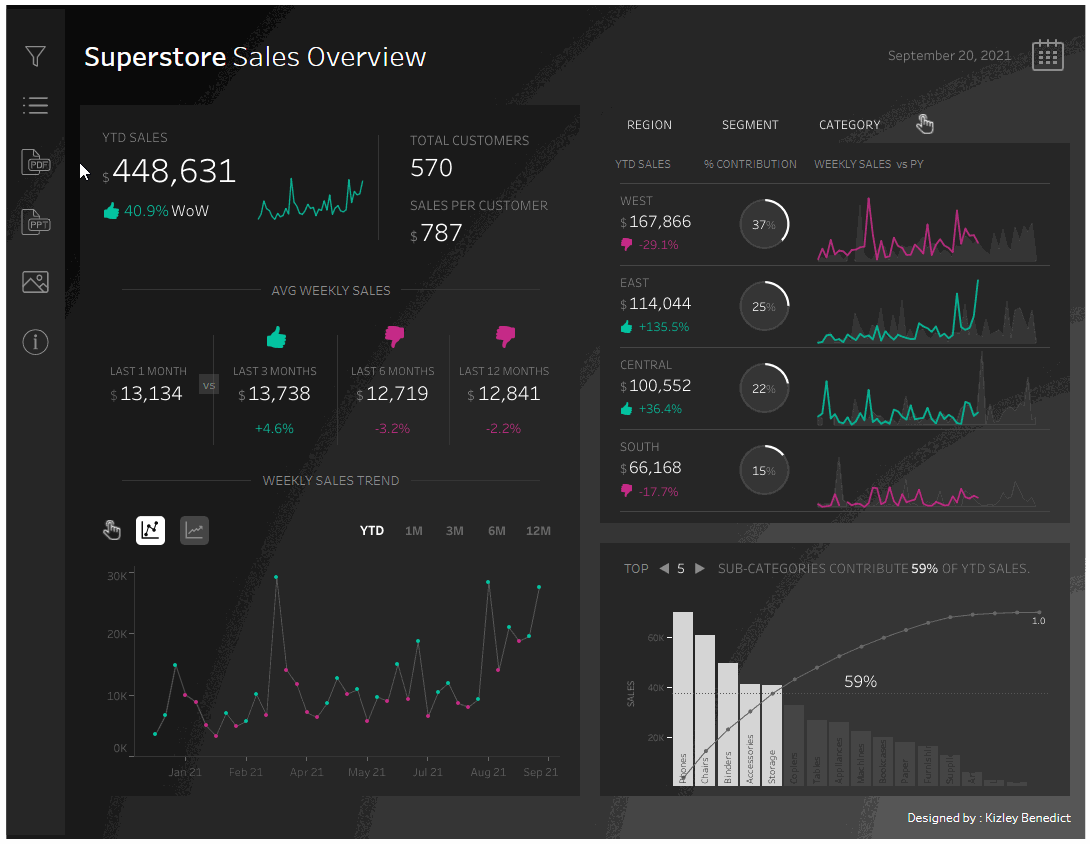
Here, the table format is included under the show/hide feature and demonstrates some of the same coloring tips listed above for added context.
Luke Stanke did the same thing here but in different categories you can click on:
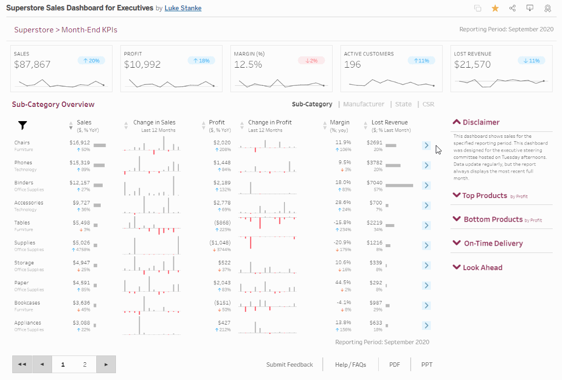
It overlays additional analysis with new charts to answer deeper questions about each category. This is sometimes seen in websites, but we can do that in Tableau as well:
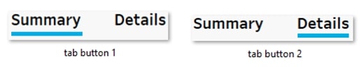
In this example, we use the show/hide feature to ensure that the user doesn’t actually need to load a new page to get more information. The Summary tab is tiled into the dashboard by default, but when the user clicks on the Details tab, the dashboard will float the information page on top of the main landing section with different charts.
Sometimes, this will be done with sheet swapping, but there were too many charts to make that uncomplicated. The show/hide button was actually just two images created in PowerPoint with the blue underline showing what the user had selected:
As the user clicks the image, it will swap between the two. Plus, it shows or hides the Details tab, so the user can see either level of the data.
Visual Context
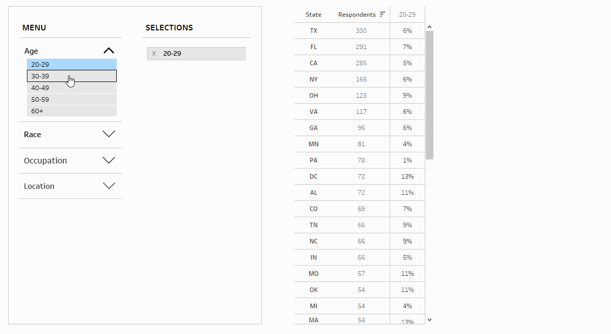
Sometimes, it’s nice to have some visual indicators to provide context between views or details. Tableau’s action filters do this quite nicely:
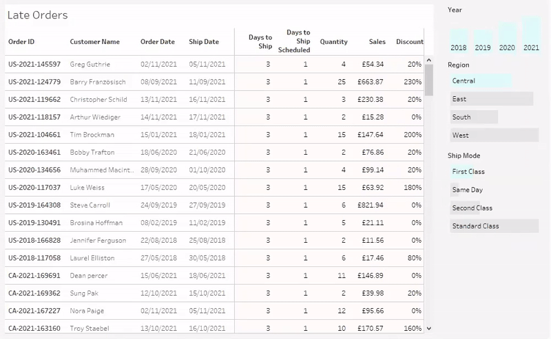
Selectable bar charts in the sidebar here can replace some simple filters. For example, when the client may be looking through late shipping in this dashboard, they’re reminded that the West may only be a small subset of all orders, and that most orders ship Standard Class. The bars are minimal and provide background information, but they allow users to change their perspective in a single click.
Tableau also allows for clickable images to be used for even more interactivity:
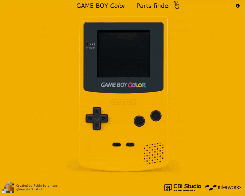
Here, we can use a background image for a fun use case (or for showing off on Tableau Public.) For this part, imagine a GameBoy repair shop that replaces buttons and screens. That client could click on the button they need more stock of and see a U.S. map showing where it was in stock.
This sort of capability can be expanded for other purposes as well. Clickable anatomy for healthcare, for example, would fit right in. Academic clients could click on parts of historical paintings for biographies of the artist or event depicted.
Maps are elements that benefit greatly from this technique, even if the mappable objects aren’t immediately recognized by Tableau. This view was recently created with the help of our new CBI Studio:
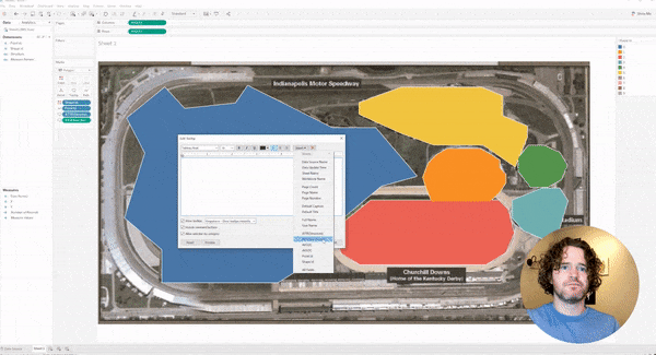
CBI Studio builds upon the Drawing Tool and allows users to plot data points on an image or map. Using a grid, points or polygons can be overlaid with labels and colorings that can be taken into Tableau and other programs. Even better: it’s free to use. #ShamelessPlug
A Few More Cool Design Ideas
A quick lightning round of things that caught our attention from some other creative dashboards!
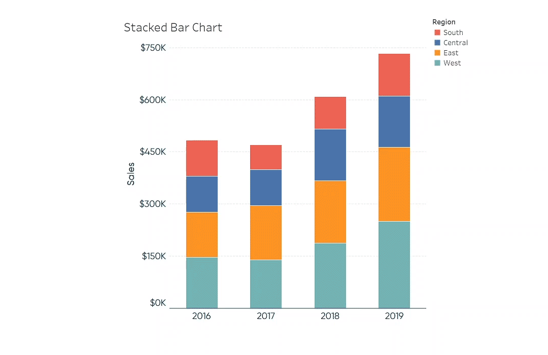
Coming from Ryan Sleeper, we’ve recently fallen in love with the stacked bar chart above. A single category in a stacked bar chart can sometimes be difficult to compare across different columns, but this solution makes different categories easy to review.
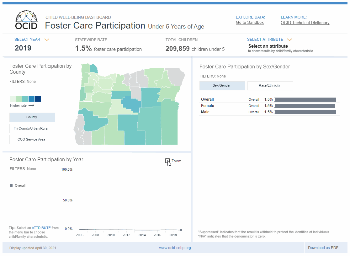
Below, this author included a zoom option at the bottom of the visualization. It shows small changes in percentage, as well as how a particular category compares to the whole. There’s an invisible reference line on the chart forcing the zoom option to switch between 100% and the Window Max option, which adjusts the axis:
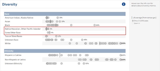
The zoom option is shown below as well, where scale matters when dealing with percentages. It shows races and ethnicities in the scale of 0-100% and within a narrower range. An individual axis within each of the dot plots lets the Zoom In button spread that data out:
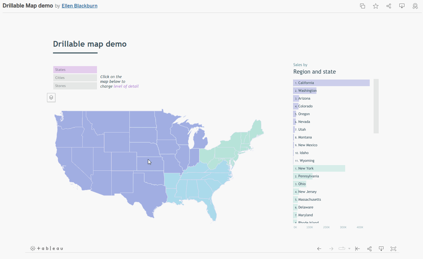
Map scrolling can be frustrating in Tableau, with actual scrolling or clicking on a plus sign to zoom in being more of a hindrance than a help. Ellen Blackburn’s solution was to have a map with layers where clicking on a state zooms it in one layer, and clicking on a city brings up its specific information. To zoom out, the user just clicks on the state again and goes back to the national map:
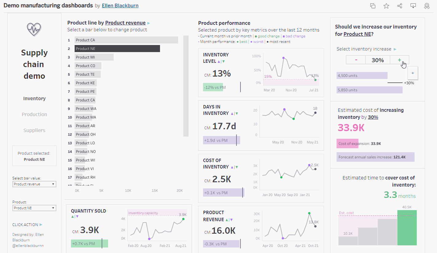
Blackburn gets a second mention here for her “What If” analysis in this manufacturing dashboard. At its core, it’s just a parameter that the users are adjusting, but it’s paired with very thoughtful charts. It shows what an increase in inventory can do to increasing cost and time in order to recuperate that cost down below:
One more! While not recommended in most cases, the accordion sidebar shown here is useful in this particular dashboard where users needed to essentially put together their own table from a large data source. The overall philosophy was to provide several expanding and collapsing sections then a number of set actions to allow users to add and remove certain measures or dimensions they wanted to see.
This dashboard was put together with inspiration from Luke Stanke, and a more detailed breakdown can be found here:
Wrapping up: Why Bother?
Some of the tips presented here can take more time and energy than just using something out of the box that can be built with Tableau, so why go to the extra effort to implement these creative features?
At the end of the day, building dashboards is about making people’s lives easier and helping them make better decisions in less time than they would otherwise. A great dashboard can reach hundreds or thousands of people, and if those end users start using it regularly, the time invested in putting together a quality, flexible dashboard will pay dividends in the long run. Any changes that can make a dashboard intuitive, flexible, and contextualized are well worth the effort.
To watch the full webinar, find the recording for your region below:
Webinar Replay – US
Webinar Replay – APAC
Webinar Replay – EMEA