
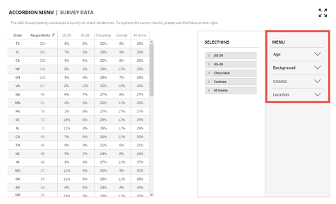
At InterWorks, we believe data shouldn’t be limited to only those who can write their own SQL queries; everyone should be able to explore and ask questions about their data with flexible and intuitive tools. On a recent project, we were looking to build one of these tools that would allow end users to dynamically build their own tables for their unique needs. The data source was complex, and the interface had to be able to accommodate a wide range of use cases. We ended up creating something like this:

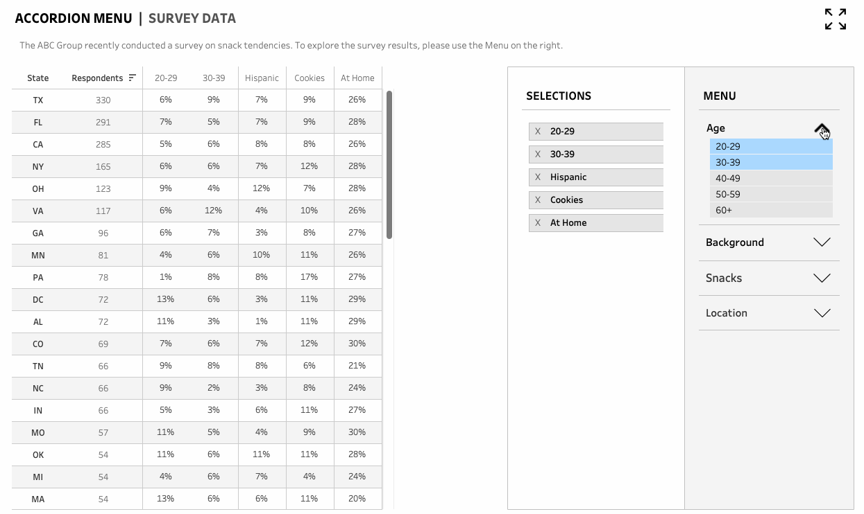
Above: Collapsible menu in action
Traditionally, the way to add and remove columns in the Tableau interface is through the Measure Names filter. However, this method can get messy quickly as the Filters selection will include every available measure in the data source, and in this instance, we had over 100 measures. We attempted a couple of alternative methods, including creating a duplicate of the data source with only the required measures, but we found most of these methods to be fairly clunky and unwieldy:
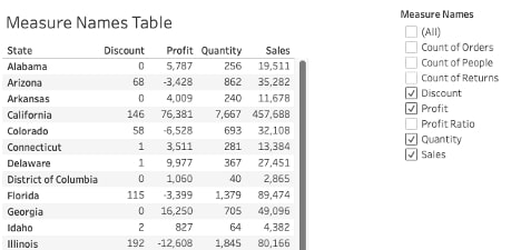
Above: Traditional method of adding/removing columns through Measure Names
Instead, by pivoting our data source and using Tableau features such as set and parameter actions, we were able to build an expanding sidebar where users could select the data they want. We’ll take you through the steps below:
The Foundation: Data
In this example, we’ll be looking at a mock research company’s survey of snack tendencies across the U.S. All data has been generated from Mockaroo.
With Tableau, we know the data is the foundation for everything we do, so we’ll begin by diving into the data schema that will be powering our view.
This is what our data looked like initially, and you probably have seen many databases or Excel sheets with a similar structure. Every record represents a single survey respondent with key dimensions such as age, gender, state and background. In the subsequent columns, there are the survey questions and responses with a 1 denoting whether the respondent marked the question with a Yes. For example, column F records whether the respondent consumed chocolate:
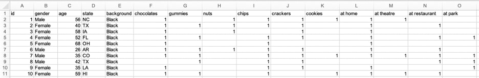
Above: Initial data structure
However, this collapsible menu method requires all of the selectable options (Questions) to be in the same column, where the data can then be filtered based on the user’s selection (see the image below). In other words, the data must be pivoted, which will make the table go from a shorter, wide table to a tall, narrow table.
This can be done in various ways, such as manually in Excel with the Transpose function or with the Pivot function if the data resides in Snowflake. In this example, I used Tableau Prep as I find it’s very useful for quick transformations where I can follow along with the changes. You can also do it directly in the data source view in Tableau Desktop if it’s a simple pivot.
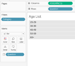
After pivoting the data, this is what the data structure looks like—one record represents the number of people who responded affirmatively for an individual question at the state level.
Fields:
- State – The master dimension to be used in the final table as the anchoring attribute
- Category – The field to assist with grouping the various questions/dimensions used to slice and dice the data
- Question – The key dimension that slices and dices the data
- Respondents – Metric column to track the number of affirmative responses to the question
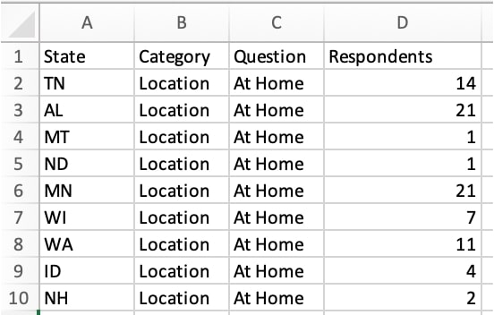
Above: Updated data structure
Building the Sidebar Menu Headers
Now that we understand the data structure, we’ll start building the section headers. These headers have an interactive icon that expands or collapses each section. It requires the use of parameters, calculated fields, dashboard parameter actions and dashboard filter actions. As such, I’ve put together a handy visual guide which summarizes the process:
Above: Sidebar menu headers
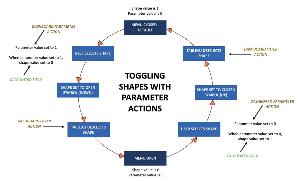
Above: Toggling shapes with parameter actions
Create a Parameter with Multiple Values
When we create our first menu item, we’ll want to define the parameter to have two values (0 and 1):
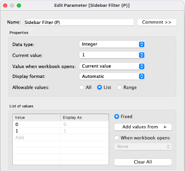
Above: Initial parameter setup
Create a Calculated Field Set to the Parameter’s Opposite Value
When the parameter is 1, then the value of the calculated field should be 0. When the parameter is 0, then the value of the calculated field should be 1:
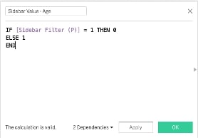
Above: Calculated field setup
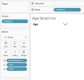
Create a Sheet with Shape as the Mark
When creating this worksheet, we’ll want to assign the up symbol (open) to the 0 and the down symbol (closed) to the 1:
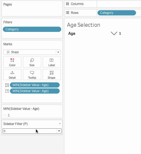
Above: Parameter toggle in action
At this point, when we toggle the parameter from 0 to 1, the shape should change from a down arrow to an up arrow and vice versa.
Put It All Together with a Dashboard Action – Parameter
We’ll want to create a dashboard action where the value of the parameter updates to the value of the mark. In other words, the dashboard action will always set the value of the parameter to the “opposite” value. So when the menu is closed (i.e. the shape is a down arrow and the value is 1), selecting the mark will set the value of the parameter to 0. As a result, the previous calculation we built will switch to a 1 (i.e. the shape will be an up arrow), meaning the menu will now be open:
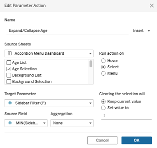
Above: Dashboard – parameter action setup
Deselecting the Mark
For additional details on the auto de-select, Tip #3 in this blog post goes into further detail. In brief, we’ll want to create two calculated fields: One which is True and one which is False. Set them both to the Details of the Marks pane:
Above: Placing true and false on the details of the Marks pane
Next, create a dashboard filter that will auto-deselect the mark so it will not stay selected after Step 4. Otherwise, users will have to click the icon twice (once to deselect it and once to trigger the action that changes the icon and expands/collapses the section):
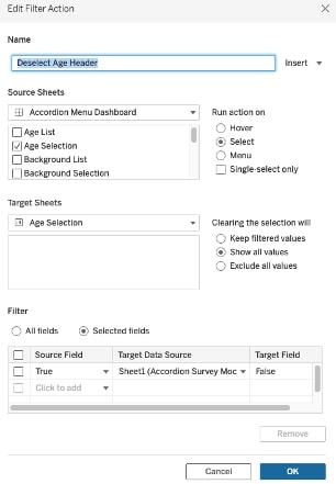
Above: Dashboard filter action to deselect mark
Building the Sidebar Menu Lists
To build these lists that show up when we expand each section, we’ll want to create bar charts where each selection option is an individual bar:
Above: Menu elements setup
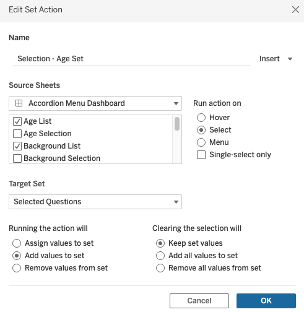
Above: Set action setup
This set should then be placed on the Colors icon in the Marks pane so that the colors update when selected. (The set will also be used as a filter in the next two steps.) As a final step, this sheet will be shown/hidden based on the parameter value created in the previous step. For additional information, check out this blog post.
Note: For the cleanest user experience, the auto-deselect should be utilized on this sheet as well.
Building the Selected List
Similar to the previous step, the selected list is built through a bar chart visualization. Using the set we just created as a filter for this sheet means only the selected fields are shown in this list:
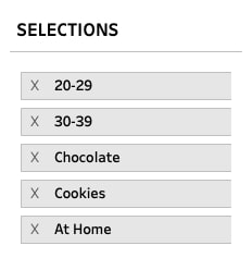
Above: Selections list
We’ll then add a dashboard action, but instead or adding values to the set in the previous step, we’ll remove values from the set when a mark is selected:
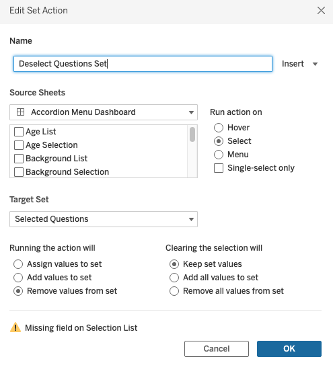
Above: Set action setup – removal
Building the Table in Tableau
Congrats, you’ve made it to the final step! The table should be the easy part where we’re just adding the desired fields onto the Columns and Rows shelves. To make it dynamic, we’ll be adding the set we’ve previously built and placing it on the Filters, so only the selected questions will be included:
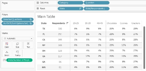
Above: Dynamic table setup
Ta-da, you’re all done!
Above: Collapsible menu in action
Conclusion
We’ve now completed the collapsible menu, and this interface should be blowing your end users away. It looks and feels like a full immersion and doesn’t look like a “traditional” Tableau dashboard.
This method might be helpful for you when you have many metrics that end users want to bring in and out of a view or highly granular dimensions that you would like to show in expandable groups. But this method may not be recommended if a simple dimension or a Measure Names filter can be used in your specific situation.
As always, I’ve included the link to the workbook on my Tableau Public, which is fully downloadable for you to reverse engineer: