
In this series, our team unpacks how to boost user adoption of Tableau Server through strategic planning, enablement and quality control.
Lack of data quality and lack of quality content can be major barriers to user adoption in an organisation. In this blog, we will outline some of the major pitfalls and how these can be overcome.
Quality Control
The challenge: we have data coming from multiple different sources, and we don’t know if the numbers are correct.
The first step in analysing the quality of the data is determining if the data is correct. Lack of trust in the numbers can be quite a common theme in businesses, especially if there are multiple teams building out data sources which then get combined. Without having this trust in the data, it is hard to get buy-in from everyone further down the process.
In some cases, there could be multiple text or Excel files that come from both inside and outside the organisation in multiple different formats. A good way to maintain the quality of incoming data is to build a quality control tool to help monitor this process. This can help look for data abnormalities, inconsistencies and duplicate data.
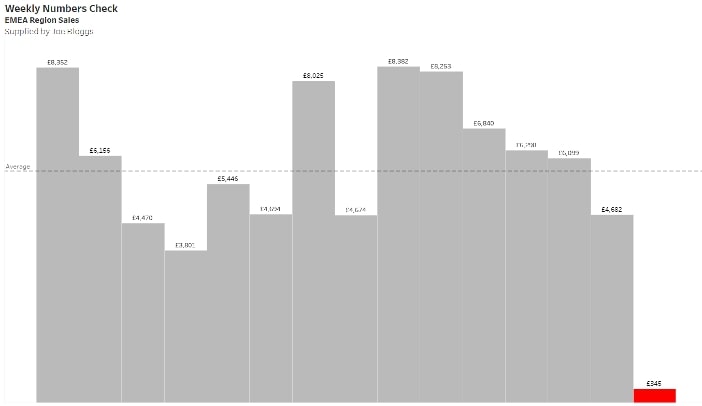
Using Tableau Desktop can be great way to build out views that can look out for those potential inaccuracies in the data. A view such as the one below can quickly show that the latest week has a huge decrease in sales compared to the weekly average. This has helped identify a potential problem, allowing you to go back to the source of the data and rectify it:
It may take time to build out a checking tool, but in the long term, it will improve both the accuracy of your data and the speed of your data-checking process.
When you have a data source that is good to go, publish it to your Tableau Server—preferably a QA or development site first—and let your users test it as well. If you have the Tableau catalogue add-on, you can also mark your data sources as certified. A green check mark will appear next to the data source, so users can see it has been approved for use. This can give your users that extra confidence that the data they will be looking at it trusted and correct.
Automate
The challenge: data is all in different formats, requiring the long, manual process of you combing through it to get it ready for analysis.
We’ve all been there … spending hours a week formatting data sources so actual analysis is possible, only for Monday to roll around and start the same tedious process again. We’re talking about hours upon hours every week that could be used to do useful analysis. Unfortunately, this can often be the case when you are gathering data from a number of different sources.
There are several reasons data can be difficult to analyse. Merged cells, pivoted data, different levels of aggregation and different time periods are just some of the common issues that we see.
The key is to automate this process as much as possible, so each week is not spent preparing the data but instead is concentrated on more worthwhile tasks. We are told here at InterWorks that if we ever find ourselves doing the exact same thing twice, we should be thinking about automating it.
Data Prep Made Easy with Tableau Prep Builder
Although the reasons I have mentioned above make it sound difficult to begin automating your data processes, there are data-preparation tools out there that can help you do this. One of these is Tableau Prep Builder, which is available for anyone with a Tableau Creator license.
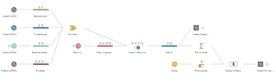
Tableau Prep Builder is a data-preparation tool that allows you to combine, shape and clean data ready for analysis. Data can be loaded in, and a process flow can be built out to get your data in the required format. The flow will then generate an output file that can be used as your data source in Tableau Desktop. All there is to do each week is then run this flow with your new updated data:
Again, it can take a considerable amount of time to build out a process like this, but the potential hours of preparation and stress it will save in the long run can free up tasks that are going to add more business value.
Future-Proofing
The challenge: every time we update our workbook, we must change our calculations to reflect the updated data.
You have your data ready and have loaded it into Tableau Desktop. You start building out some calculated fields, making groups and adding some filters to your worksheets. The only problem is every time the data gets updated, something in your dashboard seems to break or is showing you something you did not expect to see. Time is then spent going through the workbook to see where the error came from.
This is a scenario we see often, and a lot of this comes down to hard-coded calculations that aren’t particularly future-proof. This means setting a fixed value that won’t dynamically change when data updates.
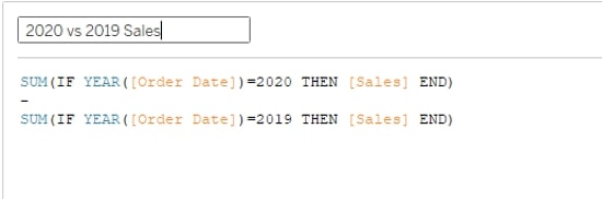
A common occurrence is seeing dates hard-coded into dashboards. Initially when the data was loaded, the latest year is 2020, and you might have some calculations comparing 2020 data to 2019 data like the one show below:
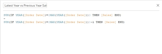
However, when we get into 2021, you want to change these calculations to look at 2021 vs. 2020. This would involve changing the reference in all the relevant calculations. A future-proofing solution is to reference the latest year and the previous year instead of the years themselves, so you will always be looking at the time periods you want to see:
It is tempting to hard-code, especially when as a beginner, as it can be a quick fix. However, putting in the extra effort to make a dashboard dynamic will make sure you avoid the headaches above and have any new data seamlessly incorporated into the existing workbook as you go forward.
Quality Dashboards
The challenge: you have your data checked, prepared and your calculations future-proofed but do not know where to start when it comes to building out some design friendly views.
When starting out building a dashboard, the endless possibilities of visualising a large dataset can make the process quite intimidating. There can be a desire to include everything, but that often leads to cluttered dashboards that take a long time to build.
One of the ways to help with these issues is creating a style guide. This can be a great way to ensure consistency across your company dashboards. A style guide should include colours, chart types, logos and text-sizing that preserve brand guidelines for a product and serve as a guide for future iterations and features.
Having design layout templates can also be useful for building some starter dashboards that can then be added to later. This can make sure you have a simple, clean design, and it limits the time you take in building out the dashboard itself. Applying this across all your dashboards within a consistent style can ensure that there is a cohesive look, feel and use, something that can be an important factor in ensuring adoption of your BI environment.
Helpful Design Resources
Below are some great resources we recommend exploring that can help get you started with creating design-friendly dashboards:
- Here are some greater starter templates from Tableau that you can download and play with.
- We recently hosted a virtual event that dove deep into the pros and cons of using dashboard templates. Check out the blog for more helpful resources and the video recording.
- Tableau has provided numerous examples of Business Intelligence dashboards you can model your work after.
- This blog post from our UX and Design team shares a few of our favourite KPI designs to inspire you in your work.