
This blog post is Human-Centered Content: Written by humans for humans.
One of Sigma’s greatest strengths is its flexibility. Unlike more rigid BI tools, Sigma lets you build complex, multi-layered workbooks with deeply customized data logic- joins, groupings, pivots, nested calculations — all within the same tool. For analysts who want to work closely with their data, that freedom is genuinely exciting.
But as we all know, with great power comes great responsibility. The same flexibility that makes Sigma so capable also makes it easy for workbooks to grow unwieldy fast. What starts as a tidy data page can quietly expand into a sprawling landscape of unnamed tables, mystery child tables and a surprising number of “Calc (1)” columns. You open a workbook someone else built — or one you built three months ago — and lose precious time just trying to trace the lineage of all the calculations, tables and charts.
But it doesn’t have to be this way. The good news is a few consistent habits go a long way. After working across multiple Sigma deployments, I’ve landed on a set of organizational practices that keep workbooks clean, navigable and easy to hand off. None of these are groundbreaking on their own, but applied consistently, they make a meaningful difference — both for future-you and for anyone who inherits your work.
Start with Structure: One Data Page, Organized with Tab Containers
The first thing I do in any Sigma workbook is create a single, dedicated data page for all tables. My creatively titled “Data” page holds all tables, all in one place.
Within that page, I use tab containers to organize tables by dashboard, then by metric. The outer tab container gets one tab per dashboard in the workbook. Nested inside each of those tabs is an inner tab container with one tab per metric on that dashboard. So if your workbook has two dashboards, you have two outer tabs. And if Dashboard 1 has three metrics, its inner container has three tabs (see the image of containers below for an example).
This structure scales well and, if you’re working with medallion architecture, it maps naturally to how your warehouse is already organized. One gold table per metric in the warehouse –> one tab per metric in the workbook. The organizational logic is consistent end-to-end, which makes the whole system easier to reason about.
One very important note: This approach is specific to Workbooks though the structure is similar for Data Models. Since Data Models don’t currently support tab containers, I recommend using a separate page per metric to achieve the same clarity.
Name Everything — Then Color-Code It Too
Naming conventions are the foundation of a navigable workbook. The convention I use follows this pattern:
metric_name_gold: descriptor
The metric name is always the prefix. Everything after the colon describes the table’s role in the lineage. Here’s how the full family breaks down:
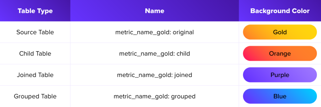
The original table is brought in directly from the warehouse — and critically, nothing is ever edited on it. All downstream work happens on the child table, which is always created off the original. This preserves the source and makes lineage obvious at a glance. If something looks wrong in a downstream table or chart, you know exactly where to start tracing.
Though this is a simple example, it can be expanded for more complicated logic. For example: If you create a dashboard where a date range filter is applied to only some charts and not all, then you would create two child tables — one for the charts that get the filter, and one for those that don’t — and expand on the naming convention, as demonstrated below:
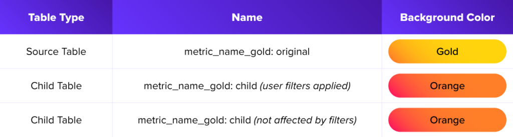
Crucially, both child tables are still labeled as such and are color-coded as orange to remind future — you that they both come from the original table but have different controls applied to them. Then you also know which charts were built from which tables at a single glance.
Of course, this color coding is a personal preference — not a rule. What matters is that you pick a system and apply it consistently. The goal is double-encoding: The name tells you the table’s role, and the color reinforces it. When you’re scanning a tab with eight tables, that redundancy pays off.
Every chart and visual on a dashboard should pull from the same table type for a given metric. No guessing, no hunting. You already know where to look.
Use Subtitles as Documentation
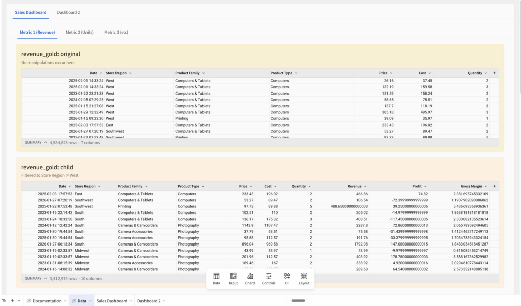
Sigma allows you to add a subtitle to each table element, which I use to briefly explain what manipulations I applied to that table.
A few examples:
Pivoted on [column name]Filtered to column name = trueJoined on customer id
This small habit means anyone opening the workbook can understand what a table contains without having to click into it. The subtitle tells the story at a glance, which dramatically reduces the time spent reverse-engineering someone else’s logic — or your own, six months from now:
Build a Documentation Tab
Every workbook I build gets a dedicated documentation tab (again, brilliantly titled “Documentation”). This is the source of truth for how the workbook is structured, and it should include three things:
- A naming and color convention reference — essentially a legend to help users understand the naming and coloring convention used in the Data page. I style the word gold in gold text, orange in orange, and so on, so the visual pairing between name and color is reinforced right there in the documentation.
- Shared: Any calculation that’s used across multiple tables should be defined here with an explanation of what it does. This makes shared logic easy to find, easy to reuse and easy to audit.
- (Note: Any calculation that is not affected by user input should live in the Data Model. Any calculation that is affected by user input is okay to duplicate across tables in the workbook. See the blog Bretten and I wrote for more details.)
- Process: If there’s a multi-step process that repeats across tables, write out the steps. If you had to figure something out the hard way, that’s exactly the kind of thing that belongs here. One of the best lessons I learned (the hard way, of course) was to not reinvent the wheel. Anything I can do now to replicate something that has already been figured out or to help others not have to figure something out I discovered is well worth the time.
A Known Trade-Off: Filter Controls and the Single Data Page
To be clear, there are limitations with this process (no free lunch here, either). The one limitation I discovered with this process is that searching for tables when applying filter targets to controls is quite difficult.
When you add a filter control in Sigma, the element picker organizes available tables by page. With everything living on one data page, all your tables appear together in one list — and on a complex workbook, that list gets long.
Of course, it is a good idea to first make sure you have gone through your data page and deleted any tables you not longer need or were just using for testing purposes. But even after this clean-up step, you will likely still have many tables — too many to scroll through efficiently.
The mitigation is straightforward: This is why naming conventions aren’t optional. Instead of scrolling through the full list, you can type the table name directly into the search bar. If your naming is consistent, you always know exactly what to search for.
It’s a trade-off worth making. The single data page keeps your workbook structure clean and your table lineage clear. Disciplined naming keeps the filter control experience manageable. Neither works without the other.
The Bottom Line
Sigma gives you a lot of flexibility in how you structure your work — which is both its strength and the source of most organizational debt. The practices here aren’t about adding bureaucracy for its own sake. They’re about building workbooks that are easy to navigate, easy to hand off and easy to trust.
Name your tables consistently. Color-code them. Document what you did in the subtitle. Keep a documentation tab. And if you’re also building in the data model, apply the same conventions there — just swap tab containers for one page per metric.
The foundation of a good workbook is a workbook you can still make sense of in the future.
For more on how to think about the data model side of this equation, check out Think Like an Analytics Engineer: Working Effectively in Sigma, which I co-authored with Bretten Farrell.
Related
