
Tables in Tableau is a trilogy designed to help you add a little extra flair to your tables, also known as crosstabs, in Tableau.
In the world of data visualisation, there is a love-hate relationship with tables, also known as crosstabs.
The truth is, as with any other type of data visualisation, tables have a space in the analytical world and are customarily used or even required by some industries, such as finance where the appetite for balance sheets, cash-flow statements and bank-reconciliation reports is a daily necessity.
Tables in Tableau already have best practices in mind, applying row banding to help the user keep track of the data corresponding on the row. The columns, on the other hand, are simplified with the absence of column dividers or banding as the human brain has the propensity to naturally align elements vertically.
Personally, I tend to favour a more visual form to display outliers, patterns and trends. But when a need for a table arises, I try to add some visual aids that not only enhance the analysis but also make it user-friendly to a wider audience.
With this, I don’t mean to advise on the redesign or “beautification” of a table just because “it is plain and boring.” Rather, given the purpose and the audience, elements such as colour, shapes and ASCII codes can be added to a standard crosstab.
This will be a table blog trilogy, but today I will walk you through the redesign of one table, depending of the use case and outcome required.
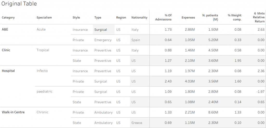
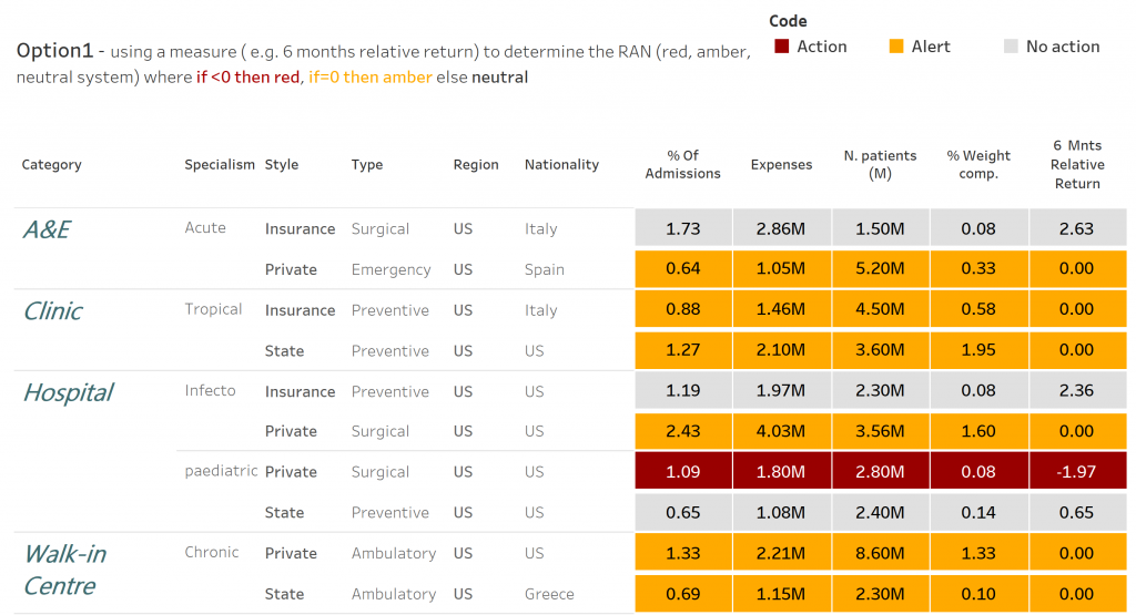
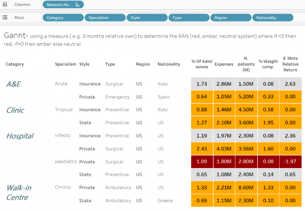
Option 1: “Alert Table”
Use case: A table that displays several measures and simultaneously gives a visual clue based on the RAG (Red Amber Green) Status.
How to?
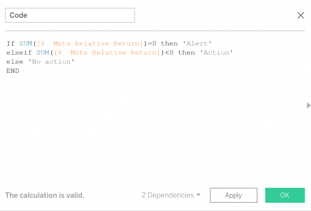
- Create a table with the data you wish to display. To colour with a discrete colour palette, we must create a discrete calculated field with the conditions we want to highlight, like so:

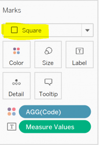
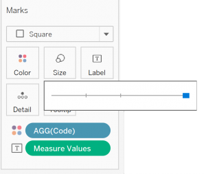
- Drag the newly created calculated field Code to the Colour card on the Marks shelf and change the mark type to Square:
The table will be looking like this:
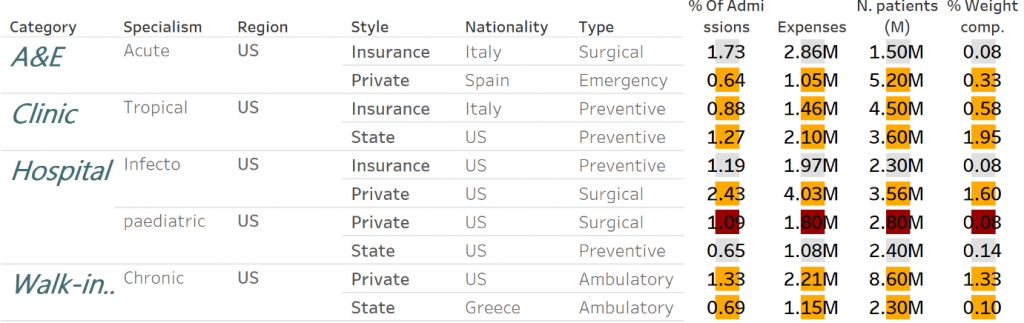
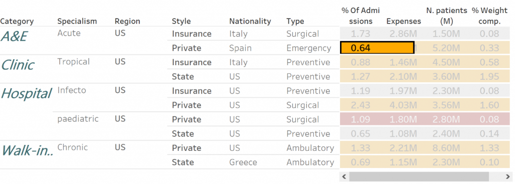
- The next step is to resize the square so the colour fills all the corresponding cell. On the Size Marks card, use the slider to the maximum size:
Although we increased the size, the highlight table doesn’t look right because the squares bleed into the neighbouring cells.
Luckily, Ryan Sleepers’ Jedi trick of adding a second discrete field to both the Columns shelf and Rows shelf will correct it. With this we will add a “blank” dimension. To do so, double-click in an open area of the Columns shelf, type two quotation marks and hit the Enter key:
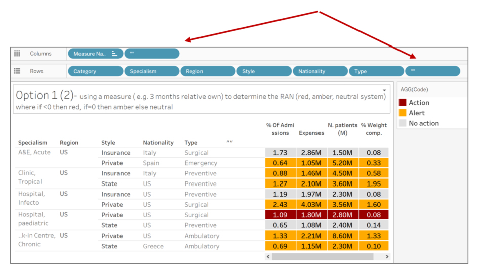
The headers of the blank dimension can be hidden by right-clicking on the newly created dimensions and deselecting Show Header.
The remaining formatting steps are personal choice and preference, however because we are using a discrete field to colour the table, the border formatting is no longer on the Colour Marks card but controlled by the Row Divider and Column Divider options on the Format pane (right-clicking anywhere on the view, choosing Format and navigating to the Borders tab).
One other way of getting this type of output without using blank calculated fields:
- Create a table with the data you wish to display. To colour with a discrete colour palette, we must create a discrete calculated field with the conditions we want to highlight, like so:
- Drag the newly created calculated field Code to the Colour card on the Marks shelf and change the mark type to Gannt:
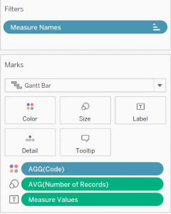
- Resize the Gannt chart on the Size Marks card, using the slider to the maximum size.
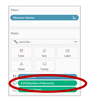
- Now “the James Austin hack” tells us to drag the Number of records field the Size Marks card and change the aggregation to AVG:
- Remove the grid lines by using the Format pane and you should have the following output:
Option 2: “Colour by Different Measures”
Use case: A table that displays several measures with separate colour ranges depending on the measure.
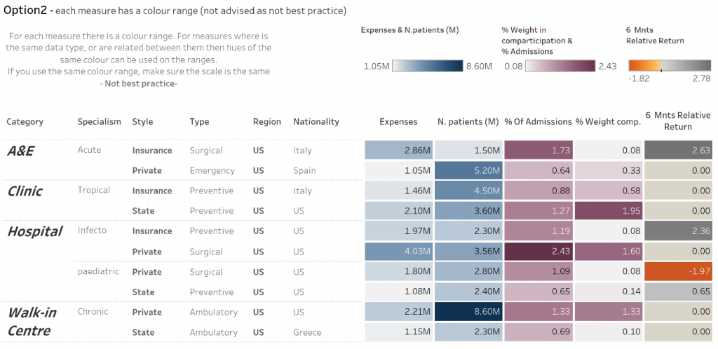
- Create a highlight table with a measure and dimensions you wish to analyse. Add the following measures to the table.
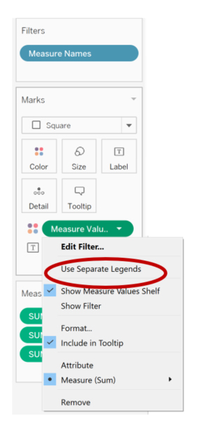
- Right-click on the field Measure Values present on the Colour Marks card and select Use Separate Legends:
- Format the colour legends, choosing different colours or hues of the same colour if the measures are related or have the same unit.
NOTE: This table type should be used with caution as it isn’t best practices and too many colours may hinder the analysis and user experience.
Stay tuned for Part II, where we will cover different ways to display negative values in tables.