
Pie charts are one of the most iconic data visualisation styles; in the past, they have been the bedrock of many a PowerPoint presentation. When you start to look a little closer, however, as many data-viz purists have, you begin to notice that they have some downsides. I am not going to go into all of them, but one gap is that whilst they give a reasonable sense of proportion, they often lack the bigger picture, i.e. the overall size of the data or other high-level stat. For example, if we are looking at sales, it’s great to know which department is contributing the biggest proportion, but what were my overall sales?
Note: This post was also written with support from James Austin. Thanks for teaming up with me!
The Sweet Surprise of a Tableau Donut Chart
This leads us nicely to the donut chart. Fundamentally, this is built on a pie chart but incorporates a space in the middle for the high-level takeaway figure. Interestingly, it often also makes the proportion of the slice slightly easier to read.
Tableau has no Show Me! for the donut chart, which can make it a little inaccessible for some, but here is a blow-by-blow way to unlock this enhanced viz type.
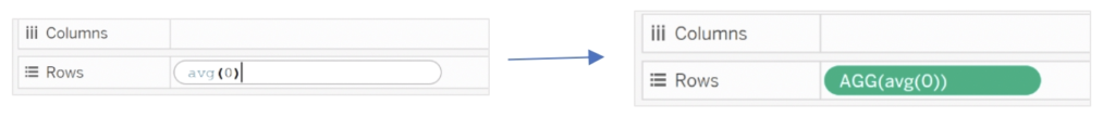
Double-click on Rows and write avg(0):
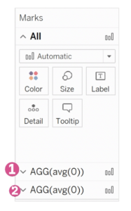
In front of the field you just created, double-click and write avg(0):

You should now have two Marks cards:
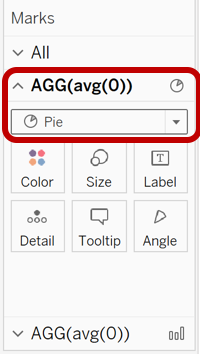
On the first Marks card (1), change the mark type from automatic to Pie chart:
On the first Marks card (1), bring your dimension to Colour (e.g. Segment) and your measure to Angle (e.g. Sales):
Still on the first Marks card (1), bring the measure (e.g. Sales) and the dimension (e.g. Segment) to the Label card. Click on the Label card and select Show mark labels:
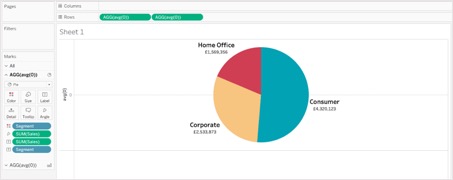
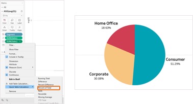
Right-click on the measure (e.g. Sales) field that you just added to the Label card, and select Quick Table Calculation and then Percent of Total:
On the second Marks card (2), change the mark type to Circle. Use the Size and Colour cards to adjust the size and colour of the circle:
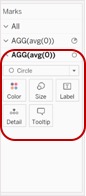
Again on the second Marks card (2), drag and drop your measure (e.g. Sales) to the Label card mark:
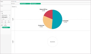
On the Rows, right-click on the second avg(0) field and select Dual Axis:
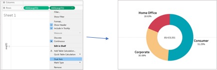
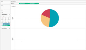
And there you have it! Now, you can visualise your data by building upon the pie chart whilst also providing key takeaway information to your audience.