10 Questions is an ongoing blog series in which Tableau Zen Master Dan Murray interviews some of the brightest folks in the world of data.

I’ve admired Kelly’s Tableau Public work and her blog for several years. Late last year, I was in Vancouver giving a talk. That gave me the opportunity to have dinner with Kelly along with the George Gorczynski, the Tableau Picasso. We talked about data viz for several hours over dinner and had a great time. Kelly calls herself the “grandma” of data visualization, but her work is fresh, informative and has the elegant presentation that you’d expect to see on the pages of The New York Times.
The Questions
Q: You’ve been using Tableau for a while, but when and how did you first discover Tableau?
Martin: I was aware of Tableau earlier, but it wasn’t until Tableau Public came along that I tried the product (2010). Honestly, I had just left a position and was seriously questioning whether I wanted to continue being an analyst, then one night I found it, downloaded it and began to play. I was hooked.
Q: As an independent contractor, do you find it challenging to balance doing the work and managing the administrative parts of your practice?
Martin: Yes, especially when I’m busy working on two or three projects at the same time (and they always seem to come together at once). I tend to do a lot of small, quick projects, which is nice, but it also means staying on top of my hours. And then there’s Quick Books – QB reports suck.
I wish some clever monkey out there would build a program (an affordable program) that helps with tracking hours, projects, invoicing, task management, etc. and either replaces QB or connects directly to it. For now, I do all of that stuff in Excel. And thank you, Dan, for the info regarding QB connectors. Now if I could only find the time to build the reports I need in Tableau.
Q: The dashboards on your blog are very appealing. I consider them best practice in the “art” of data visualization. Where to you get your inspiration?
Martin: It really depends on the subject and the people who will be using the dashboard(s), how they will be using it and the data. If the dashboard is for a client, then I pay attention to the style of the organization, the department and the subject – not just their branding colors or fonts but their style.
For my blog, I can get away with anything and experiment quite a bit. I don’t have a natural or trained eye for design (I’m always learning), but I’m a good mimic. Sometimes, I’ll see something from another visualization. But often, it will be from pictures (I get “Death to Stock” images monthly and National Geographic) or websites, home décor, film credits and even instruction manuals. If something catches my eye or delights me, I look closer at the composition of elements to discern why.
Q: Are you influenced by designers like Dieter Rams?
Martin: I’d never heard of him before now, but thanks for the prompt to check him out. My son would have heard of him (he’s an industrial designer), and now that I’ve read a bit, I recognize the concepts from conversations with him.
When I first started building dashboards instead of just charts or massive “binder” reports, I was most influenced by Stephen Few, Kathy Sierra and Amanda Cox. Stephen Few’s books and posts were hugely influential in helping me see the data so that I could show it to others. Kathy is the originator of the “Head First” O’Reilly book series that focuses on incorporating different modes of learning. When “building” something, she places the emphasis on making the user kick-ass – not you – which forces you to put yourself in their shoes and see the information from their perspective.
Her blog, Creating Passionate Users, is no longer active, but there are some gems on it. Amanda blew my mind when she arrived at the New York Times in 2005. I looked at what she was doing and thought, “Why can’t our dashboards look like this?” She inspired me to try.
Q: Who do you follow in the Tableau community and why?
Martin: At first, it was the Andy’s: Andy Cotgreave and Andy Kriebel. But in the last couple of years, the number and calibre of bloggers has grown exponentially. People are doing mind blowing things out there. I follow at least 25 on Feedly and a whole pile on Twitter. It’s a bit overwhelming to keep up, but it’s also how I learn. Ramon Martinez maintains a great list of Tableau bloggers – I think I follow them all.
Q: Being an independent consultant can be challenging. And, being a woman in tech presents different kinds of challenges. Do you feel any discrimination exists against women in tech?
Martin: “Tech” has a vision problem, as in there’s a real danger of being myopic and losing its ability to be creative and adaptive. A good example of this is how Microsoft became a big, bland, slow, monolith (I only mention Microsoft because I’ve read that they are trying to change this). How do you “think outside of the box” if you’re sitting in the box talking to a mirror? I understand that it seems easier to communicate, and you know that everyone in the box will love your ideas, but diversity – whether it be age, culture or sex – is healthier, more productive and more innovative in the long run. If you only let the monkeys build the zoo, you will have a zoo that only monkeys could love.
Being an independent consultant is much, much easier. I don’t get contacted by people who have those biases. I also think that my focus on Tableau consulting has a lot to do with it. Tableau isn’t being used by just the “tech” folk in most organizations, it’s being loved by the analysts and management in all departments. There are way more analysts in most organizations than are in IT or BI, and those departments don’t have as much of a diversity problem (e.g. finance, marketing, sales, operations). That’s why you see so much more diversity (with the exception of race) at Tableau’s annual conference.
Q: How would you describe your dashboard design approach? Pragmatic? Artistic? Both?
Martin: I like Stephen Few’s definition of data sensemaking. So, by that measure, I guess I’m pragmatic. But that doesn’t mean a step-by-step approach.

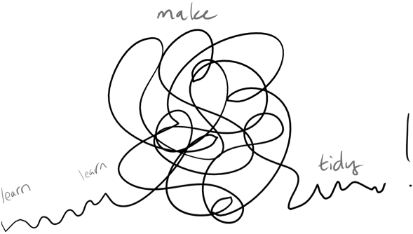
I tend to learn what I need to, then just go and do fast without thinking about it much. Do the homework, make a huge mess and clean it up with a critical eye. Is that both or creative? Or nuts?
Q: How do you approach discovery work with Tableau?
Martin: It’s a combination of research, frameworks and curiosity. Initially, I have to understand the measures and their context, which means I may have to do some research. Because my background is in planning and evaluation, I tend to approach a lot of the investigation through that framework (inputs > outputs > outcomes). But first, I will go through all the fields, checking frequencies, descriptives and relationships.
I love using Tableau for discovery. It’s addictive. Before Tableau, this part was so onerous and quite subjective. You were basically testing a bunch of hypotheses that could be very time consuming and often, we’d end up with “analysis paralysis” and squirrelly eyeballs. With Tableau, you can ask a lot of questions of your data – fast. One of my favorite games is to make a basic view and then hit all the Show Me charts rapidly until I run out of options. It’s amazing how many surprises I’ve had – it’s a random treasure hunt.
Q: What are some of your favorite dashboard designs that you’ve seen in the community? Why are they your favorites?
Martin: Are you kidding? We’re talking hundreds now. Here’s a few that stick out in my mind at the moment.
- Jeffrey Shaffer’s Music Major Data Minor – such a beautiful, enjoyable story of Jeffrey. Many items can be overwhelming, but this drew me in, and the Sankey was a beautiful surprise.
- Jim Wahl’s Small Multiple Masterpiece – so simple, clear and beautiful. This chart has solved many problems I’ve had of showing a lot of data and information in a way that can be absorbed in business.
- Steven Carter’s Adoption Gap – very simple, beautiful. I instantly knew what I was seeing and was delighted.
- Adam McCann’s Life Expectancy – a very different way of presenting this information but very effective. The overall dashboard composition is light and pleasing. Also, it inspired Nelson Davis’s Genocide and War Story Points viz – brilliant!
- George Gorczynski’s Morally Acceptable – I’m usually annoyed by radar charts, but this is wonderful.
- Matt Franis’ EPL Injuries – I often zone out when the subject of sports appears, but I couldn’t help myself – I clicked, I learned and thoroughly enjoyed this viz!
Q: What advice would you give to a person that wants to work full-time doing dashboard design?
Martin: In tech and BI, dashboards are considered to be the “sexy” part of the work because the finished product is what will excite the people receiving them. In traditional BI, the dashboard/report was the final step in a 10-12 step process. A developer would be tasked with carrying out the committee-agreed-upon requirements and design after multiple mock-ups were reviewed and approved.
With Tableau, I tend to think that there are only two steps: data wrangling and data analysis (or sensemaking). Building the dashboard is a component of data analysis. Making meaning from all the data and being able to communicate it effectively is more than knowing what colors, fonts, lines or white space to use. A full-time job doing dashboard design is a data analyst position.
So, I guess I would ask: “What kind of data analyst do you want to be?” In business, I’d suggest that they learn something of program evaluation (or Results Based Management, or Strategic Planning, or whatever the kids are calling it these days), as it helps you put a framework together to figure out what questions you should be asking of the data. I’m talking about certain businesses here. The 5W’s works well for web work (dashboards that are for public consumption and have a very specific, finite focus) and some projects, but sometimes it’s not enough. I’d also suggest you learn something of research methods, statistics and relational data (SQL).
But – and this is a big BUT – don’t let that scare you or slow you down! If you have a hankerin’ for dashboard design, then jump in – the water is fine. Download Tableau Public and find some data that interests you and start playing. Don’t judge, just follow your curiosity. That will drive you to learn the things you need as you go along. Connect with the Tableau community and you will find all the help and encouragement you can imagine.
Discover More Interviews
Want to read more insightful interviews like this one? Then you’ll love our 10 Questions blog series. Check out the full list of interviews here, and stay tuned for new additions.
Need Help? Let Us Know!
There you have it. If you need help with your data infrastructure or Tableau, we have the experience, skill, and knowledge to insure your success. Contact us today to learn more.
If you’re in college and think you might want to get into this game, head to our Careers page and apply for one of our open jobs. We’d love to hear from you.

