
“Hey, there are some leftover sandwiches from today’s TUG in the kitchen if anyone wants some.”
“Well, I was planning on being at that meeting, but I got pulled in to help with the TUG on Thursday.”
“Hey, Andrea, I think it’d be a great opportunity for you to learn a little more about Tableau if you went to Friday’s TUG. What do you think?”
“…what is a TUG?”
I recently had the opportunity to attend my first TUG—which stands for Tableau User Group, for those who didn’t know (me)—in Tulsa. It was led by InterWorks experience consultant, David, and his focus during the presentation was on designing for data. He talked about the importance of not just communicating your data but doing so in a deliberate, visually appealing way.
Why Design in Data Matters
It’s not just about making something pretty. It’s about making your data visualization simple, consistent and meaningful. David walked the group through a couple of examples upon which he improved by implementing a checklist particularly crafted to enhance a user’s interaction with a given viz. Moving from high-level viz aspects like titles and text to more detailed facets such as color and borders, David explained that everything can—and must—be purposefully tailored to the viewer.
When you simplify your viz and its elements, you can bring special attention to those things that really deserve it. Rather than overwhelming the viewer with unnecessary imaging and a cluttered layout, strive to provide only that which enhances the message you’re communicating with your data. With a simpler, more streamlined visualization, the focus can naturally drift to the most significant features. This reflects intentionality.
Practical Tips and Design Inspiration
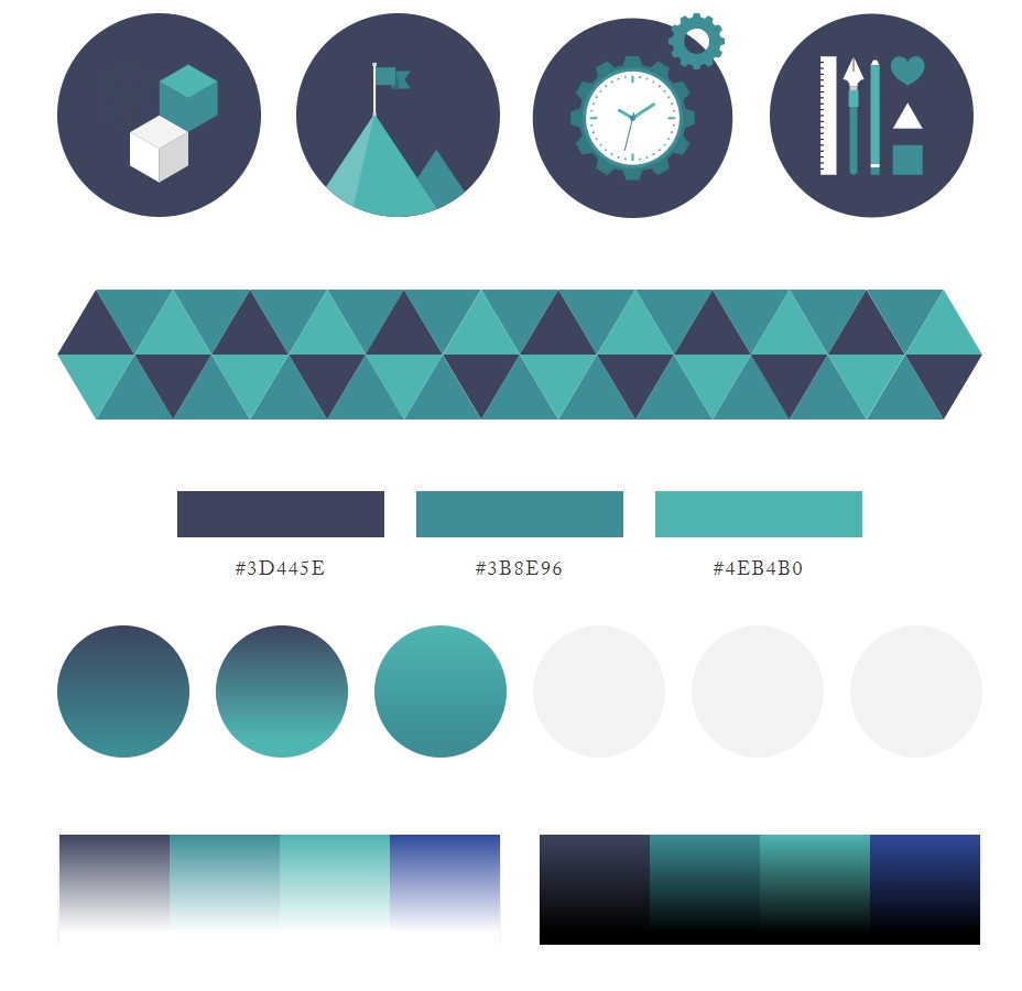
Aside from the detailed and thorough checklist, David shared numerous resources to utilize when it comes to creating a well-designed data viz, including an InterWorks creation—the Color Tool for Tableau. Throughout the presentation, he emphasized three goals:
- Increase pride
- Simplify
- Bring joy
 Above: A screenshot from ColorSupply, one of the resources David shared
Increase Pride
Once you’ve got your data how you want it, you want to knock the socks off of whoever’s on the receiving end of your viz. When you assemble a viz that’s carefully crafted, and you know that everything is cohesive and chosen for a purpose, you are naturally more invested in it. You’re proud of your work, and you want to show it off because it matters to you.
Simplify
When you introduce limits to the number of colors you use in a viz, restrict your font choices and allow more space for your data to breathe, you create freedom for your information and your user. By thinking in terms of a simpler, more minimalist approach, you’re more efficient with your platform, your time and the time and attention of your viewer.
Bring Joy
At InterWorks, we want to experience happiness in our work, but we definitely want to facilitate a joyful experience for our customers. When you create a well-designed viz, it looks good, it feels good and it works well. This trifecta is the ultimate hope when we consider the role of design and aesthetic in a data visualization. When you are proud of what you do, your joy is heightened, as is the joy of the user for whom you’ve designed it.
 Above: David presenting at the TUG in Tulsa
Flexible, Tailored and Well-Designed Data Consulting
While the focus of David’s presentation was geared toward Tableau vizzes specifically, the principles he spoke on transcend only data illustrations. They reflect the values that guide our endeavors here at InterWorks. We want everything that we do for our clients to be flexible and tailored specifically for your needs. We can put together a package of business intelligence solutions for you, but we want them to be what you want and what you need. We’ll go through the process of adjusting, reiterating and revising what we present to you because if it’s not what’s really going to serve you, what’s the point?
Want to learn more about how to design for data? We have a webinar around this very subject that you can watch right now. Hear from David and another InterWorks expert, Carly, about how to make the most of your data visualizations.
Download the Webinar
Fill out the form to get instant access to the webinar.