
This blog post is Human-Centered Content: Written by humans for humans.
If you want to follow along with the dashboard I put together in this blog, you can find it here!
Before InterWorks, my background had been in economic development and commercial real estate research, one of the few industries where geography and proximity analysis are key to decision making. This is one of the rare areas where radius maps shine: While most map analytics benefit from identifying location, density and category, radius maps add relational clarity in cases of direct, identical competition or cooperation. In real estate, for example, you might want to show a tenant the service area of competing businesses, while in economic development you might want to see where city services overlap to plan affordable housing.
Sigma does not have a built-in radius map tool, but there is a pretty easy (albeit counterintuitive) way to DIY it. For this example, I’m using the Flight Tracker Dataset built into Sigma’s sample database to create my point map. I want my map to:
- Let me select my point of interest by clicking on the map OR by typing in the name
- Let me type in a radius that will filter out locations outside the area
- Filter other content based on the selected area
- Show me a color-coded gradient of map locations
- Still be usable without a radius entered
My first instinct when making a radius map was to just give Sigma a conditional, “When I select PDX, show me airports within the 600 miles of PDX.” But it’s not that simple — selecting a spot on a map or from a list is a one-time action that Sigma “forgets” before I ask it to compare the value I picked for the database. So what Sigma reads is, “When I Select any airport, show me airports within 600 miles of any airport,” which doesn’t filter a thing. I needed to give Sigma a “sticky note” to hold onto while I made the next request.
There are a couple ways to do this, but the most efficient way I found was to pass latitude and longitude information into number input controls. I then created an action on my map to update each control to the related column for that point. I repeat the same actions on my search control, then hide my “Lat-Input” and “Long-input” controls on another page to preserve the magic trick/prevent end user confusion.
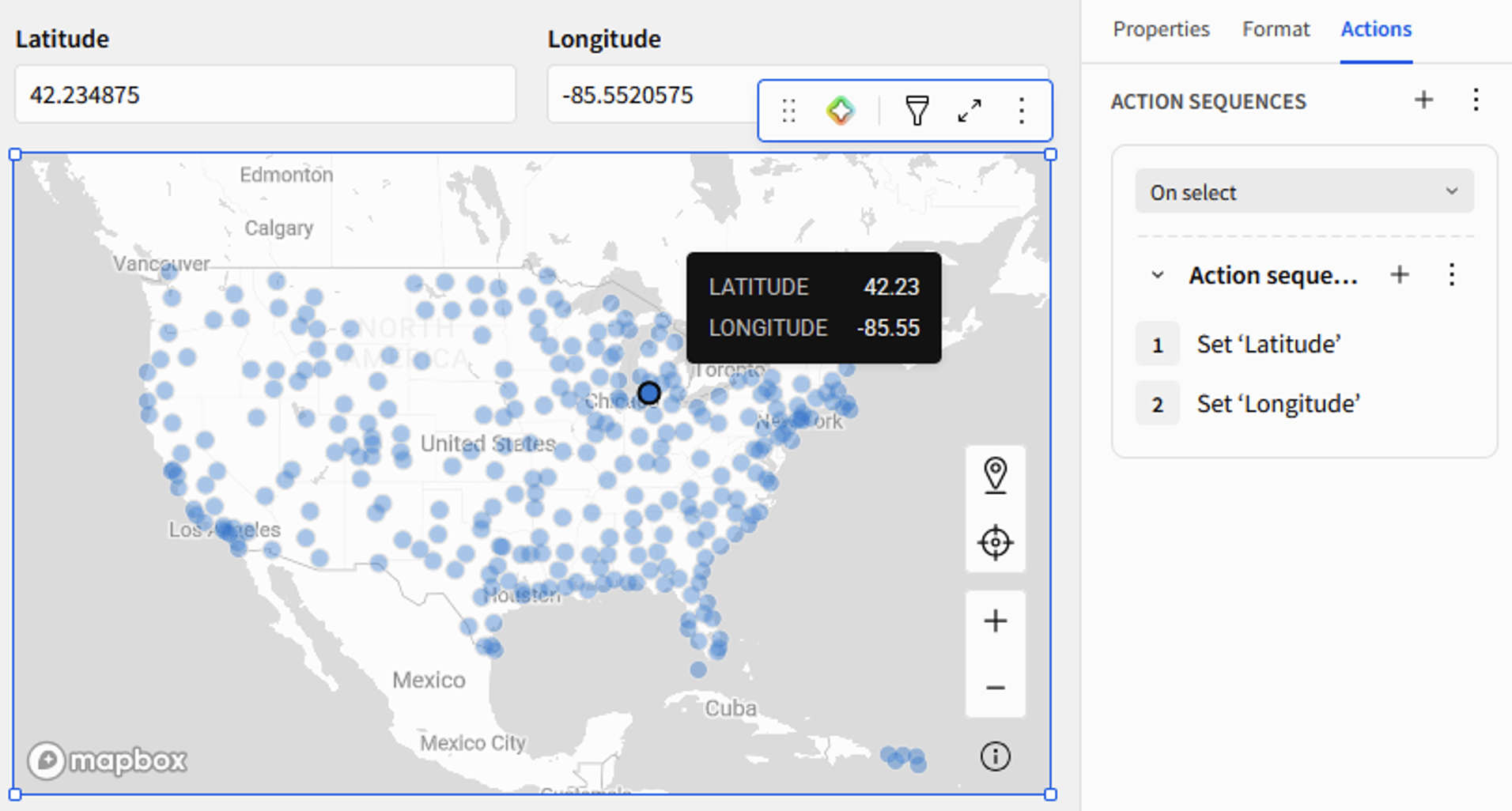
With that done, setting up the actual radius filter is simple. I set up another numeric entry control named “Radius-input” and begin writing calculations to use that radius as a buffer area around my point. First, I determine this distance from my selected airport to every airport on the map:
Distance("miles", MakePoint([TABLE_LONGITUDE], [TABLE_LATITUDE]), MakePoint([Long-input], [Lat-input]))
Then I determine if that distance is more or less than the number I set as the radius:
If(IsNull([Lat-input]) or IsNull([Long-input]) or IsNull([Radius-input]), True, Distance("miles", MakePoint([TABLE_LONGITUDE], [TABLE_LATITUDE]), MakePoint([Long-input], [Lat-input])) <= [Radius-input])
Place this boolean calc on filters set to “True.” Apply the same filter to any other visuals that need it (or just make child visuals from the map). And there’s my radius map — it worked!
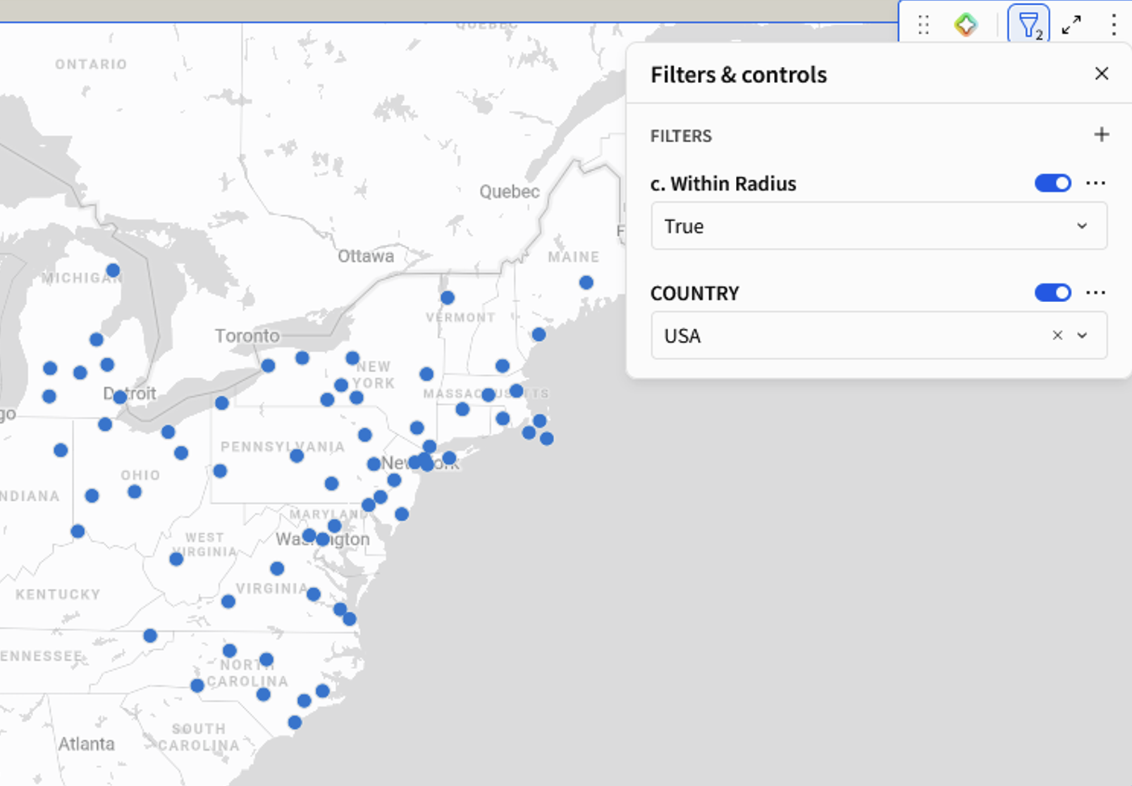
Except, I still don’t find this map super readable. For starters, I already forgot what point I selected, and I don’t have a great sense of how far the airports actually are relative to my point. Some data tools allow you to add a buffer shape around your centroid to outline the area, but Sigma doesn’t currently have that capability. So instead, I’m going to add a little more context to this map by color-coding points to correspond to distance and making my selected point/centroid a little easier to see.
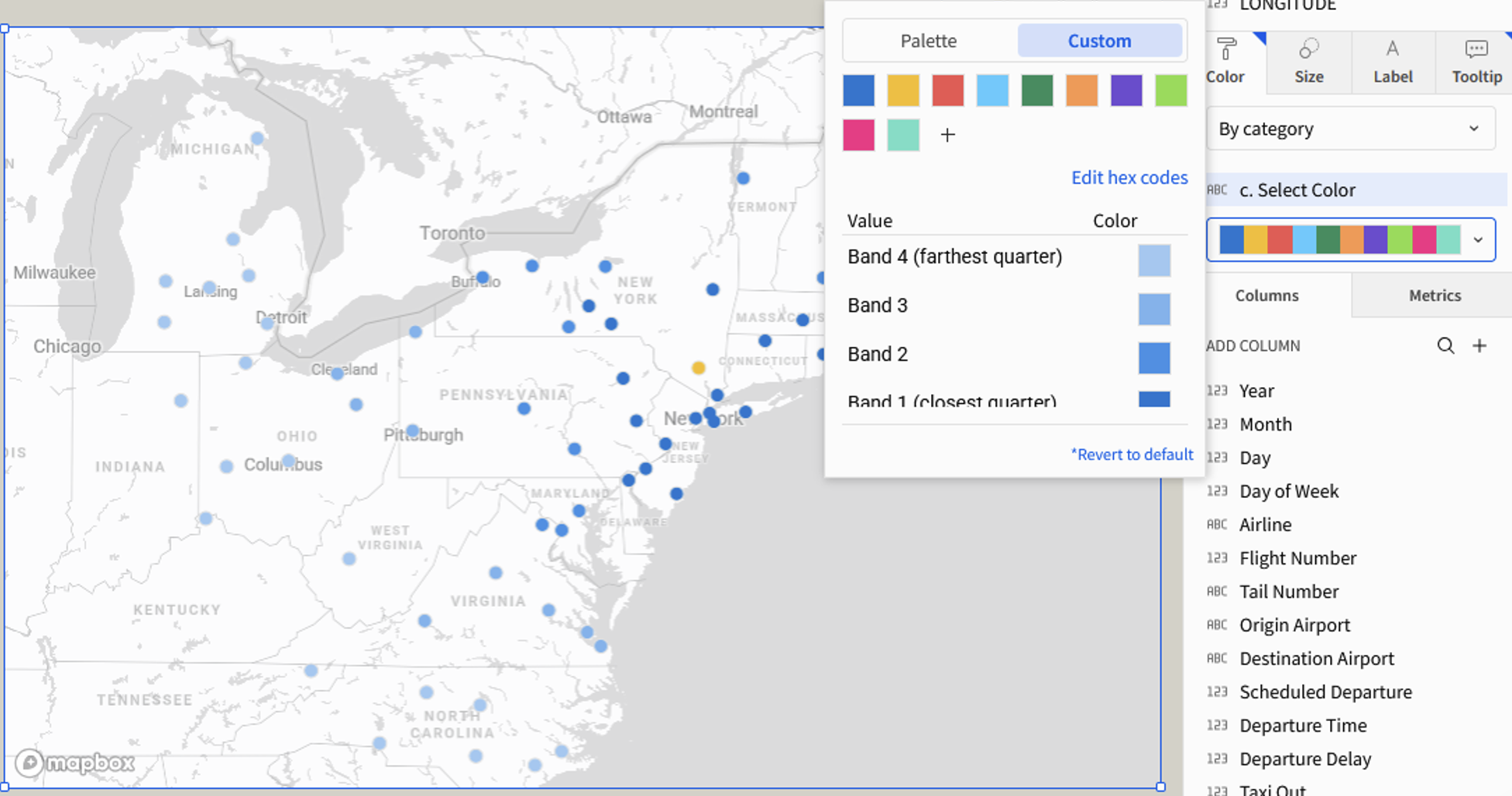
Since my radius is dynamic, my definition of “distance” has to be dynamic, too. I categorized the given radius distance into quarters and identified points belonging to each radial band. For example, if your radius was set to 100 miles, Band 1 would be any airport located less than 25 miles away, while Band 4 would be any airport more than 75 miles away. I identify the selected point as “Selected” so it stands out from the rest:
If(Round([TABLE_LATITUDE], 5) = Round([Lat-input], 5) and Round([TABLE_LONGITUDE], 5) = Round([Long-input], 5), "Selected", IsNull([Lat-input]) and IsNull([Long-input]), "Not selected", [Distance from Point] <= [Radius-input] * 0.25, "Band 1 (closest quarter)", [Distance from Point] <= [Radius-input] * 0.5, "Band 2", [Distance from Point] <= [Radius-input] * 0.75, "Band 3", "Band 4 (farthest quarter)")
While Sigma allows gradients to be used as color on many visualizations, point maps are not one of them. I chose a bright yellow to indicate the selected point, then manually assigned colors to each band using a free tool called “Lighten Color” to make sure the color scale corresponded to their relative band placements.
All that’s left is a little cleanup! I created a button to reset filters, cleaned up some tooltips and added more charts to keep my map company. It felt like a lot of work, but it all boiled down to three controls, two actions, three formulas, and one color picker. Feel free to play around with the app in Sigma Public, or check out our other Sigma blog posts.