
This blog post is Human-Centered Content: Written by humans for humans.
There’s a shift happening in analytics that I’ve been watching closely. The ask used to be “Can you build a dashboard?” which has now morphed into “Can you build a dashboard that’s fast, cost-efficient, scalable and doesn’t quietly drain our compute budget every time someone opens it?” As the amount of tools and resources available to analysts have expanded, so has the scope they are expected to understand.
Databricks is leading the charge with this shift, where the worlds of analytics and engineering are approaching each other at rapid speeds. With the introduction of AI/BI Dashboards, Databricks has moved into native business intelligence, giving teams the ability to build and publish dashboards without managing a separate BI product. For organizations already living in Databricks, that’s a meaningful reduction in overhead. No additional licensing, no new governance layer to wrangle — the Unity Catalog access controls, lineage and data quality rules you’ve already configured carry over automatically.
That said, building a fast and cost-effective Databricks dashboard isn’t just a matter of dragging in some charts and hitting publish. Since Databricks charges for compute, not seats, you pay for what you use, not the number of users who have access. This is a structurally different cost model than most traditional BI tools, and exactly why resource optimization has now landed in the analysts’ lap. There are decisions to make about compute, caching, and data access patterns that have real implications for both performance and cost. This post walks through those decisions and the configuration choices that make the biggest difference.
What Is a Databricks AI/BI Dashboard?
Before diving into optimization, a quick orientation for those who haven’t worked with Databricks dashboards yet.
AI/BI Dashboards are Databricks’ native drag-and-drop reporting interface — think of it as their answer to the legacy BI layer. You can build charts, apply filters, and publish to end users without leaving the Databricks ecosystem. Governance is inherited from Unity Catalog, which means the access controls already governing your data assets apply to your dashboards automatically (with some configuration options for how credentials are passed — more on that in the caching section).
A few things worth knowing about the product as it stands: The chart-building options are intentionally limited. What you see is what you get — if a chart type or configuration isn’t available, it isn’t available. The reason for this is that Databricks is pushing more complex, limitless use cases toward their Apps product (which is fully code-based). But for standard reporting workflows, AI/BI Dashboards still cover a lot of ground.
Choosing Your Compute: Why Databricks Recommends Serverless
Every dashboard in Databricks connects to a SQL warehouse to execute queries. The warehouse type you choose matters — both for performance and for cost.
Since certain advancements in serverless warehouses in the spring of 2026, Databricks recommends using serverless warehouses over classic clusters. These advancements include the introduction of simple, performant, and maintenance-free serverless warehouses. Depending on which type you select, features of serverless warehouses include:
- Starting in seconds
- Running twice as fast as classic clusters
- Greatly reducing the level of infrastructure management required
- Handling incremental auto-scaling
- Reducing costs by up to 70%
- Offering a remote result cache that persists across warehouse stops and restarts
Read more about these serverless warehouses here.
Understanding the Cache Layers (And Designing for Them)
This is where dashboard performance gets interesting. Databricks dashboards operate across multiple cache layers, and understanding how they interact is the key to building something that feels fast without running up unnecessary compute costs.
There are technically four layers, though one (disk cache) operates silently in the background on SQL warehouses automatically and speeds up raw file reads, but you don’t need to configure or think about it directly when designing dashboards.
Browser Cache: The Fastest Layer
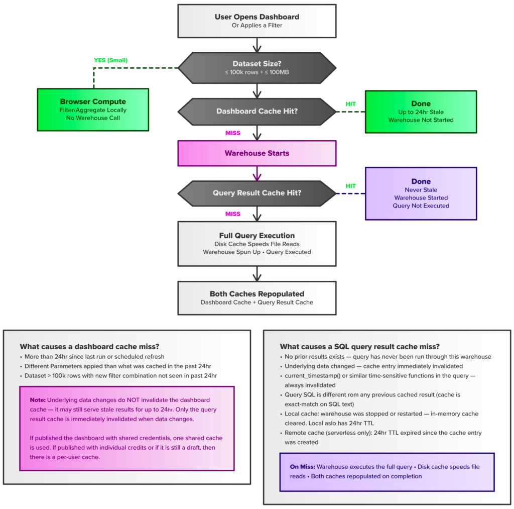
Every query result dispatched to the dashboard is cached in the browser. Revisiting a page the user has already loaded is essentially instant — no warehouse round-trip required.
The more interesting feature is in-browser compute: When a dataset is small enough, filter, sort and aggregate operations happen locally in the browser rather than hitting the warehouse. No latency, no entry in query history, no compute cost for those interactions.
“Small enough” has a specific definition: Datasets must be at or under 100K rows and 100MB in size for in-browser compute to activate. Both thresholds must be met. Design your queries with this in mind — keeping result sets under these limits means your users get an interactive experience for filtering and exploration at the browser layer without hitting the warehouse.
Dashboard Cache: The First Layer
The dashboard cache stores query results for up to 24 hours. It does not automatically refresh on a schedule by default — that has to be explicitly configured, with a minimum interval of one minute (A quick aside: A refresh cadence of one minute is not recommended, but it is available — a classic example of “Just because you can doesn’t mean you should.”
One thing to be aware of: The dashboard cache is not invalidated when the underlying data changes. If your data updates every hour but your dashboard cache runs for 24 hours, your users may be looking at stale data. This makes the refresh schedule an important configuration decision — not just a performance one, but a data freshness communication to your users. Know how current your data is, and set your refresh cadence accordingly.
Credential configuration also affects how the cache behaves. When a dashboard is published with shared credentials, a single warmed cache serves all viewers — one execution, shared result. When individual credentials are used (or when the dashboard is in draft mode), the cache is per-user, meaning each viewer may need to warm their own cache independently. For large viewer audiences, shared credentials with a configured refresh schedule is typically the more efficient choice, though it comes with security tradeoffs.
A useful pattern: The dashboard refresh can be appended directly to an existing data pipeline, so you have the option to force a dashboard refresh whenever new data lands.
SQL Query Result Cache: The Freshest Layer
The SQL query result cache is used whenever the dashboard cache is missed. It operates at the warehouse level and is populated any time a query runs through a SQL warehouse — not just dashboard queries. Unlike the dashboard cache, it never serves stale data: it’s invalidated immediately when the underlying data changes.
It’s also invalidated by time-sensitive functions in the query (like current_timestamp()) and, for the local cache, by warehouse restarts. Serverless warehouses also maintain a remote result cache in addition to the local cache that survives restarts. Both local and remote caches have a lifetime of 24 hours.
On a cache miss, the warehouse executes the full query, disk cache speeds up the raw file reads, and both the dashboard cache and query result cache are repopulated on completion.
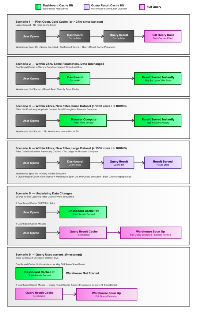
If you’re a visual learner like me and can’t keep this all straight, check out the figures below. Figure 1 walks you through a flowchart of what happens after a user opens a dashboard or applies a filter and explains what causes different cache misses. Figure 2 is a more detailed version of this flowchart and explains what happens in six distinct user scenarios:
Above: Figure 1
Above: Figure 2
Other Performance Levers Worth Using
Beyond the cache architecture, a few other features are worth building into your workflow:
Lazy loading is Databricks’ method for ensuring only the least amount of data is loaded at a time. It is turned on by default, so only the data that is actually on the rendered page page is fetched. You can use this intentionally by moving compute-heavy data or data that only a subset of users need on a separate page. This is exactly how drill-through between pages works — the data on other pages is only loaded when the page is rendered. Let lazy loading do it’s job and only load this expensive and infrequently used data load as needed.
Automatic Materialization is also worth using to your advantage. It pre-computes the results of expensive base queries on a schedule, so dashboards can pull from the materialized data rather than using cached data or having to query the warehouse. It is designed to automatically route queries to the best available materialization without having to rewrite queries. The best part is that permissions stay inherited from the original metric view, so you do not have to rewrite any governance policies (DRY Principle, anyone?). Prioritize materialization for compute-heavy queries, data or metrics that is viewed very frequently, and any query that consistently shows up as your slowest.
Finally, apply buttons on filters are meaningful not only from a cost perspective but also from a user experience outlook. Without an apply button, every filter interaction triggers a query. This is expensive for organizations and annoying for users — if a user has multiple filter selections to make, they are not going to want to wait after each selection just to select the next one before they can finally view the data they are interested in. With the apply button, however, users can configure multiple filters before executing — keeping users happy and reducing redundant warehouse calls.
Tracking What It All Costs: Can I See Some Real Numbers Please?
Unfortunately, at the time of writing this blog, you cannot isolate the cost of a specific dashboard (funnily enough, Databricks recommends creating dashboards to track usage and cost, but does not provide the capability to see what that dashboard itself is costing). Despite this irony, Databricks does give you meaningful cost visibility, and it’s worth knowing what you can see.
The system.billing.usage table is your primary source for truth for billable usage across your account. Joining it with system.billing.list_prices lets you estimate dollar costs from DBU consumption — broken down by workspace, warehouse, SKU, tag, time and more. You won’t be able to answer “What did Dashboard X cost this month,” but you can answer “What is our SQL warehouse spending, and is it trending in the right direction?”
For a higher-level view without writing SQL, the Governance Hub Cost page (currently in Private Preview) gives account admins a centralized summary of spend across the account — including spend by product, spend by workspace, tagged vs. untagged spend, and budget status. You can drill into SQL warehouse and group or filter by custom tags. Databricks also includes a custom “Cost recommendations” section to each account’s Governance Hub with feedback on how to improve cost across the organization.
Budget alerting is also available and worth setting up. It won’t stop a workload from running, but it will tell you when a threshold has been crossed.
The Big Picture
The theme I keep coming back to is this: Analysts are being asked to build engineering-aware products, not just dashboards. Cost efficiency used to be someone else’s problem. Increasingly, it’s part of what it means to do this work well.
Databricks gives you more levers than most BI tools — and more responsibility to pull them thoughtfully. Serverless compute, a layered caching strategy, materialization for expensive queries and lazy loading for detail data aren’t advanced features reserved for platform engineers. They’re the baseline for building a sustainable product.
For more on working effectively in Databricks and other modern data platforms, continue to explore the InterWorks blog.
