
This blog post is Human-Centered Content: Written by humans for humans.
Shoot your shot, as they say. That means you, as you’re building something in Sigma right now. If the dashboard, app or report you’re working on is going to be used or seen by others, take a little bit of time to make sure it’s going to land with them as you intend it to. Design leads to higher adoption, more trust in your product and a better user experience, which means users are going to find value in what you’re providing. I’m kickstarting a series of bite-size blogs that illuminates insights from the projects we’ve been working on in Sigma lately. Have other Sigma design questions? Let us know, we’re always tinkering and may have advice to share. In the meantime, let’s start with the grid.
The Grid: Sensible and Scalable
Grids are a foundational part of all great design. Without thinking much about it, humans tend to notice when things are aligned with something else on a page/poster/wall/app. We feel like they “belong” there because they share a relationship with something else. When it comes to dashboards, mastering the grid can help you achieve effective, scalable layouts. That said, not everything on your dashboard or app has to align with something, but the modular components that make up the groups of elements certainly do.
You’ll notice the grid in effect on all the devices you use as it’s a great way for developers to build content that can scale at different screen sizes and proportions. Next time you’re browsing Netflix, rearranging your phone’s home screen or playing a video game, notice how the user interface maps to a grid system. A quick tip to level up your grid game? Left-align your titles and KPIs. Too often, we see center-aligned content all throughout a page which leads to a bunch of organic (ragged-edge) shapes that can eat away at the cleanliness and structure that the grid is able to provide. Humans like reliability in where they can find content, and even small things like titles always being at the top-left of a container can aid in that. It’s the small things that add up to a big change.
How Sigma’s Grid Works
When it comes to dashboard and apps we build, Sigma utilizes a 24-column grid for us to operate on. This allows for clean breaks in content and allows us some flexibility to arrange content. Here are some examples of how that grid could be utilized:

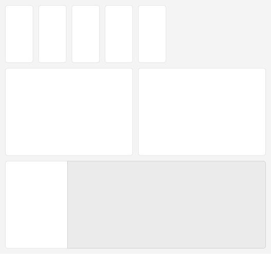
This shows three rows of content. On row 1, we have eight elements. In Sigma’s grid, each of these elements would be three columns wide. Row 2’s elements are six columns wide, and row 3 has an eighteen column wide element, and a six column wide element. We can flex this system to be a bit more modular to fit specific app or dashboard requirements.

This example shows row 1 using only five elements, but retaining the same width as the prior example’s row 1 elements. That’s fine! We’re still aligning to the grid and now we’re adopting breathing room (we don’t recommend stretching content all the way across the page if it doesn’t have to). Row 2 now has only two elements at twelve columns wide each. Row 3 gets rid of space between elements and has two elements: one at six columns wide and the other at eighteen columns wide.
Let’s Make It More Practical
Now let’s see what this layout looks like when using more normalized colors for a more realistic user interface:

This example shows that we might be using a neutral-colored background for all our content, and high-contrast elements for our most important content. This also suggests that there might be some secondary content that doesn’t need a background at all, or some tertiary content that goes on a darker (lower-contrast) container at the bottom-right of the page.
Sizing for Different Screens
Now let’s see how this might adapt on a skinnier screen:
This scrunches our containers significantly while retaining equal space between elements. This is likely to happen when we crowd our content rows too much, so it’s a great practice to test your app or dashboard on various screen sizes to anticipate how your users will receive your Sigma file. We highly suggest testing your file on a mobile device to see how Sigma will auto-arrange the elements from desktop to mobile. Sigma lets you to define a custom layout for mobile which allows you to move elements around from your desktop version, but will not facilitate added or removed content when switching between the two versions. Let’s see how this content might be laid out when viewing on a phone:

It’s not bad! If there’s any chance that your users will open your dashboard or app on their phones, this is a great practice to include in your routine as you have the option to control their experience rather than letting the tool make all the decisions for you. Ensure that your primary content remains at the top of the page and the most granular content stays at the bottom of the page.
While we’re not able to define a page length for apps and dashboards within Sigma, the tool does give us some simple settings to adjust the max-width:
- Medium Width: Equates to about 1400px when viewed at 100% scale.
- Large Width: Equates to about 1680px when viewed at 100% scale.
- Full Width: Fills the browser’s width regardless of how wide/small it is.
- Custom Width: Set a custom max-width for the 24 columns to squish or stretch to.

We typically start our apps and dashboards at medium width. This ensures that we aren’t making content that is too wide and allows us to better plan should the need to scale up arise. It’s nice to always have room to grow, right? This isn’t a blanket rule, but it helps to have some standards when we have developers creating Sigma content all around the globe.
Bonus tip: You might find yourself in a pinch when switching to a different monitor and needing to present on a screen you didn’t develop on. Use your browser’s zoom settings to scale content down to 90% or 80% and Sigma will behave as though you’re all of a sudden on a larger monitor. This is a temporary workaround we’ve used several times when screen-sharing or visiting client-sites, but be sure to return your browser’s zoom to 100% when developing, as that’s the structure we should plan for.
Best Practice: Build in Rows
Sigma’s grid system works really well when items of equal size sit in a row next to each other. When we’re planning out our dashboard content (See Designing for Data: Gathering Requirements), take that concept into consideration. This will allow you to manage the contents of your dashboard in “row” concepts and eventually move them above or below other rows as needed.
We recommend your starter dashboards and apps to be built in rows to avoid any conflicts when placing grouped-content side by side, as this can introduce some complexities into the way the grid handles height. A row-first approach will also allow you to make the most use of Sigma’s “Trim Space” option, which appears whenever you highlight over the horizontal-center of a container that has extra room you don’t need. If you see some content that appears to have extra space, but you don’t see the “Trim Space” option, that may be because there’s a conditional view such as an unselected tab or view that requires more space than what is currently rendered, and Sigma is preventing you from deprecating the space required to render those items.

Big Moves
If you have lots of content you need to move on the page, you can drag boxes around the content that you’d like to move. Click and hold your mouse and draw a selection-square to select multiple text boxes, containers, charts and more. Alternatively, you can select an element, hold shift on your keyboard, and keep clicking other elements until you have several things selected. From here, you can use the contextual move-tool to drag those items around your screen space, or you can use the contextual controls (or command + G) to “containerize” the elements you’ve selected and put them into a clean group with its own padding, background, and corner controls:

Space It Out

It’s easy to get overwhelmed with all the containers you’ll end up with, so we recommend prepping content for your screens outside of containers. This allows you to move content around the page freely without being constrained to groups you defined early in your design process. You’ll find it easier to adjust space between objects, resize charts and manipulate your view options outside of containers, so save that for the last step. Need to create some extra space while designing your page? Drag the slider on the left-hand-side of your browser down to create extra rows in the middle of your content. Alternatively, drag it up to manually trim space.
Conclusion
Use these tips to speed up your Sigma workflow and master the grid. Don’t forget to test your project on different screen sizes and ask for critique from others along the way. Feedback from others is invaluable and a key part of our design process at InterWorks.
More Sigma Design Tips and Resources
Keep an eye on the blog for more design principles-focused blogs in the near future! If you need more hands-on assistance when it comes to design work, or your Sigma needs in general, feel free to reach out!