When it comes to the business intelligence sphere, InterWorks provides quite an array of services and solutions. From foundational data engineering and data architecture to helping clients create beautiful dashboards, it’s truly end to end.
One area we’ve seen explode in recent years is an increased focus on user experience (UX). Often, organizations get caught up in specific platforms and deliverables without closely considering how those things are interacted with and by whom. You could have sparkling clean data and jaw-dropping dashboards, but unless you make it easy and enjoyable for relevant audiences to access and process insights that matter to them, even the best efforts can fall flat.
Even the term UX is loaded as it often merely implies designing systems, dashboards or portals in a better way. While it certainly does include those efforts, there’s much more to building engaging user experiences that one might not expect.
I recently had the pleasure of sitting down with my colleague David Duncan to learn about his favorite projects this year and how both of those projects involved broadening the definitions of user experience and design at a fundamental level.
Going Beyond Standard Dashboard Rollout
We started by discussing the work David did for the healthcare provider, which centered around their use of Curator by InterWorks, an embedded analytics platform that allows for complete customization:
As our client was rolling out several new dashboards to Curator, they also had a lot of new methodology and terminology surrounding how they take care of patients. To help them communicate that context and boost user enablement of the dashboards, we decided to create a series of explainer videos that could sit next to the dashboards within dedicated landings pages in Curator.
A lot of this centered around treating patients like people instead of numbers. Doctors, nurses and other providers are often looking at patient data through bar charts, so it can be easy to forget the human side of things, furthering the organization’s ongoing conversation about better humanizing their data.
Finding Meaning in the Process
This definitely sounds like a worthwhile project that adds more impact for the client and their patients, but David went on to say that the process of creating this videos was just as rewarding:
We started the process by learning and listening to what the clients goals were and the various systems involved in this initiative – not just dashboards and Curator, but every piece of the puzzle as well as their overarching methodology. We then asked them to come up with five scripts for each topic they wanted to cover. We then helped edit those down, imposing word count limits to keep them from being too verbose.
Of course, once the scripts were pinned down, David got to work on turning text into media:
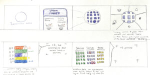
From there, I created a storyboard for each video, which was mostly about topics like workforce planning and connecting the right providers to patients. These started as hand-drawn sketches, then moved to more sophisticated mockups, and finally become polished videos with nice design elements and animations. When we got to the voiceover portion, we were fortunate to enlist the help of my UK colleague Vicky Lockett who, though she doesn’t do voiceovers for a living, is very good at them. It also just made sense for UK users to hear a UK voice.

Above: An example of the storyboards for this project.
The Unexpected Benefits of Working with a Full-Service Consultant
As David and I wrapped our conversation, he closed with some realty solid points about what benefits working with a relationship-focused, full-service consulting firm can bring to clients like this one:
A lot of people think what we do is simply building better bar charts, but for me personally, as well as many others at InterWorks, its so much more. We consider how things like dashboards will be adopted, will they really resonate with people, can they use it easily and how exactly will they use it? It’s also more than giving them clean and polished interfaces like Curator. Overall, we want to create a sort of immersive realm and ecosystem where everyone shares a common language.
We also talked about the unique advantage someone specifically like David brings to projects like these that’s uncommon in the analytics field, especially in larger firms:
This project was really interesting in that it was truly at the intersection of data and design. If our client had gone with a large data consulting firm, they probably wouldn’t have received the same variables and depth of care. We’re deeply familiar with the tools our client is using and the goals they want to achieve. We want to achieve those in a way that’s authentic to them vs. something that’s not grounded in reality. This is especially relevant for more budget-conscious clients, and we always try to work within those parameters responsibly.
Adding to that, in this project specifically, there were a lot of elements that would traditionally need to be done by a marketing agency, which can also cost an exorbitant amount of money. Even then, those agencies don’t have designers who understand what a parameter action is or how different data sources connect to each other, but this is the sort of niche experience that I’m fortunate to have and excited to share with clients like this.
I’ve had the great pleasure of working with David for many years, but there’s always something new to learn! In my opinion, he captures exactly what the essence of working with InterWorks is like in terms of both tangible and intangible benefits.

