
(Re)Intro To This Series
If you are reading this, you probably already made your way through my coworker Troy’s article, which was the first in this blog series about how the creation of music and the process of building out data visualizations share many similarities. Troy’s article walked through the idea that communication is at the heart of both music and data, because each of these respectively works to communicate a message or some information to an audience. The parallels are made clear as he articulates how each considers the audience, their actions and the story we want them to take away from what we are presenting them with. This leads us to our next connection point – how both music and data viz, require organization.
Why Music?
As Troy previously mentioned, this series, “Dashboarding is Like,” is where we will explore the relationship between data visualization and other creative pursuits. For our first set of posts, “Dashboarding is Like Music,” we are exploring (as you might expect) three larger aspects of how data and music are connected and similar. Now, you may be asking yourself how we arrived at this conversation, so let me give you some background.
Having both realized that InterWorks is filled with people who love music, from the one-time professional musicians to the off-key car singers who simply enjoy talented artists, we thought this series would resonate with many of our coworkers, as well as those external to InterWorks, who are passionate about this field. Through our conversations, we also came to understand how useful this series could be as a means to inspire new ideas and concepts by showing people a new lens to view data visualization through. As Troy put it, we want to “explore…some of the universal principles that drive the best creative work” to build bridges between different creative pursuits as well as, “enable fellow viz-builders to break through data and design challenges and, via analogy to other creative forms and mediums, to discover fresh, novel solutions to these obstacles.” In other words, we want to use this series to tie together two seemingly unrelated things in order to break down some barriers and help people unlock new ideas for the projects they are currently stuck on.
Organization
Now, let’s dive into what I’ll specifically be talking about in this blog: the aspect of organization as a connection point between music and data.
The way I see it, the organization of data is an arrangement of information in space, and the organization of music is an arrangement of information in time. What I mean by this is that it matters how we structure our analytics in the space of a dashboard, because that architecture is what guides people through the information and leads them to certain insights. When it comes to data, the way we tell the story is just as important as the story itself. The same thing can be said for music, except that the space that music lives in is the air around us as sound waves we hear over time. We use lyrics, rhythm and instruments to convey certain feelings, stories and ideas to our audience in the same way that data visualizations convey insights, analytics and stories to an audience.
Both pull from other authors, creators, and even rules and theories that already exist, but with the goal of building something new. “There is nothing new under the sun,” they say, and yet new iterations of things are created everyday using those same old building blocks. For instance, as Troy previously referenced, Taylor Swift’s “London boy“ and Cautious Clay’s “Cold War“ each use the same sampled beat (created by Cautious), but each build an entirely different narrative on top of it. Maybe creativity is less about creating something new and more about being able to see, understand and analyze the things we see around us every day and process and compile them into something that is unique in its combination or arrangement. And with that, let’s get into the topic at hand: organization of the building blocks.
Hierarchy
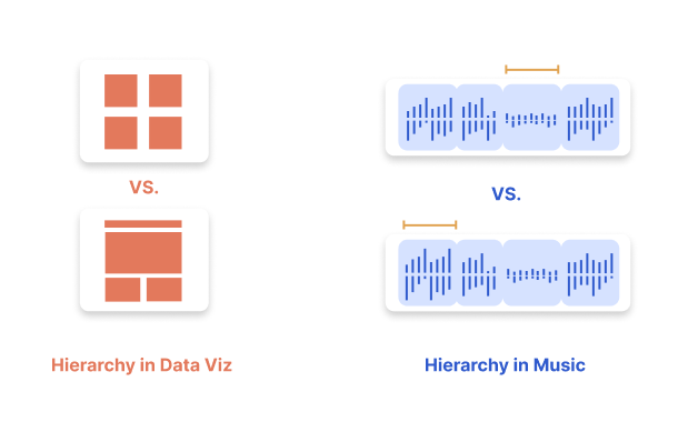
Hierarchy, on a foundational level, simply means building a structure of both leading and supporting elements of some kind – which is a concept that can be applied to many different things, data and music included. It requires prioritizing whatever materials you are applying it to in a way that makes logical sense out of them to the audience. At the heart of hierarchy is understanding. In our case, it means translating how you, as a person closer to the data or music, understand what is most important and what items fall beneath that, and then convey that understanding to the viewer or listener. Organizing the information you are conveying to your audience into tiers from most to least important is crucial in guiding them through the story you are telling. When it comes to data visualization and music both, every decision we make should be respectful of the viewers/listeners time and mental energy, always working to decrease their cognitive load. When users have to expend fewer mental calories and jump through less hoops to understand what you are putting in front of them, the experience is more enjoyable and intuitive and you build trust and reliability with them.
In terms of music, we can see hierarchy in the way that popular songs are often structured and what they build to (I say this loosely, as there are many classical/other songs that diverge from this structure). Song titles can allude to what the song is building to before we even start listening, and reiterate certain points when we think about them after hearing the full song. The introduction and verses of a song are typically slowly building out or giving more context to whatever idea the chorus really drives home, with the bridge and outro supporting but fading it back out. The strategy is often hooking people initially, keeping their interest in the middle and then providing resolution with the chorus or toward the end. This would make the chorus tier one, the verses tier two, and the bridges and intro/outro tier three.
One example of this in music is the song “Nowhere Near” by Brooke Bentham:
It starts off with soft vocals and quieter, low instrumental tones and then the ambiance slowly builds in more layers, even adding in higher pitched vocals on top as the song progresses until it gets to the chorus where it rings out “Do you know… How I feel… How I feel about you,” and reaches its most dramatic musical peaks, then flows back down into the verses again before arcing back up to the second repetition of that chorus. After this, at the very end, all instrumentation drops out and its just Brooke’s voice acapella ringing out, “…but you’re nowhere near,” to bring resolution and close out the song. The added drama and emphasis on certain parts is what we’re touching on when we talk about hierarchy. It’s easy to feel the tension building in this song because of the audio layers growing in their density and volume. This song is interesting in the way that it blends vocals and instrumental sounds together to form seemingly one dense audio layer, while other songs layer in different tracks more distinctly – like bringing in one instrument or vocal harmony at a time. A great example of this would be Jacob Collier’s song “In My Room,” where he layers in multiple vocal as well as instrumental tracks to add depth and musical hierarchy:
In terms of dashboard design, these same concepts apply but to visual rather than audio experiences. We are still leading people into the experience, keeping them interested and then brining closure to the experience, but we do this from a top down and left to right perspective and by providing more zoomed out or close up perspectives. What I mean by this is that an entire workbook of dashboards could include some that are more high level, focusing on how things are performing overall and others could be more in the weeds, focusing on breakdowns of that information and giving more details for context.
To take it a step further, from a design perspective, we also work in visual layers:
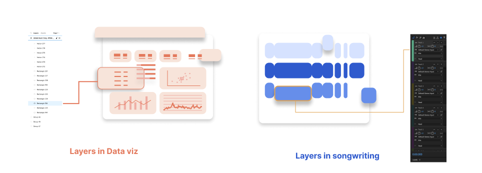

What this means is that we create dashboard prototypes by layering different shapes of various sizes and colors on top of each other as well as adding in effects such as drop shadows, opacity changes and gradients to build certain experiences for the user and aid their understanding of which elements are to be focused on or interacted with. You can see these different layers represented in the imagery above that shows a simplified version of a digital audio workstation and a design platform (such as Adobe Photoshop/After Effects). Ultimately, as I said above, hierarchy is the structure we use to help people understand what we are trying to communicate whether that’s through a visual or auditory means.
Consistency
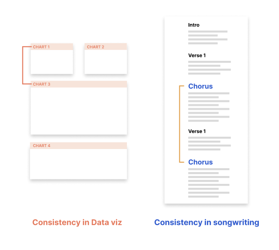
Consistency is all about building repeatable patterns and conventions, in order to make the audience’s journey through your data or music more easy and enjoyable. Consistency supports the concept of hierarchy because when you have conventions applied to your creative project, the hierarchy can be more easily understood. Being consistent in the way you present your data or music to the audience makes everything more easily scannable or scrubbable. As a data analyst, you want your user to be able to catch on to the conventions you are using to call out different types of metrics, such as a certain font weight and size for KPIs or chart titles, so their journey through the data makes cohesive sense. As a songwriter, you may write with the idea that certain music will be performed live in front of an audience and you want it to be easy for them to sing certain parts with you or as a response to you on stage, so repetition is key. Artist Dodie speaks of how she wrote her song “Lonely Bones” in a simple and repetitive way with that intention, that the audience could sing and clap along with it as a fun interaction. She even includes gang vocals (a group of people singing together on the recording) in the studio version to make that interactive part clear:
A different, more invisible example of this concept in the music world is the way that some artists, such as Sleeping at Last, create rules and guidelines for a singular song or a whole album and how they want to create and produce it. Sleeping at last’s Ryan talks about this idea on his podcast explaining how he wrote and produced the songs on his “Atlas: Enneagram” album, where he adhered to a set of rules he created stating that he would include only artists who identified with the certain enneagram types (a personality typing tool) on each of their respective songs, only included instrumentation that reflected those personality types (even using things such as cleaning supplies to create certain sounds for types that value cleanliness and organization) and even included faint “fingerprints” in the background of each song that were voice memos from friends of his that identified with the various types. This type of consistent intentionality in the content created is what song and data viz design are all about. They tie together the album or data dashboard, despite how different each song or chart actually is.
Our minds do not have an infinite amount of real estate, so often when things take up too much mental space we check out and don’t engage. We lose interest not because the data or music is not communicating something meaningful, but because we need simplicity and repetition to be able to grasp what actually matters before we walk away. Consistency is a funny thing because it both allows things to blend together, and also helps emphasize or differentiate others. When all of your metrics are styled the same except one, the others will blend and that one will stand out— making it easy to highlight key information to your user. In this same vein, if your song chorus is always the same and then one time you bring in a key change, you’ve emphasized this part to your listener. Consistency is a thread that ties both music and data visualizations together; without it data might just be a sea of numbers and words and music might just be a random assortment of notes and lyrics.
White Space
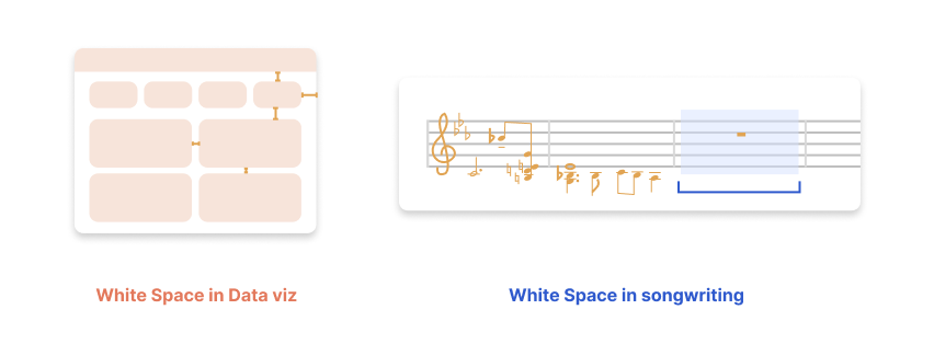
White space is exactly as it sounds: the empty room between elements that allows for pause, reflection, and/or added emphasis. White space supports both the concept of consistency and hierarchy because it leaves breathing room between different items to make everything feel more easily comprehended and less chaotic. Reducing the amount of visual or auditory clutter simplifies and allows people to navigate everything more quickly, reducing barriers between them and the insights you want to present them with. People often have the urge to dump all of their analytics onto one screen with no white space because they say, “everything here is important for the users to see.” While the intention there is good, the reality is that when everything holds the same amount of visual weight, nothing actually shines. When you want many things to be retained, nothing actually is. The crucial piece of information people miss when doing this is that white space is not only the lack of something (data points, music notes), but it is, itself, actually an element.
To relate it back to what we talked about in the intro, white space is a building block that people often disregard as a filler, when it can really be the most game-changing piece. If we can think of white space in this way, as a building block that is the same as worksheets, metrics or titles, then our dashboards will be so much less cramped and chaotic to view. In a similar manner, if we think of white space as carrying the same weight as music notes, the audio experience will be much more enjoyable. White space in music allows rest for the ears and break points that help us separate one part from another through audio; white space in data viz allows our users to move through the dashboard with ease. To give some specific examples of this, think about how songs such as “Dress” by Taylor Swift or “Can’t Touch This” by MC Hammer say, “stop” and all the music goes quiet for that 1-2 seconds to emphasize the lyric. Strategic moves like this provide us, as the listeners, a break and tend to pique our interest for whats coming after that pause.
The ebbs and flows of music are what make it compelling and intriguing to us – rather than just a wall of sound that doesn’t vary. In this same way, think of a dashboard that has no padding between worksheets, so it’s basically a wall of text. Breaking up that text with white space helps us more effectively communicate the data story to our users and keep them interested in the info they are viewing. When you present your analytics in more easily consumable chunks, rather than super heavy, overwhelming blocks, they’re more likely to be retained and useful to your users.
The Parallels of Organization
As you can see, there are many parallels between data visualization and music creation in that they each benefit from employing the concepts of hierarchy, consistency and white space in similar yet unique ways. Each of these concepts helps to organize the information we are trying to communicate to our users/listeners, whether thats through audio or visual means. The thing that ties these two concepts together is that they both contain layers, and the way those layers are overlapped, separated, arranged and emphasized guides the overall experience your user/listener has with the song or data visualization put in front of them. The organization of the layers and building blocks of both the audio and visual worlds effect how clearly and beautifully we communicate our messages to our audience.