
We’ve all done it.
We’ve completely ignored the warning label. You know, the one we probably see everyday:
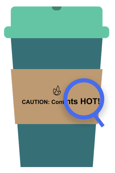
CAUTION: Contents Hot
We ignore it because it’s understood. We just ordered hot coffee or tea, and we expect it to be hot. We see the steam. The warning label adds no value.
But perhaps we added a breakfast bar or today’s specialty muffin to our coffee order. Now, the label becomes more important. Labels like “Contains Dairy” or “Contains Nuts” add value because they are telling me something I might not be able to see.
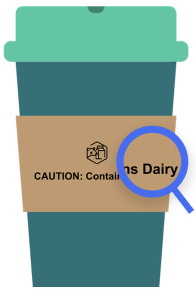
CAUTION: Contains Dairy
It’s the same for your dashboard tool tips. Often, they are present in your dashboard but ignored because they add no value. However, the tooltip can add tremendous insight and clarity when used effectively.
We’ve created other blogs that address the “how” to making a tooltip, including a seven part series, Going Deep with Tableau Tooltips, and Mastering Viz in Tool Tip, but in this blog we’re approaching tooltips from a UX/UI perspective, putting the end user first and exploring the questions:
- What makes a good tooltip?
- Which type of tooltip should I use?
- What are some best practices I can follow?
So grab that hot cup of coffee and follow along to learn how to say less to add more (value to your dashboards).
What Makes a Good Tooltip?
A good tooltip provides helpful secondary information that is not essential to the view, but adds value. Tooltips provide supplementary information that helps the user as they consume information in the dashboard.
We’ve seen hundreds of tooltips. A good tooltip does one of three things:
- Provides context
- Provides clarity
- Invites further exploration
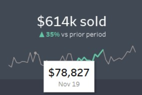
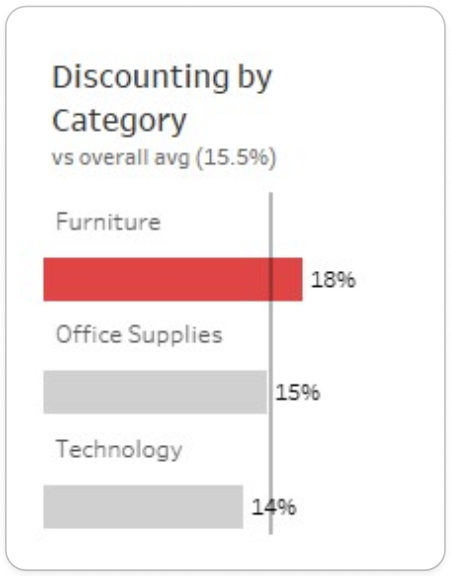
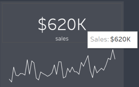
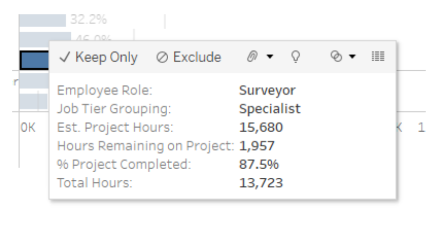
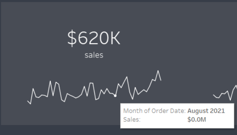
A tooltip that provides context gives the user additional data points to reference what’s in the view. For example, giving a placement in a ranking, a previous trend value or a percent change:
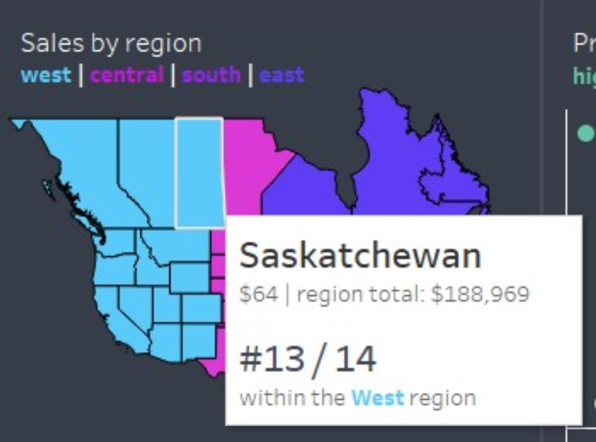
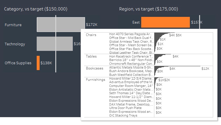
Providing context might also mean adding another layer of data, perhaps more granular than the one in the view. For example, showing a drill down from a hierarchy, a percent breakdown of an aggregated value or a further granular view of a data point:
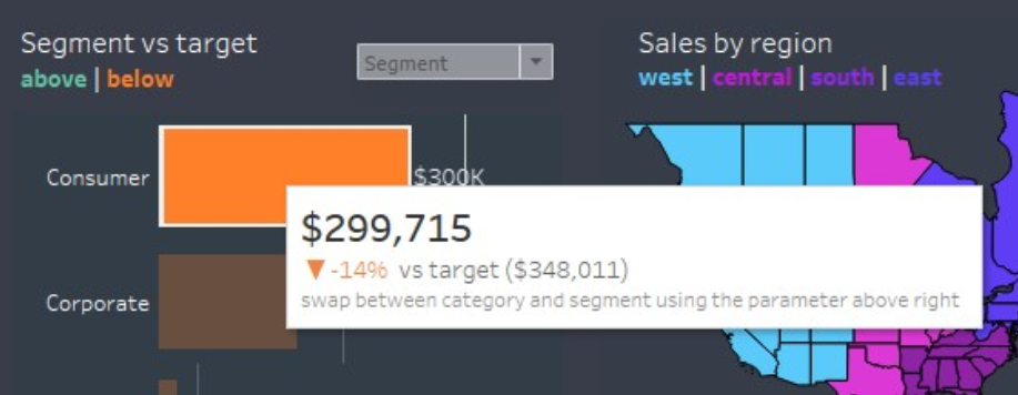
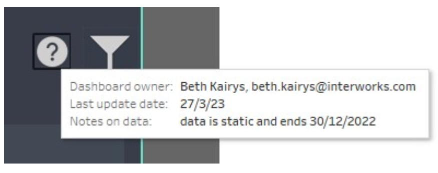
A tooltip that provides clarity gives the user additional information regarding the data source, such as a disclaimer, a narrative reference of the data shown or notes about the dashboard as a whole, like instructions, inspiration or ownership:
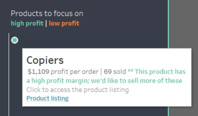
A tooltip that invites further exploration allows the end user to navigate outside the dashboard, as in a URL site, or navigate to another dashboard or sheet. These are helpful when users might need to take action in another application:
Our flow chart, which you can find for download at the bottom of this post, starts with this simple question — do you need a tooltip? The following questions help orient you to these three value adds: clarity, content and further exploration.
What Makes a Good Tooltip for the End User?
User-centered design means putting the user first. For someone with a nut allergy, alerting them that a muffin has nuts is helpful. Labeling a bag of nuts with the label “Contains Nuts” is perhaps a little redundant. For your tooltip to be effective and helpful to your end user, make sure it avoids these common pitfalls.
Good Tooltips
Meaningful — Tooltip provides additional information not found in the original visual:
Focused Content — The tooltip keeps to 2-3 metrics or a simple chart that is easy to read and provides insight. It does not complete for visual attention with the rest of the dashboard or the visual it’s attached to. It’s clear of any “noise,” e.g., a calculation that returns True/False:
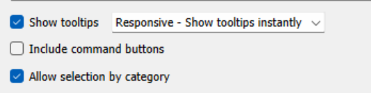
Responsive — It loads quickly and should be an instant read.
Command Buttons Off — Unless you have a specific use case for the options in the command buttons, it’s best to leave this unchecked:
Tidy and Easy to Read — Give font and/or color indicators to highlight important information. This is your participation award for simply changing the default mode. Bare minimum effort:
Bad Tooltips
Meaningless — Tooltip simply repeats what’s already in the view:
Too Large — Tooltip extends past the size constraints of the Tooltip box, pans off the dashboard view or contains too much text or too many metrics to process and read while hovering.
Too Distracting — Tooltip covers up other important information on the dashboard or there are other hover features incorporated into the dashboard that make the tooltip feature hard to access:
Too Slow to Load — A couple things can affect the performance of your dashboard: too many metrics, a complex chart/viz or multiple charts in the tooltip. Consider that each metric you add is a query to run.
Command Buttons On — Unless your end user is extremely Tableau savy, keep the “Include command buttons” unchecked. Unwanted filtering or group/set creation could occur.
Did nothing — The tooltip was just left untouched. Why is this an issue? Making everything crisp, polished and purposeful are all good UX/UI habits that give your dashboard credibility. It lets your users know you “dotted your I’s and crossed your T’s.”
From the End User’s Perspective
So what makes a good tooltip for the end user? Our flow chart below provides more of the specifics, but in general you want your end user to easily gain information needed in about three to five seconds. Consider reading food packaging as the three to five second rule. Designers use large or bold font so you can easily glance at the words “Contains Nuts” or apply simple iconography to indicate “Dairy Free” or “Vegan” options.
These can translate well into designing your tooltips:
- Limit words and numbers to only necessary information.
- Use font size, bold fonts, or color to emphasize importance.
- Make it readable in three to five seconds.
- Use simple charts or icons.
What Do Good Tooltips Look Like?
Now, to the good stuff. Here’s where the flow chart comes in. We’ve designed this as an aid to help you decide:
- Whether or not you need a tooltip.
- The form and function of that tooltip.
What do we mean by form and function? In design there’s a saying that, “form follows function.” For example, when designing things like a travel coffee cup, we need to consider the function. It needs to keep the contents fairly warm, perhaps fit in a car cup holder, keep from spilling and be lightweight. Then, designers consider things like material, size and shape based on those function requirements.
The form of your tool type, or the style, should be chosen based on the function of that tool tip. For example, if the function of the tool tip is to provide clarity by labeling a small dot on a scatter plot, then the form will probably be a simple text and numerical tool tip, styled with font sizing and colors to emphasize the important information.
To help with deciding if you need tooltips and what they should look like if you do, we’ve included a flow chart at the bottom of this page, downloadable as a .PDF, to help walk you through the Tooltip design process! Feel free to incorporate it into your design workflows as you see fit!
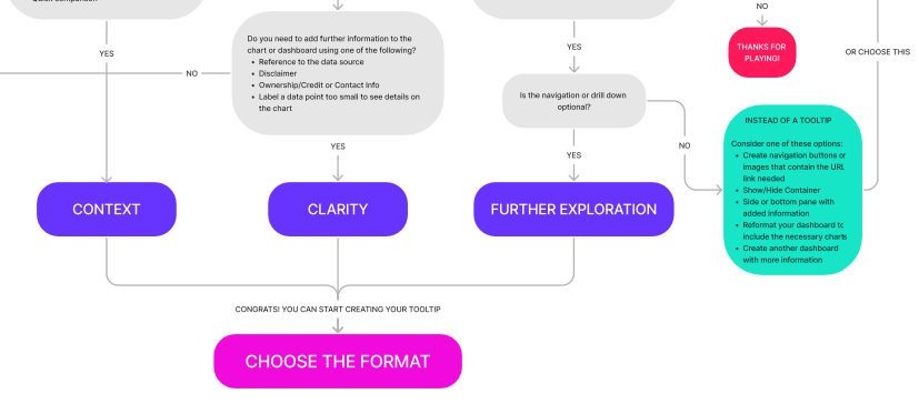
Above: A brief snippet of the “Do I need a Tooltip?” flowchart
As dashboard designers, we need to take into consideration the end user experience in terms of both design elements (color, size, spacing, font choice) and data literacy (aptitude in data content, familiarity of chart types, drawing insights, inference, etc.)
We’re providing some basic guidelines we’ve found successful in our own dashboard design and some samples you can apply to your own work. We’ve also included some key considerations to review before you hit that “publish” button. Think like a data designer and say less by ensuring your Tooltips add value to your visualizations, and go enjoy your cup of coffee!
Above: A preview of the Dashboard version of our Tooltips Best Practices that you can interact with here or download below.