
Welcome to our new series, Dashboarding is Like, where we will explore connections between data visualization and other creative pursuits! For our first set of posts, Dashboarding is Like Music, we will delve into the sometimes surprisingly rich relationship between, as the title suggests, dashboarding and music.
Though we joined InterWorks about two years apart from each other, my co-author and I were each struck by the number of colleagues who were music enthusiasts, hobbyists, curators and even one-time music professionals. We thought that there must be something to this, and had independently toyed with the idea of starting a project much like this one. Troy Schuh, an analytics consultant at InterWorks who in his former life had been a music director and performer, could not have been more pleased when his colleague, Chelsea Morgan, currently an experience designer at InterWorks and an accomplished songwriter, approached him with her idea to write a post together. Thus, this series was born!
We have several goals for this project. One is to explore, from a wide-angle perspective, some of the universal principals that drive the best creative work. In doing so, we intend to make explicit common links between data visualization and other creative pursuits. We will also shine a light on some specific roles related to viz-building and how these parallel functions in other creative fields. And, perhaps most importantly, we hope to enable fellow viz-builders to break through data and design challenges and, via analogy to other creative forms and mediums, to discover fresh, novel solutions to these obstacles. So often, placing a difficulty into a previously unconsidered context can lead to that “aha” moment of insight and clarity. It is our hope that this series will help to facilitate this process.
The Crossroads of Data and Music
After brainstorming some ideas for our first post, my co-author and I quickly discovered that:
1) Our initial thoughts could readily be categorized into a succinct handful of themes.
And:
2) The relationship between dashboarding and music runs much, much deeper than either of us imagined.
To our first realization, we decided to use these recurring motifs as a framework for our article. To the second, we thought it best to separate our initial writeup into three separate posts based on this framework: Communication, Organization and (Means of) Consumption.
We start with communication, as this is where many of the best visualizations (and some of the best music) begins. When we set out to tell data stories, we ask questions such as, “Who is the intended audience for this visualization?” and “How will this visualization be presented?” Much musical activity begins the same way. Musicians may query (although likely less explicitly), “Who is my audience?” and “In what forum or venue will this music be shared or performed?”
First, we’ll consider the function communication plays in the process of data collection and compare this to its role in the gathering of the audio artifacts that musicians often use to construct their works. Next, we’ll explore the role of communication in both visualization building and music creation. Finally, we’ll compare the presentation of data to musical performance and the importance of communication to each. We’ll provide examples throughout to highlight similarities.
Collecting Data + Selecting Musical Artifacts
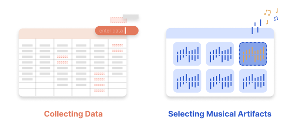
Data Visualization
As viz-builders know, it’s essential that the data we use to construct our views be relevant to our audience. To ensure this, we’ll ask ourselves questions like, “In what results will my audience be most interested?” or “What data will best help me to tell my story?” However creative, performative or aesthetically pleasing our vizzes or dashboards are, if the figures we’re communicating are not relevant to our audience, they will simply not be used.
Music
Like with viz-building, the gathering of already-existing materials can be an essential component of the music-making process. In fact, the referencing of pre-existing musical artifacts has been standard practice in music for hundreds of years and would commonly be used to provide subtext for audiences of the Baroque, Classical and Romantic eras. These sorts of meta, nod-and-wink Easter Eggs for the initiated were well-established long before Aphex Twin inserted his own image into the waveform of his track “Equation.”
You might not be aware, but you’ve no doubt heard the oft-quoted Dies irae many, many times. This is a musical sequence that dates back to the thirteenth century and has been used in music and other media to communicate death, the occult and, really, all things scary for over 800 years. Composers as diverse as Mozart, Verdi and John Williams have made extensive use of it. Heck, Danny Elfman owes much of his output (and perhaps the whole of his career) to it.
The usage of musical (or even non-musical) artifacts is the norm in today’s popular and “serious” music. It’s common for recordings or compositions to be built entirely from samples and pre-recorded audio snippets. Consider Taylor Swift’s song “London Boy:”
The beat of this piece was sampled from Cautious Clay’s “Cold War:”
Certainly, listeners of “London Boy” would have experienced something much different had it been built using different source material. Taylor (and her producers) no doubt considered the story she wanted to tell and what her audience would want to hear when choosing this sample.
Visualizing Data + Composing and Creating Music
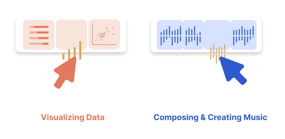
Data Visualization
We remain mindful of good communication during the visualization-building process. As we design and create, we consider the function of our viz. We ask, “Will it be exploratory, informative, or maybe even reflect some experimental, abstract form of self-expression?” and “What balance between utility and creativity am I afforded?”
There are also practical considerations. We decide on which data points will be our primary focus and which will serve to provide context. We decide which type of viz (dashboard, still image, animation, etc.) and plots (bar graph, line graph, histogram, etc.) are most appropriate for our message, and we account for the constraints of these choices.
We make design decisions and text choices (font, size, etc.) that best relay our story, establish credibility and make for an optimal user experience. As most of us have learned: The easier a visualization is to use, the more likely it is to be used.
Music
Consider communication and the process of music creation. Like with data visualization, the composer must be mindful of intended function of their music. Will it be used for commercial or entertainment purposes? Is its function religious or secular, or is it purely a means of self-expression? As with data visualization, the composer must strike the correct balance between utility and creativity.
A few years ago, a data scientist went through and created a number of visualizations of the number Pi. While the usefulness of the images are not immediately apparent, their beauty certainly is.
This is not dissimilar to much of the musical output from the late Sophie. While it’s difficult at first listening to conjure a functional usage for Sophie’s brand of angular, avant-garde pop, leagues of current artists have cited Sophie as a major influence (a flashing lights warning for this music video):
Like with viz-building, the composer or arranger decides how and where to direct the listeners’ attention and will consider which musical elements (themes, instruments, textures, etc.) will most effectively take the lead and which will serve as counterpoint or support. They will determine which musical style, form, instrumentation and even forum are most appropriate to their message, and, like viz-builders, must also be mindful of the constraints of these choices.
The music creator will generally do best to make consistent use of instrumentation, form, musical themes and textures and, in general, repetition throughout a work. By doing so, they are better able to maintain cohesiveness, establish credibility and make the listener experience easier to navigate and digest. Following established conventions is especially important with printed music. As many composition instructors have advised their students, “The easier music is to read and interpret, the more likely it is to get played.”
Presenting Data + Performing Music
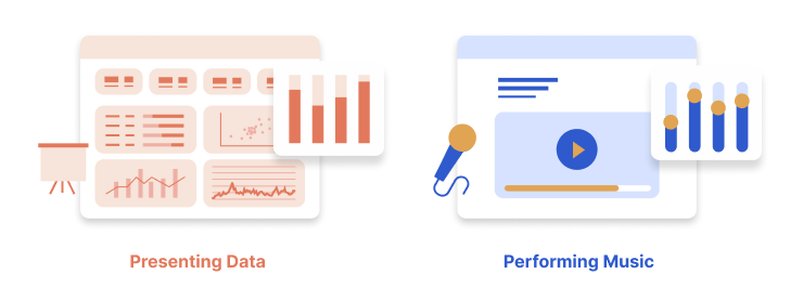
Data Visualization
Lastly, we consider the role of communication in the presentation of data and in musical performance. As with the process of data collection and viz-building, when deciding on how best to present our data, we account for the makeup of our audience, the story we are telling and any actions we want our audience to take. How we do this will undoubtably be impacted by the forum (live presentation, written report, etc.) and format (still image, interactive dashboard, mobile, etc.) in which we’ll be presenting?
We ask questions like, “Will our visualization be used as part of a presentation or will the audience consume this content on their own?” Further, we have to ask that, if it’s used in a live setting, will the presenter make use of still images, interactive views and dashboards, or will the presentation require animations? Conversely, if the audience is to consume the data independently, will this be via pdf, Word doc, or some other non-interactive view, or will they be able to interact with the view via software or the web?
Music
Likewise, the composer and performer must be aware of the venues and mediums that will be used for their music making. Again, their best choices will likely account for their target audience, the message being expressed and the intended audience take-away.
The performing artist or composer should be able to answer, “Will this music be presented in a live performance setting, or will it be recorded for later listening?” If the music is to be performed live, will it be entirely composed, or will there be elements of chance or improvisation? If the music is to be consumed via recording, will there be interactive elements via software such as ProTools or other apps?
As with visualizations, the choice of musical venue and medium and the norms associated with these will play a major role in how the music is presented and communicated.
The following, for example, are three settings of the standard “Summertime.”
This first version comes from a recent production of Gershwin’s Porgy and Bess at the Metropolitan Opera House:
The second is a live performance by Andrea Motis with the Joan Chamorro Quintet:
Finally, we have an exceptional improvisation on “Summertime” from YouTuber Yohan Kim:
Certainly, venue, medium and means of communication and consumption each played a significant role in how each of these versions were arranged and performed. The operatic setting was fully composed while the jazz combo and solo piano versions involved elements of improvisation. The first and third did not involve audience interaction, while the second likely did. As viz-builders and data communicators, we may do well to embrace such stark contrasts.
In Conclusion
As we’ve seen, communication is an essential consideration for visualization developers and music makers alike. Whether during the stages of data collection, dashboard development or presentation for viz-builders or the parallel processes of sample/artifact collection, composition or performance for musicians, we creatives will do best to account for our audience, the actions we hope they take and the story we want to tell.