
While visualizations provide a valuable snapshot of data, they often fall short in accommodating the diverse analytical needs of decision-makers. For example, imagine a visualisation shows total sales by year. This is useful. But what if we want to compare this with the average spend by customer in the same viz? Slicing data by different dimensions in a single graph can sometimes be tricky. Recognizing this limitation, most Business Intelligence (BI) tools provide a way to alter and use more than one level of aggregations to suit specific business needs. In this article I will demonstrate how to modify aggregations in two of the most popular: Tableau and PowerBI.
In Tableau, level of detail (LOD) expressions allow you to control the granularity of the data that you want to render, whether it’s at the data source or visualisation level. If you have never heard of this concept before you can find here a great introduction.
In Power BI, you can achieve similar outcomes to LODs wtih Row and Filter context. In very plain terms, these allow you to work with the aggregation at the row level or in the value of a calculation returning a single value. A good starting point on this subject is here.
Let’s See How These BI Tools Tackle the Same Scenario
As the title of the article implies, this will be hands-on. To explore how each BI tool handles changes in aggregations, I have created two business scenarios that I will address with each tool. For all scenarios, I’m using Tableau’s Sample Superstore, a transactional dataset that includes purchase data about certain products and categories. Throughout the article I will be using specific terminology/features specific to each tool.
Scenario 1: Frequency of Purchase
A common scenario among analysts in industries with a product portfolio is to understand how well each product line performs. Are there any categories that see more repeat purchases than others? Here we are trying to gain a sense of distribution of purchases. Let’s dive into it.
In Tableau:
First, I want to understand the number of distinct purchases that have been made by my customers across the board. To answer that, I will use the LOD Fixed so I can compute the aggregation that I need:
Distinct count of Purchases
{ FIXED [Customer ID] : COUNTD([Order Date]) }
By default, this will create a measure. However, I will turn it into a discrete dimension that will return “buckets” for every unique number of purchases made. That way I can use this field to slice other measures with:
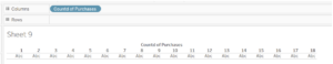
With this, I can see my shoppers have made anywhere between 1 and 18 purchases. Now, I simply need to add a count of customers and the LOD will group them in each of these buckets. This will indicate how many unique shoppers fall into each group. I will set the visualisation as bars that I will then break down by colour using the field Category. I am also adding Category into label to expose the legend:
COUNT([Customer ID])
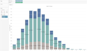
Sure enough: The horizontal axis displays the number of unique purchases made whilst the length of the bar is the count of customers in each bucket. Colour here indicates the Category where the purchase was made.
In PowerBI:
Now let’s try Microsoft’s BI tool to achieve the same outcome.
First, I will create a new column where, effectively, I want to compute the number of unique purchases made for every customer.
Count of Purchases = CALCULATE(DISTINCTCOUNT(Orders[Order Date]), ALLEXCEPT(Orders, Orders[Customer ID]))
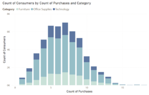
Here, I am using CALCULATE to evaluate an expression within a modified filter context. The DISTINCTCOUNT(Orders[Order Date]) expression counts the unique order dates in the “Orders” table. Lastly, ALLEXCEPT removes all filters from the “Orders” table except those on the “Customer ID” column. This will act as my dimension to separate/group my measure by. Now, onto the measure to visualize. I create the following measure to simply compute the number of customers:
Count of Consumers = COUNT(Orders[Customer ID])
And finally add Category onto colour. And voilà!
Scenario 2: Repeat Purchase Lapse Time
Another valuable insight used to assess the effectiveness of marketing strategies and understand customer engagement is to explore the average time elapsed between purchases. In other words: how long does it take for a customer to purchase a second time? And does this interval change over time?
In Tableau:
When researching to write this blog, I stumbled upon this great workbook that Tableau created that will lead us straight onto the answer. Here, I am going through the key steps.
First I need to understand when does a customer make their first purchase. To do so I simply find the earliest date of purchase:
1st Purchase:
{ FIXED [Customer ID] : MIN([Order Date]) }
Here we are using a Fixed LOD in which, in essence, we are forcing the calculation to be performed at a specified level, by the dimension/s placed in the fixed LOD calculation. This level of detail of the calculation will remain fixed, irrespective of the detail shown in the visualisation or applied filters. You can find a full explanation on LODs with examples here.
To calculate if a customer makes more than one purchase or not I can do:
Repeat Purchase:
IIF([Order Date] > [1st Purchase], [Order Date], NULL)
This calculation checks if the order date is greater than the date of the customer’s first purchase. If it is, the order date is returned, otherwise the result is NULL. This helps identify subsequent purchases made by the customer after the first one.
The above will return a Repeat Date for every date of purchase for every customer. However, we are only interested in their second purchase, so we’ll get Tableau onto the case:
2nd Purchase:
{ FIXED [Customer ID] : MIN([Repeat Purchase]) }
With the above, we can now calculate the difference in quarters between the first and second purchase, which essentially tells us how long they waited before buying again:
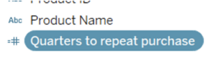
Quarters to repeat purchase:
DATEDIFF(‘quarter’, [1st Purchase], [2nd Purchase])
Let’s review what we’ve built so far by looking at just one customer:
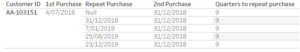
We observe that the fields 1st and 2nd Purchase (and consequently Quarters to repeat purchase) are constants for the customer – exactly what we need.
Because I want to use this number to slice the data I will convert it into a discrete dimension (More on this here):
Now I can assemble a visualisation and add COUNT([Customer ID]) onto the colour mark card to obtain this:
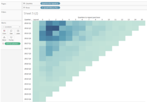
We now have a visualisation from which we can draw several interesting insights from. But let’s see how we can build this using another BI tool.
In PowerBI:
We’ll follow similar logical steps, but with some differences.
First we create a column that returns the first purchase made by every customer:
1st Purchase:
1st Purchase = CALCULATE(MIN(Orders[Order Date]), ALLEXCEPT(Orders, Orders[Customer ID]))
Now, we want to calculate the date for their second purchase. To do so, we need to create a column that returns any purchase date for that customer that is greater (that is, more recent) than their first purchase, otherwise we’ll return blank, which basically means the customer simply lapsed:
Repeat Purchase:
Repeat Purchase = IF(Orders[Order Date] > Orders[1st Purchase], Orders[Order Date], BLANK())
Here, we are going to over this newly created column with a context filter defined by the ALLEXCEPT function which, in this case, it ensures that the minimum date of the “Repeat Purchase” column is calculated independently for each customer:
2nd Purchase:
2nd Purchase = CALCULATE(MIN(Orders[Repeat Purchase]), ALLEXCEPT(Orders, Orders[Customer ID]))
Let’s see what these three fields return by looking at just one customer:
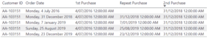
Notice that for this customer, 1st and 2nd purchase return the same value for all orders. That’s because we are calculating this for a Customer ID.
Now that we know whether each customer made a first and a second purchase we can simply calculate the difference in quarters between these two:
Quarters to Repeat Purchase:
Quarters to Repeat Purchase = DATEDIFF(Orders[1st Purchase], Orders[2nd Purchase], QUARTER)
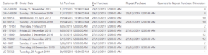
If I simply add all these fields in a Table, I can see:
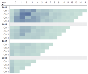
We’ve done the groundwork. Time to build the viz. We’ll be using a Matrix Visual.
I will add Quarters to Repeat Purchase to columns and 1st Purchase in Rows by year and quarter. Then in values I will simply add a field of Customers:
Count of Consumers:
Count of Consumers = COUNT(Orders[Customer ID])
I will add some conditional background colouring logic to this field, which will helps us achieve the same result:
Here, we’ve just barely scratched the surface. Both Tableau and Power BI stand as formidable contenders in the realm of data visualization and analytics, and they both provide a wide range of possibilities regarding different levels of aggregation. As you can see in this article, it becomes evident that the same scenario can be accomodated similarly using Tableau or Power BI. Interested in knowing the art of the possible in Business Intelligence? Feel free to reach out.