
The Introduction
I picked this topic to blog about for two reasons. The most important reason is because it’s one of my biggest hobbies. I love to invest, research companies and explore the data associated with them. These things have always interested me, and I noticed that the subject matter is a sparsely conveyed ideally in most American homes and families. I personally believe that EVERY American should have at least some investments aside from the investment they make in going to work every day.
This leads me into my second reason for making this blog. There are many false perceptions about the American financial system and the stock market as a whole. This has inspired me to write this blog displaying the facts about stocks and interest rates, and to dispel any rumors or insecurities about them. It’s my belief that one of the biggest sources of middle-class erosion comes from a lack of risk-exposed investments. There are many misplaced perceptions about the stock market such as:
“It’s rigged!”
“It’s too risky!”
And finally, the theme of this Blog:
“My money is safer in a savings account!”
The truth is, you can’t AFFORD to keep your money in a savings account.
The Data
I pulled FRED data from the St. Louis Federal Reserve database for the historical yield curve, oil prices, the Consumer Price Index (CPI) and the Federal Funds Rate. Meanwhile, I pulled the data for the DJIA and the S&P 500 from the “Wall Street Journal.” I pulled yearly dividend yields for the S&P 500 from a website listed in the “sources page.” Links to sources can be found at the bottom of this post.
I put all this data into an Excel file where I organized and scrubbed the data. For the yearly reports, I needed to manually go through deleting 11 months out of the year in a way that was consistent. After this, I used simple column calculations to calculate the CPI rate of change (inflation), S&P yearly returns and DJIA yearly returns. The most cumbersome calculation was when I had to account for both inflation, yearly returns and annualized dividend payments on the S&P 500. See below:
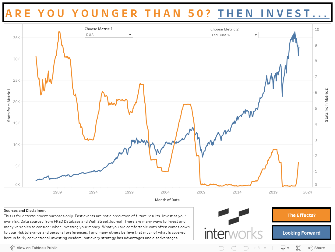
The orange line is the Federal Funds Rate. This is the rate at which the Federal Reserve is prepared to offer cash on loan to other institutions (such as banks). The exact details of this financial instrument go far past the scope of this blog, but the most important factor to know is that it’s a direct representation of the yield you get in your savings account. There are some serious variations in the fund rate and the actual yields investors see at their banks, but that won’t be considered in this report (see the “Down Sides and Inconsistencies” section for more information as to why).
Meanwhile, the blue line shows the price of the Dow Jones Industrial Average (DJIA) since 1986(excluding dividend payments). As you can see, the Federal Reserve is waging a war against your savings account yield while the stock market increases drastically and pays you quarterly dividend payments. The average yearly return of the DJIA is 8.7% .
You may be thinking:
“Wait, but doesn’t the stock market go down too? My money is safe in a savings account.”
The above statement is true. Below are the three most recent financial recessions, which include the Dot-com recession (#1), the Housing Crisis(#2) and most notably the COVID Crisis(#3).
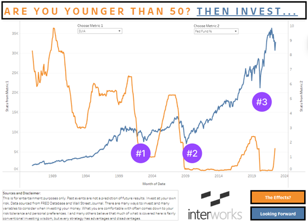
The financial downturns of the past seem scary and drastic in the moment (when you’re living through them), but they aren’t as bad as you may think. On a macro, 10+ year timeframe, investing in the stock market is quite promising.
If the above information doesn’t convince you, have you considered the dangers of inflation?
Inflation is a slow but dangerous element for investors, and it isn’t properly considered by many Americans. Click on the The Effects? button on the workbook above. This is a comparison of your savings account rates and the cost of living in the United States (CPI change).
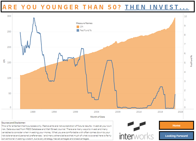
The image above is from the Effect button on the original workbook.
As seen from the workbook, the Federal Funds Rate is directly related to your savings account returns over time. Meanwhile, the orange area chart is the CPI(Consumer Price Index) since 1986. The CPI is the numerical value of the cost of living felt by the average resident of the United States, thus it’s a great visualization of inflation. As you can see, it doesn’t matter how much you put in your savings account as the CPI will swallow it up. For a better visualization of this, look below to the “$1000 Example” section to see what inflation erosion looks like.
It’s obvious that the risks incurred by investing are worth the long-term benefits.
$1000 Example
In order to best demonstrate the severity of the differences between the two investments, this section is dedicated to comparing the returns of investing $1000 into a savings account versus the S&P 500. The blue bar is the returns of the S&P 500 from 1986-2021. Meanwhile, the orange bar is the performance of the same $1000 in a savings account. Both are adjusted for yearly compounded inflation and dividend payments. The details and factors being considered for the two metrics can be changed using the parameters in the bottom right corner of the workbook.
https://public.tableau.com/views/StockProjectx/1000Example?:language=en-US&:display_count=n&:origin=viz_share_link
Not considering inflation, the returns of the S&P 500 are much higher than depicted above, but this blog must account for inflation in order to properly criticize saving account returns. Even with inflation adjustments, an investor could have expected well over 10x their investment in real world purchase power(since 1986-2021).
Below is a comparison of the returns of $1000 in a savings account with vs without inflation:
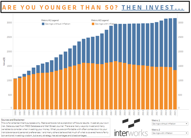
One might feel that 3x increase in their savings account value might be substantial; but when applying inflationary realities to the account, it only produced $361 of inflation adjusted buying power increase. If you look closely, this is down from a high of $668 in 2009, where since 2008, the inflationary environment has been out pacing even the most generous of interest rate payments.
Looking Forward
The current “financial crisis” (2022) may be the next notable downturn to look at for this historical model. The federal government has done two key things that resulted in this downturn. First, they printed a lot of money for COVID programs. Second, they forced rates to stay very low (near or at zero percent) throughout this time in order to create cheap lending. Finally, several “Black Swan” events have taken place to exacerbate the situation. Most notably, the lack of workers in the economy and the sudden increase in the cost of energy due to the Ukraine-Russian war pushed our markets to a breaking point. Please note, “Black Swan” is a term in finance that refers to a surprising and unpredictable event that effects the economy.
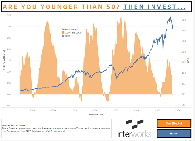
In the above chart, I have the DJIA overlayed with the 10:1 year yield curve. The yield curve is a simple calculation that compares the interest payments on far (10 year) vs near (one year) debt instruments. The natural state of the yield curve is to be in the positive region due to the logic that lenders should receive more for their investment on longer term loans versus shorter term. During times of confusion and financial turmoil the yield curve turns negative, meaning investors have so much anxiety about the future that they are willing to pay more for short-term debt vs. long-term debt.
There is a strong correlation between the yield curve inverting and an impending decline in the market. Although this indicator seems promising, it has been incorrect in the past and can easily expose you to incorrect decision making. To make fully informed decisions, one should consider many indictors in a trading strategy as well as the risk threshold of the investor based on age.
Conclusion
We’ve recently (August 2022) entered what some would identify as a “bear market.” If you look closely, the yield curve has inverted and inflation is high. Does this mean we are in for a bumpy road ahead? I don’t know. That’s for you to decide.
I think it’s understandable to be wary of the stock market, and I will agree it’s not for everyone. Although, I’d argue that if you’re 10 years or more from retirement, then it’s worth investing in the safe, major indices like the NASDAQ, DJIA or the S&P 500.
Downsides and Inconsistencies
There are a few downsides and un-accounted for inconsistencies in this report. Although, I have made sure that these inconsistencies work AGAINST my argument/premise for the blog. Please see them below:
- The Federal Funds Rate isn’t the exact yield received on savings accounts in America due to the difference between bank to consumer slippage in the market. This being said, by using the Federal Funds Rate as the return for the savings accounts, I’m giving the savings account argument an upper hand.
- For simplicity, in the “$1000 Example” section I have the dividend data compound reinvesting at a yearly rate, which isn’t realistic due to the variations in quarterly dividend payments. In reality, you (the investor) would be reinvesting the dividends instantly on a rolling three-month basis. This leaves a lot of potential returns on the table due to the time decay of this money waiting on the sidelines before the annual reinvest date I’ve set. This (in a small way) hurts my potential market return on the indexes. This only handicaps my argument.
- Aggregation dates aren’t exactly consistent due to data type availability. For example some data may start on “January 1” while others start “January 15.” This should have minimal effect on data results due to the macro scope of this study.
- Although you can place partial share orders in today’s brokerage systems, it’s unlikely that an individual would be able to place these partial orders in the 1980s and 1990s in order to fully reinvest dividend payments.
Overall, the noted inconsistencies of this report are either obsolete due to their nature or they out right benefit the opposition to my argument (most importantly #1).
Sources, Knowledge and Disclaimer
- https://www.cnbc.com/2020/04/09/what-happened-in-every-us-recession-since-the-great-depression.html
- Dow Return: https://seekingalpha.com/article/4502739-average-stock-market-return
- Div Returns S&P: https://www.multpl.com/s-p-500-dividend-yield/table/by-year
- S&P 500 data: https://www.wsj.com/market-data/quotes/index/SPX/historical-prices
- https://fred.stlouisfed.org/
- https://www.wsj.com/market-data/quotes/index/DJIA/historical-prices
Disclaimer: This is for entertainment purposes only. Past events are not a prediction of future results. Invest at your own risk. There are many ways to invest and many variables to consider when investing your money. What you are comfortable with often comes down to your risk tolerance and personal preferences. I and many others believe that much of what is covered here is fairly conventional investing wisdom, but every strategy has advantages and disadvantages.
Acknowledgements
This project was weeks in the making as many contributors helped vet and suggest improvements. Everything from data visualizations to “wordsmithing” was a collaborative effort. I couldn’t have done it without Nicholas Laurenti and Cole Shelton helping me with financial data set recommendations and improvements to the dashboard. Additionally, there would be many typos and mistakes if it wasn’t for the likes of Kelsey Lee and Garrett Sauls. Thank you all!