
This series examines all things date-related in Tableau and shares best practices for optimal processes.
In the last post, we went through the process of transforming date selection logic from ordinary to optimal. In this post, we will show off a useful trick when working with dates: date alignment. Note that we will continue to use the parameters and date logic from the previous posts.
In the dashboard, notice how as you toggle between the time period selection options, the line aggregation adjusts automatically to the corresponding period.
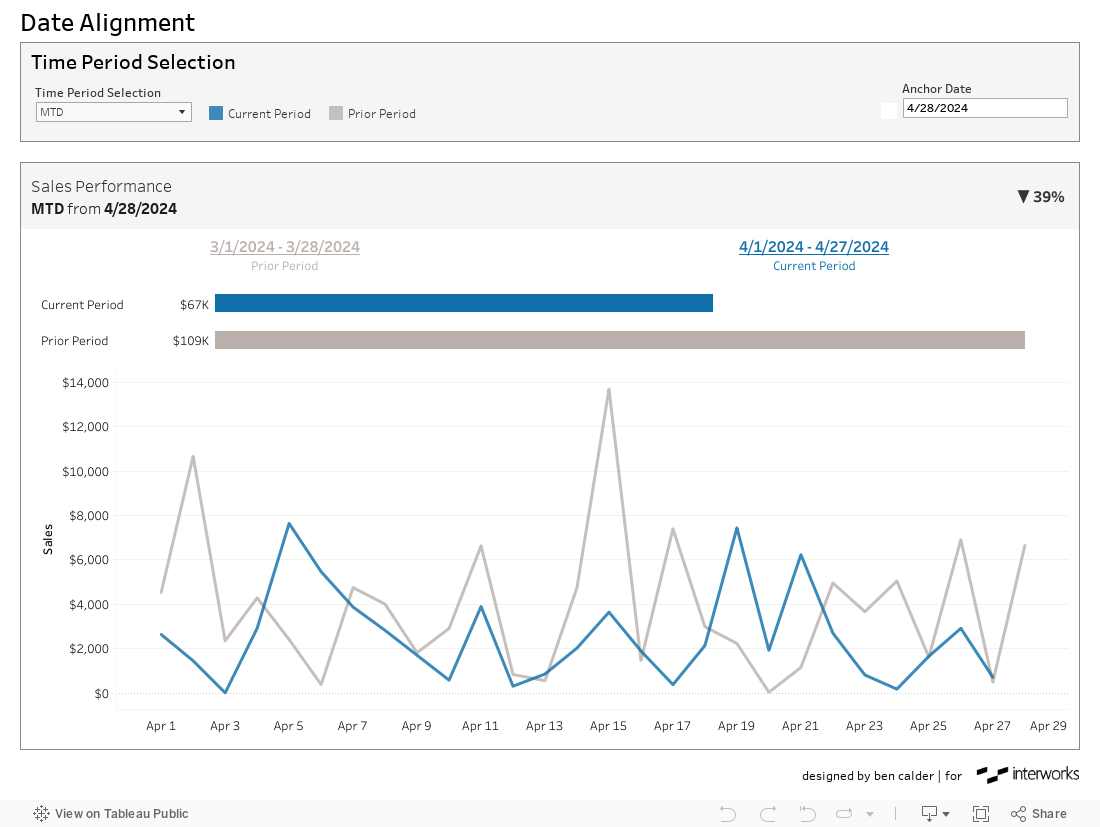
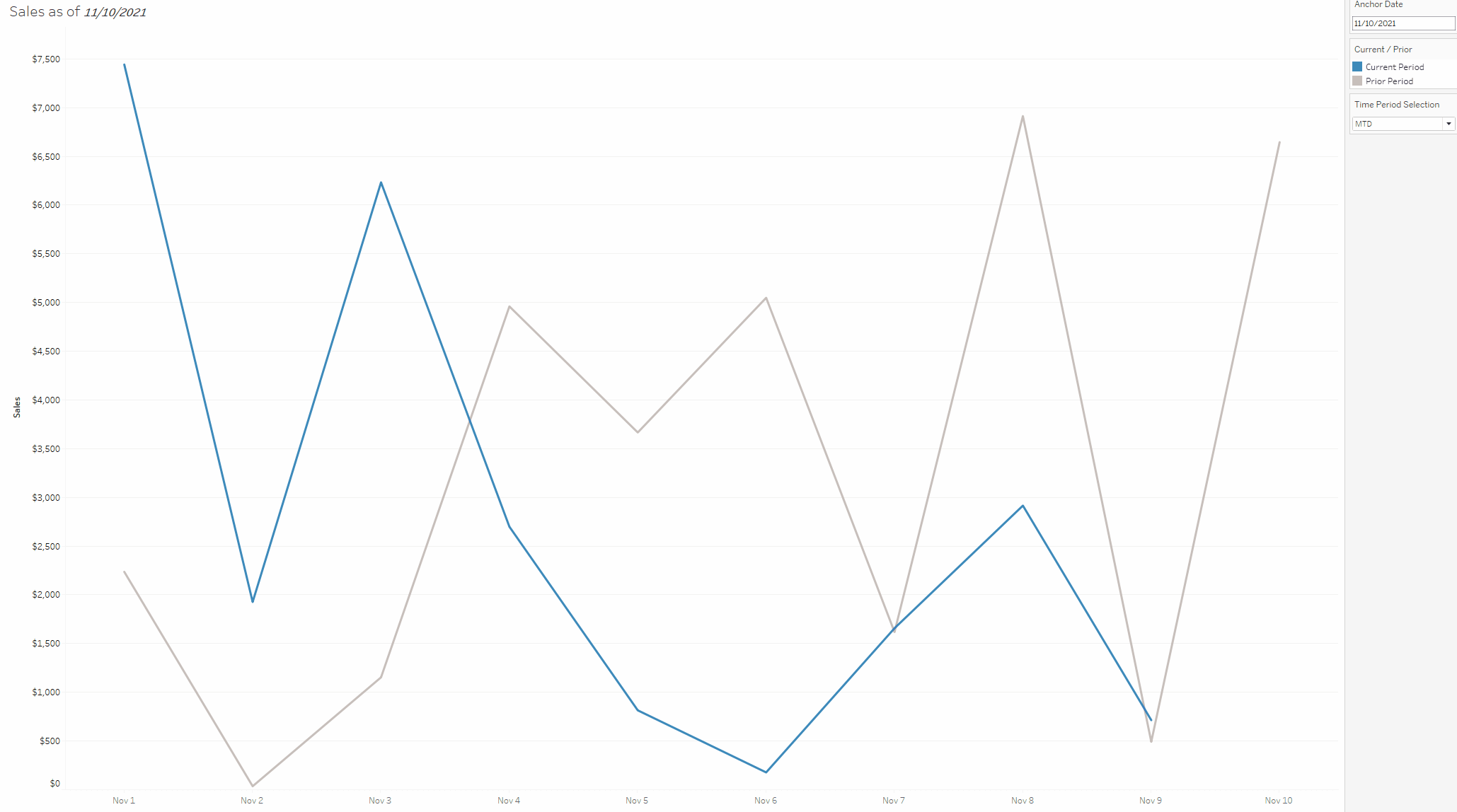
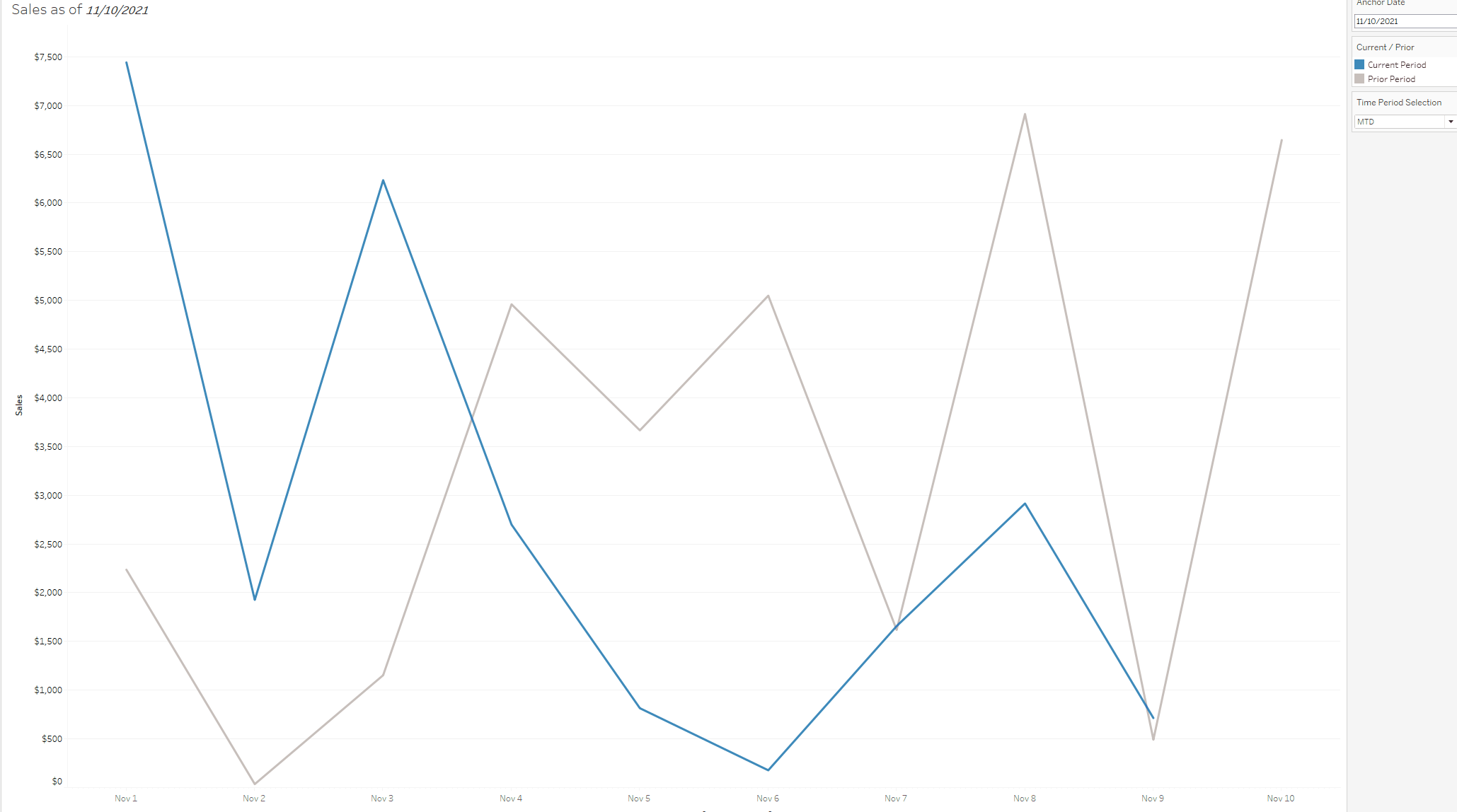
The dashboard we left off with last time focused on comparing the sales values of different time periods. The line chart below represents the MTD sales value in blue and previous MTD sales value in grey. Though we can clearly differentiate the periods by the colors, concluding which period has the higher or lower sales value is not as clear.
In other words, the periods are not aligned in a way where a comparison is readily understood:
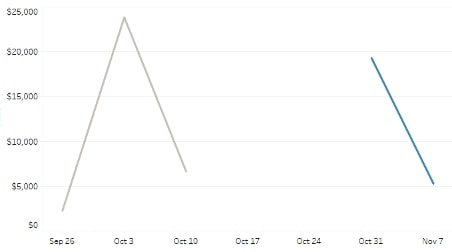
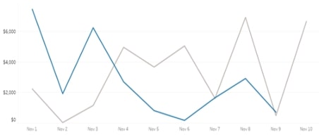
In the steps that follow in this post, we will take the above and transform it into something like the below, where our visual comparison is simplified, and we successfully adjust our axes to accommodate our time period selection options:
Calculations
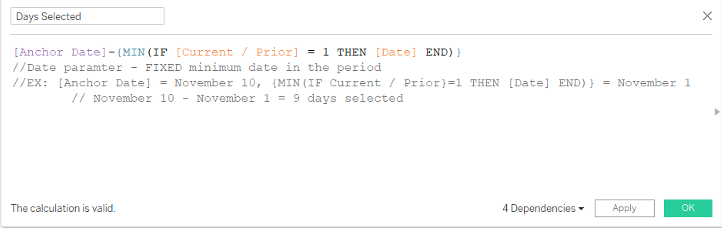
Step 1: Days Selected – Returns a Numeric Value
The first calculation we build will return the number of days between our anchor date parameter and the minimum date for our current period selection. In most cases, this is the difference between the anchor date parameter value and the first day of the time period selection.
Example: If the anchor date parameter is set to November 10 and the time period selection is set to Month to Date – {MIN(IF [Current / Prior ] = 1 THEN [Date] END)} would return November 1. The difference between November 10 and November 1 is nine (9) days:
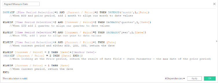
Step 2: Aligned Measure Date – Returns a Date
The next calculation will align our current period dates and our prior period dates. When the prior period is shown, the date returned will align to our current date. When the current period is shown, the current period date will be returned.
To align the prior period with the current period, we label the last date in the prior period with the last date of the current period.
Notice how the last day of the prior period [Date] field now aligns with the last day of the current period through the [Aligned Measure Date] field. This calculation becomes important when we display the information on a line chart:
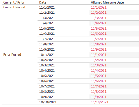
Above: Notice in the current period dates that the aligned measure date is the same, and in the prior period, our aligned measure date calculation returns a date aligned to our current period.
Step 3: Adjusting Date Axis – Returns a Date
The final step is building the date field to act as our date axis. This calculation will reference the [Days Selected] and [Aligned Measure Date] calculations to truncate the dates we see in the view. We do this so that when we toggle from something like Month to Date to last 52 weeks, our user is not constrained to only seeing the data at the level we assign it with a normal date field.
For example, when our user selects Month to Date, we would want them to see data at the day or week level, but at Year to Date, we would want to show the data at the monthly level. In other words, we do not want the user confined by a single date value when toggling between time period selections:
Above: With a normal date field on the axis, when adjusting the date selection, the user is confined to the date value we have in the view; in this case, day.
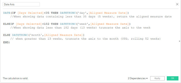
When we use this calculation as our axis in the line chart, our user sees the axis automatically truncate to the relevant level of date granularity:
Above: Notice how the date axis truncates to the relevant date part based on our selection. When we have Month to Date, the axis is shown at the day level, and when we switch to Year to Date, our axis switches to the month level.
Step 4: Add Continuous Min(Date) to Tooltip
Finally, by adding a continuous version of MIN(Date), our tooltip will accurately display our dates.
More Date Help Coming Soon
And viola! Your user now has a cleaner visual to analyze, and you have a new trick to take with you on your next Tableau project.
Feel free to reach out to us if you would like to make the most of these date tricks in your analytics environment. Stay tuned for the last post of this series where we will tackle calendar tables. Happy vizzing!