Our most recent virtual Lunch & Learn covered how to change your crosstab culture. Crosstabs are one of those enduring and painful components of analytics where you make something beautiful, and someone somewhere asks for a table of numbers. The problem is that tables of numbers aren’t great – or even good – at communicating information. So, what do you do?
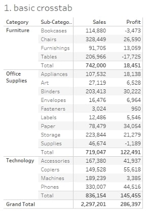
We set out to help our friends across Melbourne, Sydney, Perth and Singapore answer this question in our latest event. The aim of the webinar was to showcase visual analytics and teach attendees how to elevate their analytics and present data in clear and effective ways. We walked through how to take your crosstabs from dominating…

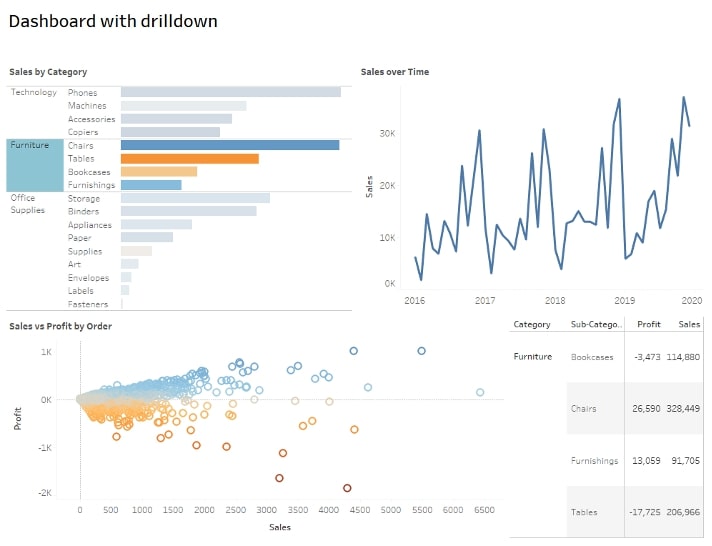
…to supplementing…

…and eventually perhaps being done with them altogether!
Changing Crosstab Culture
If you missed the webinar or want to give it another go, check out the replay below. You’ll learn about:
- Benefits of visual analytics – what it is and how it can help you tell a more compelling story with data
- Simple improvements for even the most stubborn crosstab lovers, like highlight tables and heat maps
- Advanced options using viz in tooltips and dashboard actions t0 hide crosstabs until they’re needed
We finish the virtual event by challenging you to tell a better story, and we provide some InterWorks inspiration from our very own Keith Dykstra to help you do just that. Explore the following resources to deepen your understanding of these strategies and put them into practice them even more:
More Dashboard Design Resources
- Virtual Event Recap: Dashboard Visual Design Tips
- Webinar Replay: Five Tableau UX Hacks for 2021
- Tableau Deep Dive: Dashboard Design – Visual Best Practices
- Webinar Replay: Designing Impactful Dashboards
- Three Tips to Improve Tableau Dashboard Design
- Seven Tips and Tricks from the Dashboard Experts | Tableau
Plus, you can download our Tableau Crosstab Alternatives here:

