A friendly reminder: Tableau purchased Power Tools in 2019. Contact us for more information.
Ready to add some more flavor and personality to your dashboard but not sure where to start? Color can be a difficult component to tackle when building out a dashboard, but luckily there are a lot of great resources that can help in this process. Many of you may be accustomed to using the Color Tool in your analytics work. That tool, as part of Power Tools for Tableau, is no longer a part of our toolbox, but we want to keep supporting you in bringing your design ideas and creativity to your dashboards.
If you’re looking for some tips on how to choose and implement a custom color palette into your Tableau workbook, look no further! Below are a number of resources that allow you to explore and test different color palettes, so you can find the one that’s just right for your project.
Online Color Selector Tools to Get Hex Codes
- One of our favorite resources on this list is the Adobe Color Wheel. This tool has a color wheel option to select colors yourself, and it easily provides the hex codes you need to put in your Tableau Repository preferences. There is also an option to load an image from which the software can then ‘extract’ a color theme or gradient, so you can get a perfect match.
- Another great one, though it’s limited to just showing two colors at a time unless you upgrade to Premium, is the ColorSupplyyy application. It shows two colors in example illustrations, gradients and a pattern so you can see them in action together. It also presents similar color combinations to what you choose, so you can branch out if you see something that catches your eye more.
- This Colorable tool helps you see if your colors work well together when you overlay a text color on a background color. It has adjustable sliders that allow you to change a color’s saturation, hue and lightness for testing purposes. It has a “random” button that will generate two colors at random when clicked in case you’re feeling spontaneous and want to try something new and different. Plus, it has a reverse button so you can easily flip back and forth between your chosen background and text colors to make sure they work both ways.
- A fun and easy tool is Coolors. Like Colorable, it also has adjustable sliders in case you have a specific hex code or even just a general idea in mind of a color you’d like. Simply hit the space bar again and again until you find something you like. Then you can just “lock” that color in place and hit space again to watch the colors around it update to other colors that fit well with the one you’ve locked down. It allows you to do all kinds of things: extract colors from a photo; see a gradient of each individual color or across the entire palette you’ve chosen; easily save specific single colors you like or download the entire palette you’ve chosen; and easily check for accessibility via the “color blindness” button at the top (glasses icon) to see what the shades you’ve chosen will look like to someone who is colorblind:
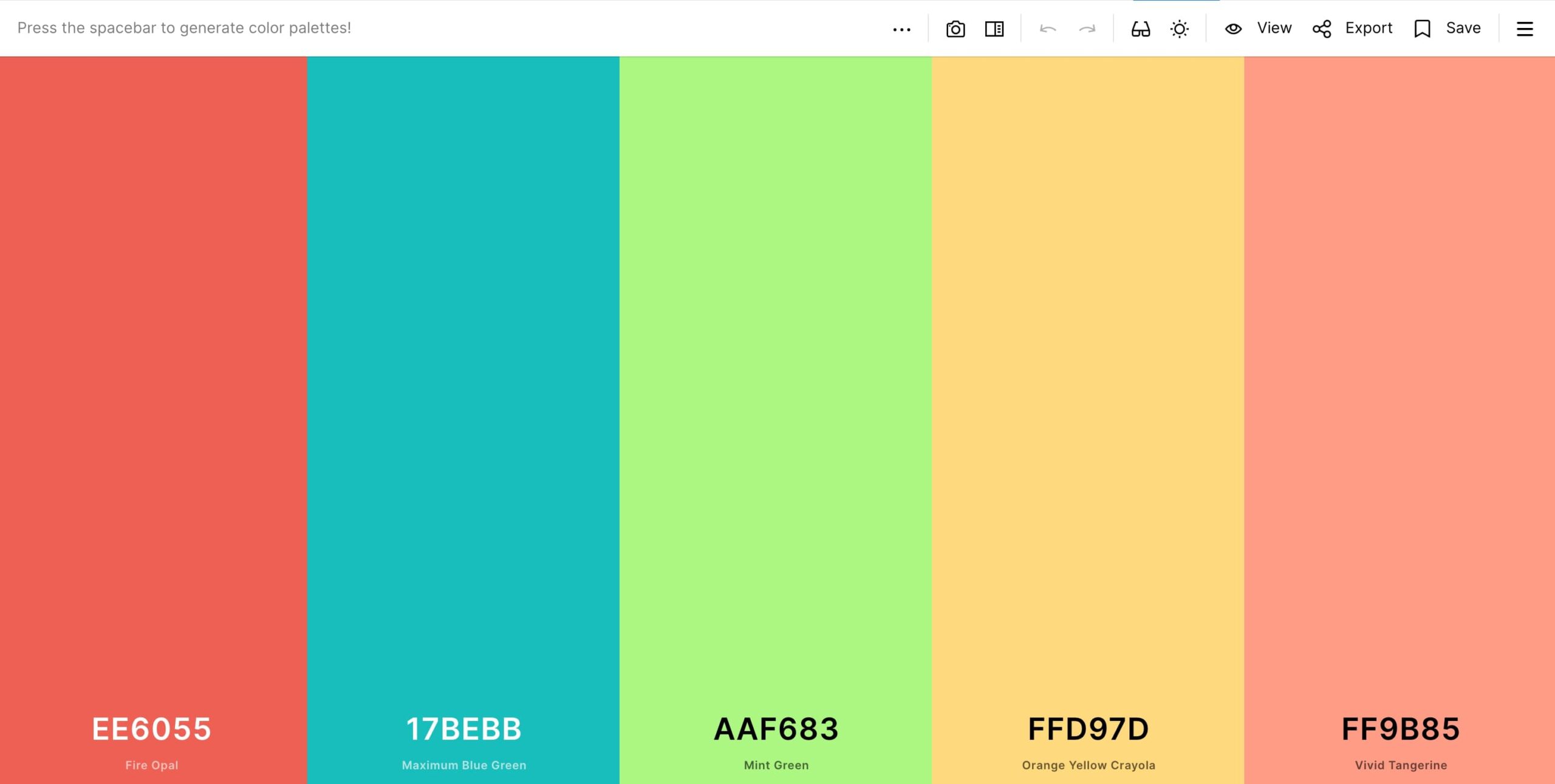
Above: A preview of the Coolors tool
Creating Custom Color Palettes for Tableau
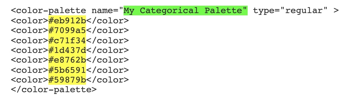
Once you have landed on your colors and have your hex codes selected for your color palette, you put them into this format and paste into the Preferences file in your Tableau Repository following these steps for a Categorical Color Palette. This is the format from the link above for what you put in your Preferences file:
- Replace the green portion with the name of your color palette.
- Replace the yellow hex codes with the hex codes you get from the color tool that you want available.
Some Best Practices for Color Selection
Incorporating design and color into your Tableau dashboards is always something we recommend, but it’s most important for that to be done well. Here are a few best practices to keep in mind as you work:
- Contrast: Provide a bold and muted version of each color in case you need to keep certain items grouped but want to show more contrast or emphasis between them.
- Variety: Provide a grayscale (at least three gray variations), black and white for when you need it for text, backgrounds or gradients.
- Emphasis: Provide at least one highlight color, so you will be able to call attention to specific areas on your dashboard and direct the user’s attention.
- Positive to Negative Change: Provide some form of three-color positive to negative color options. This could be the traditional “stoplight” colors of red (neg), yellow (neutral/caution) and green (pos), or you could branch out and choose a number of different colors for this. Just be sure to use these three colors in ways that provide clarity to the user and indicate what is a positive change, what is neutral and what is negative. If you are unsure which colors would work best for this, check out this article on the meaning and symbolism of colors as reference.
Inclusion Best Practices for All Dashboard Viewers
When we are thinking about how to represent positive and negative change, we also need to consider accessibility. When creating a dashboard, it’s important to take into account that 8 out of every 100 people looking at your dashboard could be colorblind. If this is the case, they may not be able to view the content in the way that you intend.
An important thing to note here is that red, green and many shades of blue specifically become hard to distinguish from one another to those with some form of color blindness (there are multiple types and each causes color to appear differently to the viewer). This is difficult as many data visualizations use red and green to indicate positive or negative values to the viewer, but fear not! There are some practical steps you can take to broaden accessibility and maintain the aesthetic you envision:
- The first possible solution is to include some other type of visual alongside your items of color to indicate to the viewer that the data being shown is of positive or negative value, such as up and down arrows or +/- symbols. Labeling with text also provides more context to your viewer, so do that where there is enough space and it makes sense to do so. This will ensure that no matter if your audience is color blind or not, they can understand the story your data is telling.
- The second solution is to be aware of bad color combinations like red and green, blue and purple, light green and yellow, etc. and avoid using them altogether. This is not always possible, but when you can, limiting your color palette to only a few colors (2-3 ideally) that have a good amount of contrast will help with this. If you do need to use some of these troublesome color combinations, just be sure to check the amount of contrast, and leverage light and darkness (shade/tint) between them so that you ensure there is enough difference for each to be visually distinguished from one another. A couple of resources to help with this are this article on creating a visually accessible user interface and this one from Tableau that lists five tips for designing colorblind-friendly vizzes.
Parting Thoughts and a Few More Resources
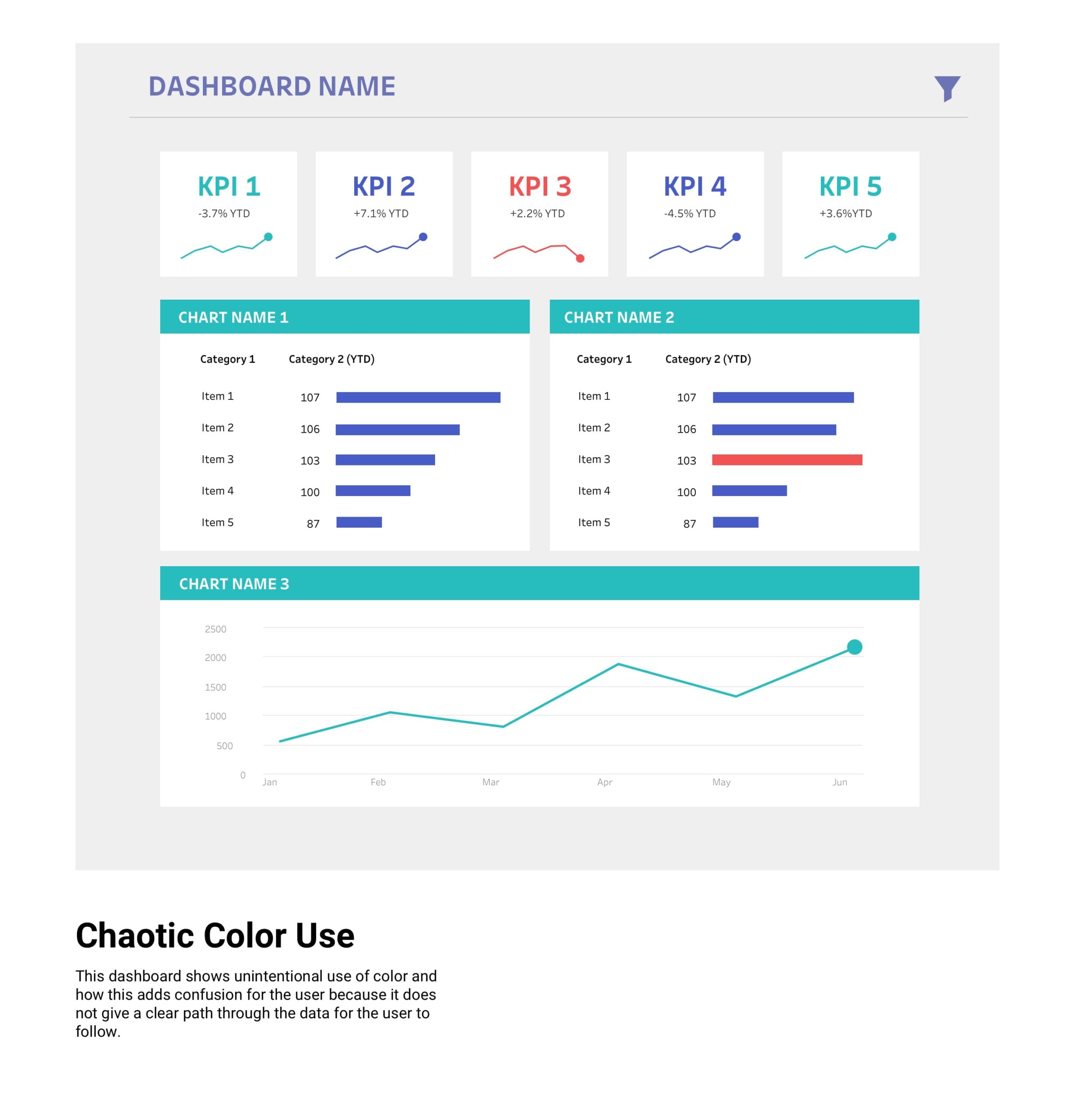
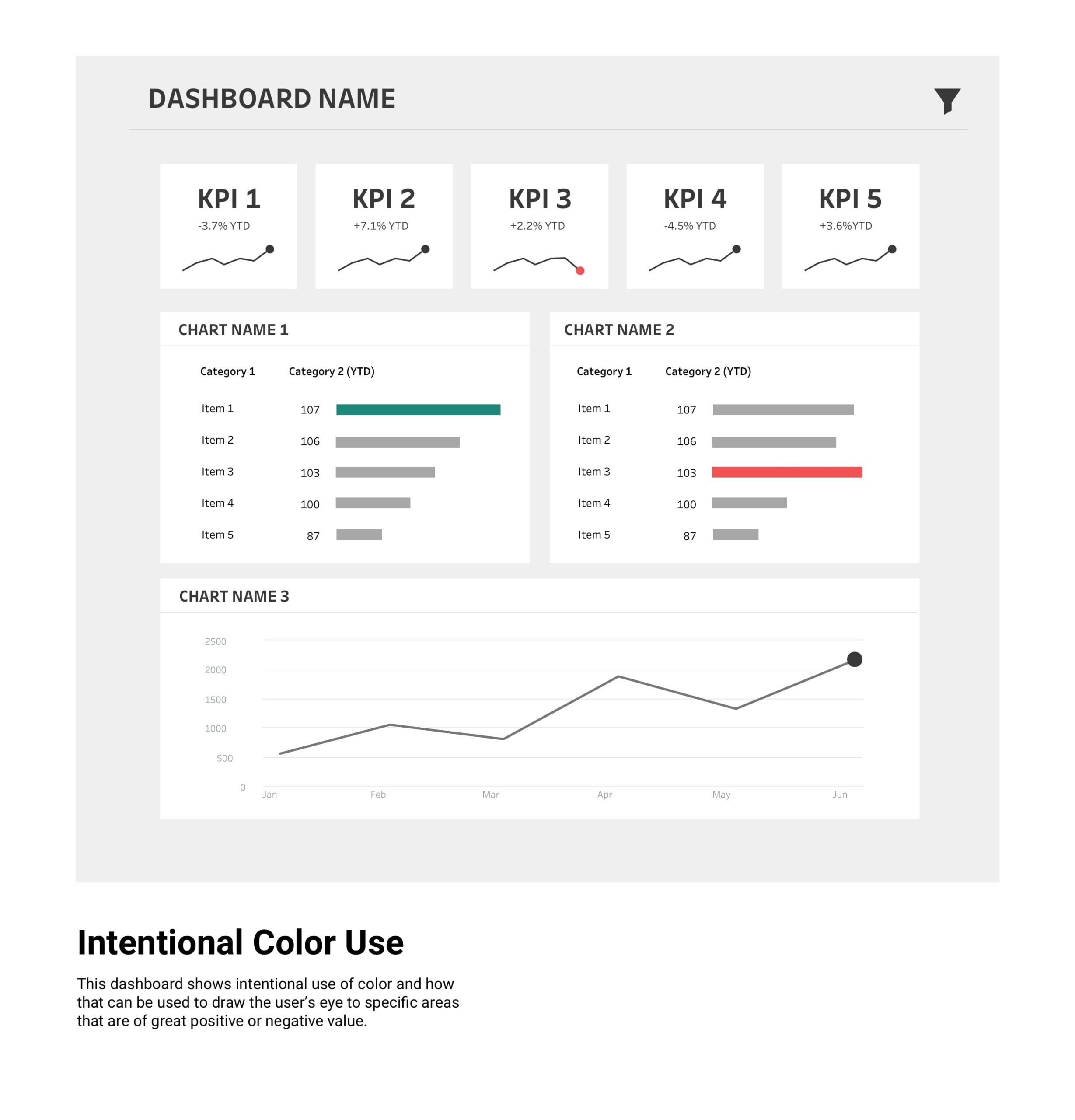
A good go-to rule of thumb is not to add too many colors or go crazy and start throwing colors on every single item on the dashboard. When in doubt, simplicity can speak volume. Remember: if everything is special, nothing is. Using color selectively and intentionally will not only be a kindness to your users, but it will also help to guide them through the data in a clearer, more meaningful way. An appropriate use of color results in the best possible user experience.
Overall, remember to have fun with it! Colors are like the seasonings and spices of the dashboards—they shouldn’t be the main dish, but they should support and bring out all the best qualities (flavors) in it. If you want more, here’s a brief list of some InterWorks content to help you move beyond simple color selection to incorporating design broadly. Happy creating!
- Five Tableau UX Hacks for 2021
- Small Changes, Big Impact: Quick Tableau Dashboard Tips
- Why Designing for Data Matters
- Human-Centered Design
- A Lite UI Checklist for Dashboard Design
BONUS: Below are examples of what a good use of color might look like vs. a poor use of color: