NOTE: The COVID-19 global pandemic continues to evolve. This data visualization is no longer being updated, and we recommend the Johns Hopkins Coronavirus Resource Center for regularly updated data and information.
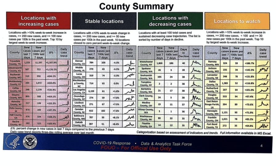
Last week, a White House pandemic task force report was leaked to the media, showing that coronavirus infection rates were spiking to new highs in communities across the country’s heartland. Immediately, everyone’s eyes went to the left table in red in the below image: locations with increased cases. Is the country really ready to open up when cases are spiking in new areas? Or is COVID-19 something we will have to learn to live with in the years to come?

Accessible and Interactive Data
Fortunately, all of the data used to make this report is public and easily accessible to people like myself, thanks to Starschema making their COVID-19 dataset available on Snowflake Data Marketplace. I took the criteria from the report as a starting point for this dashboard:
- Locations with at least 10% week-to-week increased cases
- At least 200 new cases in the last 7 days
- At least 40 new cases per 100,000 people in the last 7 days
Additionally, this dashboard allows the user to toggle between cases and deaths and dynamically interact with the data. The fatality numbers are relatively small at the time I’m writing this article. We can only hope that proper action is taken to keep it that way.
By the way, if you’re working on the White House pandemic task force, and you’re tired of manually putting that report together every day in Excel for the Donald Trump and Anthony Fauci, be sure to give us a call. 😊

