
Like many non-native Oklahomans, one of my greatest fears upon moving to the Sooner State was the threat of tornados. After almost five years, that fear has mostly subsided for a number of reasons: the storm shelter in my garage, the weather app on my phone, my growing familiarity with Oklahoma weather and the relatively few tornados and tornado-related deaths since my arrival (knock on wood).
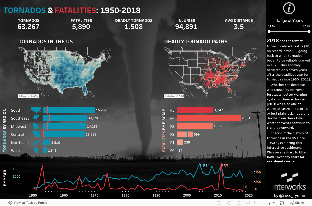
Nationwide, we have seen a similar trend. Last year (2018) had the fewest tornado-related deaths on record in the US, going back to when tornados began to be reliably tracked in 1875. This statistical anomaly occurred only seven years after the deadliest year for tornados since 1950. Even accounting for the spike in 2011, tornado deaths have been on the decline. Whether the decrease was caused by improved forecasts, better warning systems, climate change (2018 also happened to be one of the warmest years on record) or just plain luck, hopefully deaths from these killer weather events continue to trend downward.
How to Navigate the Dashboard
Check out the history of tornados in the US since 1950 by exploring this interactive dashboard. Click on any chart to filter. Hover over any chart for additional details:
New Features in Tableau
The purpose of this dashboard is twofold—first: to provide useful information about when and where tornados occur in the US; second: to showcase some of Tableau’s newest features. The new features used in the dashboard include the following:
- A Density Map was used as a replacement for hexbin maps to easily show where tornados occur most frequently.
- Set Actions were used to allow users to drill down from the region level to the state level and hide the state level when no region is selected.
- Transparent Sheets were used to overlay the data on top of a picture. Ironically, the picture used in the visualization of tornados in the US was a tornado which occurred in Manitoba, Canada.
- Viz in Tooltip was used in several places to provide users with additional details about where and what time of year tornados have occurred.
- A Rows to Columns pivot, a new feature of Tableau Prep, was used to prepare the data to make possible the Deadly Tornado Paths map.
Below is a navigation tutorial. You can see the different features of the viz in action:
Preparing the Data
The majority of the data came from the Storm Prediction Center of the National Weather Service. This data source did not have updated data for the final four months of 2018 (partially due to the government shutdown), so that data came from compiled NOAA data stored on Wikipedia.
Tornado data for Alaska and Hawaii has been removed; the two states have combined for fewer than 50 tornados and zero (0) fatalities since 1950. My intention is to keep the dashboard current with the latest data, so please check back for updates.