Images on your dashboard, combined with visual best practices, make a huge difference when it comes to the impact of your work. My years of experience as an analytics consultant in Australia have told me that dashboards are judged by stakeholders on four criteria: data, message, performance and look. Surprisingly, look is often what “sells” the dashboard to the report consumers, while it’s the other three that provide the value.
Creating a design that pops off the screen and builds user excitement is one area that is least explored by Tableau bloggers and Jedi. My goal with this blog (and future posts) is to make beautiful design accessible for even the most left-brained Tableau Desktop users.
Let’s start by exploring how we can use transparent images. We’ll take the ideas below and combine them into a before-and-after dashboard at the end.
Using Transparent Images in Tableau
We’re not really talking about transparent images but rather images with transparency. This means an image has a transparent background, so it can sit anywhere on your dashboard and blend in seamlessly. Any sort of image editor (e.g. Paint, GIMP, Photoshop) can create a transparent image, whether it be a GIF or a PNG. Microsoft Windows ships with MS Paint installed, which can be used for this. Here’s an article on using MS Paint to do just that.
Of course, there are far more powerful image-editing tools available. As a former web developer and designer, my preference is Adobe Photoshop. I also prefer to use PNGs because the anti-aliasing around the transparent edge is much cleaner than a GIF, particularly on any rounded edges:
![]()
Above: PNG, 4Kb
![]()
Above: GIF, 1Kb 3
Another consideration is the size of your images. They are incremental to the size of the work, so you need to make sure you optimize them as much as possible. It might be tempting to take an image of any size and hack it into your dashboard, but you might pay for it with slow loading times if the image is too big or blurring if the image is too small. Photoshop is ideal for this task. PNGs are a bit larger in file size than GIFs, but a few extra KBs is worth it for the final product.
Incorporating Icons in Tableau Desktop
I primarily use PNGs as icons in my dashboard. This is also one of the easiest things you can do to make your visualization stand out. There are a ton of icon-worthy images that can be found on Google without restriction on their usage. Icons are great to break up number KPIs or serve as buttons, whether for dashboard actions or filters.
A couple of tips to keep in mind:
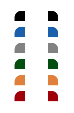
- High-color icons are often too busy. A single-color icon, often a dark color (black, navy, grey, etc.) or white is more effective and less busy to the eye. Remember to factor your icons into your overall dashboard color palette.
- Remain consistent in style. For instance, if the icon has bold, thick lines, then match all of the icons to that style as best you can.
- Don’t go overboard. Generally speaking, fewer of something is often the better choice.
- Keep it intuitive. Choose an image that makes it obvious what the icon represents without too much guessing.

Above: Some sample icons. Permission is granted to use these however you need.
Intentionally Designed Titles
Shading your worksheet titles on a dashboard is a great way to create structure and a visual flow. Tableau Desktop comes with innate style features for titles that include font, shading and borders. What Tableau doesn’t allow (yet) is using a pattern fill or rounded corners. These are also very easy to create, particularly if you use the minimum amount of imagery combined with dashboard containers or text objects that are formatted to match the style:
Above: Some rounded corners. Again, permission is granted to use in your work.
Place these on either side of a text object formatted to the same color inside of a horizontal container. Then take that horizontal container, and place it in a vertical container with whatever object is second in the order. In Tableau terms, it would be constructed like this with each grey box representing a container or sub-division of a container:
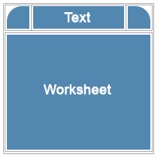
The borders above are intentionally placed to make it easier to see how they are put together. In actual practice, you’d set the cell spacing to zero (0) with no borders. Creating it in this way allows for a lot of reuse of those two images because you can resize your title background or the container background to whatever is needed.
Designing Effective Backgrounds in Tableau
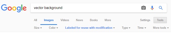
You can also use textures for backgrounds. If you don’t have a marketing department serving up brand standards and images, then do a Google search for vector background with whatever additional keywords you need. Make sure to also include the Labeled for reuse or Labeled for reuse with modification option under Tools to get images that are free to use:
I will be modifying the image by cropping it down and putting text on top of it. From my search results above, I might use this image to create a dashboard container that looks like this:
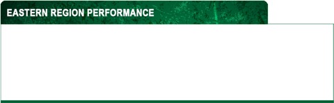
That background image is sitting on top of a dashboard container with a similarly green background and a green border with padding of three (3) on the bottom edge. There’s a floating text object sitting on top of my PNG. Whatever object that is inside the container has the white background.
The Before and After Dashboards in Tableau
Now, let’s apply all of these ideas to a dashboard using Tableau’s Global Superstore data source, along with all of the innate style features offered by Tableau. Here’s a screenshot of a very plain Before dashboard:
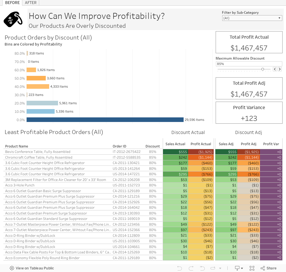
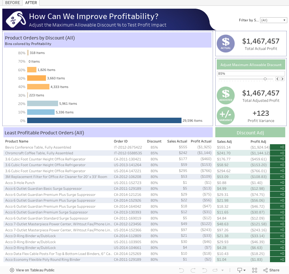
And now the polished After dashboard, as published on Tableau Public. I think it’s clear that just a little bit of extra work on the design can make a massive difference in the wow factor of your Tableau creations. Cheers!