
We have now reached the final part of our Tableau Tables Trilogy. For this part, we will be covering what I call the table/chart combo. Why do this? The reason is quite simple. More often than not, people consume data in a table format, spending years consuming tables in Excel, PowerPoint or even Word. So, it is only natural that their go-to data visualisation is a table. This mindset is often so ingrained into the concept of “if I don’t see all the numbers, then I can’t trust the data” that is challenging to convince them otherwise.
However, by introducing small elements such as colour, icons and charts, we can almost re-educate our brain and accept the use of visual aids. Here is where building a table/chart combo can help us start many conversations and change many mindsets, too.
How to Do It Then?
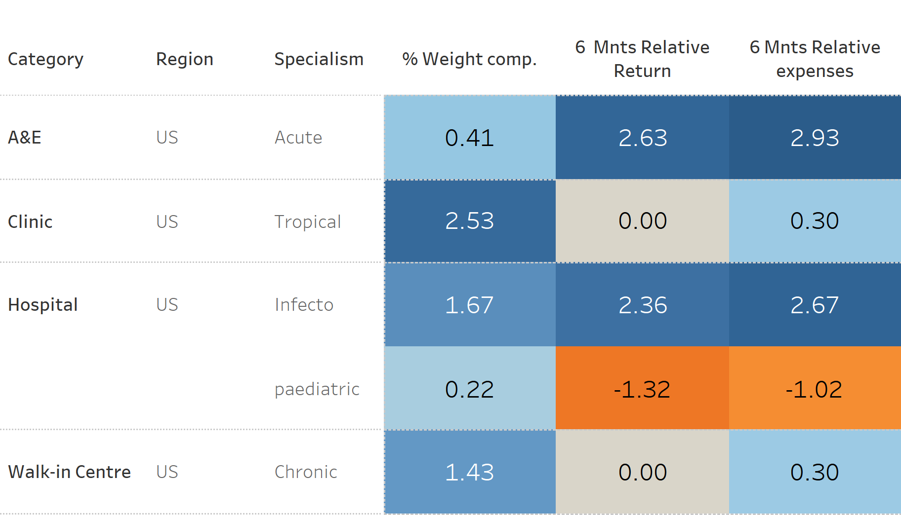
- Create a table with the data you wish to display:
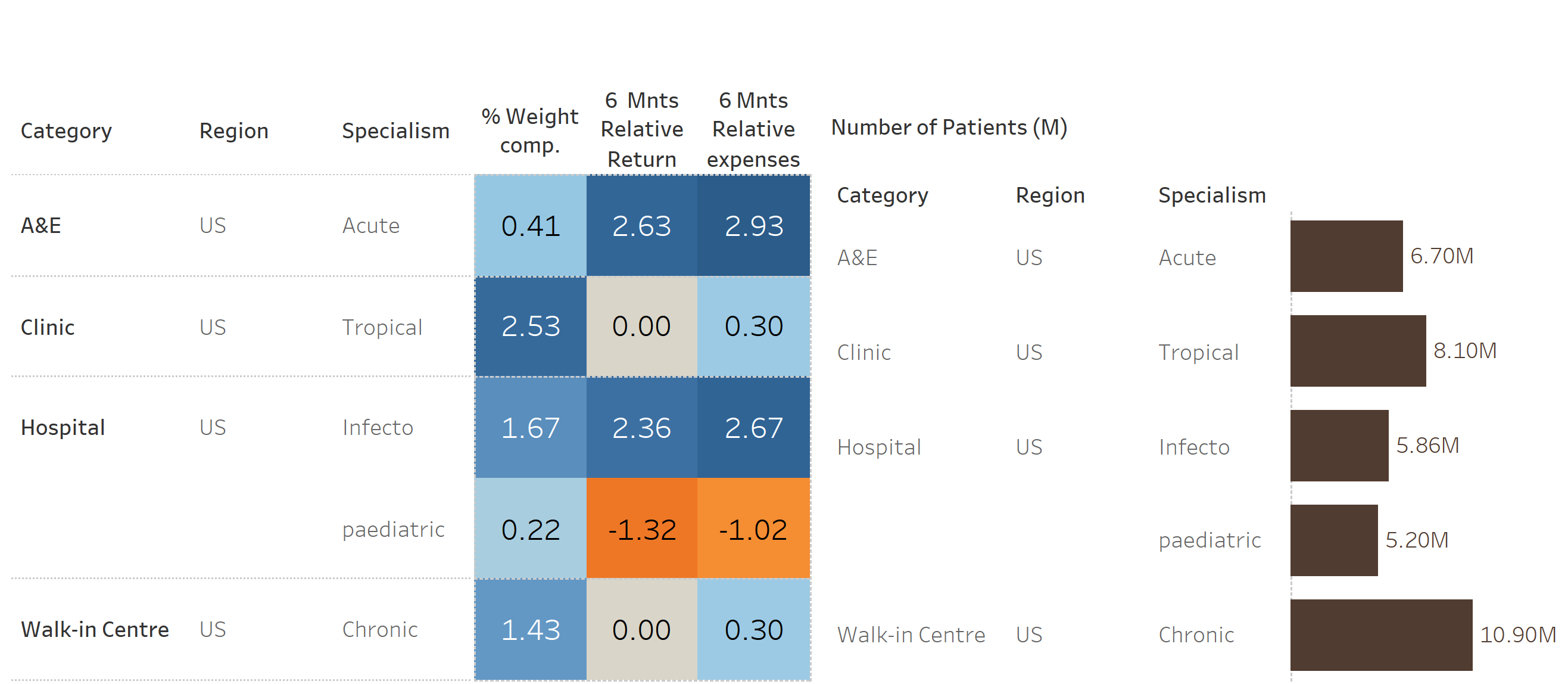
- Create a bar chart:

- In a dashboard, combine the two elements:
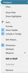
- Maintaining the order of the headers (categories) consistent between the two elements of visualisation (table and bar chart), we can now remove the headers of the bar chart.
To do this, you can:- Right-click on the header and untick the Show Header option from the drop-down menu, OR …
- On the bar chart worksheet, click on the character
 of the Dimension field and untick the Show Header option from the drop-down menu.
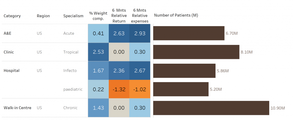
- Adjust the titles and fonts, format colours as preference. You can also add the highlight function across the two sheets so you can simultaneously see the elements of both sheets.
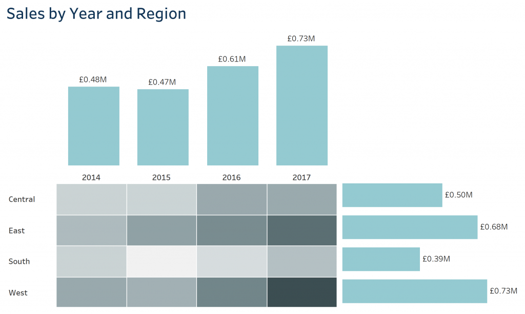
Another option for your visualisation is to use a highlight table and two bar charts like in the following example. Here the highlight table is displaying the sales by region and year, the vertical bar chart showcases the total sales per year and the horizontal bar chart shows the total sales by region:
Thank you for reading. If this is the first blog of the trilogy that you are reading, please don’t forget to read Part I and Part II. Happy “Tableauing” everyone!!