
Following the previous blog post, today we will be covering several ways to display negative values in tables.
My go-to option is to add colour to the visualisation to highlight the values that need attention; however, there are different ways we can use colour. As in any other type of analysis or visualisation, we must always keep in mind the purpose and audience.
Option 1
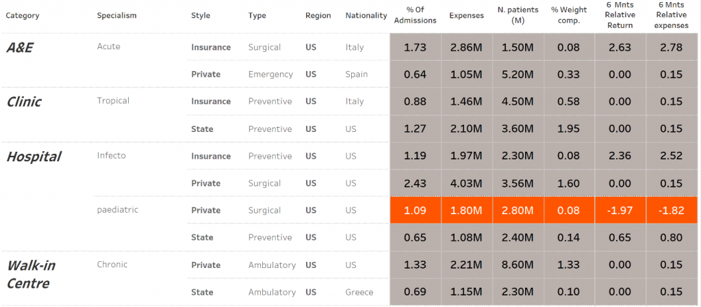
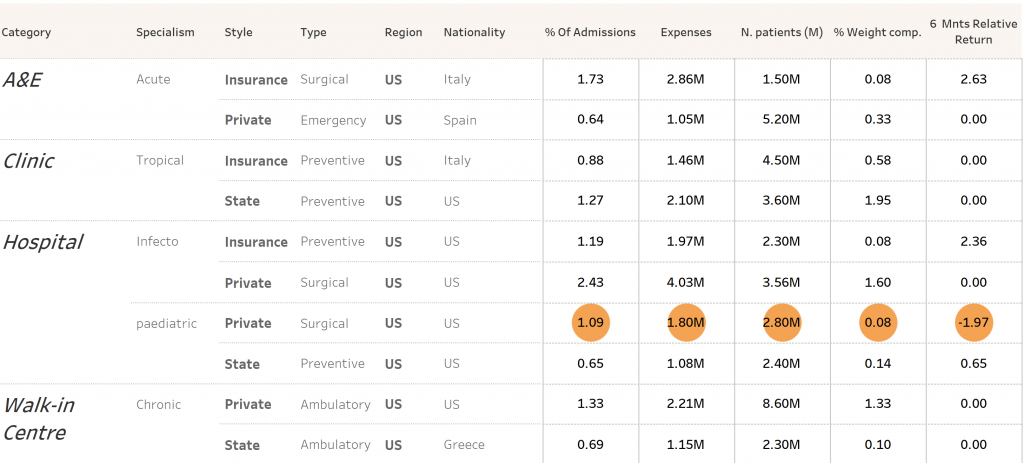
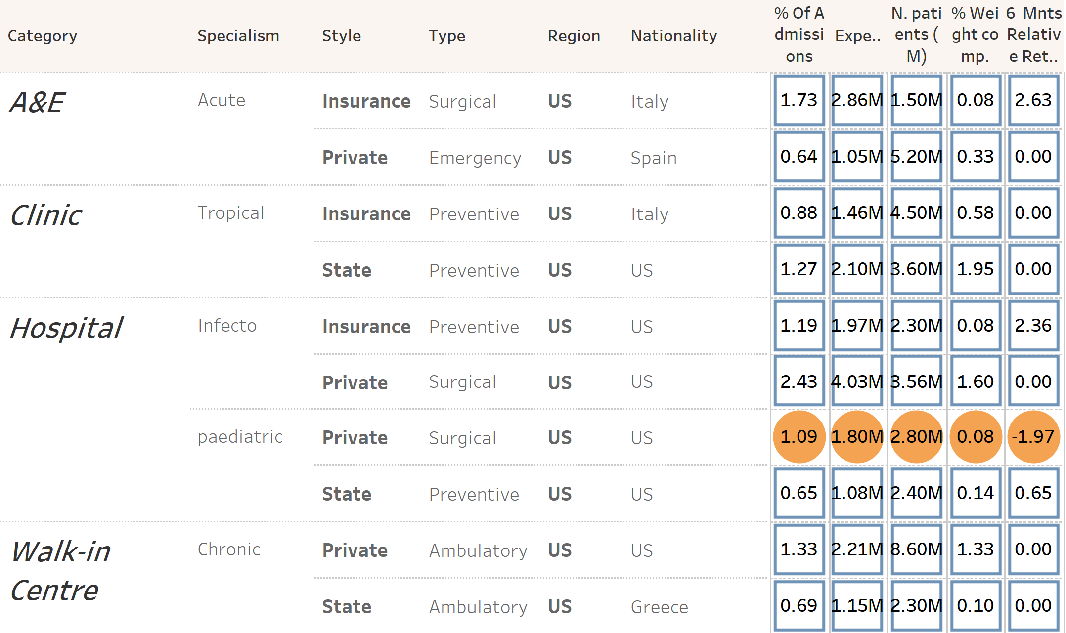
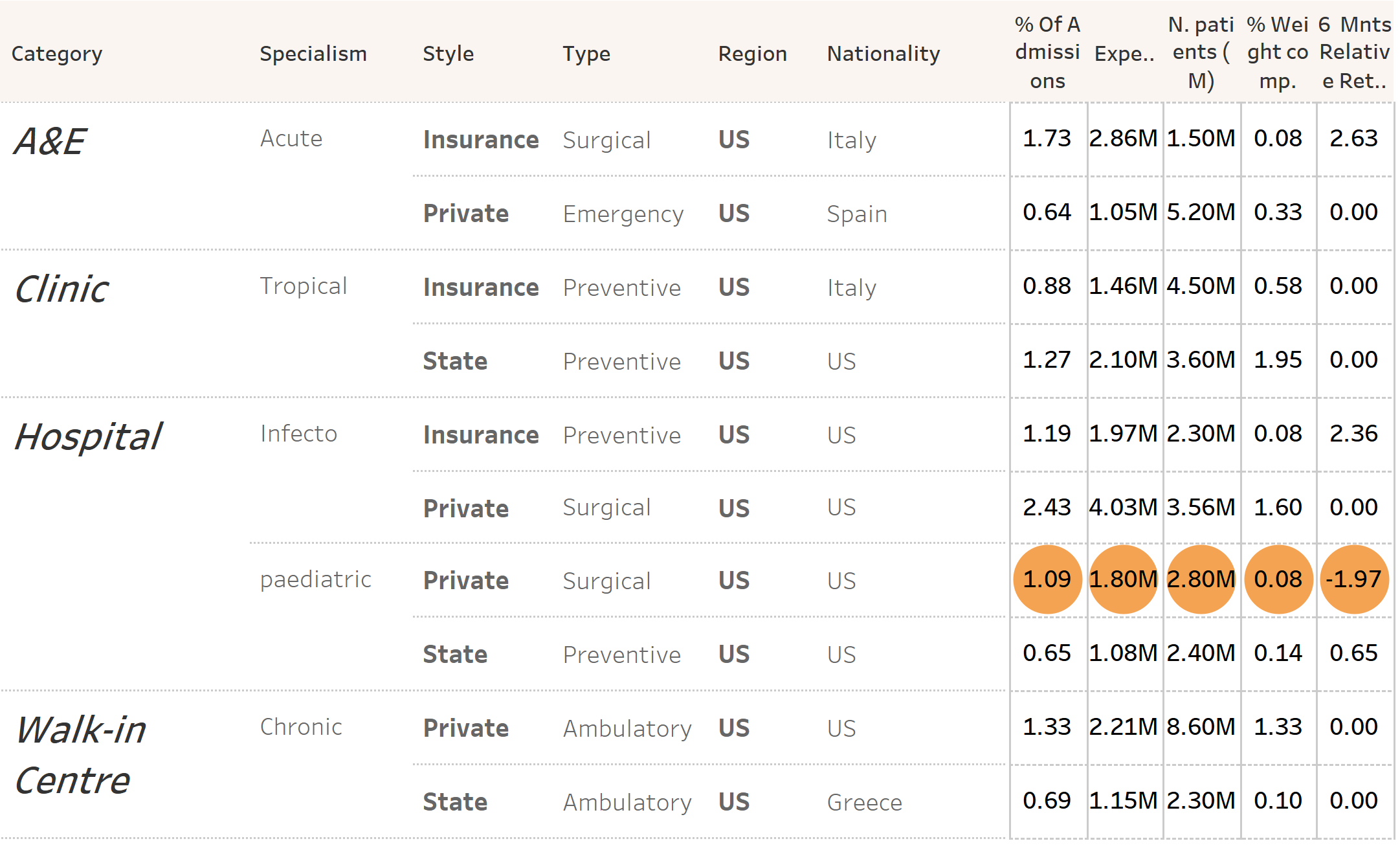
Use of colour to show negative values when the table displays more than one measure.
Use Case: The aim is to colour the row if any dimension is negative.
How to?
- Create a table with the data you wish to display.
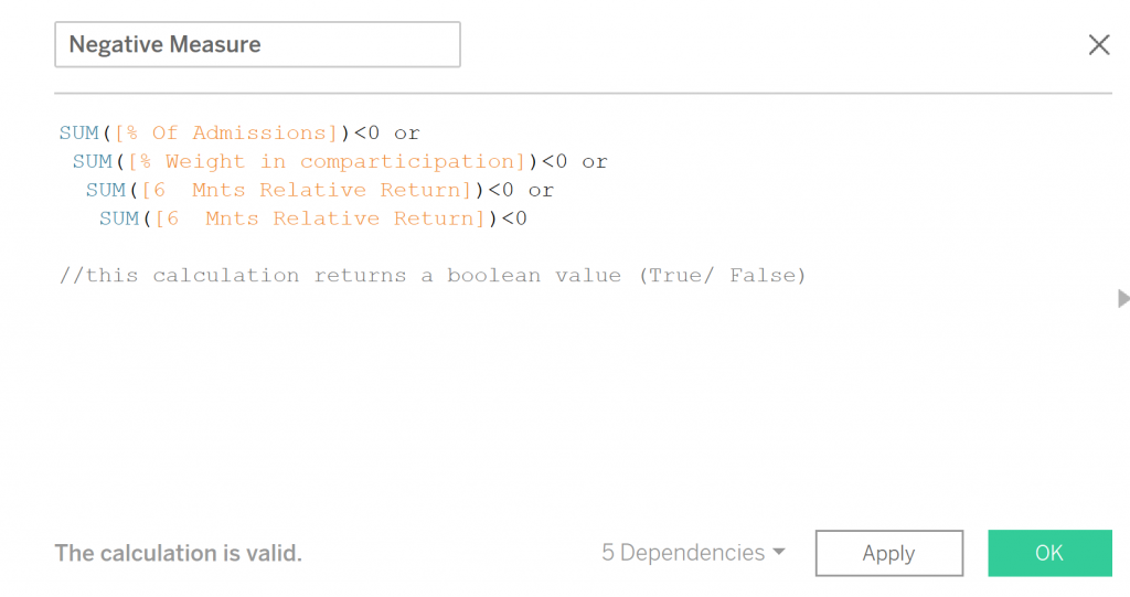
- To colour a row where all the measures follow the same condition, we must create a discrete calculated field with the conditions we want to be highlighted, like so:
- Add the recently created calculation Negative Measure to the Colour Marks card, and change the mark type to Square.
- As we did on the Part I blog, resize the square so the colour fills all the corresponding cell. For this use the slider to the maximum size.
- Create an empty field so we can have a separation between the cells. To do it so, double-click in an open area on the Columns shelf, type two quotation marks and hit the Enter key:

Hide the headers of the blank dimension by right-clicking on the newly created dimensions and deselecting Show Header. - Format the colours, headers and font using the Format pane.
Option 2
Use of colour and ASCII code to show negative values when the table displays more than one measure.
Use Case: The aim is to colour the row if any dimension is negative but without overwhelming the end user. Simple and sleek tables.

How to?
- Follow steps 1 and 2 from the Option 1 table
- Add the recently created calculation Negative Measure to the Colour Marks card
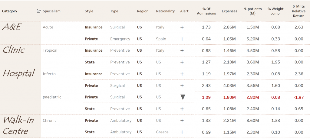
- Add the ASCII code: U
 se of ASCII code as an alert (!) where it is only present when any measure has a negative value. For this we need to create a calculated field where we state that if any measure is negative, return ◉. If not, then blank. Like so:
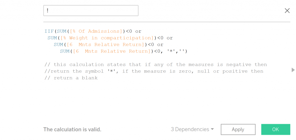
Note: To add the ASCII, I just go here and copy/paste it in Tableau (in the calculated field).▼ + Use of ASCII to not only show negative values (▼) but also positive values (+).For this, we need to create a calculated field such as:
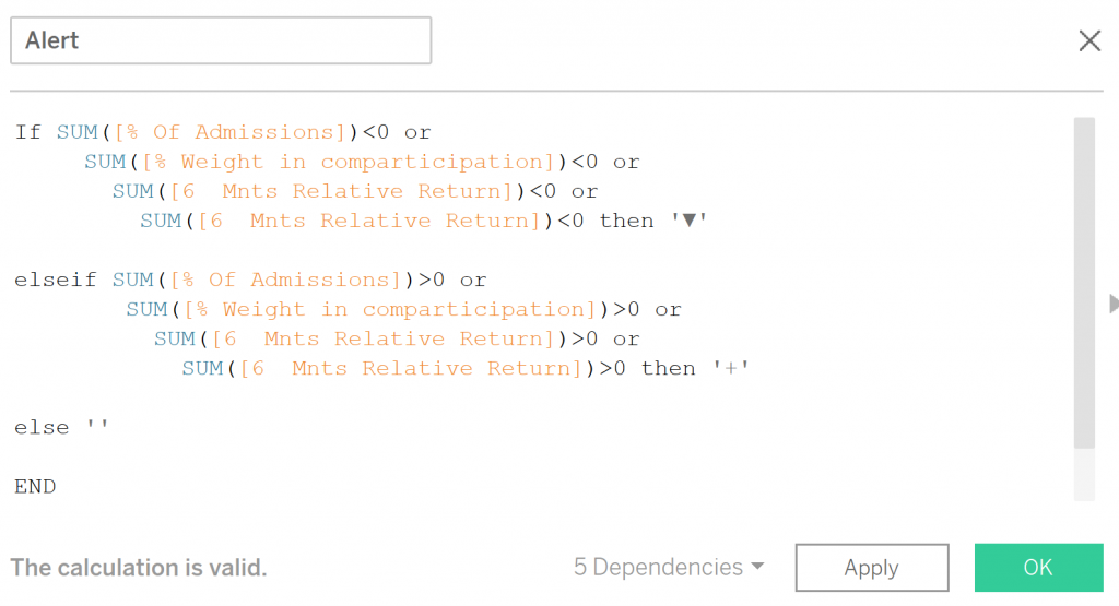
This calculation states if any of the measures displayed has a value inferior to zero, then show ▼. If greater than 0, then show +. For the remaining options (null or =0), leave it as a blank. - Add the new calculated field (! or Alert) to the rows.
- Format table using the Format pane (right-click anywhere on the view, choosing Format).
Option 3
Use of colour and shapes to show negative values when the table displays more than one measure.
Use Case: The aim is to colour the row if any dimension is negative but without overwhelming the end user. Simple and sleek tables.
How to?
- Create a standard table.
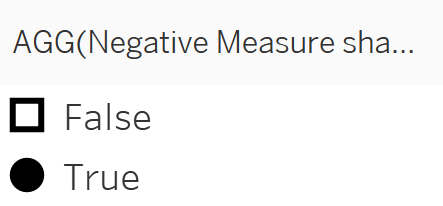
- To be able to use two types of shapes and two discrete colours, we need to create a calculated field like:

- Add this new calculated field Negative Measure to the Colour Marks card and change the mark type to shapes. Drag the same field once again, but this time add it to the Shapes Marks card.
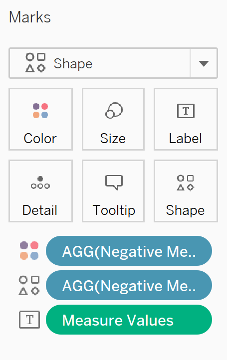
- For the shapes, choose a filled shape for negative values.
- Change the colour of the hollow shape, matching the background of your worksheet/dashboard.
- Format table as needed.
Stay tuned! In Part III, we will cover table and chart combos.