The idea behind this blog post is to document a novel approach I have come up with to allow for date selection in a report that defaults to the most recent time frame. There are multiple ways this sort of problem can be solved. My solution has likely been done by someone else in Tableau and they came up with a catchy name for this trick, but for now, I clumsily refer to it as “that thing where you use an LOD calc and put the action filter in context,” or LOD+AFIC. Feel free to comment with a better way to refer back to this process.
Consumer Complaints Example
Rather than start with a detailed explanation, check out the example below. The report defaults to showing information for the most recent week in the data set while allowing the user to quickly filter to prior week(s) by clicking on the line chart. This dashboard shows the number of consumer complaints reported to the CFPB (Consumer Financial Protection Bureau) with the most recent week’s complaints shown in all but the line chart above the map with the complaint count by week for the last 104 weeks (2 years) displayed. The data behind this is a static sample, but it would be most useful when hosted in a Tableau Server environment where the data source behind the dashboard was regularly updated and the displayed portion automatically rolled forward to show the most recent week/day.
Background on LODs
Ever since LOD calculations were introduced in Tableau, one of my favorite tricks was setting a dashboard to automatically update to show the most recent time period in a dashboard based on the most recent date in the data set. Where this would fall short was when a user would want the ability to see the report for a prior time period or range of dates. My options then were often to either add a parameter switch to allow for date selection or use a relative date filter. Both of these become problematic if the user wanted to select a particular timeframe, let alone expand how far back the timeframe went.
The relative date filter also was not a good fit for data sets that were updated intermittently, such as on a weekly basis since the anchor date had to be set in reference to today or a fixed date and could not move relative to the data set. This example allows the report to default to the most recent week but allows the user to easily select a prior date or range of dates and see the report update. I have moved away from having the user interact with a filter menu and instead use an action filter to quickly select a week(s) of interest. Personally, from a design standpoint, I want the user to explore the data as much as possible without having to make a selection in a drop-down. When you select a week with an action filter, you make an informed choice with an understanding of what was happening that week and the weeks around it. When a user selects a time frame from a filter menu, they lose this context.
So, what all is going on here?
How to in Tableau
Parameter
A parameter-driven calculation is set to show the most recent 104 weeks with the number of weeks adjustable based on a parameter. The last two years is likely a more than sufficient timeframe for the average user, but I left the parameter displayed for the edge cases that want to go all the way back. The calculation checks if a date is older than the number of weeks in the parameter input from the max date.

Now that I have trimmed down the timeframe, we can move on to the fun part which involves two components: an LOD calculation to respond to the number of weeks selected and a date-based action filter set to be in context.
LOD Calculation
We need this calculation to do two things: return only the most recent week when all weeks are selected and, when less-than all-weeks are selected, let everything through for the action filter to decide what to show.

Action Filter
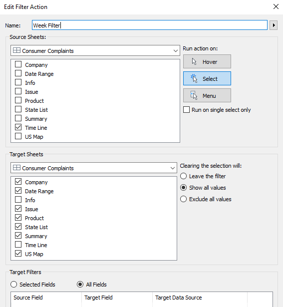
Once the filter above is in place, we can set things up in the dashboard. We just need to add a basic action filter to pass through a date value from the timeline. After it has been applied, right-click on the filter and select Add to Context. To avoid having to repeat this on each sheet, we can right-click on the action filter, select Apply to selected worksheets and push the in-context version out to the relevant sheets.

After that the dashboard is ready! The only major caveat with this sort of setup to keep in mind is that if the number of weeks in the parameter exceeds the range of the data set, the charts default to showing everything as called out by the date range displayed in the top-right corner instead of just the most recent week.
Map and Bars?
This dashboard repeats some of the same information in the map and “by state” bar chart. So, why waste space with repetition? The map is in place for visual interest and helps with the understanding of geographic presence when filtering by company. The bar chart allows for a quick ranking comparison and a place for records not shown on the map of the continental U.S. (Puerto Rico, Hawaii, Alaska and N/A). A highlight action filter helps link the state selection from either chart.

