The Journey Begins
In my 18+ year career, I’ve been around data in many different forms and fashions. From roles as a DBA to those in innovation and business intelligence, data has always been integral to what I do. I love data. I can remember playing around with Excel back in the early 90s in high school – usually around sports data. So, when the time was right, I was super excited to get started in my new role as Regional Solutions Lead at InterWorks. I wanted to get off to a good start with my first blog, so take a wild guess at the topic … that’s right, sports. Specifically, baseball.
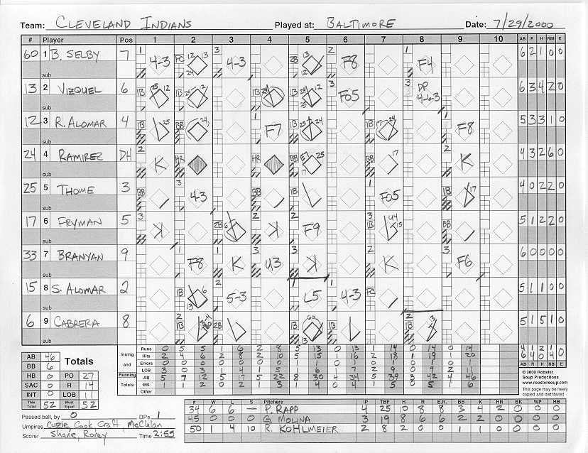
Of all the major U.S. team sports, baseball has been historically the most data-friendly. My first goal in this undertaking was to recreate a baseball scorecard. I used to keep score for my dad’s softball league as a kid, and I scored almost every Atlanta Braves playoff game in those magical 1991 and 1992 seasons.
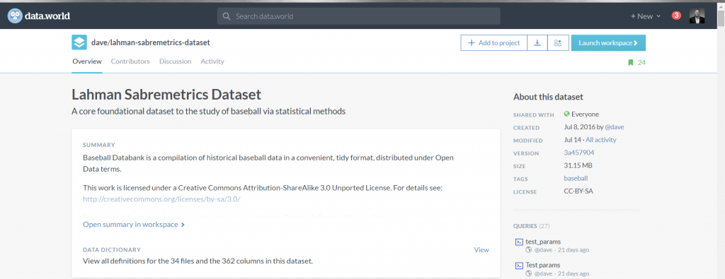
With projects like this, it always comes down to the data. I just had a hard time finding good (free) play-by-play data. In my search, I came across this Lahman’s Sabermetrics dataset on data.world.
I downloaded it and started to work. What happened next was quite unexpected.
Data Discovery with Tableau
I spent my first 13 years at Chick-fil-A and discovered the game-changing power of Tableau in my last role there. I brought Tableau to Arby’s in 2013 and spent almost five years there building out the function, working with the business (I sat in IT) and helping everyone get better at their data. Because I sat in IT, most of the projects my team worked with were complex dashboards that required an additional skillset or access to data. Rarely did we get to do true data discovery in our role. That work was done by financial, operational and marketing analysts. We simply facilitated the ability and enabled the organization to do the work.
The first thing I did was take a peek at Dave Lahman’s dataset and the structure of it:
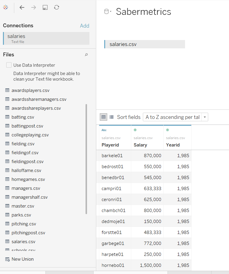
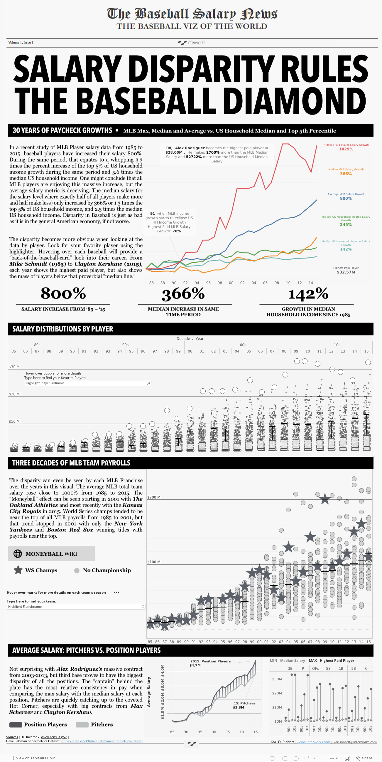
The data that caught my attention was the salaries.csv. I was fascinated with baseball players’ salaries since middle school. In the seventh grade, I remember calculating how much Jose Canseco made per hour he was alive when he signed his big contract in 1990-1991 (I think it came to about $550/hr). I dove into the dataset with a theory: “I bet the 80/20 Rule applies in baseball salaries.” What I mean by that is 80% of the total team salary is being paid to 20% of the players. I also brought in some key dimensions and some of the baseball statistics (more on that later).
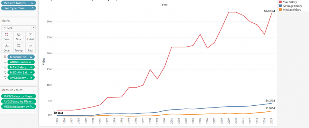
With my heavy statistical background from my industrial engineering education at Georgia Tech, coupled with the many data-driven roles I served in over the years, I knew that I would be leveraging some basic statistics like median vs. average and looking at maximums. I built some calculated fields and constructed this first viz:
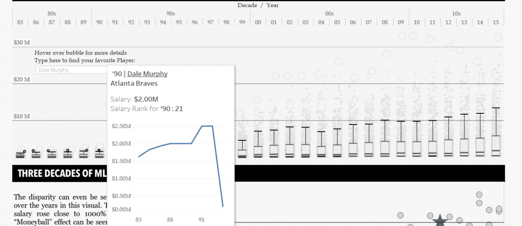
I wanted to see more details, and while this viz shows the disparity implied with an 80/20 Rule theory, so I changed lines to areas and added the box and whisker plot:
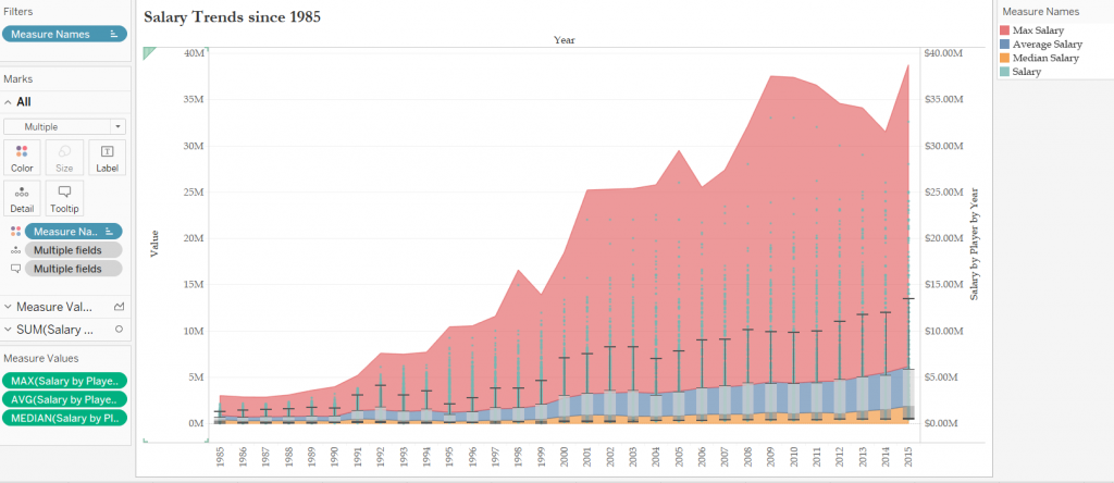
I used a dual-axis area plot to show the “coverage” of salaries from 1985 to 2015, then I used a box and whisker plot to show the distribution of salaries.
Then it happened.
I had heard about “being in the flow” at Tableau Conference. I had seen it during Tableau User Group presentations. I had colleagues use the tool to find answers quickly, but I had rarely had this experience since my first interaction back at Chick-fil-A (version 7.0 by the way). I found myself creating new worksheets to answer each question I had about the data. And with each visualization, I asked another question, and another.
With each viz, I was either getting closer to an answer or realizing that I needed to go down another path. This is one of the things that makes Tableau so powerful. With each visualization, a new answer or insight is possible. I created histograms of salaries by team, position and year. I created scatterplots to answer different questions about team wins vs. team salary as well as salary vs. hitting and pitching metrics. I even tried to recreate the backside of an old baseball card as a viz in tooltip:
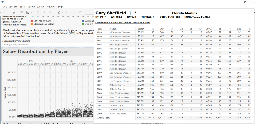
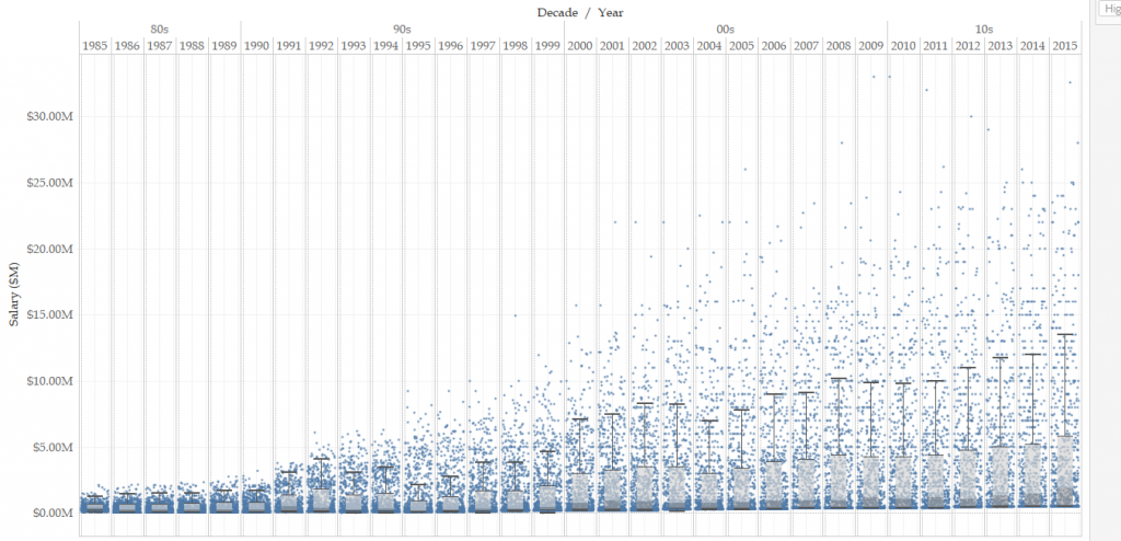
But it was too busy and hard to derive insight from it. As it turns out, my favorite viz was the box and whisker plot. It showed the disparity story the data was now telling me, and it also reminded me of a “stadium” the way the marks representing each player slowly moved higher on the plot until 2015.
By this point in my journey, I had already decided on a theme: the old “Sporting News Baseball Newspaper.”
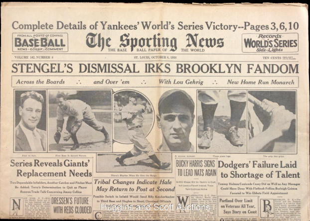
I chose this for two reasons. First, I grew up loving the sports page of the newspaper. Second, I used color as a crutch a lot in previous Tableau visualizations. A wise man (Dan Murray) challenged me long ago to “make it right in black and white” first. This theme would force that. I was then able to pick the right visualizations from about 30 I had created, but it wouldn’t be a traditional “dashboard” with the newspaper theme. I had to focus on storytelling and personalization.
Conclusions
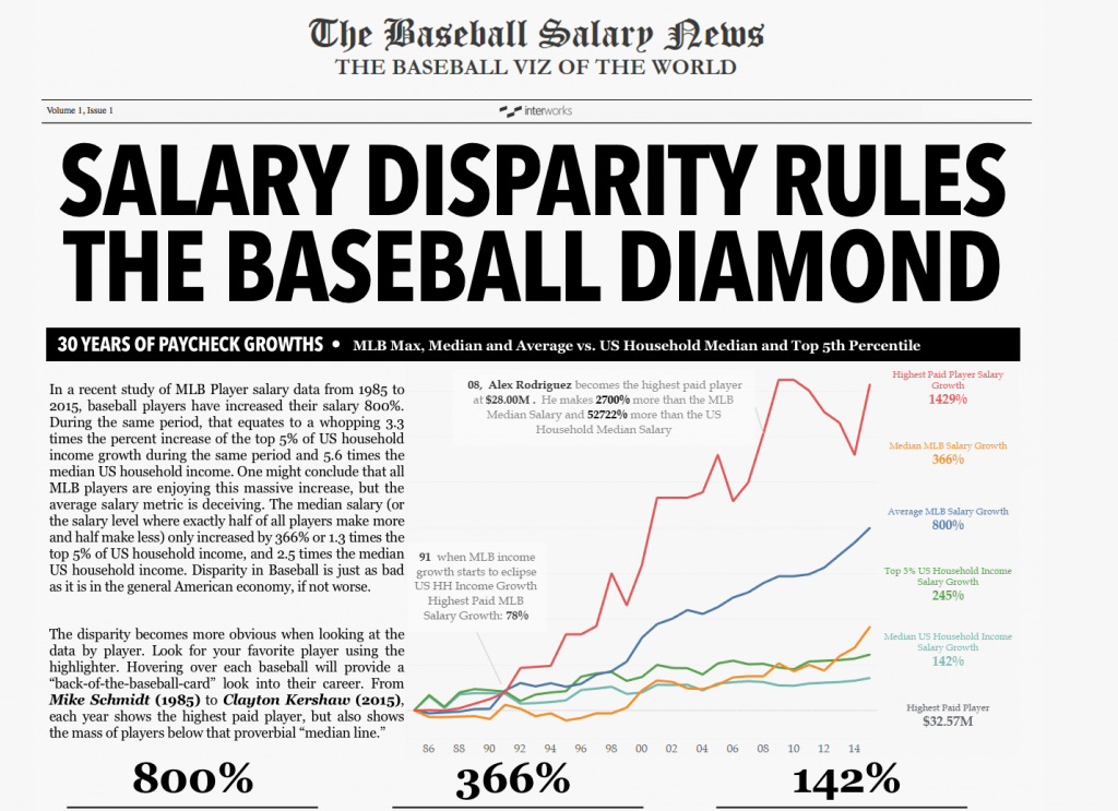
I know that a good data visualization tells a clear story. Like a newspaper, the headline is key. So, I used that first visualization but added in average household income growth to give readers a context. Millions of dollars in salary is so foreign for most of us. Comparing the growth of baseball salaries with average household income gives context:
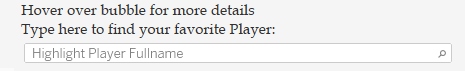
I know that a good data visualization draws users in when the data can be personalized. I added in the highlighter to my “favorite” viz so users can search for their favorite player (mine from my childhood was Atlanta Braves legend Dale Murphy):
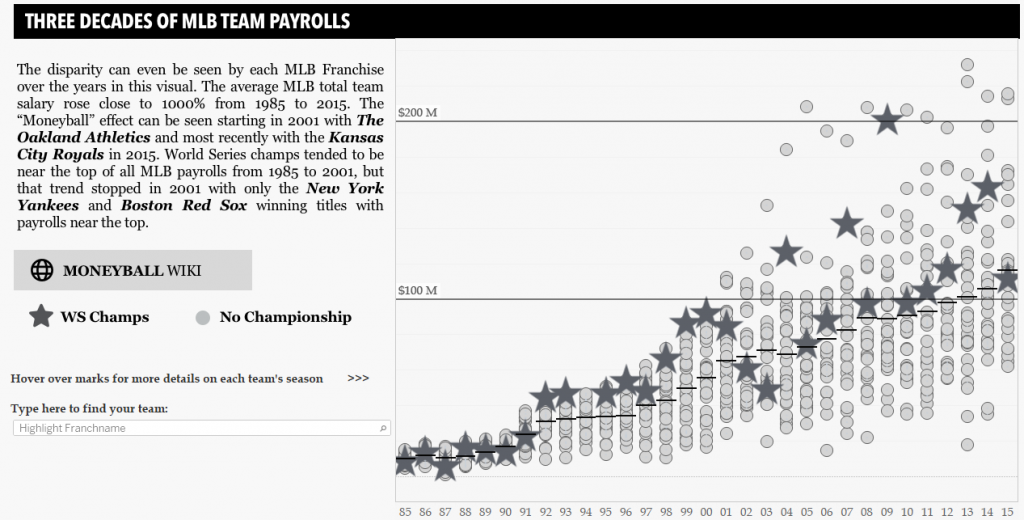
For you “Moneyball” fans, you can see the trend the Oakland A’s set in 2001. Prior to the 2001 season, the winner of the World Series was generally one of the highest paid teams. After that, only the Red Sox, Yankees and Giants won the World Series as one of the three highest paid teams:
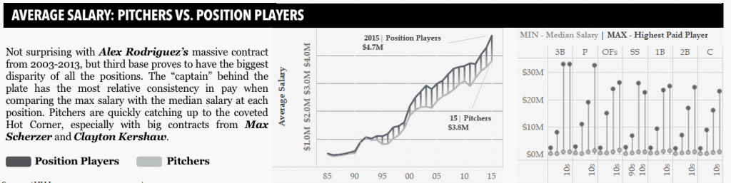
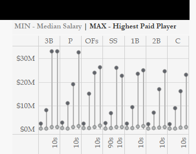
My curiosity led me to ask which positions had greater salary disparity. Due to Alex Rodriguez’s massive contract, third base stood out as the biggest disparity position:
Ultimately, my conclusion is that salary in baseball is increasing in disparity, especially when compared to household income growth (median and top 5%) over the last 30 years. But so many more questions can be answered with this dataset and with this fantastic tool.
In an environment where data discovery is so easy, the mistake one can make is to do too much. Just think about it as you go through the dashboard yourself. What other questions do you have about the data? What curiosities could you ask about? Download the workbook and try some for yourself. That’s what a great data visualization tool like Tableau allows you to do.
Note: For a more immersive dashboard experience, check out this wider version on Tableau Public.