
10 Questions is an ongoing blog series in which Tableau Zen Master Dan Murray interviews some of the brightest folks in the world of data.

I’ve been aware of Juice since before my days as a consultant. Around 2007, I found Juice Analytics because they were serving-up some very useful blog posts on data visualization before it was a household word. In particular, I loved an Excel add-on they had called the Chart Chooser. Zach is the CEO, and his brother and Co-Founder Chris is the CTO. They also wrote a good book on communicating with data called “Data Fluency.” Currently, Juice is changing from a consulting organization into a product company.
The Questions
Q: What is Juice Analytics? What do you do?
Gemignani: Juice is the company behind Juicebox, a new kind of tool for visualizing data. Juicebox was built on the premise that the best data in the world is useless if the everyday decision maker can’t understand it and interact with it. Our approach is based on turning data into a conversation, not just a presentation; creating a more “designful” experience for the end user; and delivering a complete solution, not a build-it-yourself kit. The result is data that gets understood, socialized and acted on.
Q: How has your company changed since you founded it in 2004?
Gemignani: Some things have changed radically, others are very much the same. For many years, we were a design and development company that created customized web dashboards for our clients. Now, we are a SaaS product company built on that decade of consulting experience and best practices. Ten years ago, Chris – my brother and co-founder – and I were in my basement creating elaborate Excel spreadsheets on our laptops. Today, we have offices in three states and build our product on the cloud using web technologies like D3.js, Python/Django and Redshift.
Our mission hasn’t changed. Early on we used the phrase “the last mile of data analytics” to refer to the challenges that so many data people struggle with. It is the problem of communicating your analysis and data insights in a way that anybody in your organization can understand and act on. We saw this issue in 2005 and still see it in 2015. We’ve always been on the side of analysts who have put in the hard work but need to find effective ways to express that work, so they get the credit they deserve.
Q: How does Juice’s products differ from Tableau Software?
Gemignani: Tableau is, hands down, the best tool on the market to explore and find insights in data. It is a tool built for data analysts to make them super-powered in their role.
When it comes to delivering that analysis and data to a broad audience – like customer reporting or subscription-based data products – that’s where Juicebox is the right choice. Our platform creates engaging, data-rich, interactive web applications to tell the stories in your data. It also emphasizes things that other visual analysis tools do not. We have unique features for helping non-analytical people set goals, collaborate around what they see and guide them to take action.
Here’s an analogy that we like to use: If you are the brave soul who is striking out into the data wilderness to find something new, a versatile tool like Tableau is your best friend. However, if you are more like a safari guide who wants to ensure that your data tourists are going to have a great experience, take some memorable snapshots and make it safely back home without confusion, then Juicebox delivers those audience-friendly applications.
Q: I like your book “Data Fluency.” What motivated you to write it?
Gemignani: I hadn’t imagined myself as an author, but when Nathan Yau (author of “Visualize This” and “Data Points”) asked us if we wanted to write a book with his publisher Wiley, I thought it was an exciting opportunity. We’ve been blogging about data visualization for almost ten years.
There are so many great books for data visualization practitioners; I didn’t want to try to top those efforts. Instead, “Data Fluency” poses a different question: “What does it take to make an organization that effectively communicates with data?” Certainly that starts with people who have the right skills to analyze and visualize data. But it takes more: leadership that values data, tools and processes that create a “data product” ecosystem, and a culture that embraces data as part of how things get done.
We’ve worked with dozens of companies who haven’t yet put the pieces together. We thought we could give them a practical roadmap for creating the skills and culture for data-informed decision making.
Q: You were a management consultant at Booz Allen and Diamond Technology Partners. How did that experience inform the founding and design of Juice Analytics?
Gemignani: In hindsight, there is a sort of inevitability to founding Juice. Management consulting is all about synthesizing a lot of information into a coherent analysis, then communicating that information to the client as a logical story. If there was one skill I was known for in my consulting days, it was my ability to make good PowerPoint presentations. In my consulting glory days, people would ask me to “Zach-ify” their slide decks.
I took to heart the lessons about creating a narrative, narrowing to one key point per slide and supporting those points with data. Many of those approaches have shown up in our design work at Juice. The difference is that interactive data visualizations give the audience more power to craft the story to their own interests.
Q: Describe the “data-fluent” organization. What steps should companies take to foster a data-fluent culture?
Gemignani: In the book, we explain the four elements that come together to build a data-fluent organization. Here’s a figure that sums up the parts:
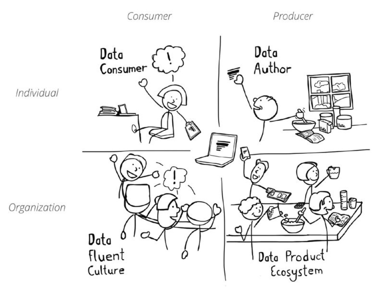
Of these, the most difficult to measure is a culture that embraces data. A data-fluent culture is built upon organizational leadership, shared understanding and conventions, and everyday habits and processes that make data communication a priority.
There are huge benefits to a data fluent culture: better problem solving, productivity as everyone speaks the same data language, ongoing performance improvement and commitment, and clarity around goals
Q: What is the Data Fluency Inventory?
Gemignani: In the book, we included a survey that helps organizations understand how far they have progressed at using data effectively and where they have strengths and weaknesses. For example, some organizations may have built a strong team of data analysts but lack top-down leadership that buys into the use of this analysis to drive decisions. In another case, your company may have the right tools and processes to capture, analyze and present data, but you struggle to create a culture where data is incorporated into meetings. The Data Fluency Inventory is a sort of score card that you can use to evaluate your own personal data fluency and how well your organization is doing.
Q: What design skills are helpful for people building dashboards?
Gemignani: I think building great dashboards is as much about a mindset as a skillset. Certainly you want to know how to use color (with restraint), contrast (for emphasis), select the right chart (99% pie-free) and label well (with jargon-free language). Beyond these skills, I focus on three things:
- Find empathy for your audience. Who is the user of this data, and how can you make them more successful? You can’t just pass on volumes of data and expect you’re doing someone a favor.
- Find the right question. You’ll need persistence and curiosity to keep asking: “Why does this information matter? What will people do with it?” Keep trying to find that clarity and simplicity in what you are saying with the data.
- Find the flow. I believe data is most accessible to people when there is logical beginning and a path to get to answers. Too many dashboards are simply a collection of charts, competing for your attention at the same time.
Q: Describe the Chart Chooser. Who are you aiming to help with that free tool?
Gemignani: There are two problems that never seem to go away in data visualization. First, people want to know: “What is the right chart for my data, given what I’m trying to express?” Second: “How can I make sure that chart abides by good chart design principles?”
Chart Chooser is a little tool we created years ago that helps you find the right type of chart and then, crucially, lets you download a nicely formatted Excel or PowerPoint version of the chart. It a simple thing, but it’s one of the most popular public solutions we’ve shared.
Q: What do you see happening in the data visualization marketplace over the next three to five years?
Gemignani: I’d like for the next few years in data visualization to bring the focus back to the people who create and consume data. With all the excitement about big data and machine learning, we sometimes lose track of the fact that people are the ones who define what data gets shown, what insights are insightful and what decisions or actions should be taken. People are more than recipients for analytical insights; they often discover the insight. They know things that aren’t in the data. They process lots of information and find patterns. They find creative answers.
What does that mean in terms of data visualization solutions? I’d like to see “people-first” data solutions that value the knowledge that data consumers have. Better tools would capture and use the information created by people as they explore, analyze and discuss data.
Data visualization also needs to be more than delivering information to people; it needs to consider how that information can transition into actions. I hope the future is less about one-way broadcasting of information and more about two-way collaboration about the meaning of that data
Discover More Interviews
Want to read more insightful interviews like this one? Then you’ll love our 10 Questions blog series. Check out the full list of interviews here, and stay tuned for new additions.
Need Help? Let Us Know!
There you have it. If you need help with your data infrastructure or Tableau, we have the experience, skill, and knowledge to insure your success. Contact us today to learn more.
If you’re in college and think you might want to get into this game, head to our Careers page and apply for one of our open jobs. We’d love to hear from you.