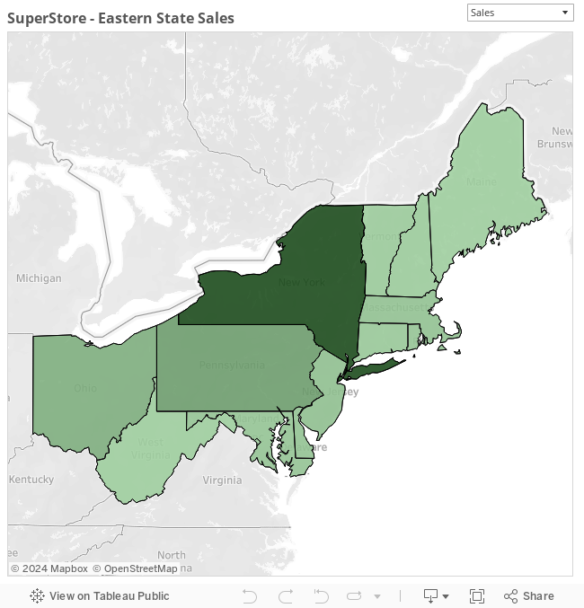
With built-in Tableau integration, using maps couldn’t be easier! Occasionally, however, we want to get creative and display more information within the map. Recently, I was asked, “When I have a parameter to choose which measure I want to view, how can I display a different color series in my map depending on which metric is selected?” Now, this is obviously just for visual flavor, as the end user would see in multiple other areas the selected metric, but the technique is a nifty trick with many different applications.
How It’s Done
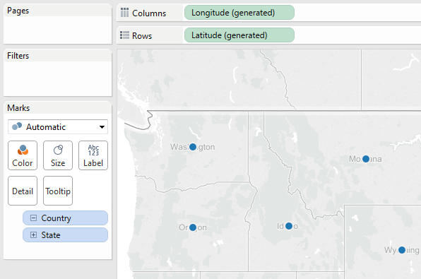
First, create a standard map with the data you would like to see. In my case, I simply added State to a map using Superstore data:
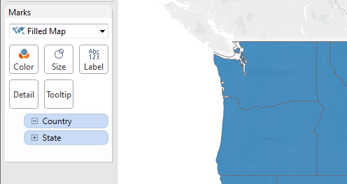
Next, change your map to a Filled Map in the Marks card:
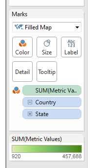
After creating the filled map, drag your base metric calculation to the Color shelf. This is the calculation that switches between your metrics. In my case, the calculation looks something like this:
CASE [Metric Selector]
    WHEN 'Quantity'
        THEN [Quantity]
    WHEN 'Profit'
        THEN [Profit]
    WHEN 'Sales'
        THEN [Sales]
END
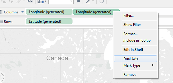
The next part gets a little trickier. Press the Ctrl button on your keyboard, click on Longitude, and drag it over on the Columns shelf. This will give you a weird-looking double map. To combine the two, simply right click on the second Longitude pill and select Dual Axis:
Now that we have our data in place, let’s add some coloring.
First, click the top Longitude tab in the Marks card. When it opens, you should still see your metric value field there. Instead of this field, drag the parameter field onto Color. Click through each of the options and give them a unique color. I like this area to have a bit of transparency, so click back on the Color button and change the transparency to 70%.
Next, click on the bottom Longitude tab in the Marks card. You should still see your metric value field here, as well. Open the Edit Color window. Select the grey sequential palette. On the right-hand side of the window, you will see a grey box. Click this and change the ending color to black. This will give you a custom sequential color for your top layer. Click Color again on this area and change the transparency to look like you’d like. I selected 45% for my example. This is the overlaying area that shades our various base colors, so feel free to adjust depending on how dark or light you would like your shading to be.
Throw it on a dashboard, adjust the look and feel as you’d like, and you are done! It is that easy! With a few simple steps, you can create dynamically colored maps in Tableau, too!