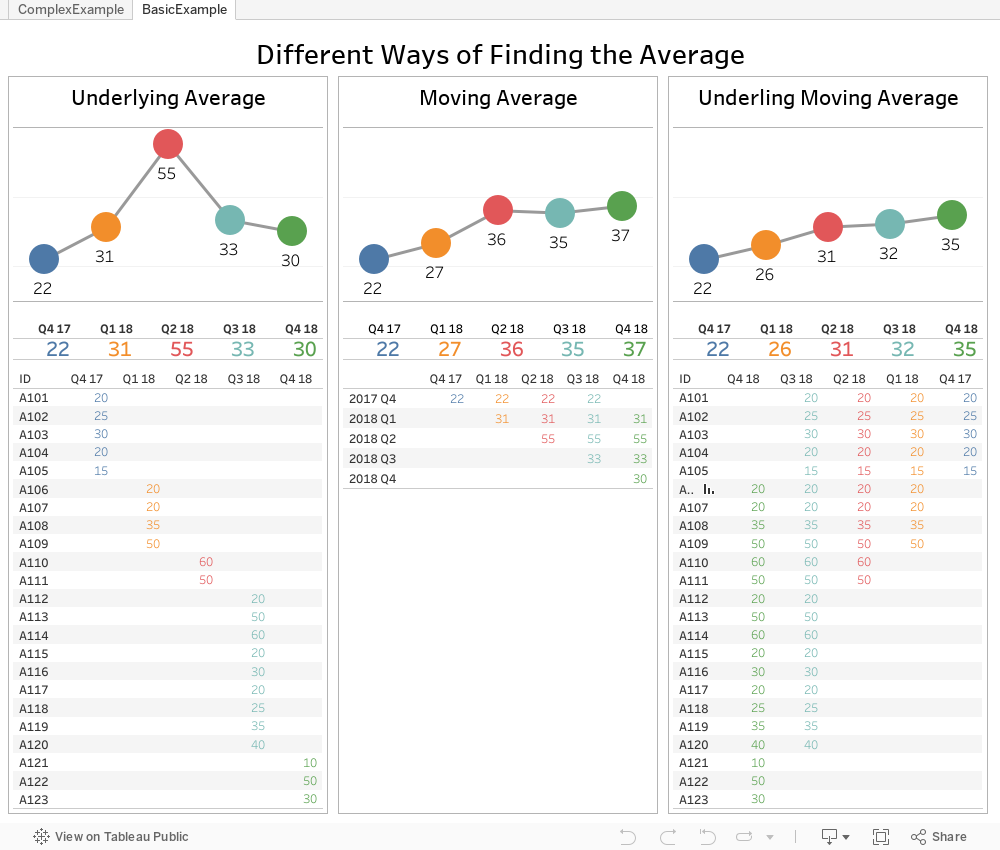
Table calculations enable you to do amazing things in Tableau. However, these work off of data that has already been aggregated. For example, a moving average is the moving average of the sum of some metric for each period. What if we needed a way to find the moving average of the underlying values instead?
Recently, a former Tableau Advanced Training student of mine reached out. They were stuck on a calculation they could not solve on their own. They wanted to find the underlying moving average—not the moving average with Tableau calculations. In their industry, it was important to track a moving average using the raw data points from the previous three quarters. For example, a transaction from 2017 Q1 should be part of 2017 Q2, 2017 Q3 and 2017 Q4.
Tableau cannot do this natively without manipulating the data. Each row of data can only be counted once in a visualisation. So, we will pad the data in order to create the additional rows.
The Need for a Cross Join
To do this, I utilised a technique that I’ve blogged about previously: cross joins. You can see the article on pivoting here, and the article on counting the number of active items given a start and end date here. The goal of a cross join is to join every row from one table to every row from a second table. If you had 40 rows in Table A and six rows in Table B, you’d now have 240 rows. In this example, we will create the cross join to have each original row be repeated four times and then make a slight change. This slight change will place the original 2017 Q1 data point in the additional 2017 Q2, 2017 Q3 and 2017 Q4 aggregations as well.
In this example, I’ve taken Tableau’s Global Superstore dataset. I’ve modified it slightly to add a few years to the dataset and remove any dates later than September 30 (I only want to show completed quarters). Then, I’ve joined this dataset to a small Excel dataset with only four rows of data.
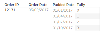
We create a join calculation on both the first table and this Tally table we are using for the padding. The value I’ve chosen is zero (0). This value is identical for each row of both tables. Now, let’s look at the result of the join (focusing on just one original row, which is now four rows):
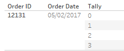
We have the extra rows of data, but now we need to utilise them. These extra rows and this Tally value will be used to create the additional quarters. We will do this with the following calculation:
DATE(DATETRUNC(‘quarter’,DATEADD(‘quarter’,[Tally],[Order Date])))
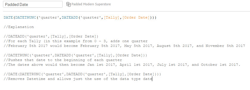
For each date we will add 0, 1, 2, or 3 quarters and set this date to the beginning of the quarter:
Now that we’ve padded the data, we will use this Padded Date in lieu of our Order Date field on our Columns shelf for the visualisation. We can then flesh out the rest of the visualisation to get our moving standard deviation at the underlying row level.