
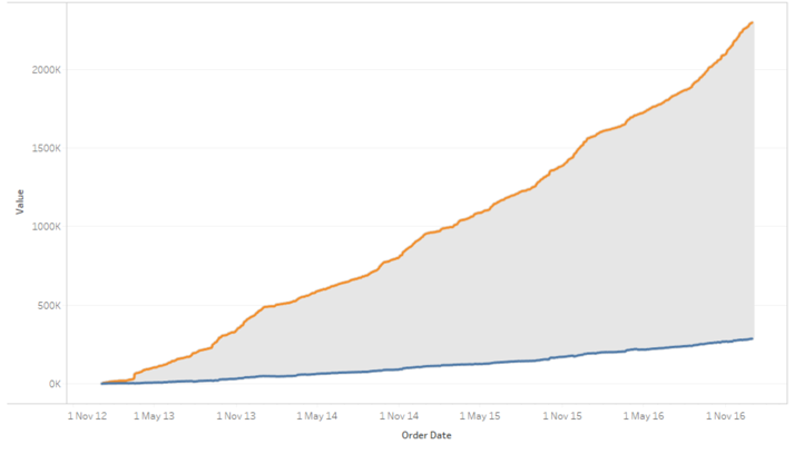
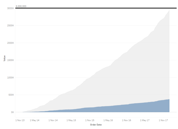
During the Tableau Conference on Tour in London last week, we were approached with a new challenge from one of our clients. The requirement was to highlight the delta between two running total lines, like this:
After spending the better part of an hour tackling the problem in typical Tableau fashion, it became clear that there were multiple ways to skin the proverbial cat. To skip straight to a working example, download the workbook here. In the below examples we are using the “Sample – EU Superstore” dataset.
Standard Running Totals
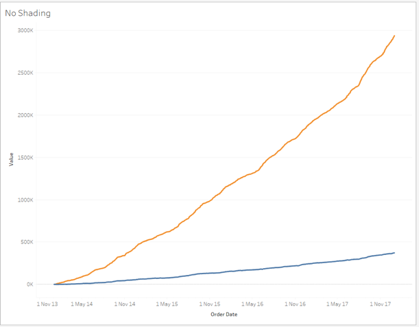
Achieving the two running total lines without any highlighting between is pretty simple in Tableau:
- Drag Order Date to columns as an exact date
- Drag Measure Values into rows
- Filter Measure Values down to SUM(Sales) and SUM(Profit)
- In the Measure Values marks card, right click on SUM(Sales) and SUM(Profit) in turn and set the Quick Table Calculation to Running Total
Following these steps should give you something similar to this:
Now to the fun part, shading the delta between these two lines. The first method makes use of area charts and a dual axis, unfortunately leaving a bit of clutter in the colour legend. The second applies lines in a pretty cool way to achieve a perfect result. If you are only interested in the cleaner result, please skip to the “Using Lines” solution.
Using Areas
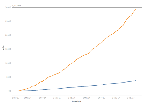
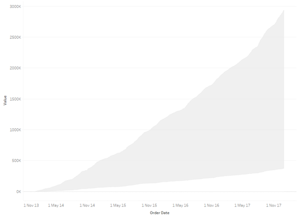
Area charts can be handy in Tableau as they allow you to show how various measures contribute towards a total by stacking the areas on top of each other. Converting our line chart directly into an area chart in this case, however, will display the “top” measure as the sum of both measures. For clarity, you can see below the line charts and area charts next to each other; the area chart goes over 3M whilst the line chart does not.
We can remedy this by creating a new calculated field for Running Total of Sales – Running Total of Profit, or in Tableau language: RUNNING_SUM(SUM(Sales)) – RUNNING_SUM(SUM(Profit)).
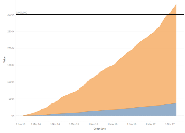
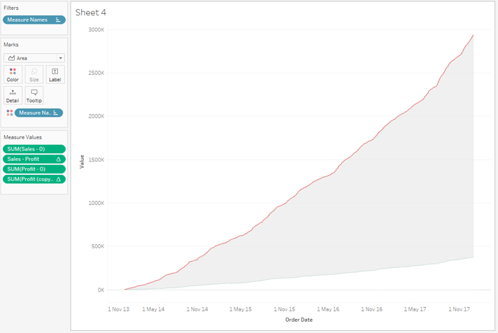
Replacing our running total for Sales with this new measure puts things back on track.
At this stage, we want to change the colour of the lower portion to be clear. Currently, this is using the running total for profit and I would rather not set that to be white on the colour palette in case Profit is used elsewhere in the dashboard. So, replace Profit with a copy and set that to be clear.
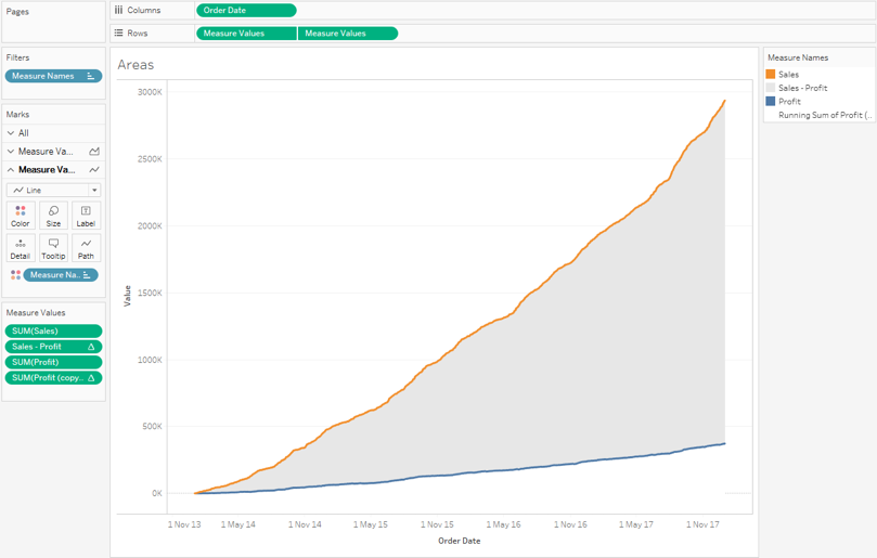
We are halfway done at this stage, however, we still don’t have the original lines showing the running totals; we only have the shaded delta between. The simplest way to add these in at this stage is to add new calculated fields called Sales and Profit, each with the value 0. Ordering your Measure Values will put these 0 lines in between the other areas, creating a line.
Personally, I’d prefer the lines to be more defined than they are in this state. This can be accomplished by copying your existing Measure Values from your rows back into your rows, and creating a dual axis between the two. The second axis can then be converted to a line chart and stacked using Analysis > Stack Marks > On. Remember to synchronize your axis!
That is the first solution, and admittedly it can be quite convoluted and still leaves a messy colour legend. The other solution is far more elegant.
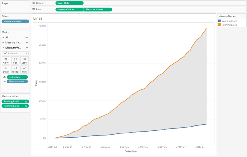
Using Lines
First achieve the “Standard Running Totals” as in the first section of this post. Once you have your running totals lines, copy your Measure Values from the rows back into the rows and create a dual axis. Again, remember to synchronise your axis!
Now for the elegant and not at all obvious solution (thanks to Iron Viz champion David Pires for sorting this one out!):
- Choose either axis and copy your exact, continuous Order Date from the Columns into the Detail mark.
- Drag measure names out of the Colour mark and into the Path mark. This creates lines between the measure values, creating one line per Order Date. Since Order Date is continuous, the vertical lines all merge into one shaded area. Not an obvious solution I know!
- Depending on which axis you updated, you may need to send that axis to the back so that the lines on the other axis display correctly.
- Update the colour of that area to a light grey or whichever colour you would prefer.
I think we can all agree that this is a much more elegant solution, however, it certainly isn’t the first solution to pop into my head. You can download a working version of this example here. Let me know if you find any other ways to achieve this result!