
It’s 2003, and the Red Sox haven’t been to the World Series since 1986 and haven’t won a World Series since 1918. Here, at this moment, in the 8th inning of Game 7 of the American League Championship Game against the hated New York Yankees, a decision is made that arguably changes the outcome of the game.
Many baseball fans already know this story, so feel free to read past my anger and gnashing of teeth. For those of you who don’t, Grady Little, then Red Sox manager, walks out to the mound to talk to future Hall of Fame pitcher Pedro Martinez. The Red Sox lead 5-2. Pedro has been spectacular, but it’s late in the game – he’s thrown over 120 pitches and a left-handed batter is up to the plate. A simple statistic from that season: After 106 pitches that year, Pedro’s Opponent Batting Average spiked 64 points to .370. This may have informed a better decision in that situation; however, Grady Little did what almost all managers do – he went with his gut:
“He still had a lot of life left in his arm. He wanted to be out there, and there’s nobody I’d rather have out there. My decision to leave him out there was no different than it has been the two years I’ve been here with Pedro.”
In other words, “I did what I always do.” Now one of my biggest pet peeves is when people blame the outcome of a game on one single event, but Pedro did go on to give up the tying run. This run catapulted the game into extra innings, where we witnessed the now infamous Aaron Boone walk-off home run.
My point in this story is that, quite often, we make decisions with our gut instinct or our memory of the recent past. Unfortunately, our gut can let us down when it counts the most. Data science, though, offers us the ability to use data and methodologies that do not hold the same biases as our gut.
The problem is that the decision makers do not get the rapid access to predictions in the real time that they need. Making the output of data science techniques readily available and easy to understand to decision makers is part of what others and myself call operationalization. Operationalization is the last and final step in the data science life cycle, enabling end users to understand analysis as the data and situations change.
An Easier Way
I’ve often heard from clients that their data science teams are constantly re-running models based on feedback from leadership. Predictive models often come with fixed inputs or assumptions. However, assumptions change and leadership often wants to play “what if” with those inputs. In many cases, data scientists have to go back, rerun code and then make sure the output gets to the right people. This is often intensive, leading decision makers to opt out and go back to their gut once again.
Interactive applications, however, give contained control to decision makers, making the info they need available instantly thus keeping them in the analysis and leading to better outcomes. To achieve this, it is often impossible to use only one tool. Instead, a system of tools may be required.
Our Forecasting Model Example
A forecasting model of future sales is developed that relies not only on historical values of sales but also on other factors such as product mix and the amount of discounts given to customers. The product mix and discount are fixed inputs to the model that could change in the future. A common question in this scenario might be, “What if we change our product mix? Does this impact future sales?”
To allow end users to answer their question, the application has to grab user inputs, pass those inputs to a predictive model, store the output of that model and then render those outputs in a way that is easily consumable for end users.
For an iOS application developer, this may be a walk in the park. But for enterprise level reporting and analytics, this can often mean doing things very differently. Let’s walk through how we are able to create such an application:
- We’ve created a simple web-application (what we call our Data Science Portal) using Python Flask. Flask is a web framework in Python that allows you to create applications. This is one of many options for frameworks and languages. Most likely, you already have some standards in house that you can leverage.
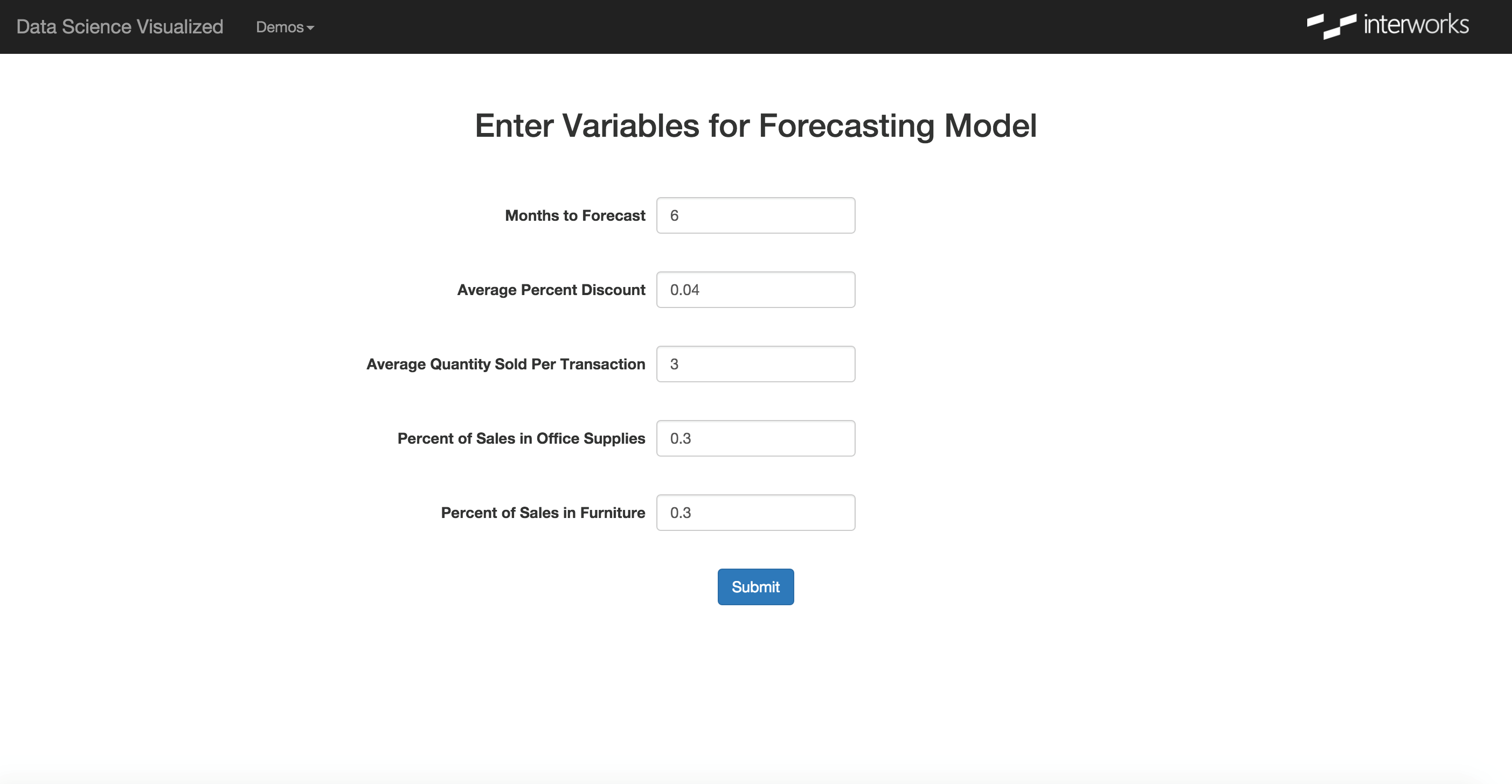
- The web application contains a Forecasting Model Variables page that uses a web form to collect user inputs. In our case, we want to know how many months into the future a user wants to see, what they think the average discount will be and what they think the product mix will be.
- Those user inputs are then passed to a script written in R that generates the forecast prediction. The R script then writes the prediction as rows in a table stored in a Postgres database. Like the web framework, the database is not important and can be traded out for those you already use and support within your organization.
- To allow for multiple users, the web application also needs to generate a unique user key, which ends up being written to Postgres. This is important in our next step to ensure that the end user only sees the forecast data that she/he generated.
- Finally, we bring it all together in an easy-to-understand visualization in Tableau. The dashboard is connected to the data in Postgres and is rendered by Tableau Server. Using the Tableau JavaScript API, the dashboard is embedded in the same web application that we started with, using the unique user ID to show only the data that the end user created.
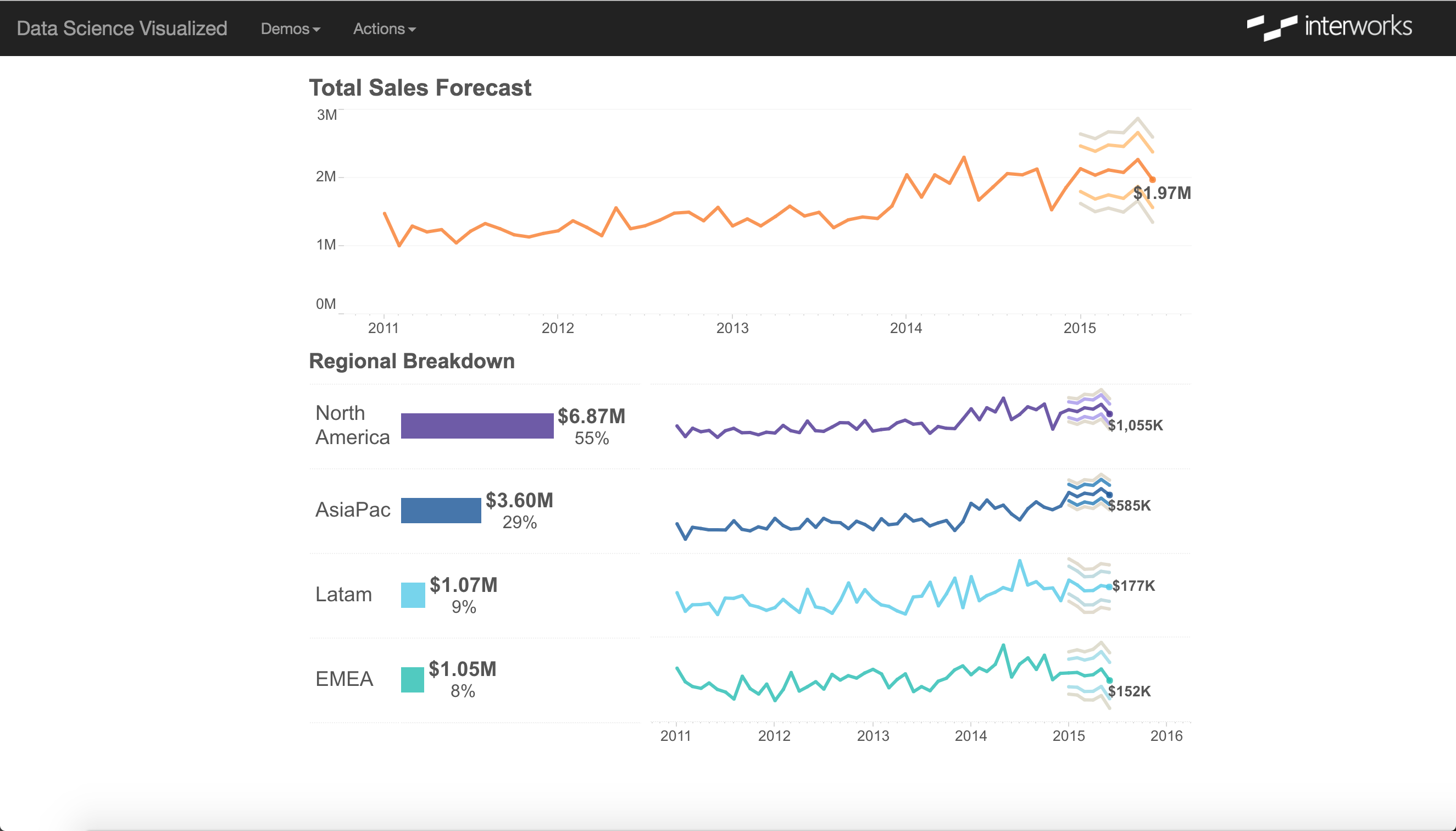
From the user perspective, they go from submitting inputs to Tableau visualization, completely unaware of all the individual pieces that are running in the background. This is the sort of deceptively simple experience our modern end users expect because of tools like Tableau. If you want deeper analysis to make an impact, you have to meet and exceed those expectations by offering it in an interactive, visual format.
Preventing Future Grady Littles
To bring it back to baseball, one of the goals of data science is to transform the way decision makers make decisions. Focusing less on gut and more on data-driven insights is one of the best ways to curb the effects of human bias in decision making. Data science seeks to use advanced analytical techniques to do this, but simply generating the analysis is not enough.
We as data scientists need to embrace these modern ways of presenting our work. It is only by communicating our analysis in a quick, meaningful and adaptable ways that we will move our organization from “I did what I always do” to informed, data-driven decisions.
If you want to know more about how to harness the power of data science for your reporting and analytics needs, feel free to reach out to us.