
In February, I had the opportunity to attend the Innovation Enterprise Predictive Analytics Summit in San Diego, Calif. The conference lasted two days and featured data scientists from some very recognizable companies like Facebook, StubHub, BuzzFeed and eBay. The talks ranged from how to detect newsworthy events through internet photos to choosing the right advertising for video games.
Without further ado, my thoughts for you in bullet points:
1. There Are Some Great Things Going On
Whether it’s a business needing to figure out what’s going to trend next on the internet or figuring out what factors best predict hospital readmissions, there is a lot of great analysis being done in almost every industry. Powered with new and exciting tools, almost anybody can take data, find insights and communicate those insights to others.
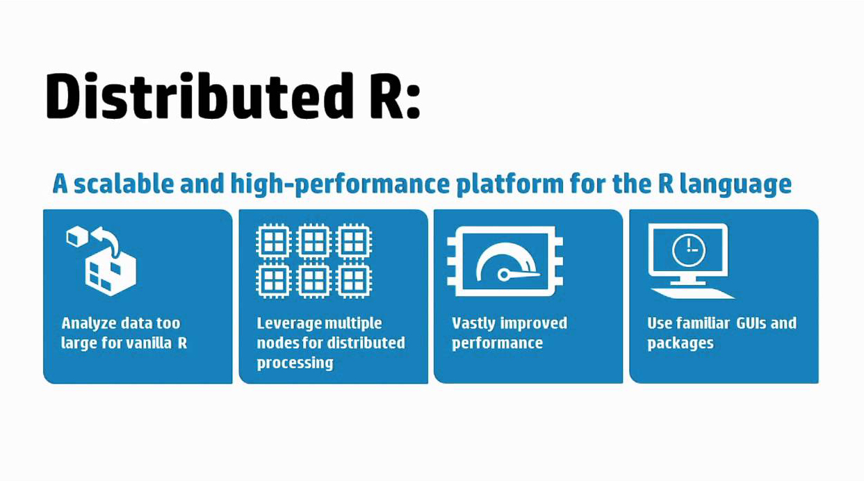
One of the new and exciting tools that was presented during the conference was Distributed R. Indrajit Roy from HP Labs spoke about how they have been working in collaboration with the open source R community to create the Distributed R package that allows for parallel R computations across multiple machines. While the package is available through open source, it is also a feature in HP Vertica that allows for fast data science on large data sets.
Another company, Banjo, is doing some impressive prediction of current events by using photos and other data found on the internet. Chief Data Scientist Pedro Alves spoke about how, on many occasions, they have performed better than all other news outlets on reporting events across the globe. Additionally, they can get measures of brand awareness in social media by mining the internet for photos containing particular product logos.
All the presentations brought with them interesting ideas and very neat uses of advanced analytics to generate real insights for organizations.
2. Data Scientists Need to Think Harder About Visualization
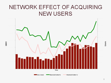
I don’t know that I need to say much about the above graph, but with three axes that don’t tell you what increment things are plotted in, it’s really hard to get meaning out of this visualization. Now I’m not going to call out the specifics, but I saw this chart in the wild during an otherwise interesting presentation.
The biggest battle of data science is not figuring out what to do once you have good data – that is often straightforward, as the business problem you’re trying to solve helps guide what types of analyses make sense. The real fight is getting stake holders to not only understand what advanced analytics are telling you, but to buy in so that the right business decisions are made as a result. Data science is often seen as a black box where some gals and guys with thick glasses do some stuff nobody understands. But that’s where great data scientists shine – by making analyses that are otherwise complicated and dense easily understandable.
Communicating results is more than just important – it’s mission critical. Visualization is by far one of the most common and effective ways to accomplish this. It’s easy to get caught shoving too much of your awesome analyses into too few or too many charts. But this is the point in the data science life cycle where visualization best practices can make life much easier. There’s nothing worse than doing some awesome work only to have it shot down because end users can’t understand it and don’t trust it.
3. I Love This Stuff
At one point during the conference, a speaker asked, “How many people, by show of hands, have never done a regression?” No hands went up. Being in that type of room was a great reminder for me of the passion I have for seeing organizations empowered by their data. There’s no doubt that if your organization is not exploring what it means to move beyond reporting and into the world where data can accurately target customers, predict sales numbers or locate the best location for a new facility, you’re about to get left behind.
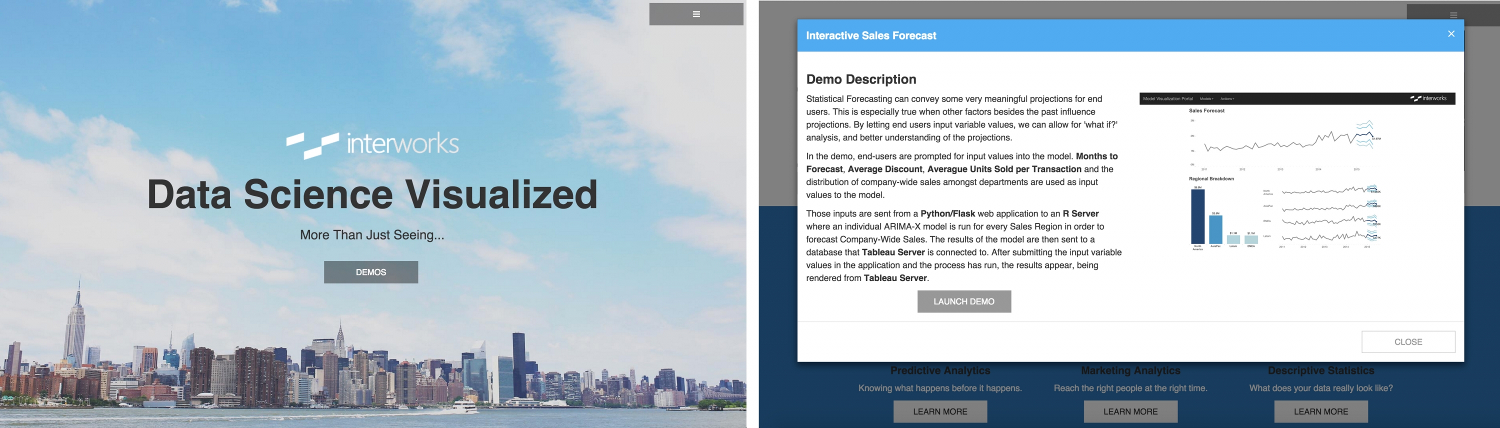
One of the easier things that an organization can do is start delivering advanced analytics in ways that are easier for stake holders to consume. Things like web portals that house live data visualizations or interactive models (like the one pictured below) are good ways to start getting stake holders more involved.
If you need to explore more possibilities in data science or better connect your stake holders with insights, don’t hesitate to contact us.