
This blog post is Human-Centered Content: Written by humans for humans.
Historically, BI tools drew a clear line between the people who model the data and the people who build the dashboards. Sigma collapses that gap. You’re working directly against the warehouse, operating on non-aggregated data with a bottom-up, spreadsheet-like approach, and transforming the data as you go.
That flexibility is one of Sigma’s biggest strengths. It’s also where things get unwieldy if you’re not intentional about how you build. After working across multiple Sigma deployments, the biggest lesson we keep coming back to is this: Success in Sigma requires thinking like an analytics engineer, not just a dashboard builder. You’re designing analytical systems, and that means putting on a data engineering cap from the start.
Start with the Data, Not the Dashboard
Before a single visualization gets built, you should be asking, “What grain(s) of data do I need for the visuals required in this workbook? If the data is not already at the required grain, should I manipulate the data within a Sigma Data Model, Workbook or push the engineering back to the warehouse?” Though Sigma is most performant when the majority of data manipulations happen in the warehouse, sometimes it is inevitable that you utilize Sigma’s in-house data manipulation tools. When this happens, you have to remember the grain and ask questions like, “What happens when I join these two tables? Am I fanning out rows, collapsing them,or creating a many-to-many that’s going to add computational cost downstream?” These are data engineering questions, and in Sigma, they’re yours to answer.
One specific area where you have to shift your mindset from an analyst to an analytics engineer is with calculations that leverage LODs (Level of Detail calculations). In other BI tools, you can create LOD calculations directly off the data model and plug them into a visualization. In Sigma, you have to get creative and design a table element at that specific grain first. Across a workbook with several visuals, it is easy and tempting to create multiple versions of that table, each serving a specific visual. But this comes at a cost. Being intentional means recognizing when that pattern is becoming a problem and when you should standardize the logic instead of letting it sprawl.
The Reporting Grain
Sometimes the visuals you’re building align naturally with the grain of your upstream table. If you have a deal-level table with the deal name, profit, and cost, and all you need is a bar chart showing profit by deal, then great. You already have an established reporting grain.
But the grain isn’t always that clean. Consider a project portfolio where each project is allocated across multiple regions and business units simultaneously, with a single project carrying a 60/40 regional split and a 70/30 business unit split. That’s a many-to-many relationship on two dimensions at once. Now add a cross-filter requirement: Clicking a region in a pie chart should filter a project-level table to show only projects with exposure in that region, without distorting the totals. You need accurate breakdowns at the sub-project, region, business unit and portfolio level, all from the same structure, all responding to the same filter. Getting there requires careful handling of allocation types, percent splits, and how rows fan out, or the numbers start lying quietly in the background.
This is where the reporting grain becomes essential. A reporting grain is whatever standardized, performant data structure gets your dashboard where it needs to be. It centralizes the logic so your workbook doesn’t have to reinvent itself sheet by sheet, and it should be materialized as a physical table in the warehouse to keep complex dashboards performant.
What that looks like in practice depends on the use case. When your dashboard requires interactive filtering across multiple grains and performance is a priority, a wide table that pre-aggregates across those grains and is materialized as a physical table often works well. Everything lives in one place, filters can act on it directly, and the warehouse does the heavy lifting ahead of time rather than at query time. For example, if users need to toggle the reporting currency, you might create a table that pre-calculates values for each currency option and stacks each currency’s rows on top of one another. The filter works, and the logic lives in a performant upstream table rather than scattered across workbook elements.
In other cases, a semantic layer or a combination of approaches may be the better fit. The key question is: What needs to be interactively filtered in the dashboard, and what structure supports that most cleanly? Once the data has been standardized and structured to support every required interaction, you’ve established your reporting grain.
There are several ways to get there. You can define the transformations entirely in the warehouse, or build them in Sigma through custom SQL, joins, unions or any combination of approaches. If you build in Sigma, the reporting grain table can be materialized as a physical table in the warehouse with a scheduled refresh at the click of a button. If your team has access to GenAI tooling, iterating on the SQL can be especially efficient regardless of where you write it.
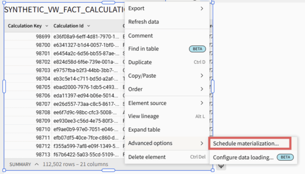
Above: The “Schedule materialization” dropdown menu location.
If your reporting grain is solid and materialized, building the actual visualizations becomes fast and almost trivially easy. That’s how you know the foundation is sound.
Building Complex Visuals in Sigma
Even with a solid reporting grain, you’ll occasionally encounter a visual that can’t be built without rethinking the underlying table structure. This is especially common when migrating dashboards from other BI tools.
Take multi-layer mapping. In many tools, you can add layers to a map visualization through a built-in layering option. In Sigma, it requires structuring the source table so that each row represents a desired layer, with all rows sharing a GeoJSON column that specifies the geometry type (point, polygon, etc.) and coordinates in a JSON format. (See a deeper dive in this companion blog post.)
Or consider a KPI visual that displays Year to Date (YTD) as a bold number at the top but depicts the month-to-month variation across a longer date range as a trend line below. This requires two different levels of granularity: One at the year level using a date range limited to just the current year, and another at the month level at a date range that includes months from prior years (rolling 12 months, for example). In Sigma, this type of mixing-and-matching grains and date ranges within a single visual is not possible, and requires you to get creative. The solution to something like this would involve breaking up the visual into two: One to show YTD information, and another to show the trend line. Then, you would change the alignment of each (YTD bottom-aligned and trend line top-aligned) and merge both into a container to give the impression that it is one visual.
A final example: In Sigma, you cannot have multiple dimensions on a single axis (ex: Last Updated Date and Department). Though trellis’ are available to help solve this problem (ex: putting Department on y-axis and Date on Trellis Row), the visual aesthetics of trellis charts are not always very flexible. If this is the case for you, you can utilize Sigma’s Concat function (or simply “&”) to combine multiple dimensions into a single column, plotting that column on an axis, then using custom sort to make sure your multiple dimensions are sorted correctly.
The point of all these examples is this: When a visualization isn’t cooperating, the first question to ask is, “Can I reshape the table this visual is built on to fit the desired output?” If you are confident you will not have to change warehouse connections later down the road, don’t be afraid to use custom SQL for tables that need heavy transformations, whether for complex pivot tables with overarching categories or multi-layer maps (there is not a way to “Change Warehouse” for custom SQL like there is a “Change Source” for tables at the moment). If the table is heavily reused or needs to be more performant, push it upstream or materialize it to the warehouse. If the table relies on user input (i.e. controls or filters), then do as much engineering upstream (to keep the workbook performant and the data logic accessible to all users and future workbooks) and leave the final manipulations that rely on user input within the Workbook.
The Bottom Line
When moving from one BI tool to another, there will be tradeoffs. It requires rewiring how data teams approach solutions they’ve relied on for years. Many BI tools take a top-down approach to calculations, actions and visuals. Sigma asks you to think from the bottom up. Some visuals from a prior dashboard won’t translate pixel-for-pixel. But what you gain is substantial: Warehouse-native architecture, data writeback, more accessible licensing and rapid development speed. And Sigma is advancing quickly, actively incorporating product feedback on many of its current limitations.
Sigma rewards structured thinking. Be intentional about grain, deliberate about where transformations live, and disciplined about keeping Data Models and workbooks clean. Build the reporting grain well, materialize where it matters and let the visualizations follow from a solid foundation.
If you’re evaluating Sigma or looking to get more out of an existing deployment, these patterns come directly from our work across client environments. Please reach out to us here to see what a BI tool migration might look like for your organization.