
This blog post is Human-Centered Content: Written by humans for humans.
I have to admit, when I am teaching courses on Tableau, I oftentimes try to be perfect. Not to say that I am a perfectionist, but I just want the training to go smoothly and for the learners and participants to feel like they’ve gotten something useful from their time spent with me.
Then, Tableau happens.
Last year, at the end of training, I got a question that I hadn’t been asked before. I thought I knew the answer, but then in my live training environment I faceplanted. I’m actually being overcritical of myself, because I just wanted our dismount to be flawless and it was anything but.
It started with a question I got from our Q&A at the end, something to the tune of:
“When selecting a mark for a dot plot on the dashboard, which then filters the supplemental table shown next to it, how do you also temporarily remove the other dots from the dashboard’s view?”
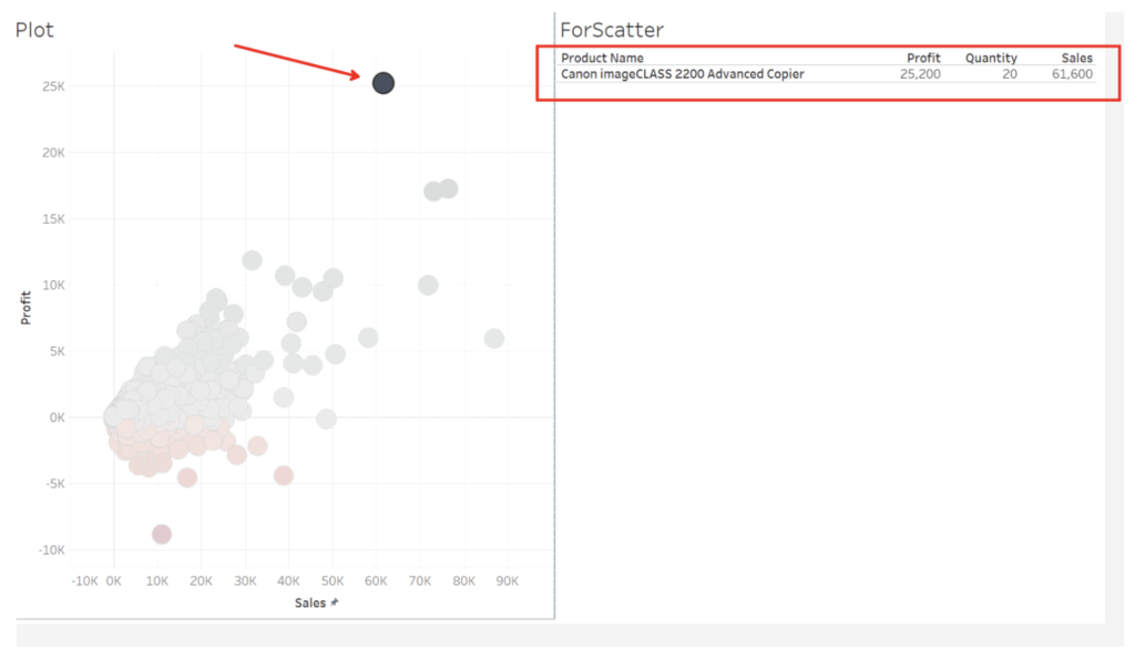
Basically, I want a visual filter to “filter” itself to reduce clutter.
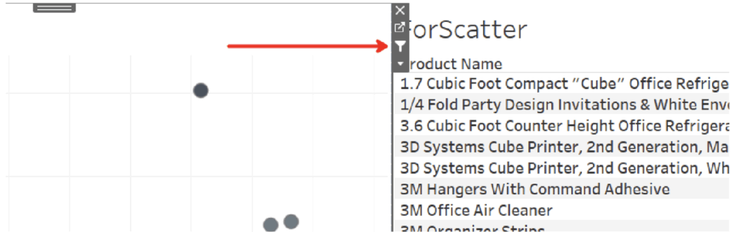
At first, I used a single “Dashboard Actions” Filter Action where I left both sheets checked for source and targets, but that solution was clunky, as it required a total of four clicks to get the drill down working:
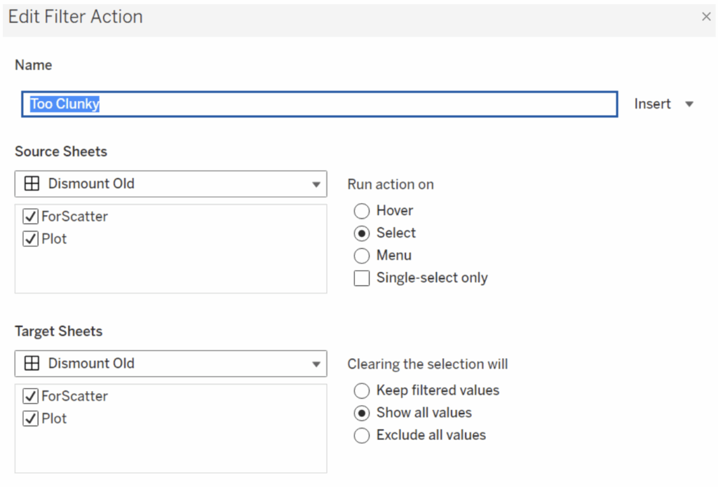
A user experience nightmare. I remember a co-worker of mine saying, “just because you can in Tableau, doesn’t mean you should,” so I kept at it.
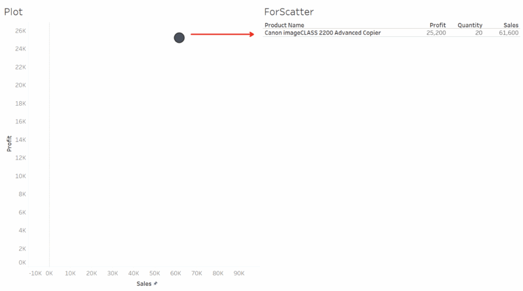
Then, I tried breaking them out into two separate “Dashboard Actions” Filter Actions, which I thought would work and require one less click. But setting up the inverse actions this way gets me into a limbo where the other dots never actually show back up even with the table is showing the full product list again:
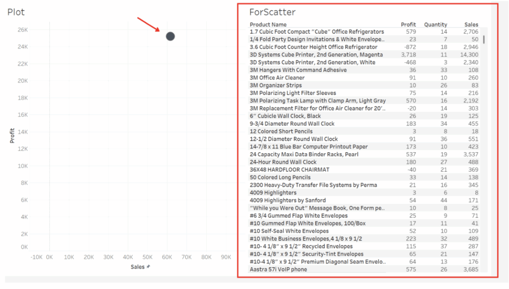
The filter actions in this instance were colliding, and one was canceling the other out. Thus, I had to find a different way to accomplish this using a more innovative option. And I promised my learners once I figured it out, I would email them with a “how to,” which I did. I’m creating a blog post to commemorate the experience and for others to hopefully benefit from my less-than-perfect training moment.
Parameter Actions For the Win
Here’s a step-by-step solution.
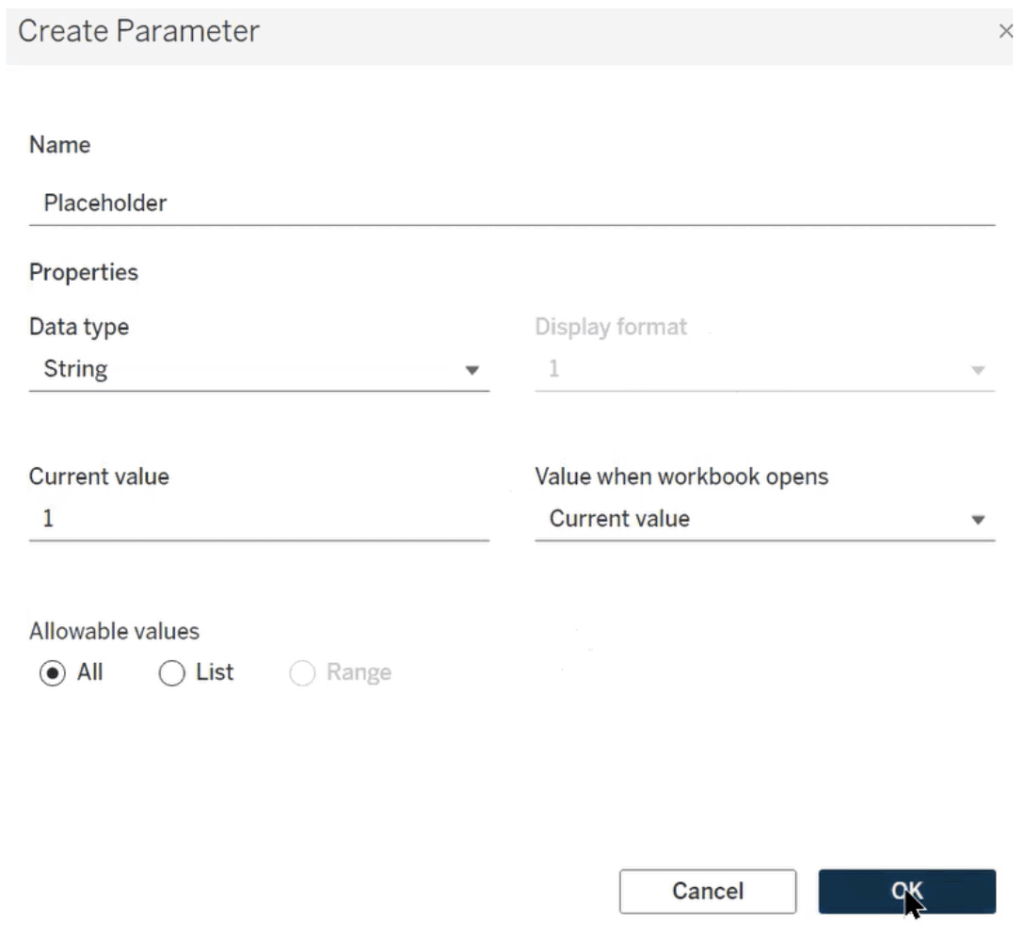
Step 1: Going back to one of the sheets being used on the dashboard, I used the “Create Parameter” option to generate a new “Placeholder” parameter with String as the data type and “Allowable values” set to All:
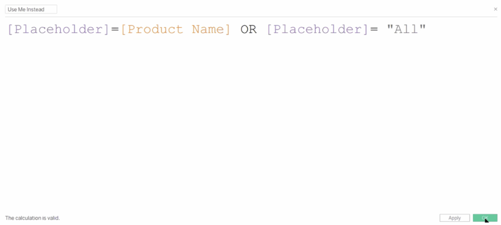
Step 2: Create a new Calculated Field. I called mine “Use Me Instead,” and in the formula, it’s basically the [Parameter] = [field name from table] OR [Parameter] = “All” you see here:
Step 3: Create a new “Dashboard Action” Change Parameter Action:
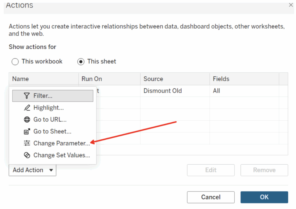
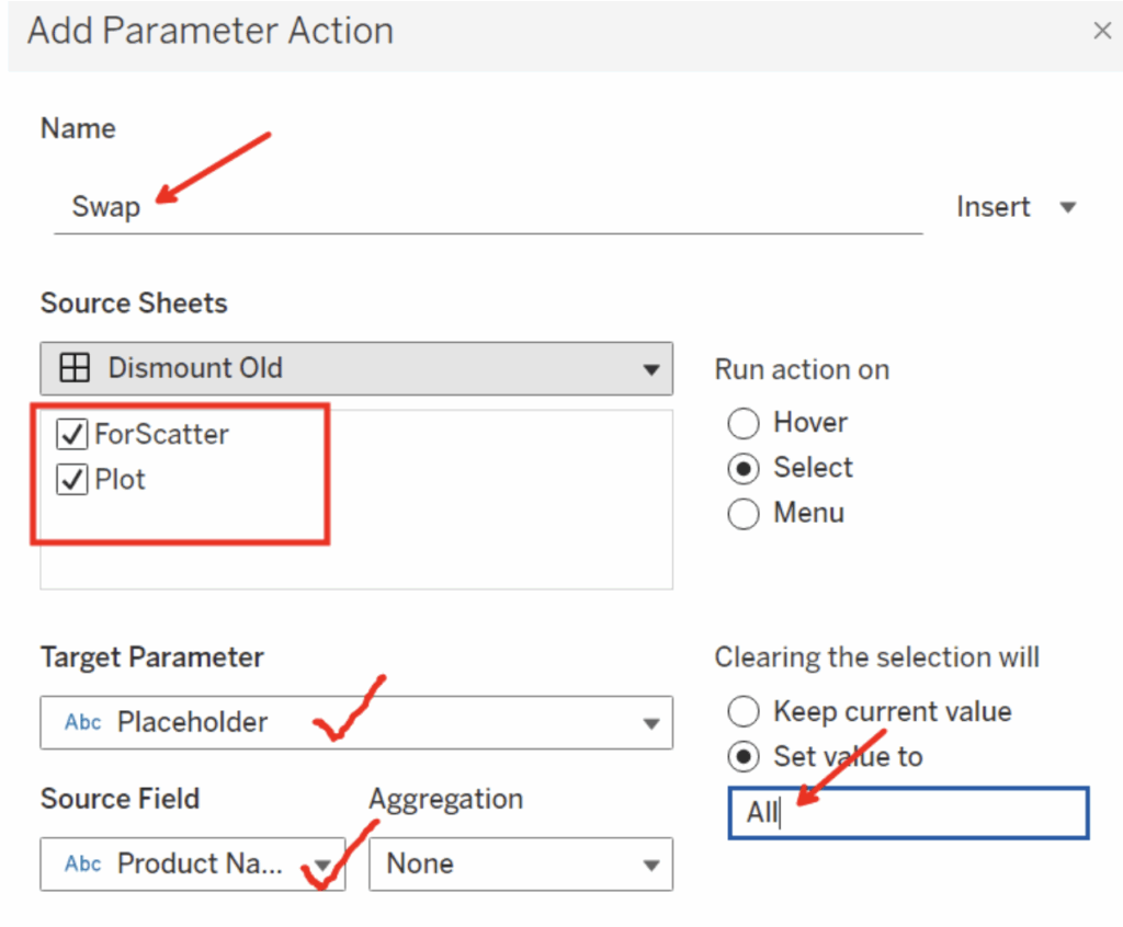
Step 4: I named my Parameter Action “Swap,” as you can see in my example. Leave both the source sheets selected, which is going to ensure our action goes across both sheets with a single user click. The Target Parameter will be the [Placeholder] parameter you’ve already created. Then choose your [field name from table] under the Source Field dropdown (mine is Product Name). The finishing touch is typing “All” into the “Set Value to” under “Clearing the Selection will” area:
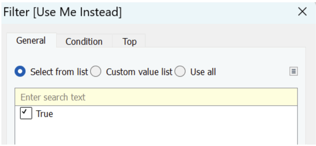
Step 5: Implement your Parameter. Go back to the plot sheet being used on your dashboard and drag the “Use me instead” calculated field onto the Filter shelf. It will give you an option for “True” to select. Mark that, then hit Apply and OK. That’s going to activate your parameter with a new two-for-one benefit:
Working in tandem with the single visual filter that I originally implemented (by just hitting the funnel button on the plot sheet from the dashboard), you’ll get a preferred approach to this use case.
If done successfully, you will have created some quick and simple Tableau magic too:
Bonus: Go to your Format tab at the top and select “Workbook.” From the “Format” window on the left, turn “Grid Lines” to off. That will have a workbook wide effect and is proactive too! Hopefully, you, like my learners, have gotten something out of your time spent on this blog. Either way, we’d love to hear your feedback.