
While browsing our Snowflake sandbox, I came across a dataset tracking InterWorkers’ work flights and the corresponding carbon footprint each generated. Instantly, I imagined building an interactive decision app: a central hub where employees could request flights and supervisors could approve them while keeping carbon emissions in check company.
Form Meets Function
The result is a fully functional and interactive Sigma app that not only works but also looks polished. This app showcases just how customizable Sigma can be. Below are a few design techniques we used to give it a clean, professional finish.
Containers and Element Spacing / Padding
Although it might seem like elements can’t sit perfectly adjacent in Sigma, there is a way to make it work. The key is those elements must be inside of a container which has the element gap option turned off.
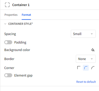
This means that for the most flexible pages, it is a good idea to build everything within a container for maximum customization options.
Custom Font
No finished product is complete without a company approved font! I made sure to download our company font: Proxima Nova and upload it into our Sigma environment. The process is pretty straightforward, but only admins can do it. In the Administration view under Account, go to the Branding Settings pane and click “Add” under custom fonts.
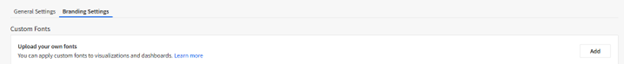
Set a family name for your font family and upload as many fonts as you would like (there can only be one font per weight and style). Now you are ready to go with your marketing
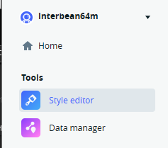
Custom Map
By making a free account on Mapbox it is easy to create your own style, publish it and upload it to the custom map option in the format pane. Log in to Mapbox and navigate to the style editor.
Then you can create a new style and edit it to your heart’s content. Once you are done, publish the map style and share it. Use a web style URL for sigma if you make it public then you don’t have to worry about the access key.
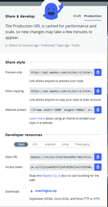
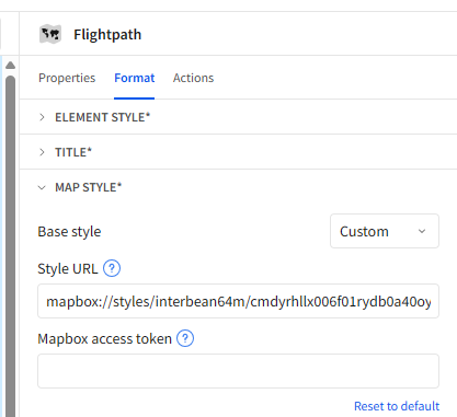
Finally, set the map style to custom in Sigma and reference the custom Mapbox URL. Now we can align the map color scheme with that of our dashboard and visualizations.
The Process Through Previous Blogs
Creating this piece has been a long process, and I have documented the updates through multiple bog posts. If you are interested in the entire process. Check these out!
- My First Sigma Dashboard: Unpacking a Suite of Visualization Tools
- Transforming a Dashboard to a Decision App with Sigma
I’m excited to finally share this finished version. Whether you’re here for the technical build tips or just curious about the design possibilities in Sigma, I hope you enjoy exploring the app!