
As a Tableau, Power BI and Excel user, the idea of a spreadsheet based BI tool struck me as an interesting concept. I had heard that Sigma had a powerful visualization toolset, but l lacked some of the customization options of more traditional BI tools. In return, Sigma offers a UI which is extremely friendly to spreadsheet users, as well as powerful data application capabilities.
Before diving into the advanced tools Sigma has to offer, I wanted to explore the tool’s more traditional BI visualization capabilities. So, I loaded up an interesting dataset through InterWorks’ in-house Snowflake connection and got to work.
Data Preparation with Sigma
The first thing that impressed me about working in Sigma was the data preparation phase. The data preparation phase is where spreadsheet users will be most comfortable as this part of the process is done almost entirely in a spreadsheet interface.
Being able to easily see and alter your data in its raw form is transformative to the data preparation experience. Using the formula bar, you can easily create new calculated columns and validate the results against raw data in real time.
I was working with InterWorks’ consultant flight dataset and had to join this dataset with public information on where airports are located so I could then visualize the flight paths that InterWorkers were taking.
The join was the first true test of Sigma as a proper BI tool. I found the experience to be intuitive as Sigma provides feedback to the user along the way through information about their join.
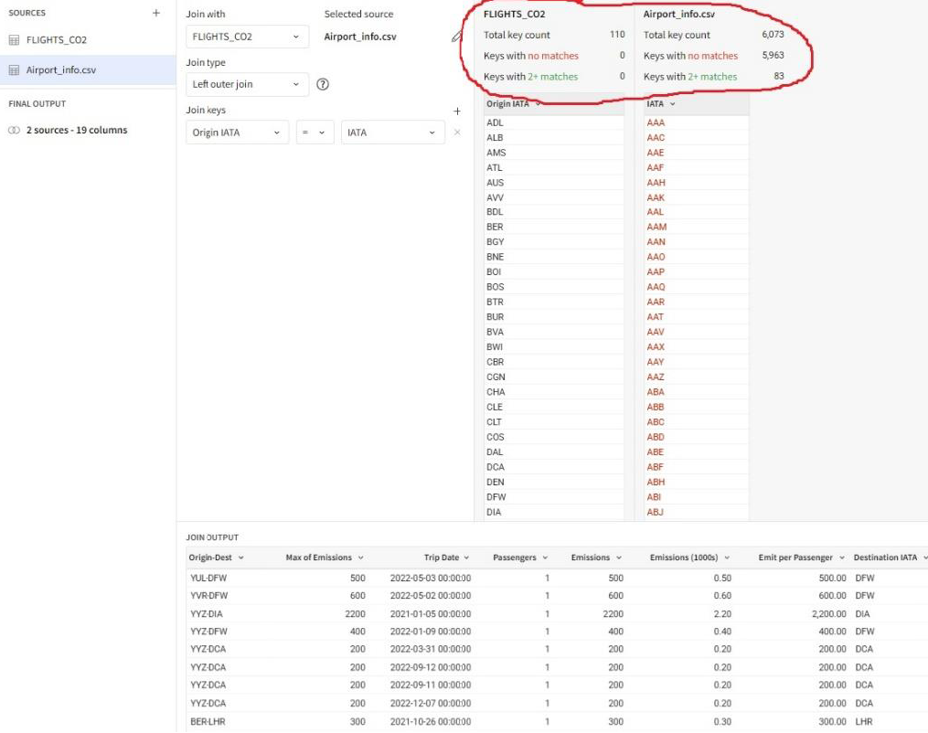
As shown above, Sigma displays information about the joining keys, including how many unmatched keys are on each side of the join. This gives the user critical information on whether their join will be successful.
Additionally, Sigma gives the user full flexibility to choose which columns to keep from each data source, reducing noise in the finalized output. On top of the intuitive UI, the cloud native Sigma was able to handle advanced join operations without significant delay.
With data preparation complete, it was time to put Sigma’s suite of visualization tools to the test.
Data Visualization in Sigma
When creating visualizations in Sigma, Tableau users – and perhaps even more so Power BI users – will find themselves in a familiar environment. You place the chart you want to create in the worksheet, drag columns into the appropriate axis and fiddle around with formatting to your heart’s content.
Naturally, some features were in different places from other BI tools. However, after adjusting my senses and locating everything, I found navigating around Sigma’s UI to be a straightforward process.
I found the flow of working with Sigma’s visualization tools to be quite intuitive. You can organize visualizations into handy containers and even switch the data source of a visualization without a hitch (if the column names are the same).
I was especially impressed by the tabbed containers feature. This allows developers to layer visualizations on top of each other, and it allows users to easily cycle through those visualizations by simply clicking on a tab.
I also enjoyed using the Buttons and Actions features. I felt like I only scratched the surface of the potential use cases for these logic driven tools when using them to embed links or create filters.
So, with all these tools and features, what was this first-time user able to create?
My First Sigma Dashboard
What I built is a comprehensive and dynamic look at InterWorks’ carbon footprint from 2021 to 2022 through company airplane travel. Take a look at the screenshot below.
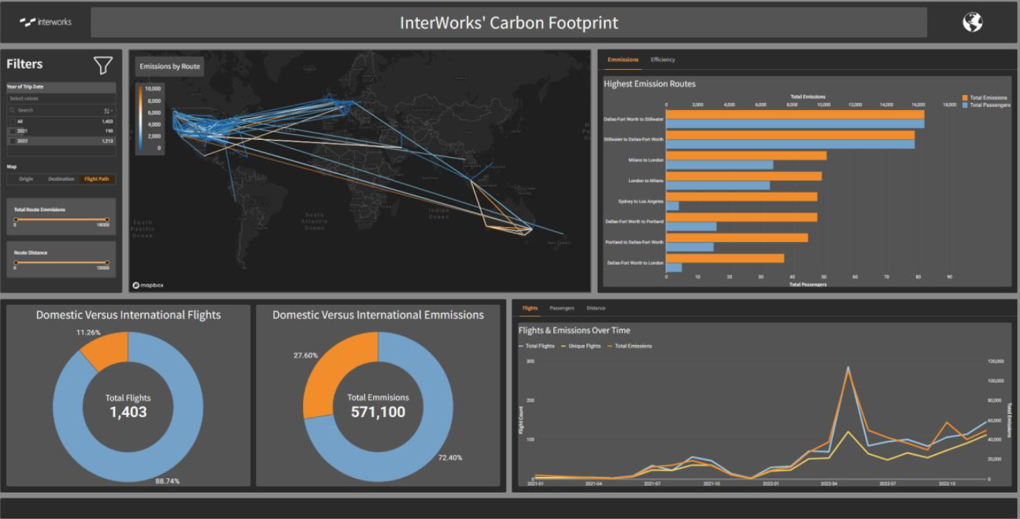
Although InterWorkers are not traveling at the rate we were before the pandemic, the trends show that we are beginning to travel once again as we grow as a company. This comes with a notable increase in international travel.
Please feel free to explore the dashboard for yourself and see what insights you can find!
What I Am Excited to Explore Next in Sigma
Doing this first pass with basic formatting has got me excited. My work here just scratches the surface of Sigma’s full visual design capabilities. Sigma’s diverse and powerful suite of BI tools allows the user amazing flexibility. Additionally, Sigma is growing and consistently adding new features to its already diverse suite of capabilities. Indeed, in Sigma’s current state (including beta features like Tabbed Containers), the tool can adequately serve many business use cases and even has some advantages over mainstream BI tools.
Even by its data preparation and visualization features alone, Sigma is already an exciting tool to explore in the BI space. I hope to write more about these functionalities and how to get the most out of individual features. However, I am most excited to dive deeper into the features that truly make sigma unique – input tables, action, modals and more.
Sigma has amazing documentation and is starting to expand its training network as well, but InterWorks is also here to help! Please let us know what you think of Sigma or if you have any questions here.
Happy analyzing!