
In our last blog, we gave you some tips on how to create worksheets that will bring your users a delightful search analytics experience, but what if you want to build some pre-built analyses for users needing to quickly consume visual data that can then be customized and drilled into futher? Enter ThoughtSpot liveboards!

Let’s clarify what a liveboard is before we jump into the weeds! Liveboards are similar to dashboards. They are tools built for the consumption of KPIs and key summary data in a visual way, equipped with the ability to filter and drill down.
What makes liveboards special is that each visualization can serve as a starting point for users to explore the data. From any visualization on a liveboard, users can add filters, additional columns from your worksheet and drill down on the data by any dimension. For users, this eliminates the need for asking analysts to add new columns or filters in order to get the data in their preferred way — a common pitfall of dashboards. For developers, this means less time spent on change requests and more time spent on building and improving new data products. The other difference: liveboards use live data from your cloud warehouse. No extracts. No flat files. Live data only!
TLDR: Liveboards only use live data and enable users to drill down by any dimension or measure in the data model. Dashboard drill down paths are limited and must be pre-defined by developers.
Here are five tips to make your liveboards delightful for users:

Using correct, well-thought-out visualizations is not unique to ThoughtSpot liveboards, but it is essential to creating sticky, user-friendly analytics experiences. We must understand that each visualization on a liveboard is designed to be a starting point for a user who may want to drill-down on the data with other dimensions, or add measures to enrich the visualization and compare data points.
While ThoughtSpot has a wide range of visualizations available (including paretos, sankeys and starburst charts included), it’s usually best to choose visualizations that are familiar to users and modeled to the business question. It’s also important to consider users who will consumer your liveboard outside of ThoughtSpot either in Slack or email. You’ll want to make sure your vizzes are legible, well-formatted and useful.
The last thing to consider when selecting visualization is performance. ThoughtSpot is using a live connection to your data warehouse, meaning that every visualization on a liveboard that loads will generate a query. If your liveboard is overloaded with complex visualizations and fields that may not be necessary to the user, you may be adding complexity to your queries that are not generating value.

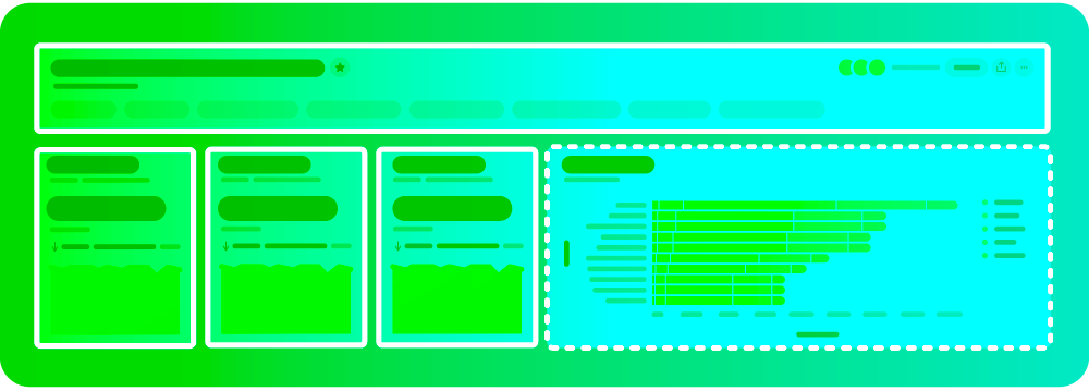
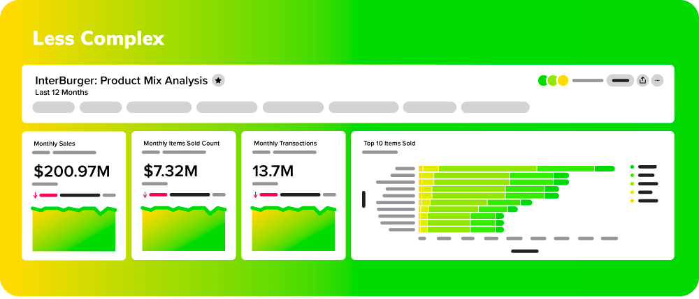
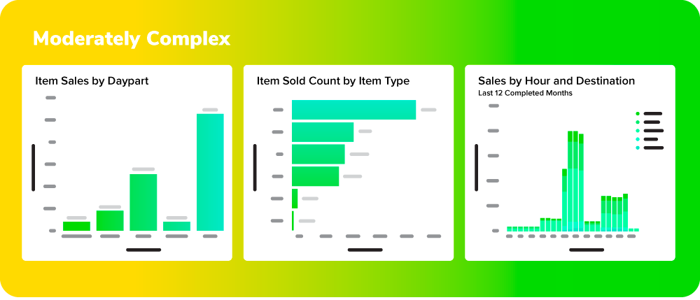
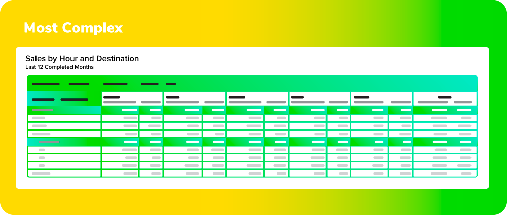
In addition to selecting the right visualizations, it’s also imperative to select the order in which your visualizations appear on a liveboard. To build best-in-class liveboards, consider laying out your visualizations starting with the least complex visualizations at the top, moderate complexity in the middle of the liveboard and complex vizzes or pivot tables towards the bottom.
This approach aligns with how many users consume information. Almost all users of a liveboard will need to view top-line numbers, so it’s important that these answers are the most accessible. More granular, complex visualizations are typically not being referenced with the same frequency or user base as top-line KPIs, so they should be moved further down the liveboard.
This approach also acts in the best interest of your warehouse. Since each visualization that loads equates to a query, that means that the more simple visualizations at the top will always be loaded first. If you were to put complex visualizations or tables at the top of your liveboard, your users may experience slower load times and more expensive queries when it can easily be avoided.

Simplicity is key when it comes to creating Liveboards, as they are designed to inspire users to drill down deeper into their data, not serve as the only visualization for the answer the user is seeking.
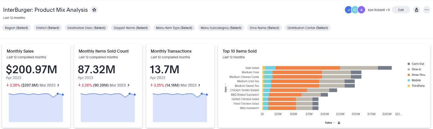
The number of visualizations you select will vary depending on the savviness of your users and the complexity of your data. As a general rule of thumb, 8-12 is the upper bound of how many visualizations you would want on a liveboard. To pack more information into a single liveboard without creating friction or overwhelming users, use liveboard tabs to logically organize visualizations.
Another important consideration when designing liveboards is how flexible your visualization is for end-user explanation. For instance, if you design a pivot table with four dimensions of drill-down, it will be difficult for an end user to reconfigure or customize a visualization, whereas if there were only one dimension, it could be done in a single click. For ad-hoc questions or more complex visualizations designed to answer a specific user question, it is best to save that as an answer instead of pinning it to a liveboard.


Filters can be powerful for users who need to view their data comprehensively across different time frames, cohorts or segments. However, there is such a thing as having too many filters. The number of filters will depend on the complexity of your data, but the rule of thumb is to keep the number of filters for a liveboard under four.
Since liveboards are using live data and designed for each visualization to be its own independent data story, filters must be chosen carefully as they could conflict with the way some visualizations are designed, most commonly time-series charts. When choosing filters, it’s best to avoid liveboard-wide date filters and save the filter space for dimensional filters:

Finally, it’s essential to get feedback from users on your Liveboards and monitor adoption of these tools. This will help you identify areas for improvement and ensure that your Liveboard is meeting the usability, visual appeal and actionability standards of your users. Admins of ThoughtSpot can use the User Adoption liveboards and user interviews to identify baselines for ThoughtSpot usage and areas within the user base that demand more attention.
Are you just getting started with developing liveaboards in ThoughtSpot? Our data visualization and engineering experts can help you craft a ThoughtSpot strategy that will create stickiness with your consumers. Drop us a line to see how we can help!