
Data Driven Alerts in Tableau Server and Tableau Cloud is a built-in feature that allows you to tell Tableau Server you want to be notified if your data reaches a set threshold for your business. When they’re set up, data driven alerts can automatically notify people who are subscribed to the alert notification. They can be set up to alert via Email, Slack (which requires the Tableau for Slack application) or a notification within the Tableau site itself.
Setting up Data Driven Alerts
When it comes to setting up data driven alerts in Tableau Server or Cloud, the most important thing (and sometimes a hindrance to design) is that you have a continuous measure axis to set the alert on. Because of this, you cannot easily just set an alert on a BAN KPI (big a** number KPI) and say, “Tell me when it hits 60k.” Instead, you need to have a Y or X axis to say, “Alert me when the value of this bar exceeds 60k on this axis.”
This is good for when you have an existing dashboard with views with continuous axes. However, in some cases users have created dashboards specifically with line charts to monitor their data and send them an alert if it falls outside the threshold – this is helpful for data quality monitoring to catch outliers, lack of data, etc.
These two blogs here can help you with setting up this feature: the first goes over the basics, while the second provides a ‘hacky’ way to set up a hidden axis on a BAN KPI so you can have a data driven alert on a BAN without the user seeing the axis. I have never tried this myself, but you could check it out.
What Can You Set Alerts On?
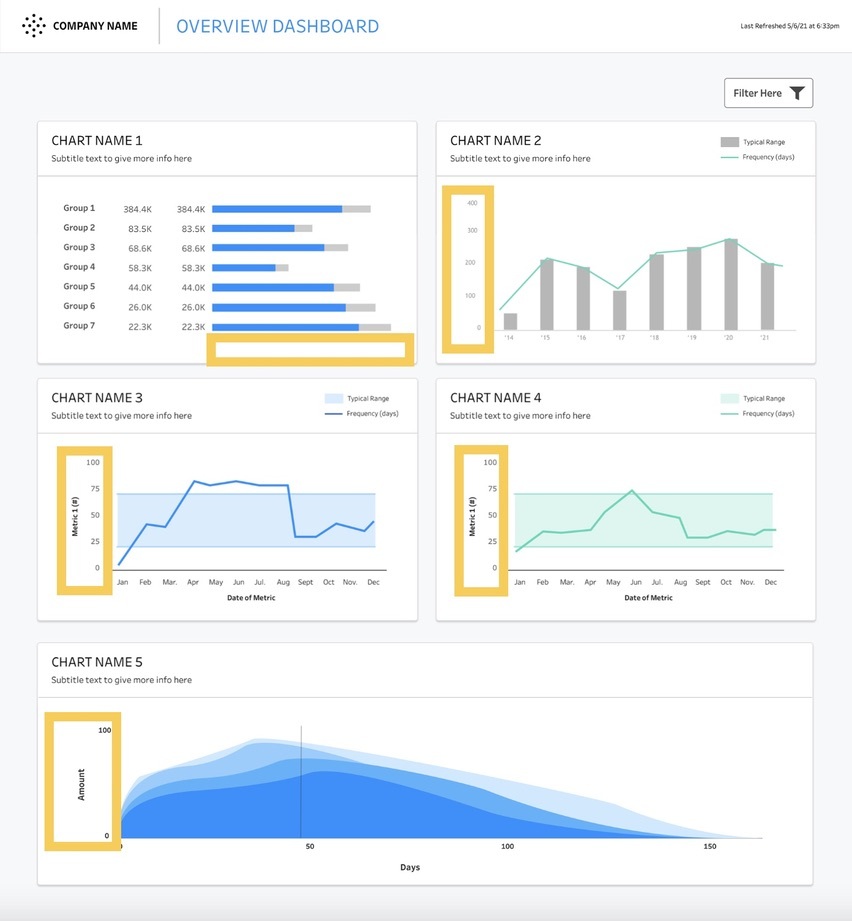
As mentioned before, you need a continuous measure axis to set up a data alert. For example, none of the information on this dashboard would allow for data driven alerts:
But any of the yellow outlined continuous axes in the example dashboard below could have data driven alerts set up on them:
Data Monitoring in Tableau Server Using Subscriptions
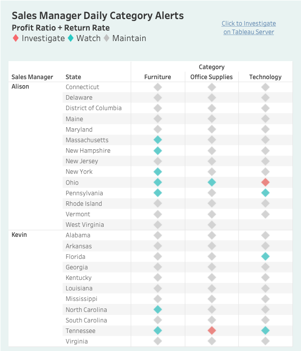
Another option when it comes to monitoring data in Tableau Server is to build a dashboard specifically around this end goal using color/shape indicators and calculated fields to indicate when data is within/outside of your acceptance range. This works well if you are wanting an alert that is dependent upon multiple qualifiers as opposed to a single metric.
For example, if you want to know when your profit ratio falls below 0 and your returns rate increase above 6%, then you could create a calculated field that returns a binary 0/1 (T/F) result if both of those things are true and have it return a red/green dot on a dashboard that gets sent to you every morning via a Tableau Subscription. When the dot comes through as red, you know you need to explore more, and you could include a link in the body of the subscription to your dashboard where you can dig in further. Obviously that’s a simplified example, but imagine if you built a dash with five red/green dots across the top that gets sent every X hours, it would help you stay on track of your data throughout the day. Or further imagine an even a larger heat map style board with multiple rows/columns of indicators:
Lastly, you could even combine the method of the binary calculated field logic with the axis viz from above and set up a data driven alert for when the axis hits a value of 1. That would allow you to have a conditional alert with multiple parameters controlling when you get alerted.
These are just a few ideas you can pursue with data alerts in Tableau. If you want to talk more about the alerts, Tableau or data visualization as a whole, drop us a line and see what we can do for you!