Our team of experts share their most reliable and time-saving formatting tips and tricks to enhance dashboarding work in Tableau in this blog series.
Sometimes, little tricks can save you a lot of time. At InterWorks, we work with clients in industries of all shapes and sizes, so I asked around amongst our many consultants for the tips they use most in their day-to-day work. What I heard back was not a list of incredibly sophisticated technical maneuvers or very involved calculations, but instead a variety of small things that add up to make a big difference. For the first part of this series on Tricks of the Trade, let’s take a look at how custom number formatting and special characters can be manipulated separately or together to do a whole lot more than initially meets the eye.
Using Special Characters to Your Advantage
For a lot of Tableau users, comparison metrics are a very common business ask. Whether we’re looking at month-over-month, year-over-year or even custom time frames compared vs. another, measuring one time frame vs. a preceding time frame is almost always a value-add. Usually this process involves a few steps: setting your time frames, getting your measures identified as separate measures and then making a comparison calculation that represents the difference between the two, either as a number or a percentage. While this is all fine and well, a few simple extra steps involving text symbols can really add a nice extra touch to these oft-used calculations by adding variation to the basic + and – formatting type.
There are three easy ways to access text symbols:
- The Character Map, seen below, which you can use the search bar on your computer to find. Simply copy and paste which symbols you like.
- Alt Codes. These can be utilized by making sure that Num Lock is on and then holding Alt while you type in the numbers that match your desired symbol’s code.
- Symbol sites like Cool Symbol. Just simply copy and paste from here as well.
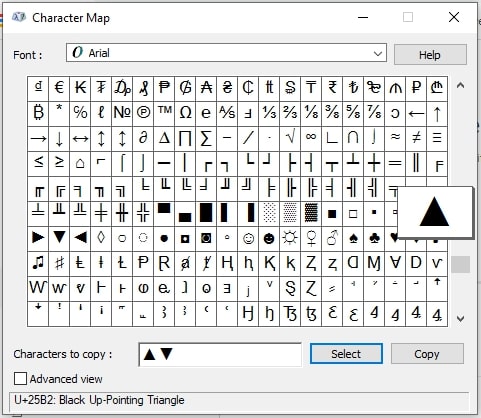
Any of these options will work for our goal, but use whichever option is best for your work. Next, after I have picked out my symbols, I will copy them onto the clipboard and head back over to Tableau.
Once in Tableau, I will refer to my comparison calc, which in this case calculates the % difference of 2020 Sales vs. 2019 Sales as a field called “vs. Last Year”. Tableau offers a decent number of built-in templates for formatting this number, but the most useful option – the “Custom” option – lies at the bottom of the list. Here, you can identify whatever format you so choose to apply to each of three scenarios; one for positive numbers, one for negative numbers and one for zero (0). Using this knowledge opens up a lot of possibilities, so let’s explore some different ways this can be approached.
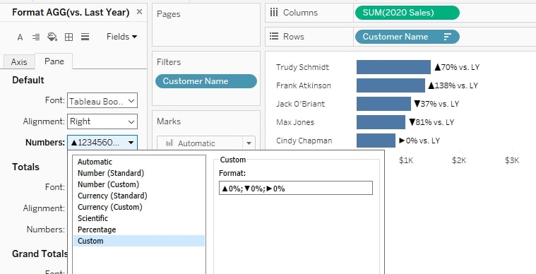
In the example above, I’ve included the triangle symbols from the character map to use instead of + and – signs. This accomplishes the initial goal of dynamically bringing in the new characters while still dynamically showing the result of the calculation. Below, you’ll see some other preferred options of number formatting that InterWorkers use within the confines of these three formatting sections:
- ▲ 0%;▼ 0%;► 0 (Arrow before the number with a % after)
- 0.0%▲;0.0%▼;0.0% (Arrow after % sign with one decimal place)
- 0 ▲;0 ▼;0 ► (Arrow after #))
- $0 ▲;$0 ▼;$0 ► (Currency formatted version of above)
- ▲ 0″%”;▼ 0″%”;► 0″%” (Arrow with a % sign when the percentage in data is reflected as a whole number. Putting any text in quotes will allow it to show as you desire.)
- ▲;▼;”” (When 0, show a blank string. No arrow at all)
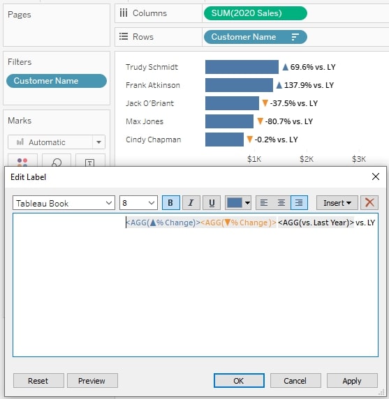
There is an extra layer to add if you want to dynamically color the special characters, though, because the custom formatting box does not allow for anything outside of what happens in the aforementioned three scenarios. Below, I’ve outlined the three steps necessary to get the same output as above, but with green coloring for positive numbers and red coloring for negative numbers:
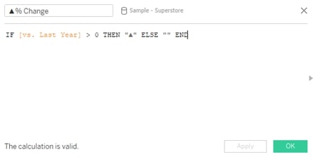
- Create calculation for “Positive % Change” and “Negative % Change” based off of whether the “vs. Last Year” calculation is greater than zero (0) or not, but make sure to identify a blank string in each of them for what happens when the condition isn’t satisfied. This will allow you to have only one of them appear at a time depending on whether the value is positive or negative:
- Place *both* of the newly created fields next to the metric in the Text label on the Marks card.
- Color each of the fields as you wish in the Text label. I did blue for positive and orange for negative in my example.
- The finished product should look like this inside of your Text label:
Bonus: Other Use Cases for Special Characters
Custom Legends
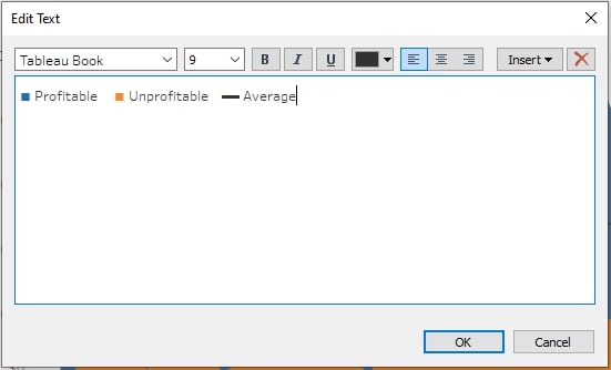
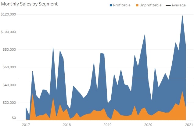
In a text box, use these symbols to act as custom legends when Tableau’s built-in legends don’t quite capture what you are looking to show:
Use Directly Inside the Text Label
While we have discussed how to dynamically put special characters into the custom formatting, if it makes more sense just to use special characters directly in the Text label of the Marks card, go right ahead. There are plenty of applications and use cases for styling up your text boxes using symbols.
Non-Comparison Formatting Options
Not all of this formatting has to be with comparison metrics, though. There are many other use cases, and this is where your creativity can be put on full display. Using the three sections of positive, negative and zero, you can create a three-scenario calculation to dynamically format your data. Below are some examples of these:
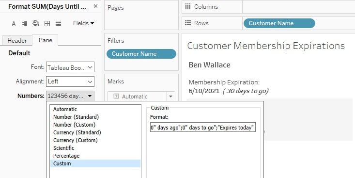
- #,##0 “days ago”;#,##0 “days to go”;”Expires Today”
In this example, we are using the custom formatting to add context next to the number that represents how many days have passed or how many days there are to go until a customer’s membership expires. Note that even the zero (0) section here adds additional information by not displaying the number at all but instead saying that the membership expires today:
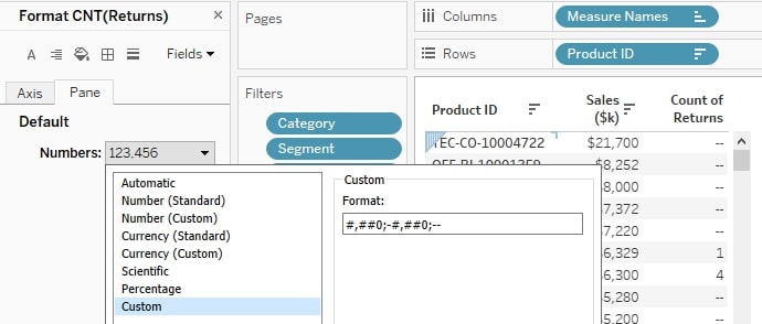
2. #,##0;-#,##0;– (For tables, show a “–” instead of a 0)
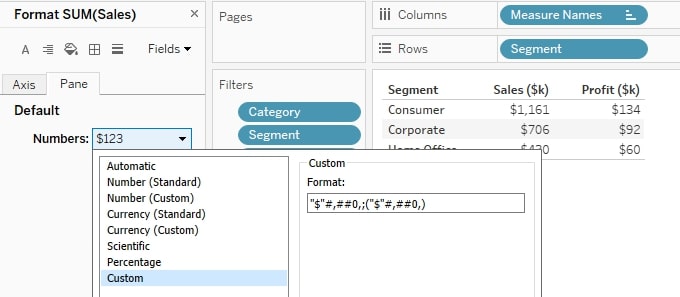
3. “$”#,##0,;(“$”#,##0,) (Currency formatted for thousands, but without the K)
Look for More Formatting Tips
As you can see, there are a wide variety of ways to use this custom number formatting to your advantage, and I am only scratching the surface with these examples. The next time you are building a dashboard, take a second to consider whether using custom number formatting or the Character Map could benefit you. And be on the lookout for more posts in this blog series that will arm with you practical tips to improve your dashboard design!
