It’s rare that a new Tableau feature can be used for so many other use cases beyond those intended. The Tableau community is continuing to find new ways to make the most out of Map Layers, a new feature from version 2020.4. Some are calling it a game-changer already. So, what is all that fuss about?
A Review of Map Layers
Tableau Desktop 2020.4 introduced the management of map layers. Up until that version, if we wanted to show or fill two layers on a map instead of one (country and states, for example, each with different measures on Color), we had to duplicate our longitude (or latitude) and create a dual-axis chart. Still, we were limited to two layers overall. That’s now history.
Map layers allow us to add as many layers in our map as we want. We just drag the geo field into our view, move it onto Add a Marks Layer in the upper-left corner and have another layer we can work on with color, size, text or tooltips, completely independent of other layers. What’s more: We can rename each layer, hide or show them, and prevent them from being clicked or automatically zoomed in. You can find a detailed explanation on map layers in my previous blog post.
A Use Case for the Sunburst Chart
What is a sunburst chart? Well, it’s easier to show than to explain:
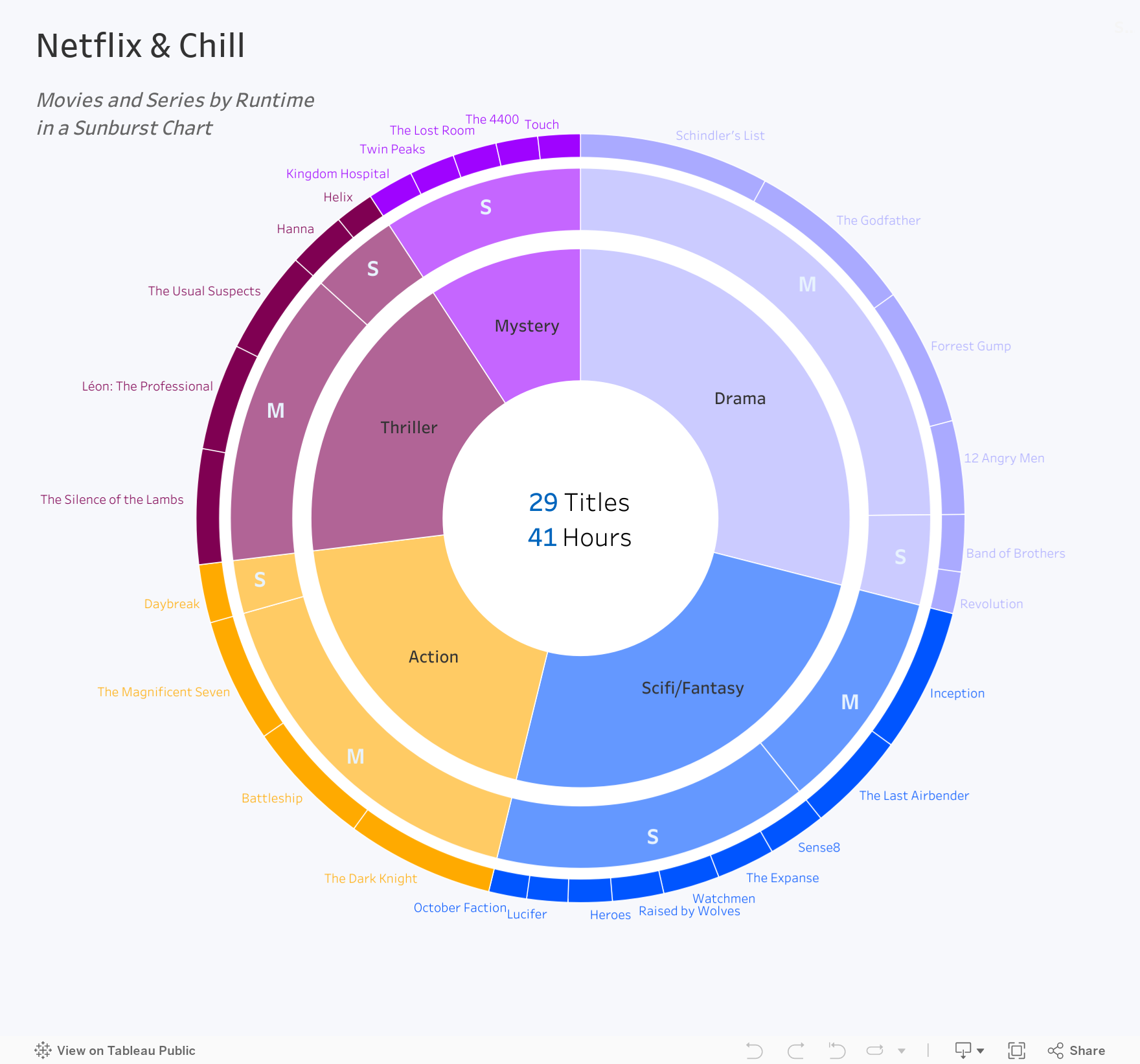
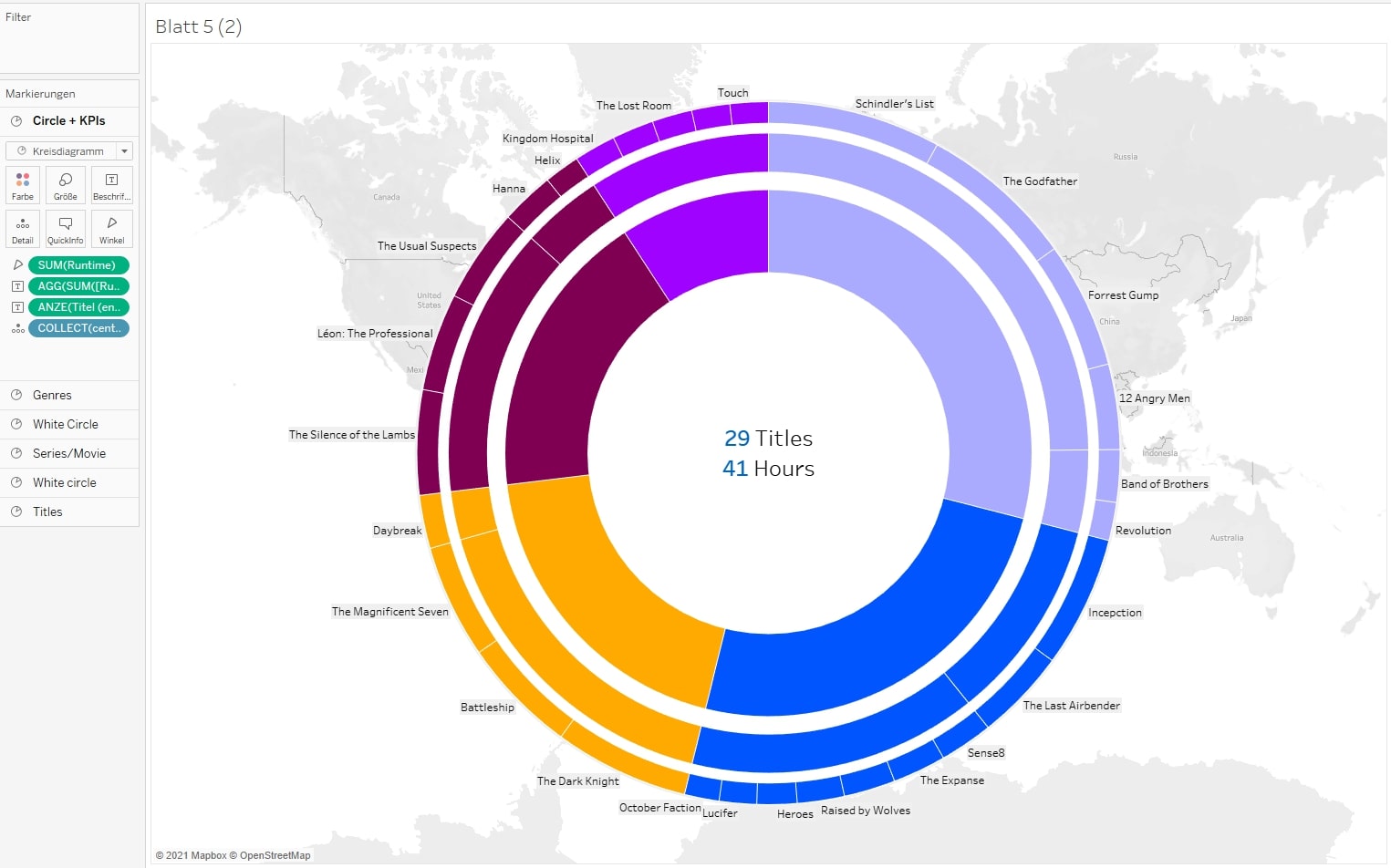
And what do I need a sunburst chart for? Well, it is more of a visually pleasing chart than it is one for deeper analysis. Sunbursts give a quick survey of one or several measures on at least two dimensions, and most times more. Like in this case: Here, we have a few movies and series ready to be watched on a cozy evening in. I can visualize what movies or series belong to which genre and how long their runtime is. The chart as a whole tells me how long the runtime is for all movies and series (taken as one episode) and in which genre I have the most hours of movie time represented. So, how do we build a chart like this?
The good news: We don’t need a single calculation for it. No sine or cosine functions, no table calculations or LODs – the only features we are using are maps and Mark types.
The bad news: What I am describing and showing here is quite new as of now (Tableau version 2020.4), and as this feature is not being used as intended, we encounter a lot of limitations and strange behavior from Tableau. But let’s disregard that for now and build!
Create Layers and Adapt the View
In this example, we are using a small dataset that consists of 29 movies or series from five genres with their runtime each. You can rebuild everything with data from the Tableau Superstore, of course. If you want to go with the screenshots here, just copy the following table and paste it into an empty sheet in Tableau Desktop:
Genre,Serie/Film,Title,Runtime
Action,Film,The Dark Knight,152
Action,Film,Battleship,131
Action,Film,The Magnificent Seven,128
Drama,Film,12 Angry Men,96
Drama,Film,Forrest Gump,142
Drama,Film,The Godfather,175
Drama,Film,Schindler's List,195
Scifi/Fantasy,Film,Inception,148
Scifi/Fantasy,Film,The Last Airbender,103
Thriller,Film,The Usual Suspects,106
Thriller,Film,Léon: The Professional,110
Thriller,Film,The Silence of the Lambs,118
Action,Series,Daybreak,60
Mystery,Series,The 4400,43
Drama,Series,Band of Brothers,59
Thriller,Series,Helix,40
Scifi/Fantasy,Series,Heroes,45
Mystery,Series,Kingdom Hospital,47
Scifi/Fantasy,Series,October Faction,39
Scifi/Fantasy,Series,Sense8,60
Drama,Series,Revolution,43
Mystery,Series,The Lost Room,45
Mystery,Series,Twin Peaks,47
Scifi/Fantasy,Series,Watchmen,58
Mystery,Series,Touch,43
Scifi/Fantasy,Series,The Expanse,60
Scifi/Fantasy,Series,Lucifer,42
Thriller,Series,Hanna,60
Scifi/Fantasy,Series,Raised by Wolves,53
Once you have that ready, here are the steps to begin with:
- Create a calculated field and name it Center. Yes, I said we don’t need a single calculation, and I stand by that! We just need a point on our map, so we just write: MAKEPOINT(0, 0)
And that’s it already. No more calculated fields. The function converts the field into a geographical field and generates a point at the latitude 0° and the longitude 0° (that’s somewhere in the Gulf of Guinea, but for today, that does not matter at all). - Drag [Center] into your view, and watch Tableau create a map in the background.
- Set the mark to a pie chart, and fill the angle with a measure in our dataset with [Runtime].
- Again, drag [Center] from your Data pane, but this time, drop it onto a new map layer. Repeat that and step 3 another five times! I know that sounds kind of boring, but hey, it’s just drag-and-drop and a few clicks. When we are finished, we should have six different map layers.
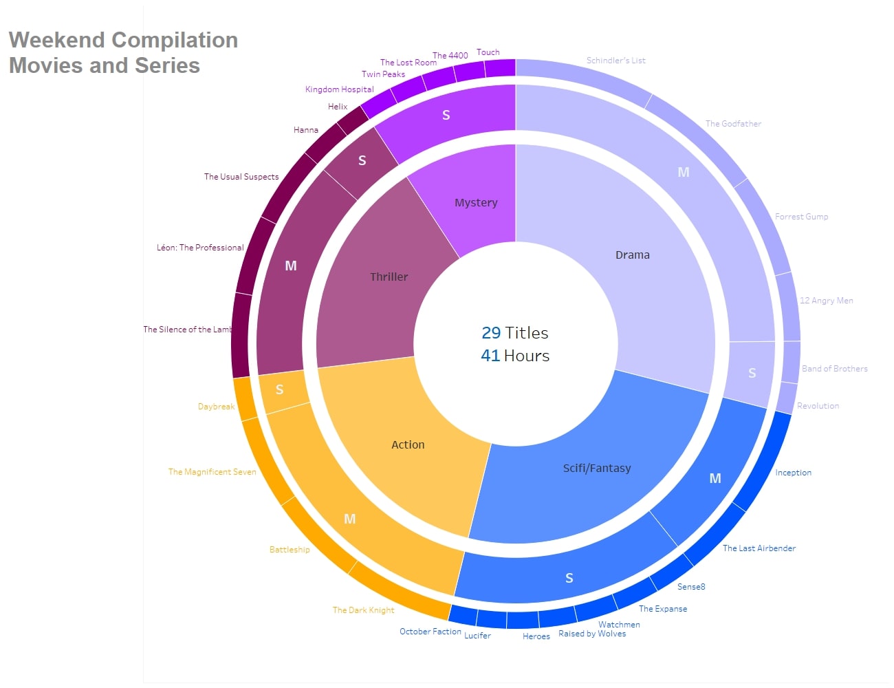
- Name the layers. That comes back to us very soon, as navigating among six layers called Center 1-6 is a bit difficult to do. If you want to, use the coming screenshot as orientation.
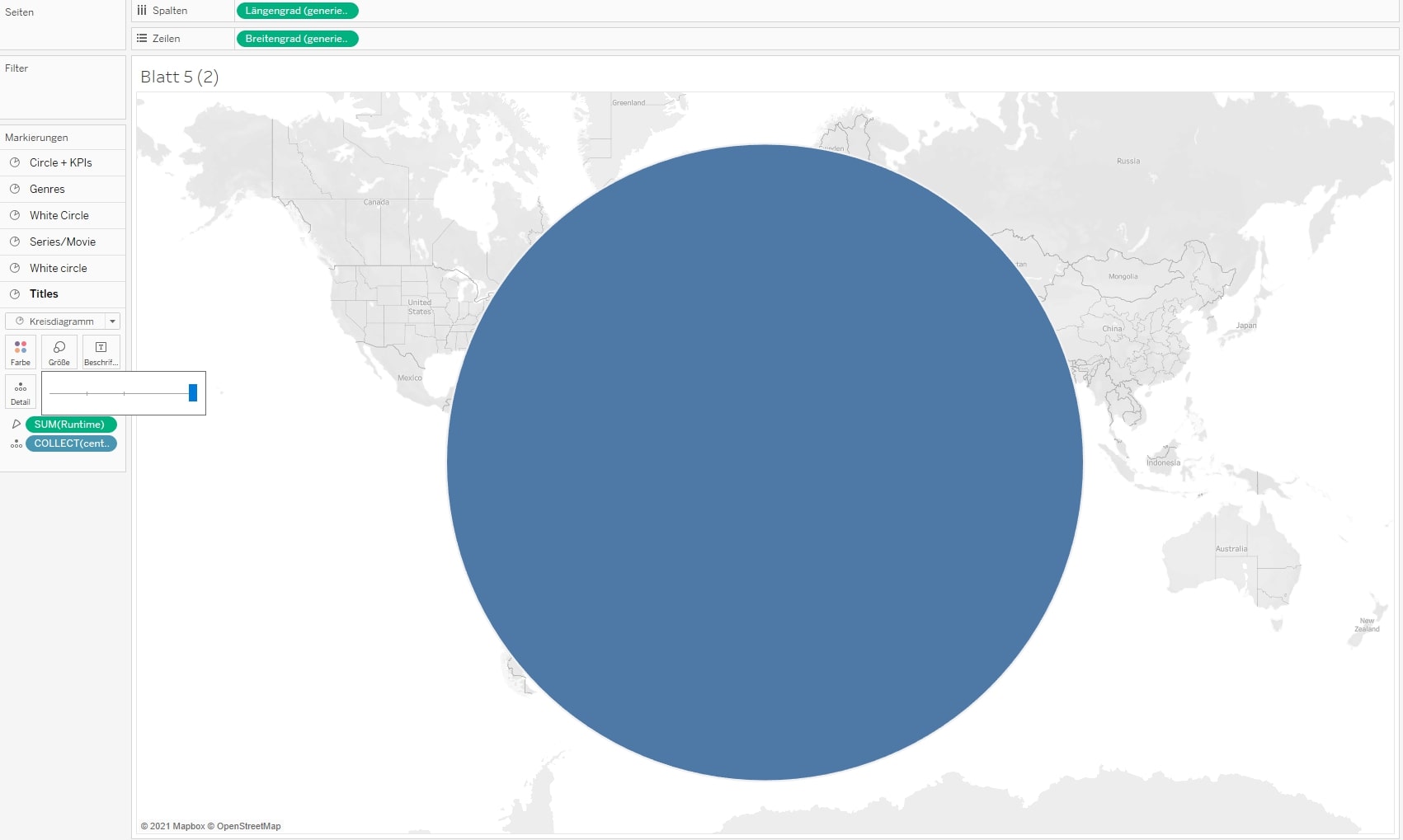
- Drag the size of the lowest layer to its maximum, and type Ctrl-Shift-B (Cmd-Shift-B on Mac) as often as necessary to make the circle almost as big as your world map in the background. But keep a little space, so that our movie titles have a bit of room to breathe.
Now you should have a big, fat blue circle in the middle of your view:
Fill the Layers
Next, we have to fill the map layers. We start at the lowest layer and keep doing most of the stuff there before we go on to the next one. Here are the steps:
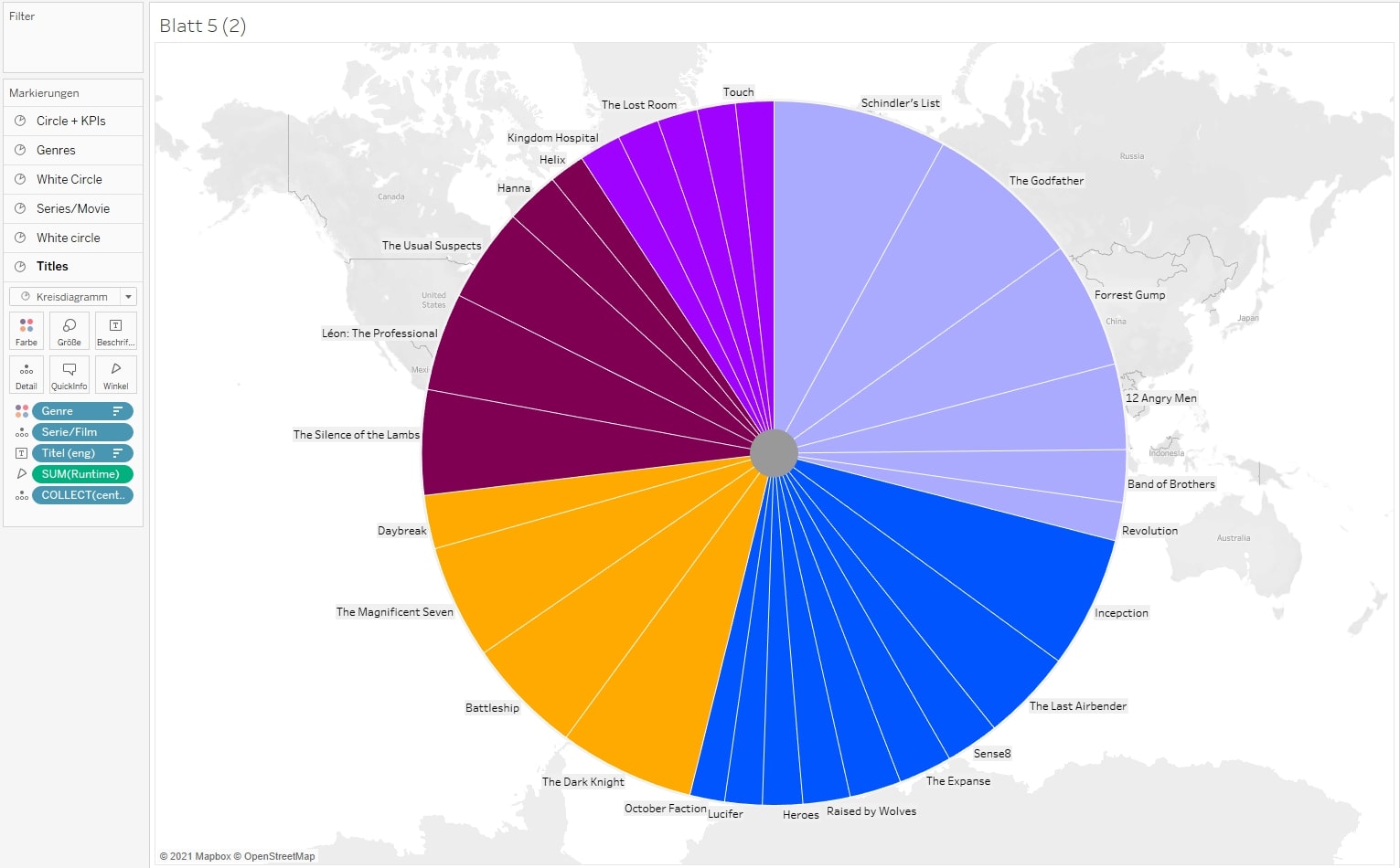
- Drag all dimensions that you want to have on your rings in the end and drop them onto the lowest map layer. Important: Sort them in the right order on your Marks card. The more detailed the dimension is, the lower it has to be. In our case, the [Title] should be on the outer ring, so they are the most detailed and have their place below [Genre] and below [Series/film].
- Drag the top dimension (in our case [Genre]) onto Color. Drag the bottom dimension (in our case [Title]) onto Label. Adjust the colors as you wish. Color the border white.
- Optional: Sort the fields [Genre] and [Title] descending by the field [Runtime].
4. Jump to the next but one map layer – (Series/Film), in our example – and drag [Genre] and [Series/Film] into that layer as well: [Genre] onto Color, [Series/Film] onto Detail. We don’t need the [Title] in here, as we are on the second of our three rings. Color the border white.
5. Again, jump to the next but one map layer (Genre). Drag the dimension [Genre] onto Color and color the border white.
6. Now, color the two map layers white that we skipped before. That ensures our spaces between the rings are white.
Tweaking the Chart
- Now, adjust the size of all pie charts to create several rings as such: the second layer (from the bottom) a bit smaller than the lowest one, the third layer a bit smaller than the second one, and so on. A lot of patience is required here as the size slider has to be moved pixel by pixel to get the right size.
- Open the top map layer and color that pie white, too. Add the measures you want to see in the center of your sunburst. Format the text as you wish.
3. Optional: Adjust the tooltips or deactivate them. Important note: Tooltips can be controlled by each map layer but can only be activated/deactivated for all layers at once. If you want to get rid of tooltips on specific layers, see step 4.
4. Disable the selection for the white “space”-pies. That prevents the tooltips from being shown as well.
Final Steps
Go to the menu and choose: Map > Background Maps > None. That deactivates the background map. Important: After that step, it is not possible to add new map layers! If you need additional map layers, activate the background maps, add the layer and deactivate the background maps again. Then set the view to Entire View:
Remove the headers, grid lines and zero lines. An optional step: design everything that’s left as you wish Voilá! You now have a sunburst chart, completely without a single calculation but with a bunch of map layers. Explore the complete dashboard here: