
It took a few years, but Tableau finally made a wish come true that had been long held by a large part of the Tableau community: the ability to visualize more than one layer in a map. With Tableau Desktop version 2020.4, we can do this using a new feature called Map Layers.
What’s This All About?
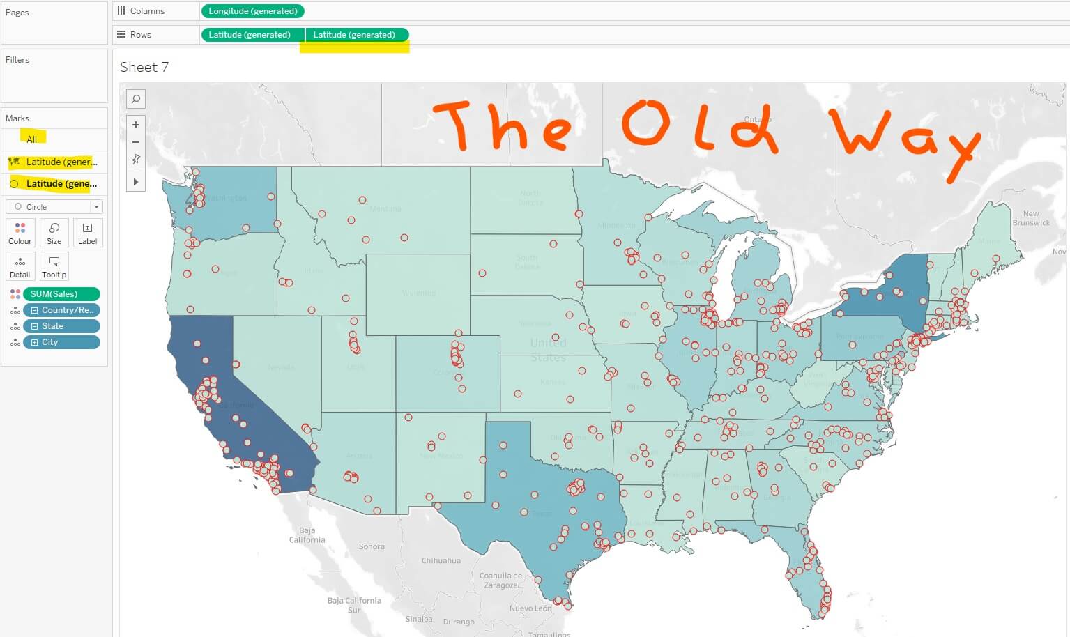
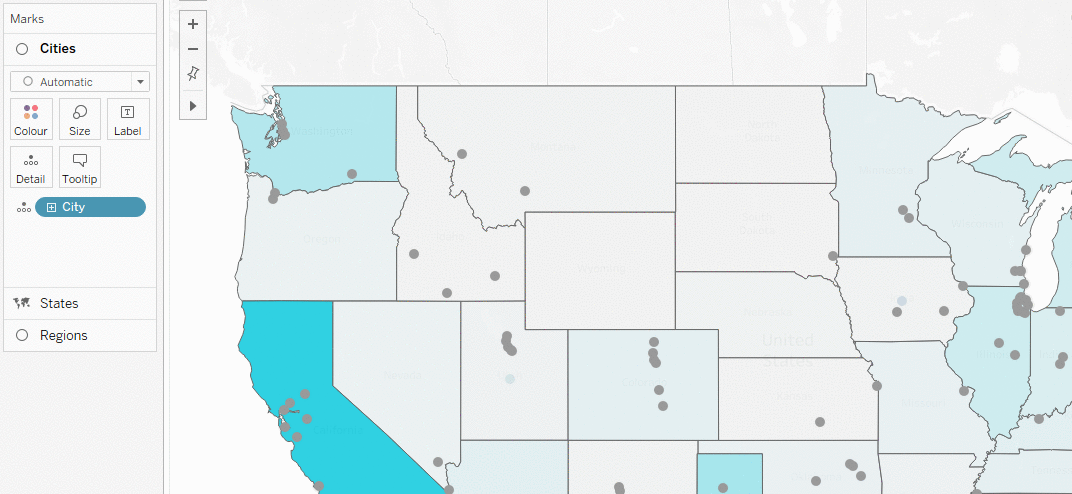
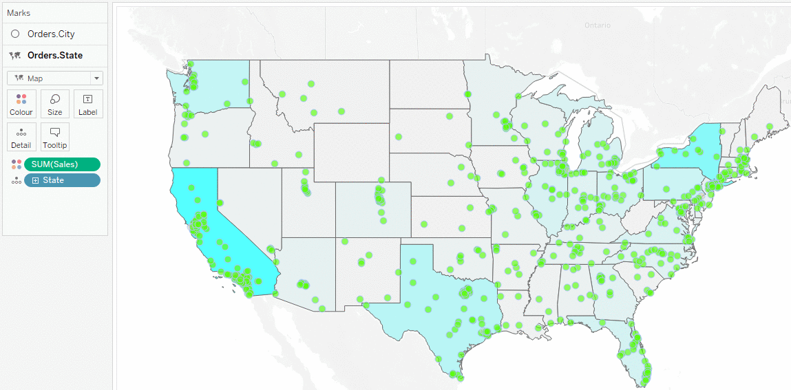
Well, let’s take a short step back and see what the problem has been until recently. We dive into the Tableau Global Superstore data, the curated dataset of a fictional online store. Imagine—we have a map that shows the sales values in all the states in our country. So far so good. We colored those states by the sales measure. Now, we want to add our cities to that map, with each city represented as a circle that is also colored by our sales measure. And here it has already gotten tricky.
What we had to do until version 2020.3 was duplicate one of our geographic coordinate fields (like latitude on Rows) and create a dual axis. That way, we got a second map layer on which we could drag the cities and color them. We had to remember, however, that the upper layer in our Marks card is always the lower layer on the map, which was not very intuitive. But that’s it. Two layers, no more:
What if we wanted to show countries in our map as well? Or neighborhoods? Or any other geographic field? Now, this struggle is history!
Meet Map Layers
We create a new sheet, drag the field [State] onto our view and the measure [Sales] onto Color. Now, lo and behold: We drag the field [City] from our Data pane and drop it in the upper-left corner of our map onto the new bar Add a Marks Layer:
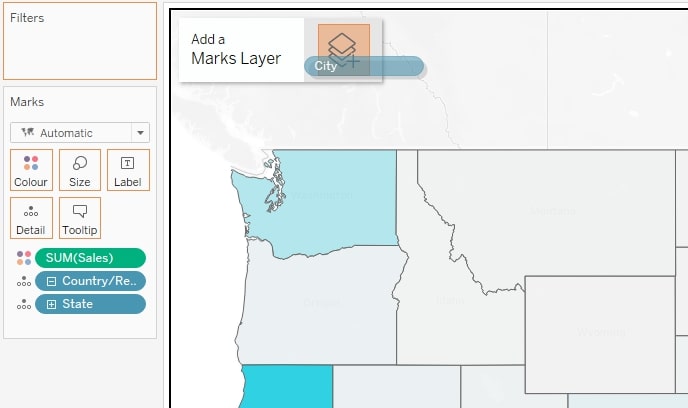
There are a few things we can spot immediately:
- The Marks card has changed. A layer title emerged above the mark type dropdown, both for the states layer and the city layer.
- The new layer lies on top of the other in our Marks card.
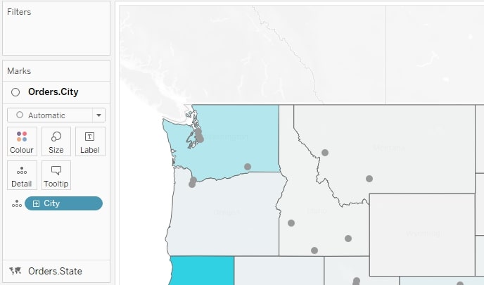
- The new layer lies on top of the other in our map view. Otherwise, we would not see the small circles as they would be covered by the state colors.
- There is no All-layer like when we have a dual axis.
That means, whatever is on top in our Marks card is also on top in our map view! No more remembering, testing or wondering—it’s just that simple. The lack of an All-layer also means that the layers work, in fact, independent of each other. And that’s great news! We can adjust each and every layer, as if it is the only one, without having to think of all the others (apart from which layer is on top of which other layer, of course).
Wait … all the others?
How Many Layers Can You Add?
Two work fine. Three? Yes, no problem at all. Four? No end in sight. Five? I’ll make it short: I don’t know the absolute maximum, but I tried up to 33 layers, and it still worked like a charm. Our imagination is our limit! And of course, what the user is able to get out of the visualization in the end. I surmise that more than 3-6 layers on a map view might be a bit much, depending on the type of data that is.
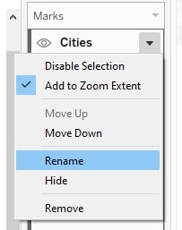
So many layers can get a bit difficult to navigate, so that’s when another new map layer feature falls into place: we can rename each and every layer by double-clicking the title or choosing Rename from the dropdown menu found next to the title:
Wait … we can hide layers?
Yes, your eyes did not deceive you; there is a small eye icon visible in the screenshot, left of the layer title Cities. The eye appears when you hover over the layer, and it replaces the mark type. Clicking on it will hide the layer from our map view:
Why do we need that? There are quite a few reasons: We may have a lot of geographic fields we want to have in our view because they work well together, but we may not always want to see them all at once. Yes, we can delete a map layer, but re-adding it, after you maybe originally had 15 fields on Color, Label and Detail with table calculations and distinct formatting is a very tedious task. A click on Hide/Show is much faster and a lot more convenient.
The same applies for making the view a bit more dynamic. Not all dashboards are going to be published, and a lot of analysis is done in Tableau Desktop where the users are creators and able to hide and show layers.
Disable Selection
In the dropdown menu, we find another function – Disable Selection:
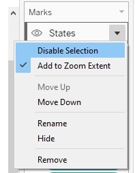
Sounds cryptic at first, but this option helps in a lot of ways. Once we click it, the whole layer in our map view keeps being there, but the user is unable to interact with it. That means: no selecting the mark, no using it for worksheet or dashboard actions and no tooltip!
Why is that helpful? It happens that we have a lot of data that is absolutely relevant for the user but does not need to be further explained. No tooltip needed, no aggregation after clicking a mark needed. Also, depending on what is in the view and how many layers we have, there can be a whole bunch of tooltips appearing anywhere and everywhere, disturbing the user flow and thereby the whole user experience. Less is sometimes more.
That applies especially when building different views for different devices. For example, in a mobile version, we just don’t need too many interactions as the room to navigate a dashboard is far more limited. By the way: this functionality also comes into play in some advanced techniques, like when building a sunburst chart via map layers.
Add to Zoom Extent
This option is ticked by default, meaning that every layer we add is part of our map in terms of zooming in and out. Remember: Hiding a layer does not exclude it from the zoom extent! It’s hidden but still there. Unticking Add to Zoom Extent, on the other hand, really excludes this layer from auto-zooming. It’s tricky to explain but easy to show:
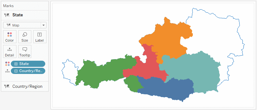
In this GIF, we see the beautiful country of Austria. A few of its eight states had some data, while the others (those unfilled on the left and right) did not. Behind the states, the country field is on another map layer, first hidden and shown in the GIF then excluded from the zoom extent. This example is actually the very use case for this feature!
You can also move the layers around in Tableau. The different map layers are not fixed in their hierarchy—we can move them up and down as we please, either via the drop-down menu or via drag-and-drop. We can just click the layer and drag it wherever we see a slim, orange line appear:
This is amazing! But wait, there’s more!
Duplicate as Crosstab
I love that tiny function, especially when I am building LODs and table calculations. Right-click on any tab, choose Duplicate as Crosstab, and a new sheet appears showing all the data I used in a fancy visualization – now in a crosstab.
The same goes for map layers, but here, emphasizing the independence of each layer, each layer gets its own crosstab. Let’s say we have three map layers in our view and use this function; we get three new sheets, each with a crosstab that includes all the data that’s in the respecting map layer.
Using MAKEPOINT
The functions MAKEPOINT() and MAKELINE() are geographic functions. They convert the calculated field into a geo field. That means we can add this new field to a new map layer and start editing our map on a very granular level. Just define a point or a line, drag it in as a new layer and customize it as needed:
What’s Next After Map Layers?
I am really curious how Tableau will evaluate the success of this feature. It’s not only a new jumpstart for map designing, but this layer concept also has the potential to change simple visualization design as well. Imagine: We could add new calculation layers on a sheet, making dual-axis constructs not obsolete but playing around with more than one measure far more flexible.
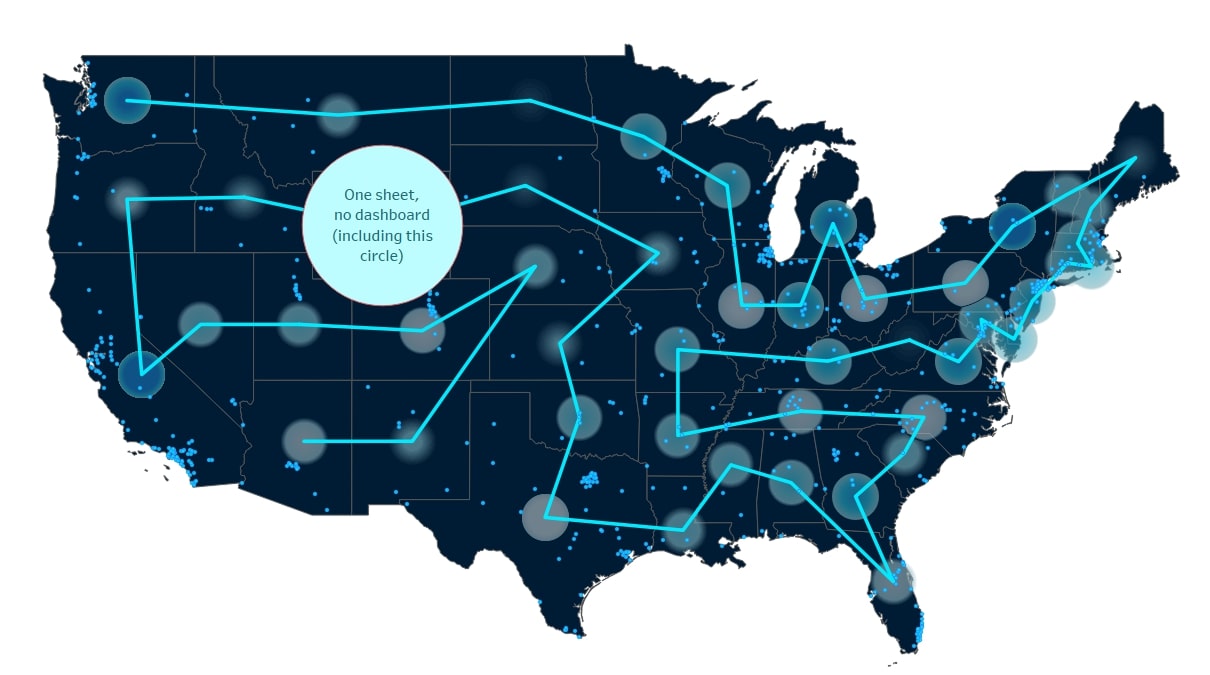
There is a lot more that’s possible with map layers than I can summarize in this blog article. We barely scratched the surface! See below for example. This chart shows a tour through the USA with the help of some map layers. Note the white circle:
And that’s it! A thorough introduction into map layers in Tableau Desktop. Thank you for reading and see you soon!
…just kidding. This just scratches the surface of what map layers can do. Here are some additional tips and thoughts around this new feature.
Q&A and Map Layers Troubleshooting
Q: Can I still work with a dual axis and map layers on top?
No, that is not possible. All the map layers in your view use the same geographic coordinates, coming from a longitude field and latitude field. A second field of those two on Rows or Columns would confuse the layers, so we get an error when we have more than one lying around there. It does not matter if we use a dual axis or not. You can, of course, create a dual axis only, without map layers, as you could before.
Q: What if I want the user to hide a map layer? Is that doable?
That is possible, too, although not with just one click. For that we need:
- A parameter (Boolean is the easiest way). Let’s call it Hide States.
- A calculated field (let’s call it States optional) that checks if the parameter is true and gives us the geographic field: IF [Hide States] THEN [State] END
- A map layer that has [States optional] on Detail, Label or Color.
When the user switches the parameter, the layer disappears in front of his eyes! Of course, you can use that parameter to switch between geo fields as well instead of just let one vanish.
Q: I can only drag geographic dimensions onto new map layers, is that right? No other dimensions?
Yes, every map layer needs to be mapped onto the geographic fields that lay on rows and columns. This is not possible for non-geographic fields, of course. So, you only get the new bar (or right-click option on the field) to add a field to a new map layer when the elements of that field can be found on a map generated by the coordinates on rows and columns.
Q: Can I drag any other fields onto Columns and Rows?
Yes, but the options are very limited as map layers don’t support other coordinate fields (like another latitude field) and no continuous fields, may they be measures, dimensions or even date fields. Discrete fields on the other hand (including discrete date fields) can be added to Rows or Columns.
Q: Is there anything to mention in terms of table calculations?
Not that much. Table calcs work fine on map layers. In Tableau Desktop 2020.4.2 (when this blog article was written), there is a bug when creating different table calculations on more than one map layer: the dimensions from the very first table calc are taken into the direction of the next one on another layer as well, producing an error (red pill). In that case, we have to edit the failing (second) table calculation and remove the dimension that is not present in the current layer.