Please note that Portals for Tableau are now officially known as Curator by InterWorks. You can learn more at the official Curator website.
We are so excited to be launching our new product “Care Quality Analytics” and thought what better way to do this than with a blog and a demo! So, here goes!
Let’s first take a look at the why we built this product, you may well be familiar with the Care Quality Commission (CQC), an organisation that is an independent regulator of health and social care in England, i.e. adult social care, dentists, NHS trusts, etc. The CQC is responsible for rating all of these services and making their results public, they will look at all aspects of the service from dignity and respect, food and drink, good governance, fit and proper staff, etc., and they share the results online for public consumption. So, whether you are looking to identify the best dental practice, care home or CCG for use or you are running one of these services we all have a vested interest in what this data has to tell us.
This information is vitally important but what is clunky about doing it all online is that there is little to no comparison functionality and certainly looking at historical data would be something an individual would need to compile, whilst the data is accessible it certainly is not organised. Comparisons and benchmarking are key factors when making decisions and setting goals and that’s where Care Quality Analytics comes in.
We aim to answer the following questions and more:
- Where can I feel comfortable to care for my loved ones?
- How are other providers in my area doing?
- How is my brand doing in the market?
So, before you hit play on the all-important demo let’s talk tech!

Firstly, we have the data being pulled through by AWS using Mongo DB. Once it’s in place, we are pulling it into Tableau (part of the Salesforce family), a data visualisation tool, to build out those analytics and it’s then being housed in Curator by InterWorks.
Dashboard 1 – Overall View
This high-level overview will give you a snapshot of all of the rated locations and the all-important ratings: Outstanding, Good, Requires Improvement and Inadequate. All of this data can be sliced and diced for the view that you require, by location, measurement, organisation type, etc.
Dashboard 2 – Locations Analysis
This deeper dive is now looking at the individual locations, analysing the reviews throughout time and nationally and drawing down on a more specific group for a clearer comparison.
Once we drill down we can assess what is happening with particular brands over a period of time. You’ll notice you can drill down on specific KPIs to understand why the scores are set and what has been happening over time.
Dashboard 3 – Single Location Lens
Here we can see the finite detail relating to a particular location and are getting into the “nitty gritty.”
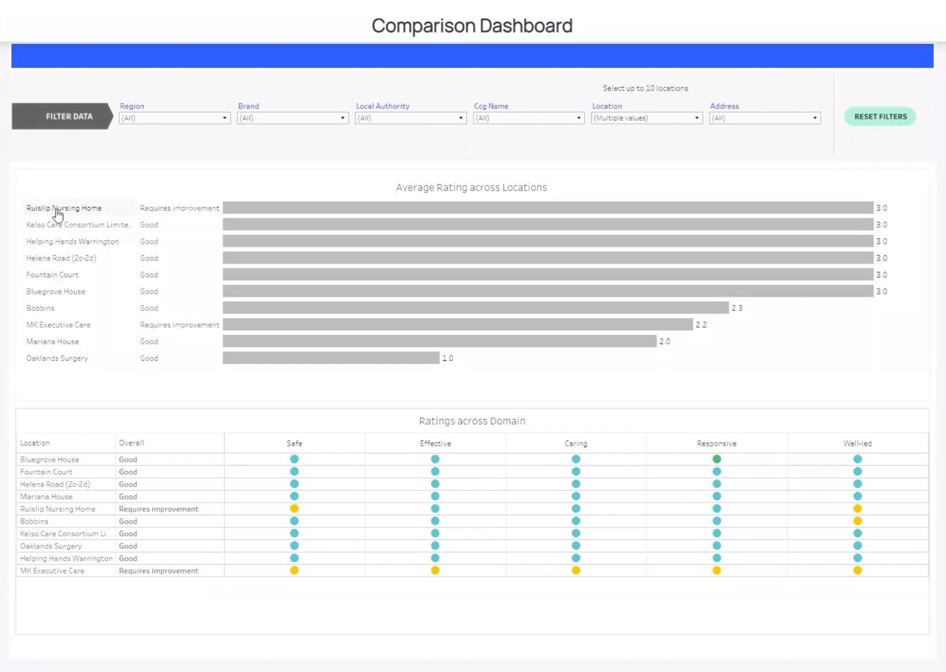
Dashboard 4 – Comparison Dashboard
Here we can select specific locations to understand how organisations compare and start benchmarking against those for an overall picture of what is happening.

The devil truly is in the details, and this solution sharpens your view of data, from high-level comparisons or benchmarking to detailed historic reports with only a few clicks. Users at all levels of health and social care will find valuable insight to support strategic decision making.
If you would like to learn more then please contact us.

