This series examines some advanced techniques of Tableau Tooltips and will help you effectively build upon an already solid foundation.
In this new blog series, we’ll be looking at a few advanced techniques for tooltips. To get to grips with the basics, why we use tooltips and how they can add to your views, refer to this blog from my colleague Brooks Barth. You can also access this guide to adding a viz to a tooltip written by Holt Calder.
Each of the entries in this series come with a couple of warnings:
- Always be wary of the performance impact of tooltips. When we add sheets to tooltips, Tableau has to pass a filter through to the target sheet and take a new image of the view every time we hover over a mark. This can cause some serious performance issues on larger datasets, so make sure the tooltips you build perform properly before giving them to your audience.
- Just because you can, it doesn’t mean you should. Opening up the possibilities of tooltips can feel like a treasure trove—a big box of flashy new tricks you can use and will want to force into every dashboard. But remember to take a step back, always build with the end user in mind, and ask whether your tooltips are making your viz more impactful … or just more confusing.
Conditional Colours
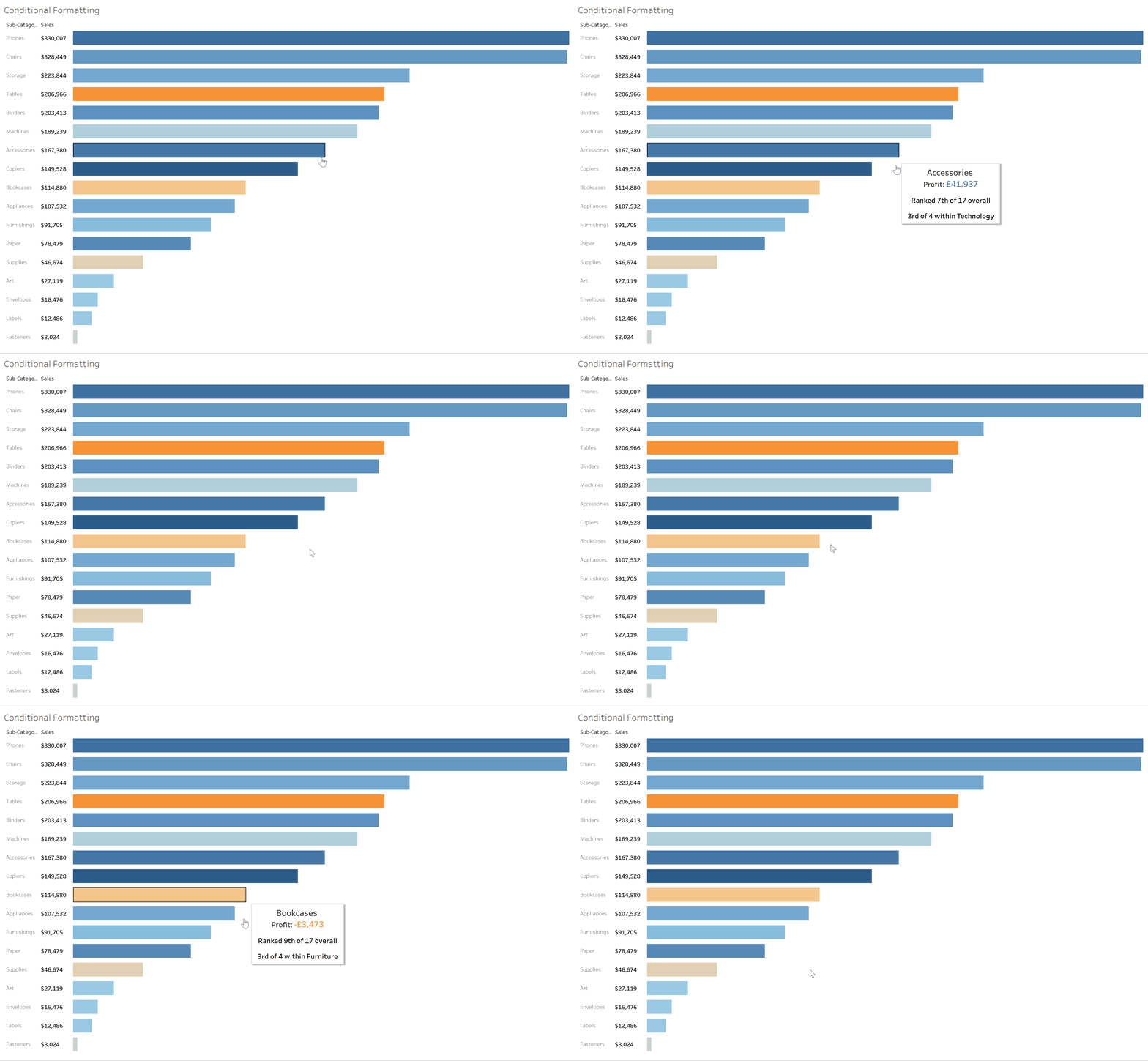
One of the common complaints with tooltips is that there is no way of adding a colour legend to the tooltip text. In this example, I have a bar chart showing sum of sales by sub-category and coloured by sum of profit. By default, my tooltips will look like this:

The profit colour legend (Orange – Blue) does not carry into the tooltip; I see negative and positive values in black. From the tooltip dialogue box, I can update the colour, but I can’t add a condition to it to colour positive and negative values differently:
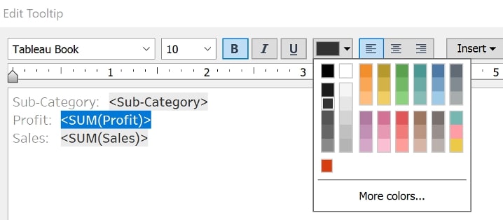
To create a conditionally formatted colour legend, we have to create two new fields—one for profits above zero and one for profits below zero:
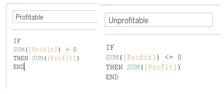
One field will return my Sum of Profit value if the value is profitable and null if it is unprofitable. The second field will do the opposite. I update the default number format of both new fields to Currency and drag them to Tooltip on my Marks card. Next, add them to the tooltip, and update the colours of each to match the colour legend:
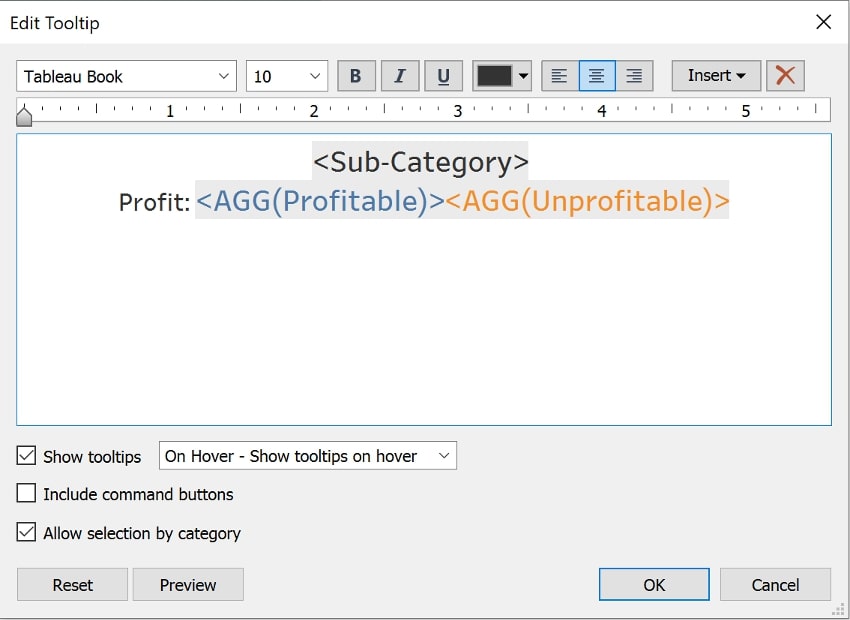
I have both fields in my tooltip, but one of them will always be null, so I’ll only see one displayed at a time:

Conditional Strings
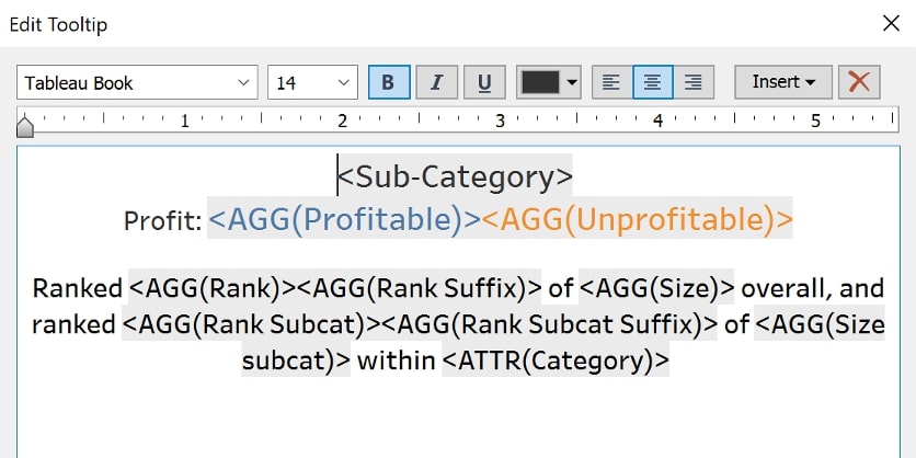
We can add conditional text to tooltips in the same way. Taking the previous example forward, I have added some rankings into my tooltip (using a rank-and-size calculation on the Table level, and another rank-and-size calculation on the Category level):

Using this type of natural language can be an effective way of increasing audience engagement with a dashboard, but I’d prefer it if this tooltip read Ranked 8th of 17 overall…
I’ll need another calculated field in my tooltip to give the correct suffix for my rank. First, I need to bring my rank table calculation out of my view and into my Data pane so that I can reference it in another calculation. Then create the calculated field below:
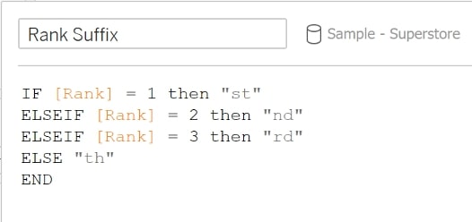
Repeat the process for the sub-category ranking, and bring both of the new suffix fields into the tooltip:

In the next post, we’ll look at how these string manipulations can be used to switch between to visualisations in a tooltip. Stay tuned!

