
Like most people here at InterWorks, I really love data. I’ve been collecting data about different aspects of my life for a long time. Several years ago, I discovered Automatic – a little device that plugs into your car’s on-board diagnostics port and logs data about your driving. I’ve logged nearly every trip for over two years and now I want to take a closer look at my driving history in a blog series called “The Quantified Car.”
The Data Set
The Automatic tracker records all data at the trip level. Using the IFTTT platform, I upload every trip to a spreadsheet in Google Drive. Next, I use an Alteryx workflow to process and wrangle the data (more on that in a future post). When the data finally makes it into Tableau, I have access to loads of information about each trip:
- Start and End Date Times
- GPS Coordinates of Start and End Locations (This does not include GPS points along the trip)
- Distance
- Duration
- Fuel Consumption
- Fuel Efficiency
- Fuel Cost of Trip
The device also measures the duration I spend in different speed ranges such as 70-75 mph, 75-80 mph and above 80 mph. Plus it counts the number of hard brakes and accelerations for each trip. There is a lot of information to be analyzed here and we can derive even more. So, let’s dig in!
The Speed and Cost Dashboard
The first two things I wanted to learn were my speed habits and fuel cost, so I built a dashboard to examine those measures:
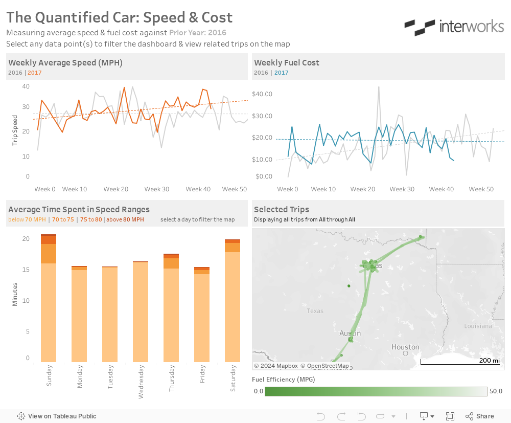
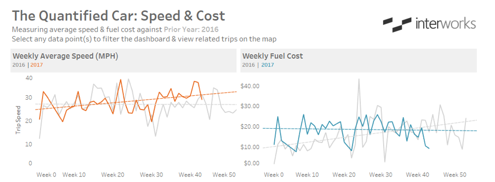
Fuel cost is readily available in the data set. Trip Speed can be derived from the distance and duration measures. I aggregated the constituent metrics to create the Trip Speed calculated field:

The trends of these two measures make up the top half of my dashboard. We can see that my weekly average speed has been increasing throughout 2017 while my weekly fuel cost is decreasing:
The bottom half of the dashboard is comprised of a stacked bar chart that shows the map and the average amount of time I spent at various speeds per trip:
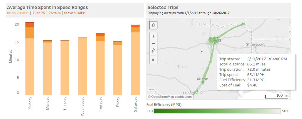
Looking at the bar chart above, we can see most of my driving time is spent below 70 mph. The total height of the bars represents the average trip duration for each day. We can also clearly see that my trips are a bit longer on the weekends.
The map plots each trip as a straight line between the start and end locations, and I’ve mapped a fuel efficiency color. We’ll dive much deeper into this type of map in a future post, but the primary purpose here is to embed the details of each trip into the tooltip. This allows users to hover over any individual trip and see all the associated data. See our post about why tooltips are useful here.
Driving Dashboard Interaction
User interaction is an important element of data delivery. Allowing users to engage with the data can facilitate their understanding and help drive adoption. Let’s look at which actions this dashboard uses to encourage users to interact.
There are three actions in this dashboard. The first one allows the user to filter the lower half of the dashboard by selecting data in the upper half. The second action highlights the corresponding data in the opposite trend chart when data is selected in either trend chart. And the third action allows users to further filter the map by selecting a day from the bar chart. You can interact with the dashboard above to see this filtering in action.
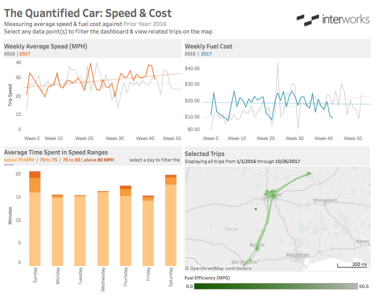
Notice the flow of the user interactivity. The top half filters the bottom half, the bottom left filters the bottom right and the bottom right filters nothing. In general, this is a best practice for guiding users through any dashboard. They should experience the data much like they would experience a book, from top to bottom and left to right.
This has been a brief look at just some of the data from the Automatic data set. There are many more exciting things we can do with this data and we’ll continue to use it to discuss topics like forecasting, clustering and Alteryx workflows. Stay tuned for the next installment of “The Quantified Car” series!