The Drawing Tool has been incorporated into CBI Studio by InterWorks. Explore CBI Studio to see what’s new.
People working with Tableau come from many different backgrounds. They’re analysts, data journalists, graphic designers or just curious people wanting an upgrade from their spreadsheet. Regardless of who creates them, I think the best dashboards share one thing in common: They inspire viewers to learn more. For my Iron Viz entry, I’ve recreated a tool that’s been used for centuries to educate others, the information wheel, with a few updates for the modern generation. If you like the viz, I’d appreciate it if you took a sec to go vote for it as part of Tableau’s Politics Viz Contest.
What Is an Information Wheel?
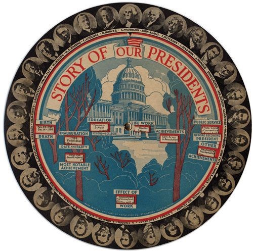
You may or may not have used an information wheel before, but the design is incredibly intuitive and interactive. You typically have a series of options displayed on the outer rim of the wheel, then you rotate that disc to view information about those different options. One example, which I first saw in Jessica Helfand’s “Reinventing The Wheel,” is shown below:

This wheel was created more than 80 years ago, but it is still a great example of a tool that piques the interest of the user and educates them. It relies on carefully crafted text to bring up the information relevant to each selected president, and while it can be a little tedious to turn the wheel just right, it’s quite intricate considering the technology available at the time. My hope was to create something similar to this in Tableau and take advantage of the interactivity available to us.
How I Made the Viz
The first step was figuring out how to recreate the rotating portraits in Tableau. I used Adobe Illustrator (thanks for the free trial!) to make a circle with 43 equally spaced dots along it, then used InterWorks’ very own Drawing Tool for Tableau to turn that in to something with X/Y coordinates that I could use with a custom image in Tableau. I then did a little bit of manual manipulating to create a layout for each president. The information came from several different sources, but most of the basic demographic information was grabbed from Wikipedia using import.io. Add in a dash of pencil maps from Mapbox to give things a little more simplistic motif, and we’re all set.
There’s no shortage of politics data out there, especially in an election year. Tableau Public has already been flooded with an endless stream of new electoral maps. It would have been very easy to look at that sort of thing for this competition, but I wanted to build out something that didn’t focus so heavily on the inherent conflict within politics. The conflict is so often what turns people off from getting involved or getting educated. I wanted to build something to counter that, getting people interested and intrigued. Hopefully, this new take on an information wheel can help pique curiosity in people like the paper ones of the past.

