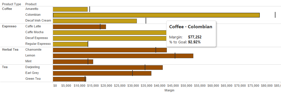
One of my favorite viz types in the history of the whole wide world of Tableau is the bullet chart. I’m not sure I’ve ever produced a workbook that didn’t make use of this awesome “progress to goal” option because it’s simple, easy-to-understand and visually appealing. To wit:

You can easily tell which products haven’t yet met their goal because the bar doesn’t extend to the reference line, which marks the goal. You can be extra special fancy if you want to and color-code the bars using a simple T|F calculated field. This lets the user know that darker colored bars represent those products with excellent product managers who managed to meet their goal, whilst the slightly lighter bars represent products whose managers are, well, not quite up to standard.
And will you just look at that cool tooltip? Tooltips are my favorite … what a way to get extra information into your view without crowding your viz, right? Here, I added in the % to the goal so we can at least see that Mr. Product Manager for Colombian Coffee is at about 92.92% of the way there (we’re rooting for you, Mr. Product Manager – don’t lose hope!).
The Wrench
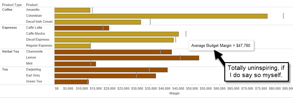
But the problem is, when you add in a reference line that shows you the goal, you don’t have the luxury of a tooltip. No, sadly, you’re stuck with just the name of field you reference, preceded by the calculation (Average, Sum, Total, etc.) chosen in the Add Reference Line dialog:

I’m not one to complain, but blech. And it only goes downhill from there if you’re using a rather nasty calculated field, with an equally nasty name, as your reference line. You either have to give your field a decent name, which you may not want to take the trouble to do if you’re only using it in this one context, or put up with this ick:

How do we remedy this small but irritating problem? Here’s where understanding Tableau and how it uses fields in the view makes all the difference. If you’ve taken a training class with me, you know that I harp on blue vs. green ad infinitum (and/or ad nauseam, some may say). This is because knowing that you need a continuous green field to get you an axis, and therefore a Marks card, and therefore a tooltip, can help you solve this issue.
Keep Thinking Vertical
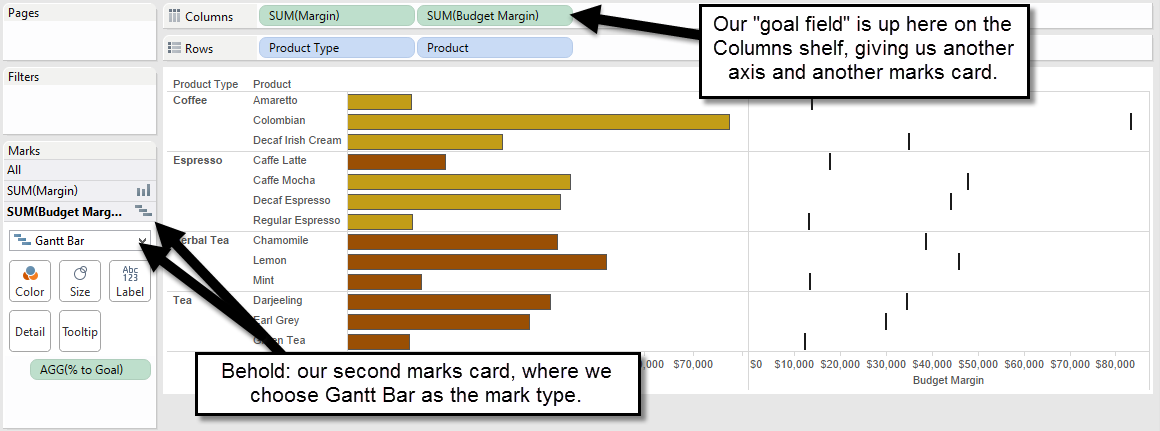
What if we had a mark type that was similar to a vertical line, like our reference line here? What about the Gantt mark type? It looks suspiciously “vertical line”-ish to me. Let’s take a gander at what happens when we use that as our reference line instead.
We’ll start by pulling our Budget Margin (our goal field) out to the Columns shelf, instead of to Detail on the Marks card. This gives us a second Marks card, as green fields in Tableau are wont to do:

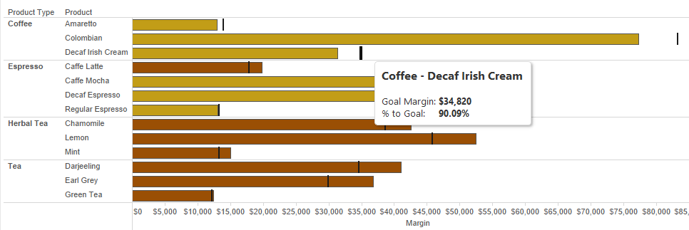
All that’s left is to dual axis this baby (ok, so we’ll do a little formatting clean up as well, like synchronizing the axis, and clearing the Show Header option on the goal field), and we’ve got ourselves a reference line that we can put formatted tooltips into:

And there you have it: A vertical “reference line” that now has formatted tooltips showing you not only what the goal is, but the % towards it. MAGIC.
It really is the little things, folks. The lack of a formatted tooltip on a reference line won’t end hunger or encourage world peace, but swapping to a Gantt Bar can make your visualization just a little bit more appealing – that counts for something!

