Divvy Bikes, Chicago’s fantastic and vast bike sharing program, gives both local commuters and tourists alike an alternative option to Public Transit or taking a cab.
My goal for this dashboard was to create a comprehensive guide to get to know your neighborhood Divvy. The dashboard allows the user to navigate by neighborhood and Divvy station to find out peak months and rides per hour to figure out what the ideal time is for the maximum probability of there being a bike available to ride. It also allows the user the ability to track the construction of new stations in their respective neighborhood.
To create this dashboard, a series of advanced Tableau techniques and a little help from Alteryx was needed.
Shaping the Data
Divvy happens to keep excellent historical ride data for every station in the system. The issue, however, is that the data is separated out by quarter and year into separate files. In order to use all this historical data, I first utilized the Union feature available in Tableau 9.3, placing all the individual CSV files in a single file directory:
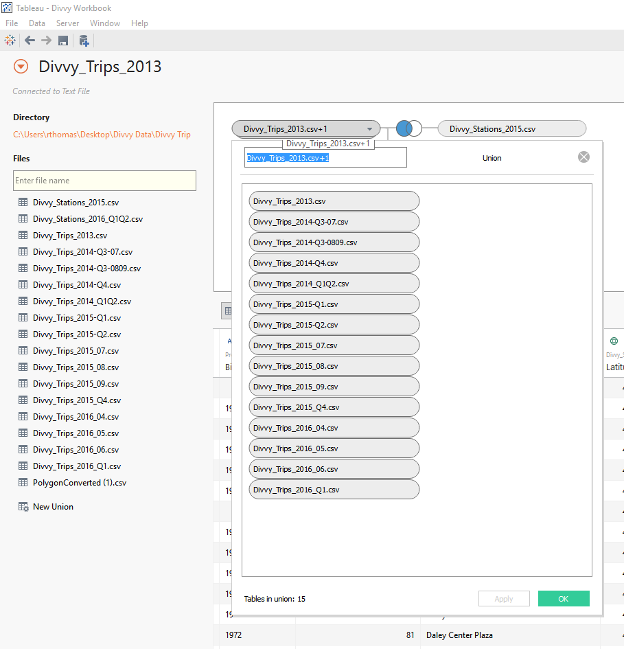
Once the Union was complete, I had to merge two mismatched fields for birth year.
Shapes for Neighborhoods
Chicago is a neighborhood-centric city. As a Chicagoan, I use neighborhoods as a means to describe where I am and where I am going. Divvy does not include the neighborhood associated with each respective station, so I had to get creative.
First, I had to visit the City of Chicago website to find a shapefile associated with the neighborhoods. With this shapefile and a little help from the very handy (and free!) Tableau Shapefile to Polygon Converter, I was able to convert the file into a series of points and coordinates to be utilized within Tableau as a custom polygon overlaying a background map:
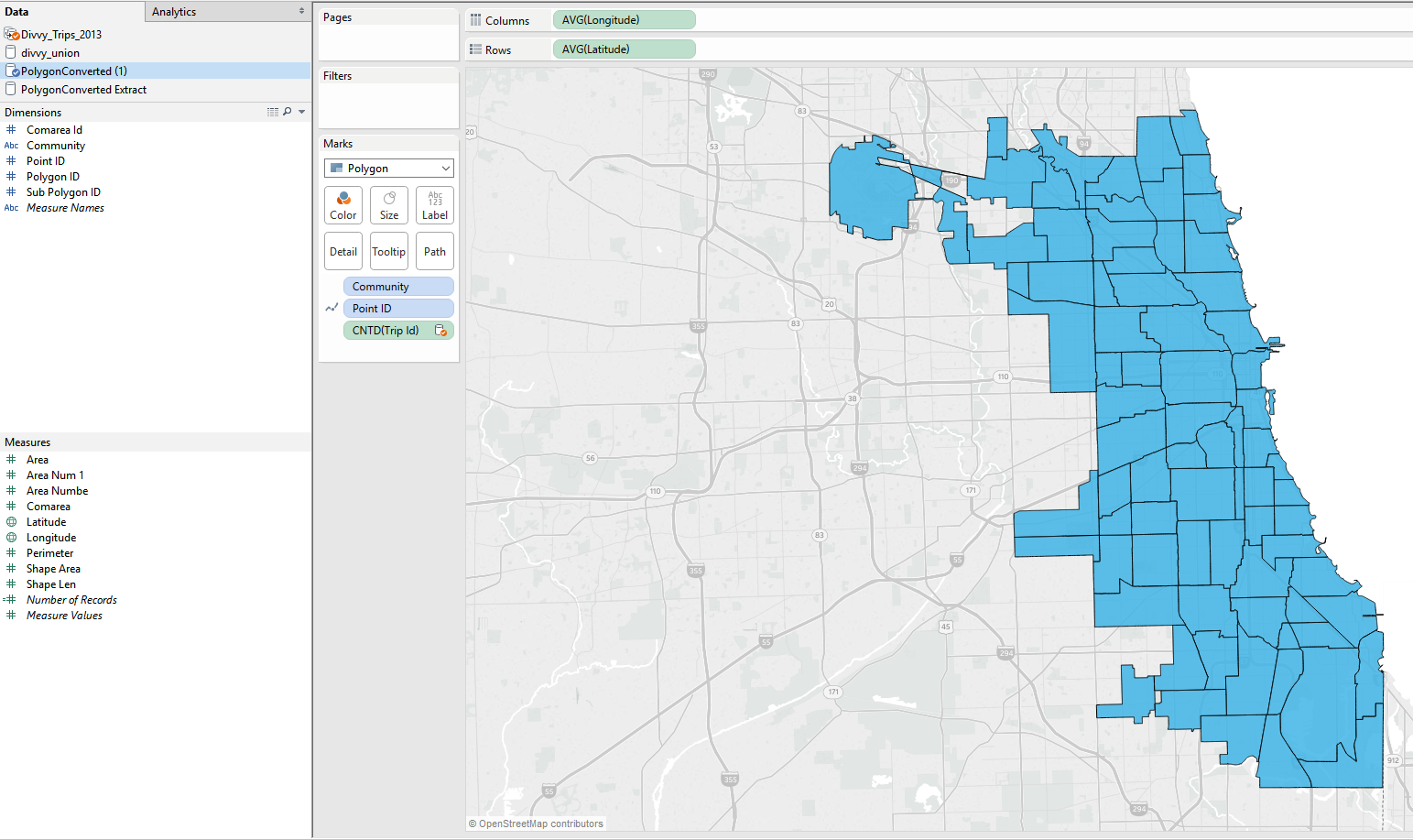
Having my neighborhood map, I needed to now figure out how the coordinates for the stations fit into each neighborhood. Utilizing Alteryx Designer, and more specifically the Spatial Match module, I was able to find where the stations lied within each custom polygon. I then joined that result back to the original Divvy Stations List:

Average Trip Distance
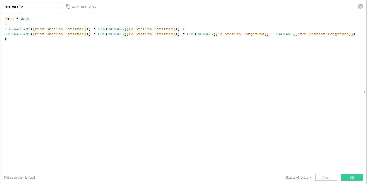
For me, getting to know my neighborhood Divvy Stations also meant knowing how long each trip was on average. Figuring out the exact distance traveled between two stations for every trip using Google Maps would have been unreasonably difficult, but getting an approximation using the Great Circle Mapping equation was within the realm of possibility.
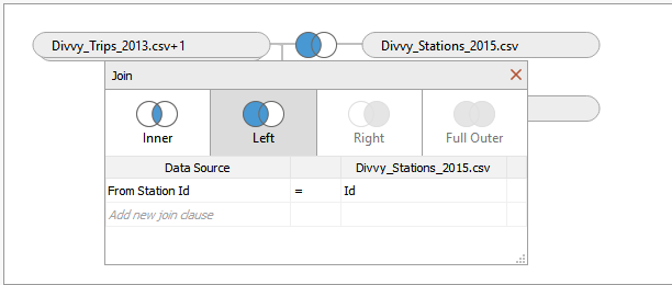
In order to even get to point where this equation could be used, a bit more data massaging needed to be done. We are giving To and From Stations in the unified historical data set. We are given the coordinates (and now neighborhood!) for each station in a separate file. By creating two different joins, one using the To Station in the join clause, and another using the From Station, I was able to get the coordinates for both:
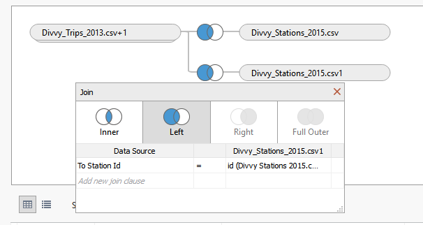
Now, the following equation could be applied to find the distance for each trip:
