
Have you ever interacted with Google/Android’s gorgeous visual identity and wondered, “What is this, and how can I make Tableau look like that?” If your answer was a resounding yes, let me walk you through how we go about answering both the “What?” and the “How?” of Material Design, Google’s new visual language.
What Is Material Design?
The material is an environment in a 3D space, which means all objects have an x, y and z dimension. The z-axis is perpendicularly aligned to the plane of the display, with the positive z-axis extending towards the user. Every sheet of material occupies a single position along the z-axis and has a standard 1dp (density pixels) of thickness, which is equivalent to one pixel of thickness on screens with a density of 160 pixels.
In other words, think of Material Design as sheets of paper in motion! In practice, it uses these sheets of paper as a visual cue to provide a clear definition of what action needs to be performed. For example, a button is on a higher sheet to reflect that there is an action that needs to be performed on it.
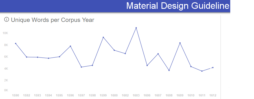
The theory behind the workbook was to guide a user through design decisions made to make a Tableau dashboard fit into the language that is Material Design. The approach started with a personal desire to explore a Public BigQuery data set on the works of William Shakespeare by breaking down unique word usage over year and corpus. This initial data story was then told through the lens of Material Design best practices.
Let’s first walk through how we access our data set and workbook.
How to Use the Workbook
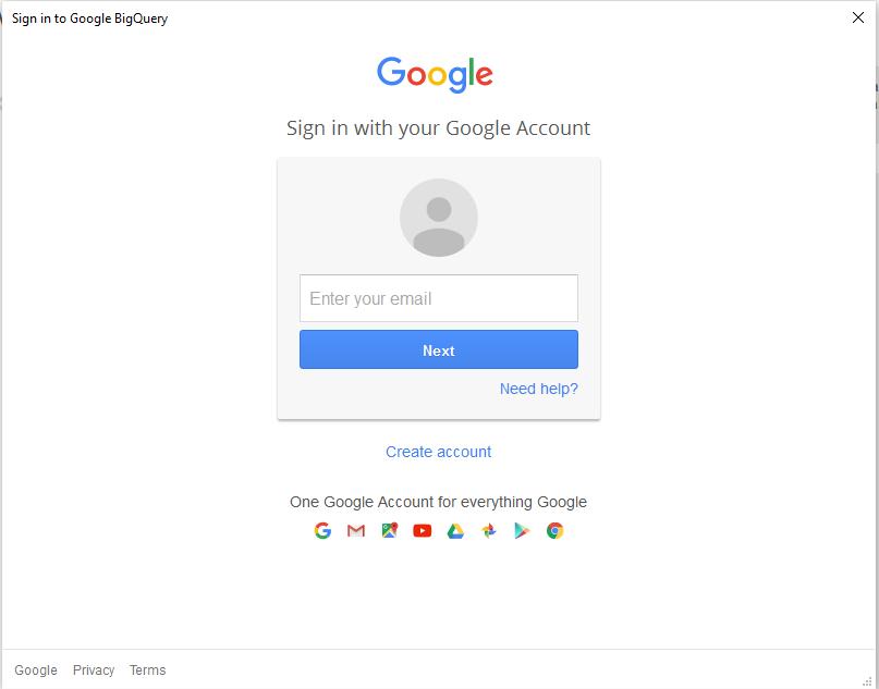
In order to access the Shakespeare Data Set, you will first have to have a Google account and also be signed up for BigQuery.
When you first open the workbook, you will have to sign into your Google account. The following screen shots will guide you through the process:
How to Make It Work in Tableau
Now let’s take a look at our “Material Design Best Practices” dashboard and break it out into its component parts:
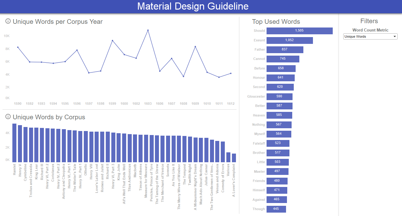
Simple Bar Chart:
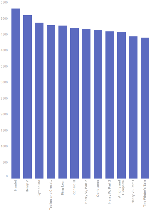
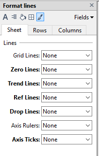
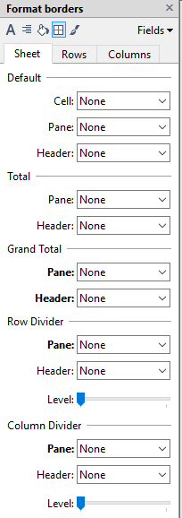
To correctly follow the principles of material design for our Bar Chart, we must remove axis labels and tick marks and all borders from our bar graph. Also, make sure to limit the major tick marks down to the absolute minimum:
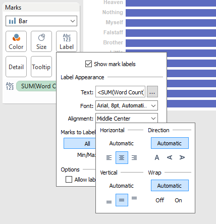
Bar Chart with Labels:
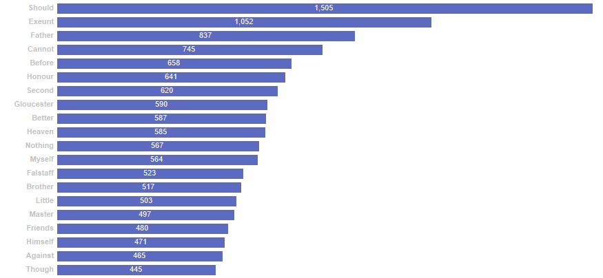
In addition to removing all we removed from the Simple Bar Chart, when dealing with a bar chart with labels, the x-axis itself can be removed. We also move the labels from the end of the bars to the middle of the bars:
Time Series:
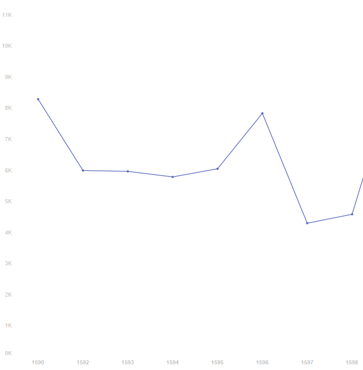
In addition to removing all we removed from the Simple Bar Chart, we additionally are going to remove the grid lines, decrease the size of the line and add markers to the visualization.
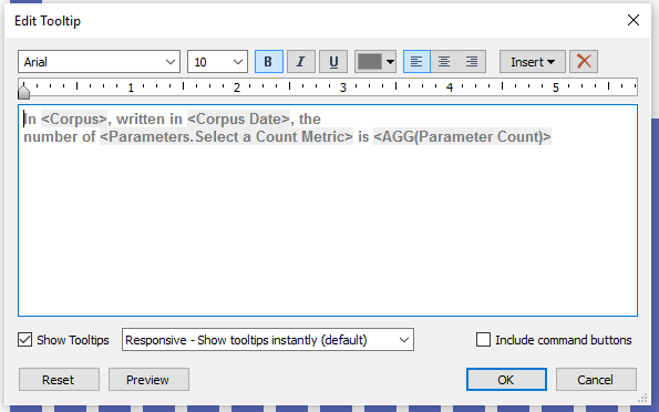
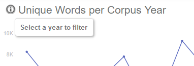
Tooltips:
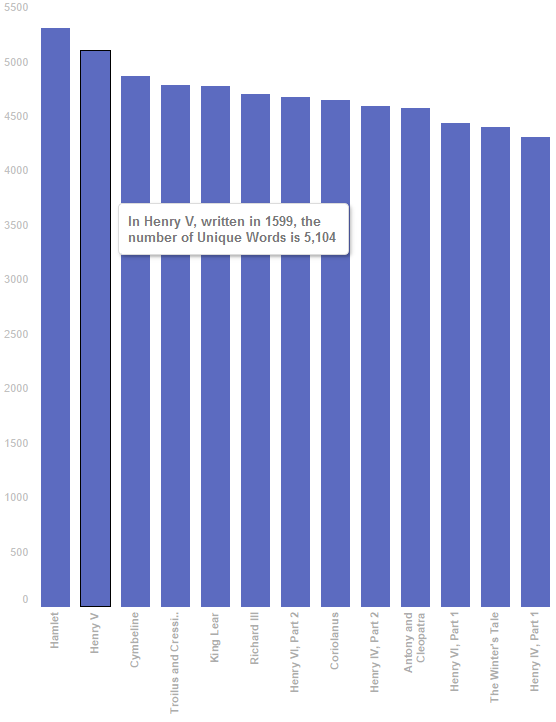
The tooltip uses Arial 10pt font in Grey (#787878) color and also uses a short, dynamic sentence to describe the selected mark:
Building the Tableau Dashboard: Part 1 – The Background
Every sheet in material design has its own thickness equal to 1dp. To show this elevation, we add drop shadow to our layers of sheets. Adding drop shadows in Tableau is not currently an option, so we add them to custom shapes created in Photoshop.
In our case, we are dealing with three distinct sheets, with three individual elevations: Header, Filter and Visualization. In an ideal, material design world, we would leverage motion along with floating action buttons to expand and collapse out our filters page. Because motion within Tableau breaks the best practices outlined, we keep our dashboard static, avoiding motion and scrolling.
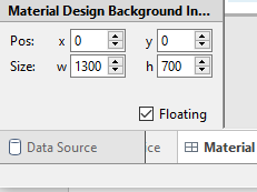
I have sized the background image to fit into a dashboard sized 1300×700, brought in the background image as a floating object and set its x and y coordinates to 0x0 and its size to 1300×700:
Building the Tableau Dashboard: Part 2 – The Layout Containers
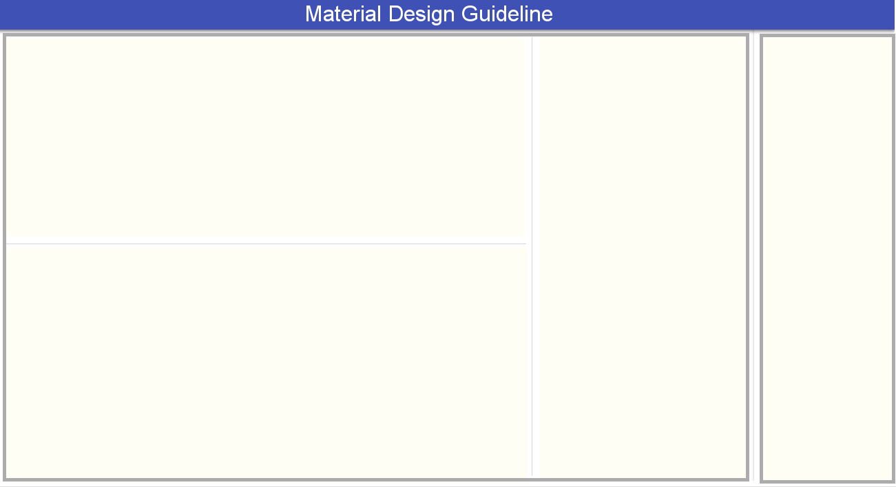
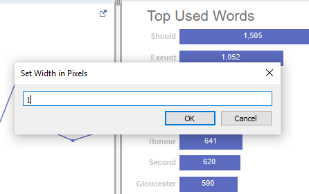
A floating layout container is added to both the Filters Sheet and the Visualization Sheet. Within our Visualization Sheet, we break out our seams by using 1dp dividers. To make the dividers, we create a text box, 1 pixel high or wide with a light grey (#d7d7d7) filling:
Building the Tableau Dashboard: Part 3 – Color and Font
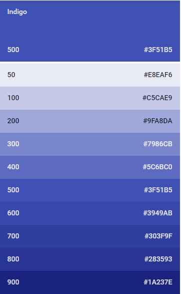
Color is a vital aspect to Material Design. The goal is to only use enough color to get the point across. Color for the sake of color is frowned upon, and you should strive for simplicity. For any dashboard, you will pick a primary color palette used widely throughout the dashboard and a single secondary color palette to use as an accent. In this dashboard, an Indigo primary color palette with Indigo 500 used for the header and a variation of Indigo 400 is used for the visualizations.
Arial is used as the font for all text objects as it is universally available across all modes of consumption and is available in Tableau. Following the Material Design guidelines, the header is set at 34pt size and white in color. Subheadings are set at 16pt size and light grey (#6d706f) in color to mimic an opacity of 54% as set forth by the guidelines. All axis markings are set at 10pt size and lighter grey (#c0c0c0) in color to mimic an opacity of 38%.
Building the Tableau Dashboard: Part 4 – Actions
Material Design specific iconography is used as a call-to-action to draw users to a worksheet that drives dashboard actions. In this case, the info icon is used to both draw the attention of the user towards the action and also with a tooltip, describe the action to the user. Each icon is its own worksheet, which allows for the use of the tooltip on hover. The opacity of the icon is set to 54% to indicate that it is an actionable item:
Building the Tableau Dashboard: Part 5 – Filters/Parameters
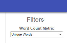
Place all filters on the filter sheet. For the filter titles, use a light grey (#6d706f) sized 10pt.
Final Thoughts
As a final product, we have a clean, three-dimensional dashboard that fits into the Material Design vernacular to the best of Tableau’s abilities. Find the final workbook here and start exploring Material Design in Tableau for yourself!
Related